Category: Analytics
This shelf is the job, not a tool manual. You are here if someone expects a number, a chart, or a “what should we do,” and the spreadsheet is starting to argue with itself. The articles cover the question before the query, a metric with a written definition, a chart that answers something, data that is fit to ship, and the messy middle of pipelines and stewardship.
It is not the SQL category. SQL is how you ask a table. Analytics is what you are trying to decide, and whether the number is even the right one. It is not the AI category either. A model can draft the email about the metric. It does not pick the metric.
Where to start: Analytics foundations if you do not yet have a clear question. Metrics if the team is arguing about a definition. Charts if the picture is pretty and the decision is still fuzzy. The SQL series when you are ready to ask the table yourself. Learn groups these as a track so you do not have to guess an order from a flat list.
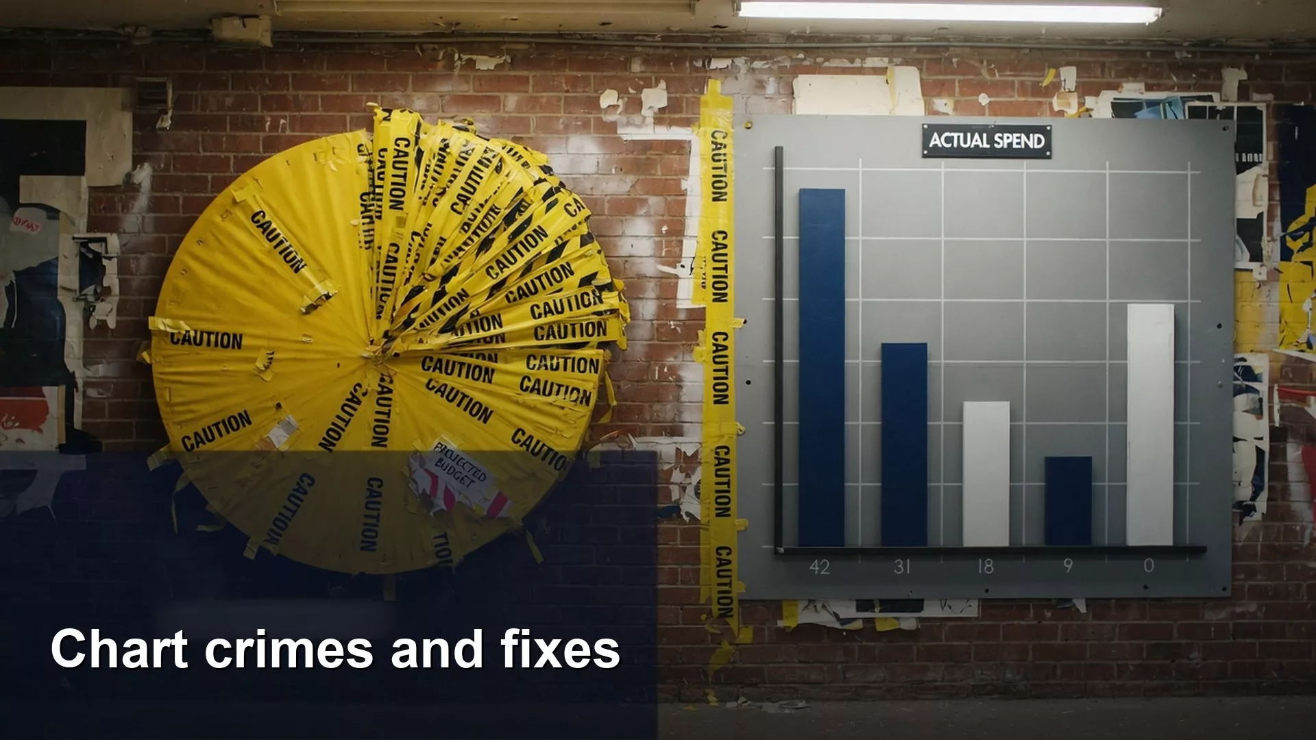
Common chart mistakes that mislead people, and how to fix them
Spot and fix common chart crimes: pie overload, 3D distortion, truncated axes, dual-axis tricks, rainbow heatmaps, and wrong chart types. Clear encoding beats decoration.
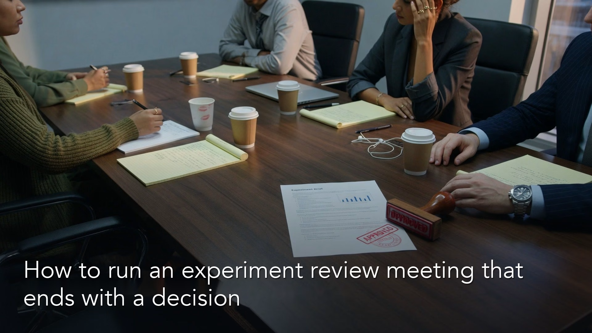
How to run an experiment review meeting that ends with a decision
Run experiment reviews that decide: ship, iterate, stop, or gather one named fact. Use a short agenda, a one-page pre-read, clear roles, and a written decision log.
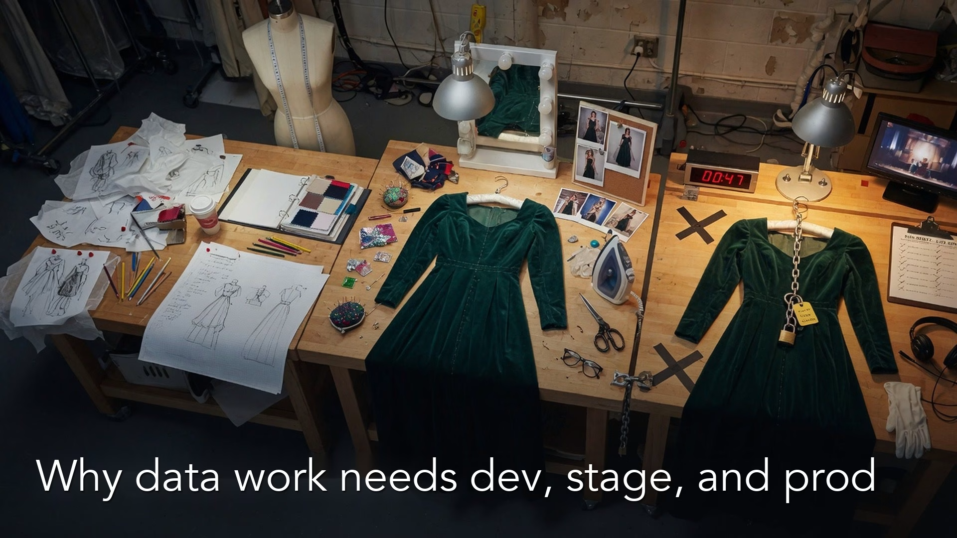
Why data teams use separate dev, test, and production environments
Laptop truth is not production truth. Learn what dev, stage, and prod mean for data work, a simple promotion path from notebook to trusted table, secrets hygiene, and…
Goodhart’s law: what happens when a metric becomes a target
Goodhart’s law: when a measure becomes a target, it stops being a good measure. Pair KPIs with incentives, audit gaming paths, and prefer metrics that are hard to…
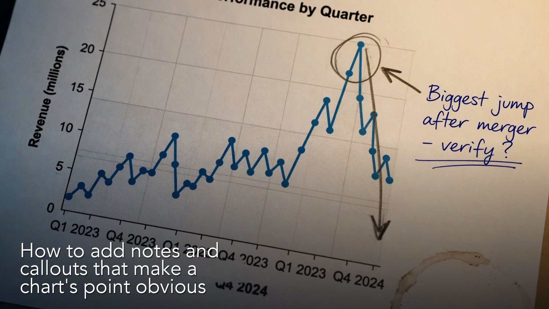
How to add notes and callouts that make a chart’s point obvious
Treat titles, callouts, reference lines, a so-what line, and footnotes as part of the chart. Annotation turns a clean picture into a decision aid without lying.