
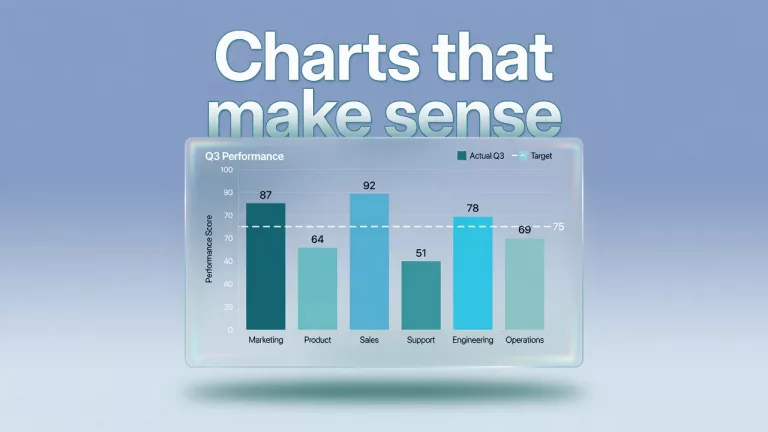
This path is for you if the chart is pretty and the decision is still fuzzy. Parts cover the purpose, which chart fits, honest axes, color and labels, a dashboard versus one slide, annotation, and common chart crimes with a fix. Start with the first part on this page.
- 1 Before you make a data chart, decide what decision it should help someone make A chart is a job, not decoration. Learn explore versus explain versus persuade so the next deck chart answers a real decision instead of filling a slide with color and empty overview titles.
- 2 How to choose the right chart for your question Pick the chart for the question, not the template gallery. Use comparison, trend, composition, and distribution on purpose, plus a short never-do-this list for pies, 3D effects, and rainbow color chaos.
- 3 How chart axes and baselines can make the same numbers tell different stories Axes decide whether a chart is honest. Learn baselines, truncated scales, dual-axis traps, and when a log scale helps so small differences stop looking like emergencies in the board deck.
- 4 How to choose chart colors and labels that everyone can read Color and labels are accessibility decisions, not brand sprinkles. Build colorblind-safe charts with strong labels that still work in grayscale, on printouts, and on a phone at 7 a.m.
- 5 Should you build a dashboard or a single slide for your data? Dashboards monitor change; single slides carry one decision. Use the one-idea-per-view rule and a declutter checklist so a busy ops page stops pretending to be a decision document.
- 6 How to add notes and callouts that make a chart’s point obvious Treat titles, callouts, reference lines, a so-what line, and footnotes as part of the chart. Annotation turns a clean picture into a decision aid without lying.
- 7 Common chart mistakes that mislead people, and how to fix them Spot and fix common chart crimes: pie overload, 3D distortion, truncated axes, dual-axis tricks, rainbow heatmaps, and wrong chart types. Clear encoding beats decoration.