Chart crimes are visual choices that distort the story, such as overloaded pies, 3D effects, cut-off axes, dual-axis tricks, rainbow heatmaps, and a different chart type on every metric. Fix how the data is drawn before you argue about what it means.
Picture a coworker pasting a 3D exploded pie with fourteen slices into the team channel and writing “thoughts?” You do have thoughts, but most of them are about geometry and not about the business.
What we mean by “chart crime”
A chart crime is a design choice that systematically makes the wrong comparison easier than the right one, or that burns attention without adding any value to the decision. Not every ugly chart is a crime, and not every crime is intentional. Many come from software defaults, such as an automatic second axis, automatic 3D, an automatic rainbow, or an automatic pie for any percentage.
We care because workplaces make real bets from these pictures. They hire, cut, ship, pause, and set prices based on charts. Misleading design is not a style debate, since it is operational risk with better fonts.
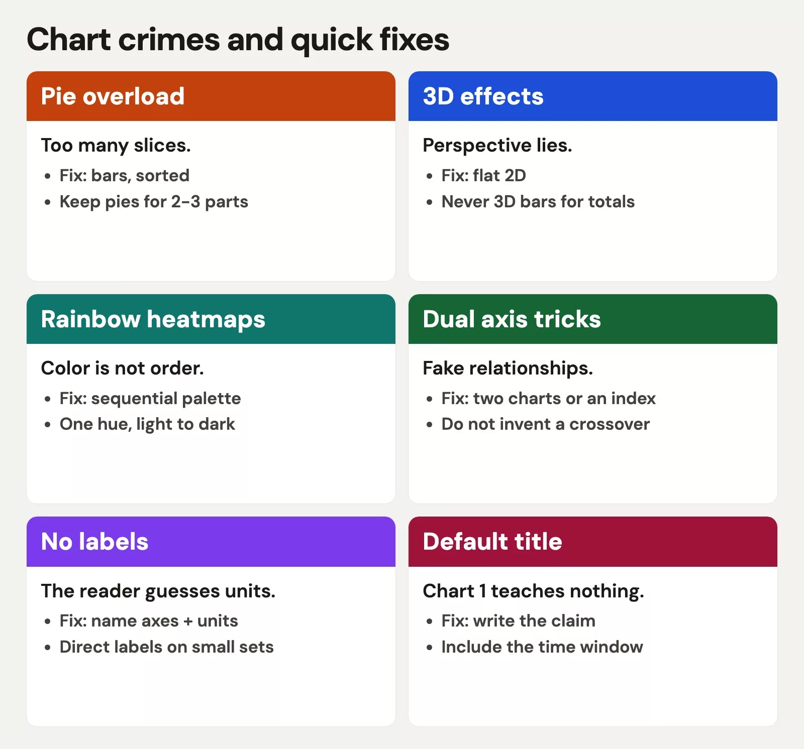
Crime 1: Pie overload
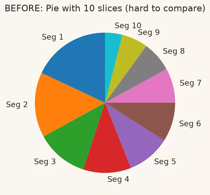
This crime looks like a pie or donut with many slices, or slices of similar size, or both. The labels collide, the legend matches colors to categories on the other side of the slide, and sometimes a second pie sits next to the first for “comparison.” People are poor at comparing angles and areas, especially for near-equal slices. A pie with many categories turns into a color-matching exam, and side-by-side pies are even harder to compare than two bar charts.
There are four ways to fix it.
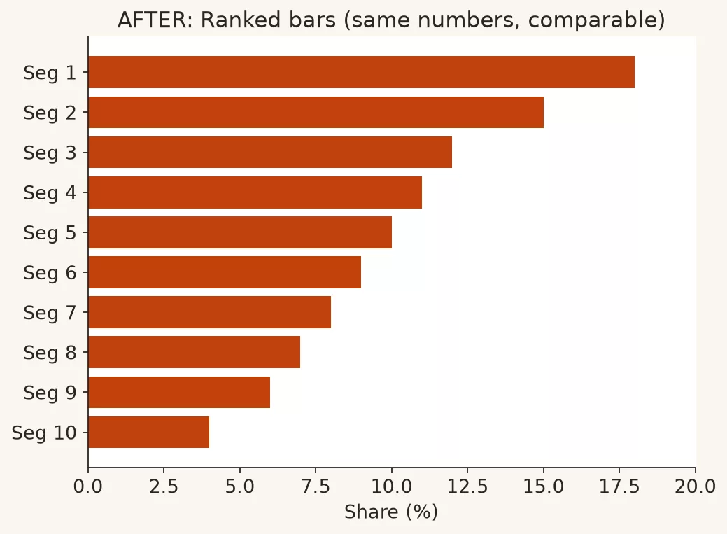
- For many categories, use a horizontal bar chart ranked by value.
- If composition matters, show each share as a bar, or use a simple table with the percentage and the absolute value.
- If you keep a pie, use it for two to four very different parts of a whole, with direct labels on each slice.
- Never use pies to compare across groups. Use grouped bars or small multiples, which are several small charts side by side.
The next two images show the same share data as a crowded pie and then as ranked bars. The bars make the order and the gaps readable without a legend exam.
Crime 2: 3D and other decorative distortion
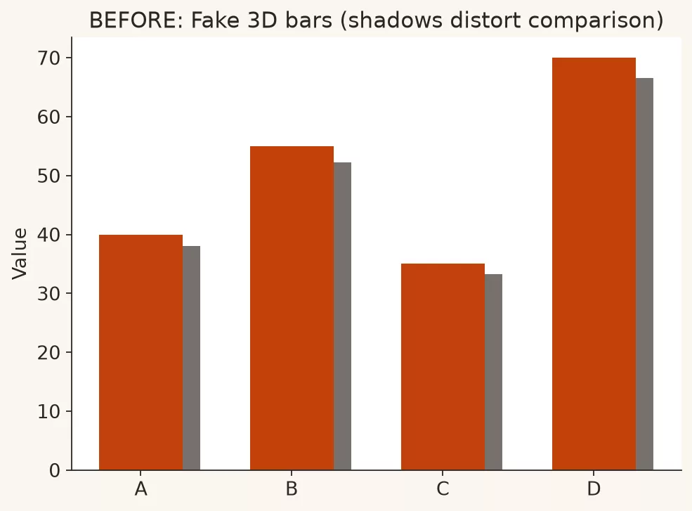
You will recognize this crime in 3D columns, 3D pies, extruded donuts, perspective walls, and heavy gradients that look like neon signs. Perspective shortens bars and slices, so equal values stop looking equal. The decoration also competes with the data for attention, and projectors and screenshots make it worse.
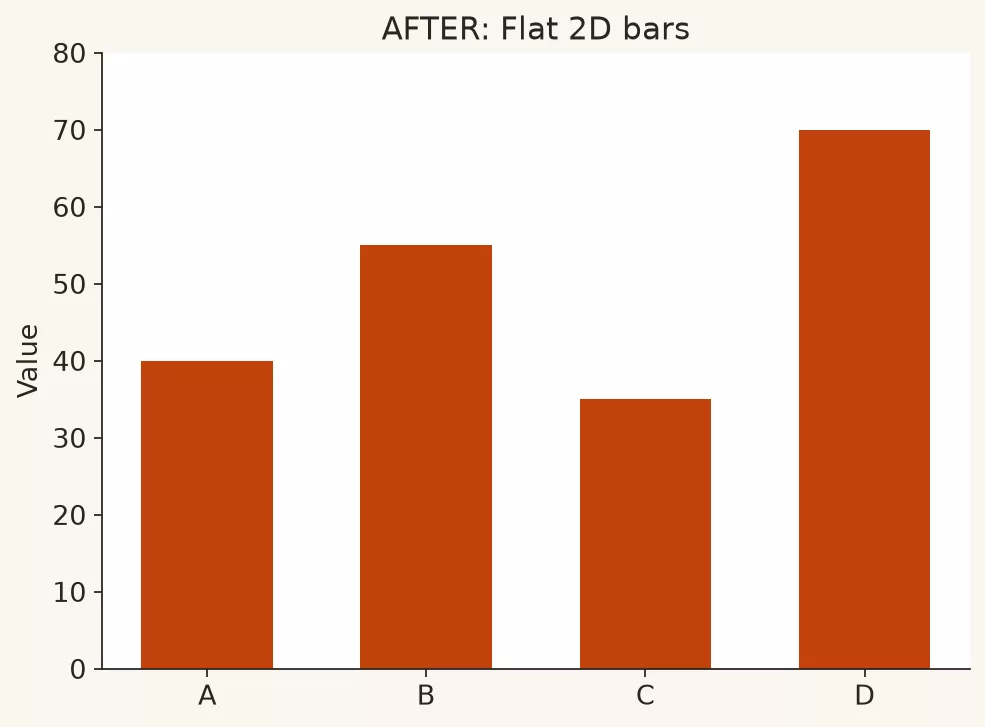
The fix is flat 2D charts, with length and position doing the work. Save depth effects for video games. If a stakeholder says they like 3D, show the same data flat and ask which version they can read faster. After one round, speed usually beats novelty.
Here is the same data with fake depth and shadow, and then as flat 2D bars. Equal values stay equal once the perspective is gone.
Crime 3: Truncated axes that sell drama
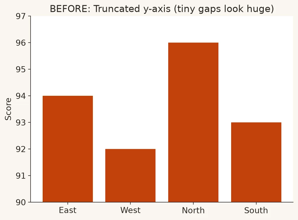
This crime is a bar chart of values from 92 to 96 with a vertical axis that starts at 90, so tiny gaps look like cliffs. It also shows up as a line chart zoomed in so far that ordinary noise looks like a crisis. Readers judge a bar’s size by its length from the baseline, so when the baseline is not zero, the picture overstates the difference. Lines can sometimes skip zero when the point is a small change, but then the title and a note must say so, and you should not pretend the swing is huge.
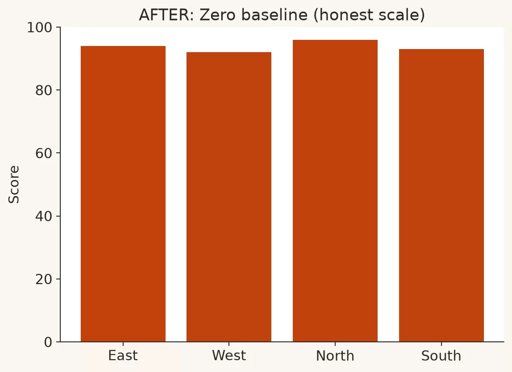
For bars that compare sizes, start at zero unless you have a rare, labeled reason not to. For lines about small process changes, show the scale clearly, add a reference point for context, and avoid panic titles. The earlier post in this series on axes and baselines was entirely about this honesty contract.
In the images below, the scores run from 92 to 96, first with a vertical axis starting at 90 and then with a zero baseline. The gap did not change, but the drama did.
Crime 4: Dual-axis tricks
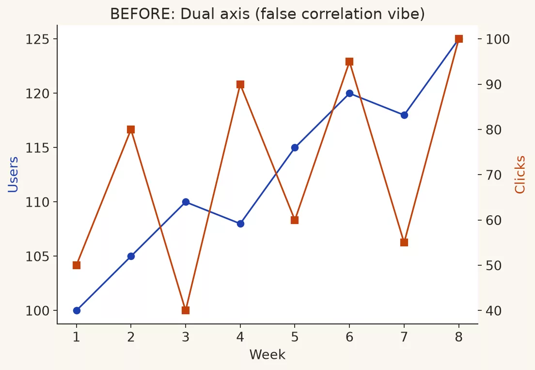
Here, bars for revenue use the left axis and a line for conversion rate uses the right axis, scaled carefully so the line “tracks” the bars and implies a story the data has not earned. In other cases, two series with incompatible units are forced into a visual marriage. Readers assume that both sides share the same vertical meaning, and dual axes break that assumption. Authors, or automatic chart features, can invent a correlation just by stretching a scale, and even honest dual axes overload working memory.
You have four better options.
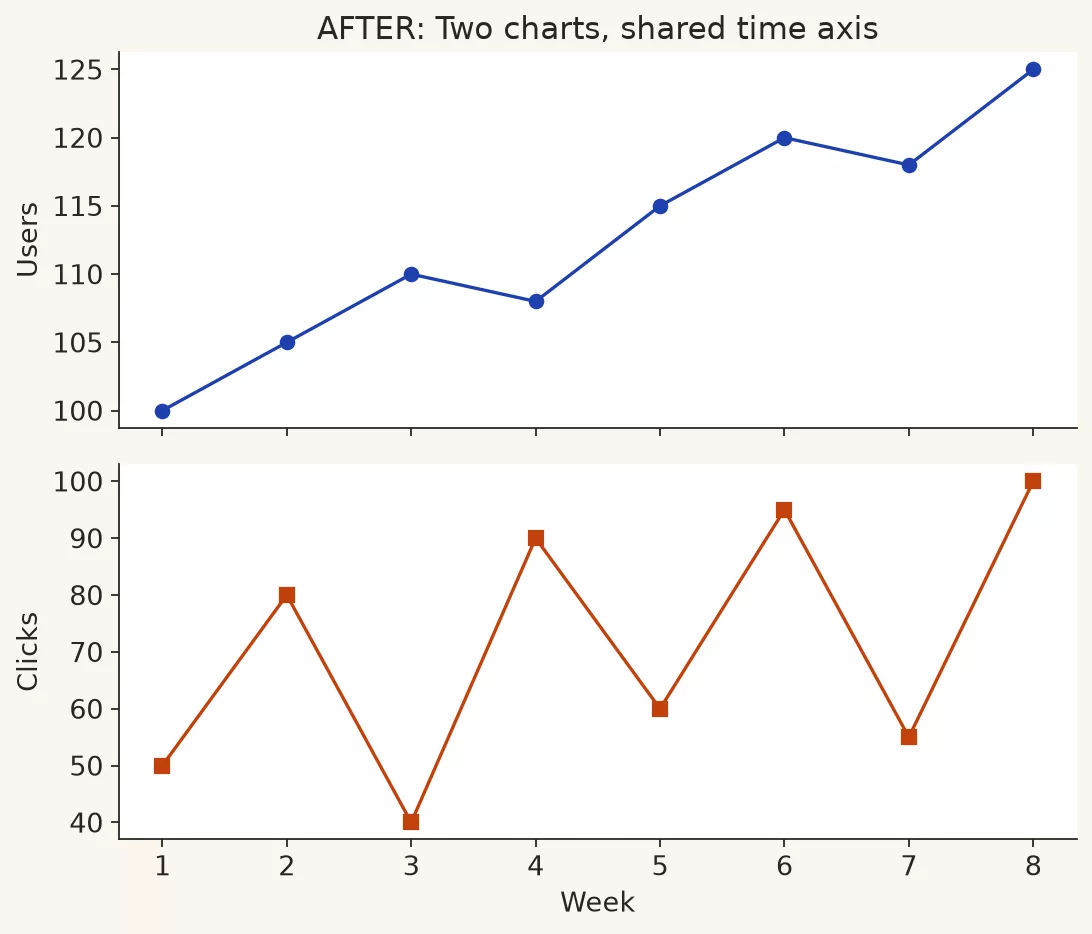
- Prefer two charts stacked with a shared horizontal axis, whether that axis is time or category.
- Or index both series to a common starting point, for example 100 at the start, when the point is that they move together, and say so.
- If you must use two axes, label both loudly, use very different line and bar styles, and never imply that one causes the other just because they line up.
- Ask yourself whether the chart would survive a skeptical finance partner zooming the right axis.
The first image forces two series to track each other on one plot. The second uses two panels that share time without sharing a vertical scale.
Crime 5: Rainbow heatmaps and unordered color
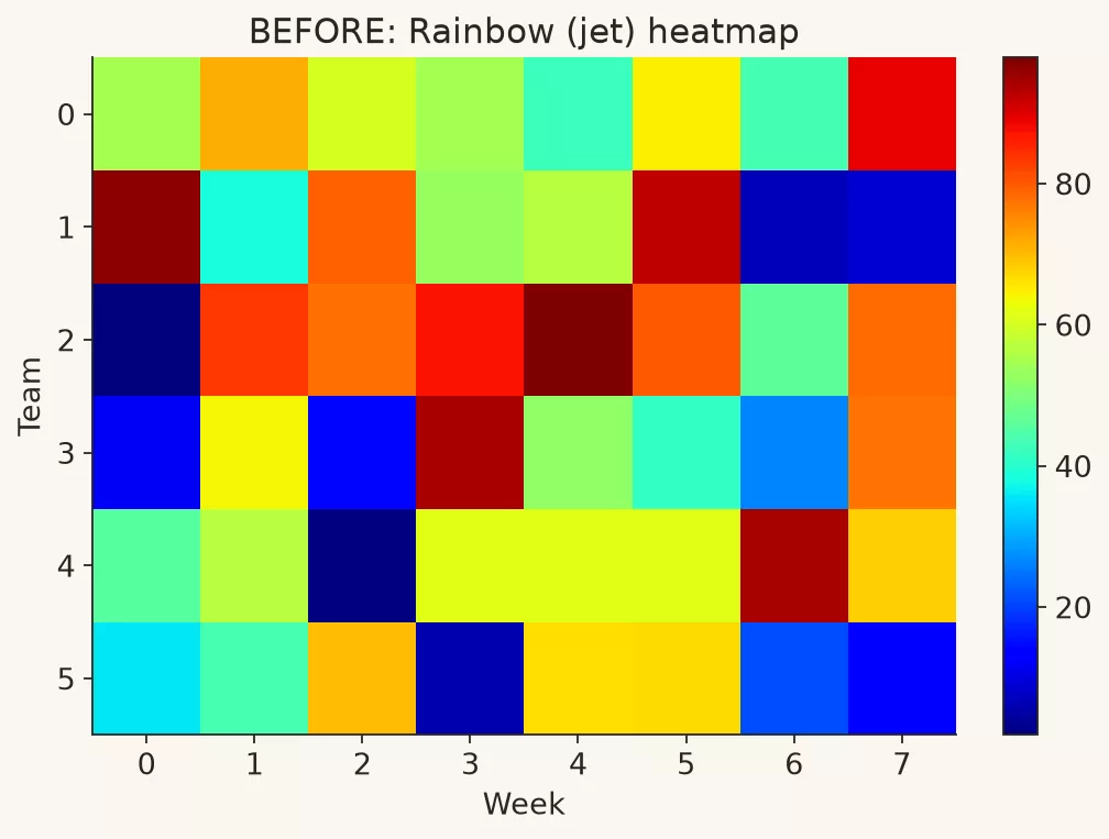
This crime is a grid where low-to-high values use a full rainbow, from blue through cyan, green, yellow, and orange to red. It also appears as categories with random bright colors and no logic behind the legend, or a red and green status with no second cue. Rainbow scales are not perceptually even, so some color changes look like bigger jumps than others. Colorblind readers lose categories, and neon noise reads as “important” even when the values are dull. The earlier post on color and accessibility covered safer palettes and contrast.
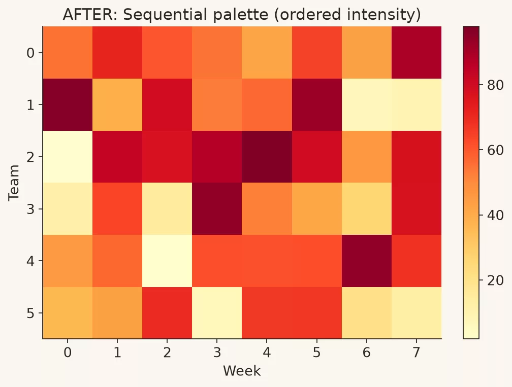
Use a single-hue or carefully controlled sequential scale for magnitude, and a small, limited palette for categories. Add direct labels, and pair status color with an icon or text. When the decision is high stakes, test the chart in greyscale.
Below, a rainbow heatmap is followed by a sequential palette. Ordered intensity is easier to read and safer for many viewers.
Crime 6: Chart type roulette
In this crime, every KPI (key performance indicator, a number the team is judged on) gets a different toy, such as a gauge, a radar chart, a bubble chart, a waterfall, a funnel, or a treemap, all on one page because variety feels like sophistication. Comparison dies when the drawing style changes for no reason. The mental load goes up, and people spend the meeting decoding shapes instead of deciding. The earlier post with the chart chooser exists so you match the chart type to the question and not to boredom.
The fix is to repeat the same honest pattern. Use bars for rank, lines for time, and consistent KPI cards with tiny trend lines. Novelty is not a KPI.
Crime 7: Spaghetti lines and unreadable legends
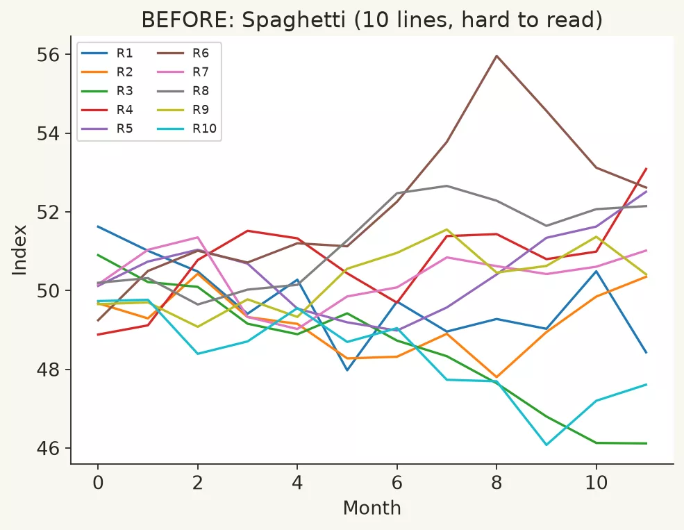
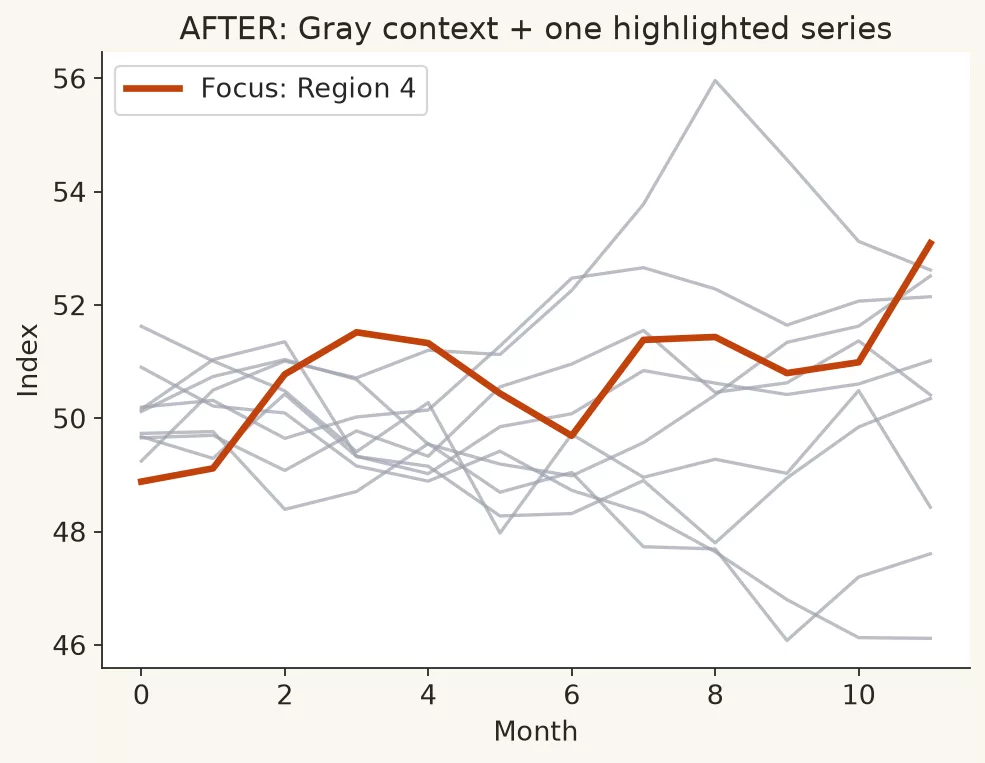
This one is twelve regions on a single line chart in twelve colors, with the legend at the bottom and crossings everywhere. Working memory cannot track that many series, and the interesting ones hide in the knot. You can fix it with small multiples, which give each region its own small panel. You can also highlight one series and grey out the rest, or show the top few plus an “other” group. When only a few lines remain, label the ends of the lines directly.
The images show ten competing lines and then grey context with one highlighted series. Focus is a design choice, and it should not cost the reader a legend hunt.
Crime 8: A map when a bar would do
A shaded map of sales by state looks impressive, but if the question is who the top five are, land area hijacks the picture, and large states dominate what you see whatever their sales. Geographic area is not business importance. Maps shine when the spatial pattern is the point, such as coverage gaps or delivery routes. They mislead when rank or rate is the point and land area steals the show.
Use ranked bars for top and bottom lists, and save maps for spatial questions. Choose carefully between rates and raw counts, because a rate needs a denominator, which is the total the count is divided by.
Crime 9: Silent definitions and vanity precision
Here you see “Users: 1,204,338” with no as-of date and no inclusion rules, seven decimal places on a survey score, or a gauge reading 99.87% “health” with no formula behind it. False precision signals false certainty, and missing definitions guarantee that two teams will invent two meanings. This is a data quality crime wearing a chart costume.
The fix is to add footnotes, dates, and a plain-language description of what one row means. Round to the precision a decision needs, and link to the certified metric when one exists. The annotation habits from the earlier post on labeling charts are the patch.
Crime 10: A dashboard collage with no main idea
This is the villain of the earlier post on dashboards and slides: twelve equal tiles with no hierarchy, pasted as a screenshot into a board deck. Attention has no landing strip, monitoring and deciding get mixed together, and everyone picks a different tile and argues past each other. The fix is one idea per view. Split the monitoring page from the decision slide, remove clutter, write a title that states the claim, and add a line on why it matters.
Worked example: one slide, four crimes, one repair
A product team presents “Feature adoption health” for a quarterly business review (QBR). The original slide has four problems. It has a 3D pie of users by plan tier with eight slices. It has a dual-axis chart of weekly active users (WAU), meaning people who used the product that week, on the left and “feature clicks” on the right, scaled to look perfectly aligned. It has a rainbow heatmap of click rates by weekday and hour, and the title is “Feature metrics overview.” With that slide, nobody can answer the real question, which is whether the new onboarding changed adoption for free-tier users.
Repair plan
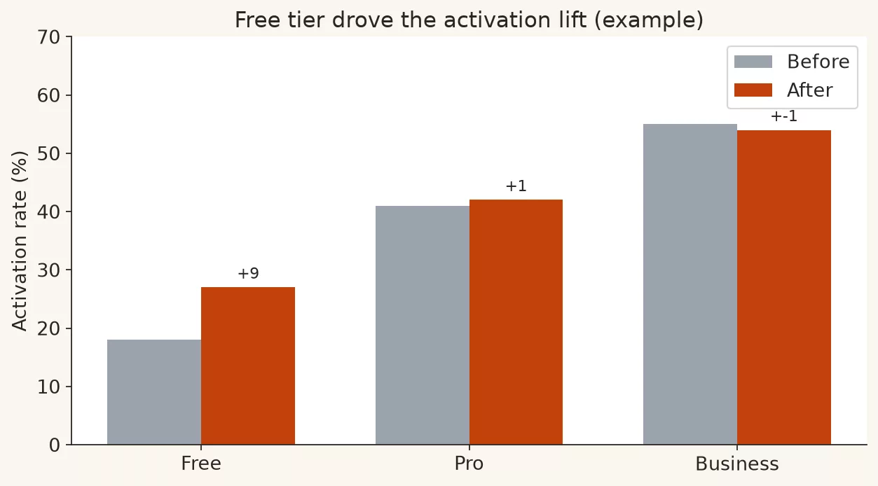
Start by picking one idea: “Free-tier weekly activation rose from 18% to 27% after onboarding shipped, while paid tiers were flat.” Then build one honest main visual and one supporting visual.
- Replace the pie with a ranked bar of activation by tier, or a simple before-and-after grouped bar for free versus paid.
- Replace the dual axis with two panels sharing a time axis, showing the activation rate first and then the absolute WAU.
- Move the heatmap to an appendix, or replace it with a small line of free-tier activation by week with a marker for the release.
- Make the title the claim, and let the “so what” name the product decision, for example “keep onboarding; test the empty-state next.”.
The table below shows each element of the old slide, the crime, why it hurt, and the fix.
| Element | Crime | Why it hurt | Fix |
|---|---|---|---|
| 3D pie, 8 slices | Pie overload + 3D | Hard to compare tiers | Ranked or grouped bars |
| Dual axis WAU vs clicks | Dual-axis trick | Fake alignment story | Two panels, shared time |
| Rainbow heatmap | Unordered color | Noise without decision | Appendix or drop for QBR |
| “Metrics overview” | No claim title | No retellable message | Claim + so what + footnote |
| No as-of / definition | Silent definition | Argument about “activation” | Footnote: formula + date |
Here are sample numbers for the repaired primary table. They are made up for teaching and are not a real product export.
| Tier | Activation before | Activation after | Change (pp) |
|---|---|---|---|
| Free | 18% | 27% | +9 |
| Pro | 41% | 42% | +1 |
| Business | 55% | 54% | −1 |
A code sketch of the main bars follows, in case you build charts in Python. The same idea works in any tool.
import numpy as np
import matplotlib.pyplot as plt

tiers = ["Free", "Pro", "Business"]
before = [18, 41, 55]
after = [27, 42, 54]
x = np.arange(len(tiers))
width = 0.35

fig, ax = plt.subplots(figsize=(7, 4))
ax.bar(x - width/2, before, width, label="Before", color="#9ca3af")
ax.bar(x + width/2, after, width, label="After", color="#c2410c")
ax.set_xticks(x, tiers)
ax.set_ylabel("Weekly activation rate (%)")
ax.set_ylim(0, 70)
ax.set_title("Free-tier activation rose 18% → 27% after onboarding; paid flat")
ax.legend()
ax.annotate(
    "+9 pp",
    xy=(0 + width/2, 27),
    xytext=(0.35, 34),
    arrowprops=dict(arrowstyle="->"),
    fontsize=9,
)
ax.text(
    0,
    -0.18,
    "So what: keep onboarding live; next test empty-state for free tier.",
    transform=ax.transAxes,
    fontsize=9,
)
plt.tight_layout()
This is what that code draws, as example output from the snippet above.
Five-minute pre-meeting audit
Keep this list in your head and run it on every chart that leaves your hands. It walks through the whole series in eight questions.
- Purpose: are you exploring, explaining, or persuading?
- Type fit: does the chart match a comparison, a trend, a composition, or a distribution?
- Scale honesty: are your baseline and dual-axis choices defensible?
- Color: does it carry meaning and enough contrast, without rainbow chaos?
- Format: is this a dashboard (a screen of charts that tracks key numbers) for monitoring or a one-idea slide?
- Annotation: does it have a claim title, a focus, a “so what,” and a footnote?
- Crime sweep: is there pie overload, 3D, a dual-axis trick, spaghetti lines, or a silent definition?
- Quality: would the metric survive a challenge to its definition? The data quality series covers this.
Rule of thumb: If fixing the crime takes longer than explaining the number, the slide is doing theater. Cut the scope until the truth is cheap to show.
Common mistakes when “fixing” crimes
- Replacing one trick with another. Killing the pie but keeping the dual-axis drama is not a virtue.
- Over-correcting into emptiness. Decluttering does not mean deleting the comparison standard or the “so what.”.
- Policing taste instead of risk. Prioritize the crimes that change decisions over the fonts you merely dislike.
- Humiliating authors in public. Share a better version privately, teach the checklist, and keep the relationship, because snark does not scale a culture.
- Ignoring data quality. A perfect bar chart of a broken metric is still a crime against Monday.
How to practice this week
- Collect five charts from recent meetings, yours or public ones, and tag each with the crimes from this post.
- Repair one of them from start to finish, covering type, scale, color, annotation, and the “so what.”.
- Run the five-minute audit on next week’s deck before it leaves draft, because fixing a chart before it is shared is far cheaper than correcting it afterward.
- If you plot in code, keep a personal file of reusable code snippets with honest defaults, such as zero-baseline bars, annotations, and no 3D, beside the habits in Python for analytics.
- When two metrics disagree, pause the visualization work and check definitions with the data quality playbook before you “fix the chart.”.
Series recap: Charts that make sense
You finished the path, and here is the whole spine of the series in one place.
- What is this chart for? Separate explore, explain, and persuade, and finish the sentence “this chart helps someone decide whether to ___.”.
- A chart chooser for real life. Match comparison, trend, composition, and distribution to drawings that humans can actually read, and avoid type roulette.
- Axes, scales, and honest baselines. Bars that show size need an honest baseline, and dual axes and log scales should be rare, labeled tools and never defaults.
- Color, labels, and accessibility. Color carries meaning and is not wallpaper, so design messages that survive colorblindness and greyscale.
- Dashboards versus single slides. Monitors and decision slides are different products, so use one idea per view and declutter on purpose.
- The annotation habit. Claim titles, callouts, reference lines, footnotes, and a “so what” turn geometry into a message people can retell.
- Common chart crimes and fixes (this post). Audit pies, 3D, dual-axis tricks, rainbow maps, spaghetti lines, silent definitions, and collage pages, and repair them under pressure without theater.
Here is how the series connects to the rest of Analytics Made Simple.
- Analytics foundations supplies the decision-first mindset before any mark hits the page.
- Data quality for people who ship numbers keeps metrics worthy of visualization.
- Python for analytics (including chart anatomy) gives one concrete way to draw honest plots when you live in notebooks.
- Learn maps the wider curriculum when you need SQL (the standard language for asking a database for data), spreadsheets, or the next skill track.
You do not need a new business intelligence (BI) license, meaning a paid reporting tool, to use this series. You need a slower five minutes before you send, and the courage to ship fewer, clearer pictures.
Quick recap
- Chart crimes make the wrong comparison easy or burn attention without adding value to the decision.
- The top repairs are bars over overloaded pies, flat over 3D, honest scales, two panels over dual-axis tricks, controlled color, fewer series, and claim titles.
- Run a short audit that walks through purpose, type, scale, color, format, annotation, and crimes before high-stakes meetings.
- Fix the culture with checklists and better drafts, and skip public shaming.
- The series closes here, moving from purpose to choice, scale, color, format, annotation, and then a crime audit.
Ship one cleaner chart this week, and then another, because trust compounds.
Series notes
This is Part 7 of Charts that make sense, the last part of the series.
Sources
Research and further reading used for this article:
- Edward Tufte, The Work of Edward Tufte and Graphics Press: https://www.edwardtufte.com/tufte/.
- Stephen Few, Perceptual Edge library: https://www.perceptualedge.com/library.php.
- Cole Nussbaumer Knaflic, storytelling with data: https://www.storytellingwithdata.com/.
- Data Visualization Society: https://www.datavisualizationsociety.org/.
- Nightingale, the journal of the Data Visualization Society: https://nightingaledvs.com/.
- ColorBrewer (sequential and qualitative palette guidance): https://colorbrewer2.org/.
- W3C, Web Content Accessibility Guidelines (WCAG) overview: W3C accessibility guidelines page.
- matplotlib documentation: https://matplotlib.org/stable/contents.html.
- Analytics Made Simple, Learn hub: https://analyticsmadesimple.com/learn/.
- Analytics Made Simple, Analytics foundations: https://analyticsmadesimple.com/series/analytics-foundations/.
- Analytics Made Simple, Data quality for people who ship numbers: https://analyticsmadesimple.com/series/data-quality/.
- Analytics Made Simple, Python for analytics: https://analyticsmadesimple.com/series/python/.
Keep going
Same lessons in your feed
Short diagrams, hooks, and weekly tutorials on Substack, Instagram, X, and Facebook.