When a number becomes a target, people start working on the number instead of the thing it was meant to measure. That idea is called Goodhart’s law. If you design a metric and its rewards together, the chart improves and the customer’s experience improves with it. If you design them apart, the chart improves while the customer does not.
Say your call center hits its average handle time goal for the third month in a row. Leadership celebrates. Meanwhile customers are filling out long survey comments that describe the same problem twice, because support reps were racing the clock to end each call.
The law in one sentence, and the longer truth
The version you have probably heard comes from the anthropologist Marilyn Strathern, who was summarizing a line of thought tied to the economist Charles Goodhart.
When a measure becomes a target, it ceases to be a good measure.
Goodhart’s original insight came from British monetary policy in the 1970s, and it was closer to this: any statistical pattern you observe tends to collapse once you put pressure on it in order to control something. In other words, a relationship you noticed in the wild stops behaving the same way once you use it as a steering wheel.
Donald Campbell made a related point about measuring society. The more a quantitative social indicator is used for decision-making, the more it attracts pressure to corrupt it, and the more it can distort the very process it was meant to monitor. Schools that teach only to the test are the classic example, and business has the same problem in different costumes.
None of this is an argument against metrics. It is an argument against naive metrics, which are single numbers with high stakes, weak definitions, no guardrails (a second number that warns you when the first one is being pushed too hard), and no curiosity about side effects.
Why smart people game numbers
Gaming is not always malice. It is often a sensible reaction to a broken scoreboard, and there are five common reasons it happens.
- The metric is easier than the mission. Closing tickets is easier than solving problems, and shipping tickets is easier than shipping outcomes.
- The reward is sharp and the cost is soft. A bonus is cash this quarter, while brand damage is next year’s problem.
- The definition has loopholes. If “active user” means any login, then bots and password resets become growth hacks.
- Leaders ask for green. A culture that punishes bad news produces creative accounting and not better operations.
- Teams compete on a leaderboard. A ranking with no shared guardrails turns colleagues into rivals with spreadsheets.
If you design metrics as though people were robots who cannot read incentives, you will be surprised every quarter. Design as though people are clever, busy, and responsive to whatever gets measured and celebrated.
A map of how metrics break
The diagram below is a simple map from pressure to distortion. Use it in design reviews by starting at the left and walking right, and ask at each step where your KPI (key performance indicator, the number you report on) is vulnerable.
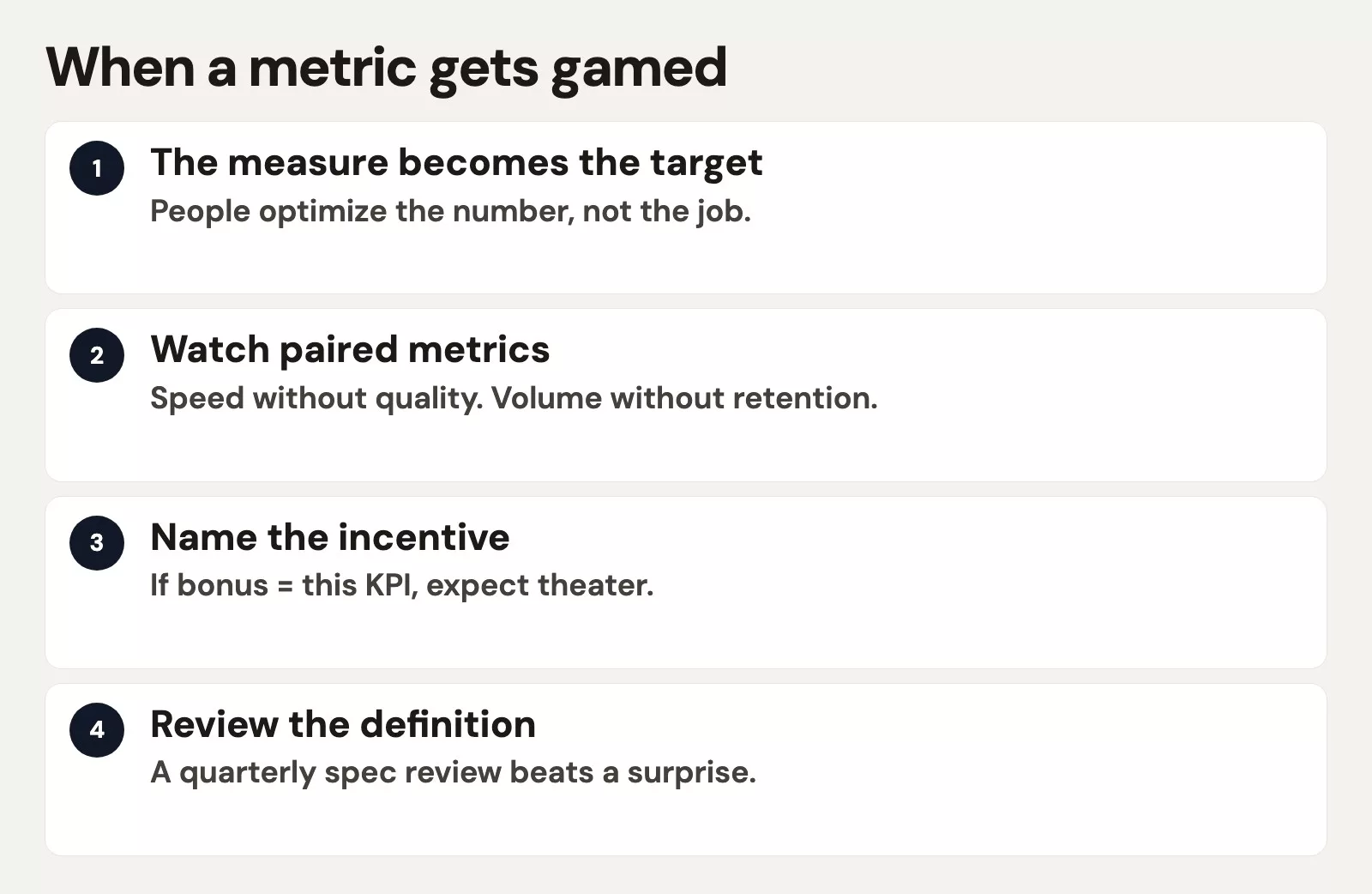
Pattern 1: Narrowing
People optimize the slice that is measured and abandon the whole that is not. Teachers drill the tested topics, and salespeople push products that close fast instead of products customers need. Analysts report only the segments that look good, so the metric improves while the real capability shrinks.
Pattern 2: Threshold theater
Behavior clusters just above the pass line. A support rep answers at 4 minutes 50 seconds when the service promise is 5:00, and an engineer merges trivial pull requests (small code changes sent for review) to hit a “ship count.” Nobody aims for excellence, because everyone is aiming to not be red.
Pattern 3: Definition shopping
If the formula is vague, teams pick the version that flatters them. Is churn counted by customer logos or by revenue? Is a trial “converted” at signup or at the first paid invoice? Without a written definition, which the earlier post on metric specs covered, you get three truths and a political fight.
Pattern 4: Timing games
People pull revenue into this quarter and delay refunds into the next. They pause outbound messages at month end so response time looks fine, or push releases past the measurement freeze. Time is a dimension you must specify, or people will choose whichever clock flatters them.
Pattern 5: Outright fabrication
This is rarer in healthy cultures, but it is real under extreme pressure. It looks like fake surveys, discarded samples, or altered logs. That is a people and controls problem more than a KPI design problem, though extreme stakes on a single metric make fabrication more likely.
Pattern 6: Proxy collapse
You chose a proxy (a stand-in number) because the real outcome was hard to measure. Then you managed the proxy as if it were the outcome, treating clicks as engagement, lines of code as productivity, or training hours as skill. Proxies drift on their own, and once the proxy becomes the target the drift speeds up.
Incentives: the quiet co-author of every KPI
A metric on a dashboard (a screen of charts that updates on its own) is a suggestion. A metric tied to pay, promotion, vendor scorecards, or a public ranking is a behavior program. Before you attach stakes to a number, ask yourself the questions below.
- What is the cheapest way to move this number without creating real value?
- Who can change the inputs without changing the customer outcome?
- Which guardrail (a limit you agree not to cross) would catch the cheap path?
- Can someone lose money for doing the right long-term thing?
- Is the time window short enough to encourage timing games?
Sometimes the fix is not a cleverer formula. It can be lower stakes on the proxy, higher stakes on a balanced set of numbers, or delaying bonuses until quality shows up in a lagging outcome (a result that arrives late, such as renewals). The earlier post on leading and lagging metrics gives you an anti-gaming tool here: pay on a mix, or review the leading number weekly and settle the lagging one each quarter.
Design moves that make gaming harder
Example:
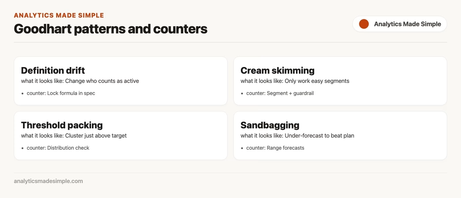
When the number climbs for the wrong reason:
You will not eliminate Goodhart’s law. What you can do is raise the cost of empty optimization and lower the cost of telling the truth.
- Pair metrics. Never attach high stakes to a lone volume metric. Pair volume with quality, speed with rework, and acquisition with retention.
- Write the loophole list. Before launch, brainstorm how a team could hit the target while failing the mission. Turn the best attacks into guardrails or clauses in the definition.
- Write the spec like you mean it. Include the owner, the grain (what one row stands for), the formula, the filters, the time window, and the known caveats, then publish it where the number appears.
- Separate learning metrics from scoring metrics. Experiment metrics are allowed to look messy, while scorecards that decide pay should be steadier and audited.
- Sample the qualitative. Read tickets, listen to calls, and review a random set of “closed” cases, because numbers with no contact with reality drift.
- Rotate and retire. If a proxy is being drained dry, change the mix, since a stale KPI invites expert gaming.
- Reward honesty about exceptions. Celebrate the team that flags a broken definition early. If only green is safe, green will be manufactured.
- Watch data quality. Gaming often shows up as odd distributions, sudden definition changes, or missing events, so the checks from the data quality series are part of metric hygiene.
Worked example: “resolved tickets” goes wrong
Say you run a support team at a company that sells software to businesses. Your company sets a target that 90% of tickets are resolved within 24 hours, with a bonus for team leads if the target holds for the quarter. Within six weeks, you notice four things.
- Agents mark tickets resolved and tell customers to “reply to reopen” if they are still stuck.
- Hard tickets are transferred to a backline queue that is measured differently.
- Customers with incomplete data get closed as “info needed” with no real path back.
- The customer satisfaction (CSAT) score, where customers rate their experience, is not on the scorecard, so speed wins every trade-off.
The 24-hour resolve rate hits 93%, but the repeat-contact rate climbs. Churn risk rises in the mid-market segment, which is the one that brings complex issues. Leadership is confused because “support is crushing it.”
A redesign against gaming might look like the table below.
| Element | Old design | Failure mode | Redesign |
|---|---|---|---|
| Primary metric | % resolved in 24h | Premature close, transfers | % resolved in 24h and not reopened within 7 days |
| Quality pair | None on scorecard | Speed over help | CSAT or ticket-level quality sample; reopen rate as hard guardrail |
| Definition | “Resolved” left to each rep’s judgment | Definition shopping | Spec: resolved means customer-confirmed or policy checklist complete; auto-reopen rules |
| Incentives | Bonus on speed alone | Rational gaming | Bonus on composite: speed band + reopen under cap + quality sample pass |
| Segmentation | Company average only | Hide hard queues | Report by severity and channel; no cherry-picking average |
| Audit | None | Silent fabrication risk | Monthly random audit of 20 closed tickets with shared notes |
| Learning space | All tickets scored | Fear of experiments | Pilot queue excluded from bonus during process tests |
The next block is a compact metric contract for the redesign. It is the kind of text you store next to the dashboard, and it might read like this.
METRIC: durable_24h_resolve_rate
GRAIN: support ticket
FORMULA:
  tickets_durably_resolved_in_24h / tickets_created
WHERE durable = resolved_at within 24h of created_at
  AND no_reopen within 7d of resolved_at
  AND resolve_reason NOT IN ('info_needed_auto', 'transferred_out')
FILTERS: exclude spam; exclude Sev-1 incident children (tracked elsewhere)
OWNER: Head of Support (definition), Analytics (pipeline)
GUARDRAILS:
  reopen_rate_7d <= 12%
  csat_trailing_28d >= 4.2
  transfer_rate stable vs baseline
STAKE: team bonus uses composite scorecard, not this rate alone
KNOWN LOOPHOLES:
  - soft resolve then chat offline (mitigate with reopen + audit)
  - severity downgrades (mitigate with QA sample)
REVIEW: weekly ops; monthly audit; quarterly definition freeze
This is not bureaucracy for its own sake. It is the minimum writing that keeps a high-stakes number from eating the mission. Analysts who can draft this contract are more valuable than analysts who can only plot the old, gameable rate in a prettier chart.
Where analysts and managers each own the problem
Managers own the incentives, the rituals, and what happens when a number turns red. If red always means punishment, expect theater. If red means “what did we learn and what will we try next?”, metrics stay informative for much longer.
Analysts own clarity, instrumentation, and early warning. A sudden change in the shape of a distribution, odd spikes at period end, or a definition that cannot be reproduced from the warehouse are all smoke. Bring the same skepticism you use on joins and grain in the Python and data quality work, because if a number cannot be rebuilt, it cannot be trusted under pressure.
Both own the loophole brainstorm. The best anti-gaming sessions happen in mixed rooms, with operations people who know the shortcuts, analysts who know the data path, and a leader who can change the stakes.
Common mistakes
- One metric, a big bonus, and no guardrails. This is the purest form of Goodhart bait.
- Blaming individuals for system design. If half the team “games” the number, redesign the game.
- Secret definitions. Ambiguity is a subsidy for gaming.
- Reporting only averages. An average hides the segments and queues that were sacrificed.
- Never visiting the work. Metrics with no occasional contact with ground truth rot.
- Changing the formula mid-quarter without a note. It looks like fraud even when it is an innocent fix, so version your specs.
- Confusing motion with progress. Activity counts such as emails sent or tickets touched are easy to inflate, so prefer outcome pairs.
Quick recap
- When a measure becomes a target, it stops being a neutral mirror. That is Goodhart’s territory, and Campbell adds that high-stakes indicators invite corruption and distortion.
- People game through narrowing, thresholds, definition shopping, timing, proxies, and sometimes fabrication.
- Incentives co-author your metrics, so design pairs, specs, audits, and an honest culture.
- Brainstorm loopholes on purpose, and turn them into guardrails before you attach pay.
- Analysts and managers share the job, which is clear measurement plus sane stakes.
The final post in this series covers how to run weekly and monthly metric meetings that use this whole stack without becoming a theater of green dots.
How to practice this week
- Pick one high-visibility metric on your scorecard, because improving a metric people watch shows the value fastest.
- Write five ways a clever teammate could improve it without improving the real goal.
- For each way, add a guardrail, a definition clause, or a paired metric.
- Check whether pay or ranking touches that metric, and if it does, raise the design bar.
- Schedule one qualitative sample, such as calls, tickets, or deals, before the next review.
- Read the next post on review cadence, so your anti-gaming design shows up in the meeting and not only in a document nobody opens.
Series notes
This is Part 5 of Metrics that matter.
Sources
Research and further reading used for this article:
- Wikipedia overview of Goodhart’s law (history and Strathern phrasing): https://en.wikipedia.org/wiki/Goodhart%27s_law
- Marilyn Strathern, “Improving ratings: audit in the British university system,” European Review (1997): commonly cited source of the “when a measure becomes a target…” phrasing; journal page via Cambridge: https://www.cambridge.org/core/journals/european-review/article/abs/improving-ratings-audit-in-the-british-university-system/FC2EE640C0C44E3DB87C29FB666E9AAB
- PMC discussion of Goodhart’s law in measurement contexts: https://pmc.ncbi.nlm.nih.gov/articles/PMC7901608/
- Wikipedia overview of Campbell’s law: https://en.wikipedia.org/wiki/Campbell%27s_law
- Nielsen Norman Group on Campbell’s law and metric manipulation: https://www.nngroup.com/articles/campbells-law/
- Amplitude North Star Framework (context for product metrics that still need guardrails): https://amplitude.com/books/north-star/about-north-star-framework
- Analytics Made Simple, Learn hub: https://analyticsmadesimple.com/learn/
- Analytics Made Simple, Analytics foundations: https://analyticsmadesimple.com/series/analytics-foundations/
- Analytics Made Simple, Data quality for people who ship numbers: https://analyticsmadesimple.com/series/data-quality/
- Analytics Made Simple, Charts that make sense: https://analyticsmadesimple.com/series/data-viz/
- Analytics Made Simple, Python for analytics: https://analyticsmadesimple.com/series/python/
Keep going
Same lessons in your feed
Short diagrams, hooks, and weekly tutorials on Substack, Instagram, X, and Facebook.