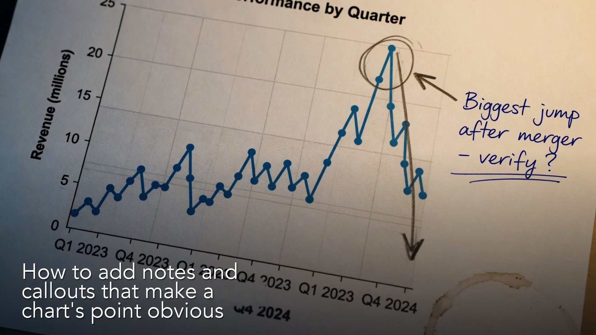
A chart needs words to finish the job. That means a title that states the insight, callouts that point at the key mark, reference lines for targets, a “so what” line that says what to do next, and footnotes that keep people’s trust. A clean chart with no words still leaves the room guessing.
Say you put a clean bar chart on a slide. The axes start at zero, the colors are calm, and the layout is tidy. Then the vice president (VP) asks, “So what am I supposed to notice?” and nobody answers. The chart was dressed up, but it was never annotated.
Annotation is part of the chart
People who work with data sometimes treat text as a failure of the visual. “If the chart were good, you would not need words,” they say. That is half true when you are exploring alone at your desk, and almost false when you are explaining something in a meeting. Readers are busy, they skim, they join late, and they look at phones. Words are not a crutch, because they are how you tell the eye what to do.
It helps to think of a chart as having two layers.
- The encoding layer: the position, length, angle, and color of the data marks.
- The guidance layer: the title, subtitle, labels, callouts, reference lines, source notes, and next step.
The earlier post on choosing the right chart taught you to pick encodings that match the comparison you want to show. This post finishes the job, so that a smart person who did not make the chart can rebuild the message without your voiceover. If they cannot, you shipped a puzzle.
Rule of thumb: The title states the takeaway. The chart proves it. The callout shows where to look. The “so what” says what changes on Monday.
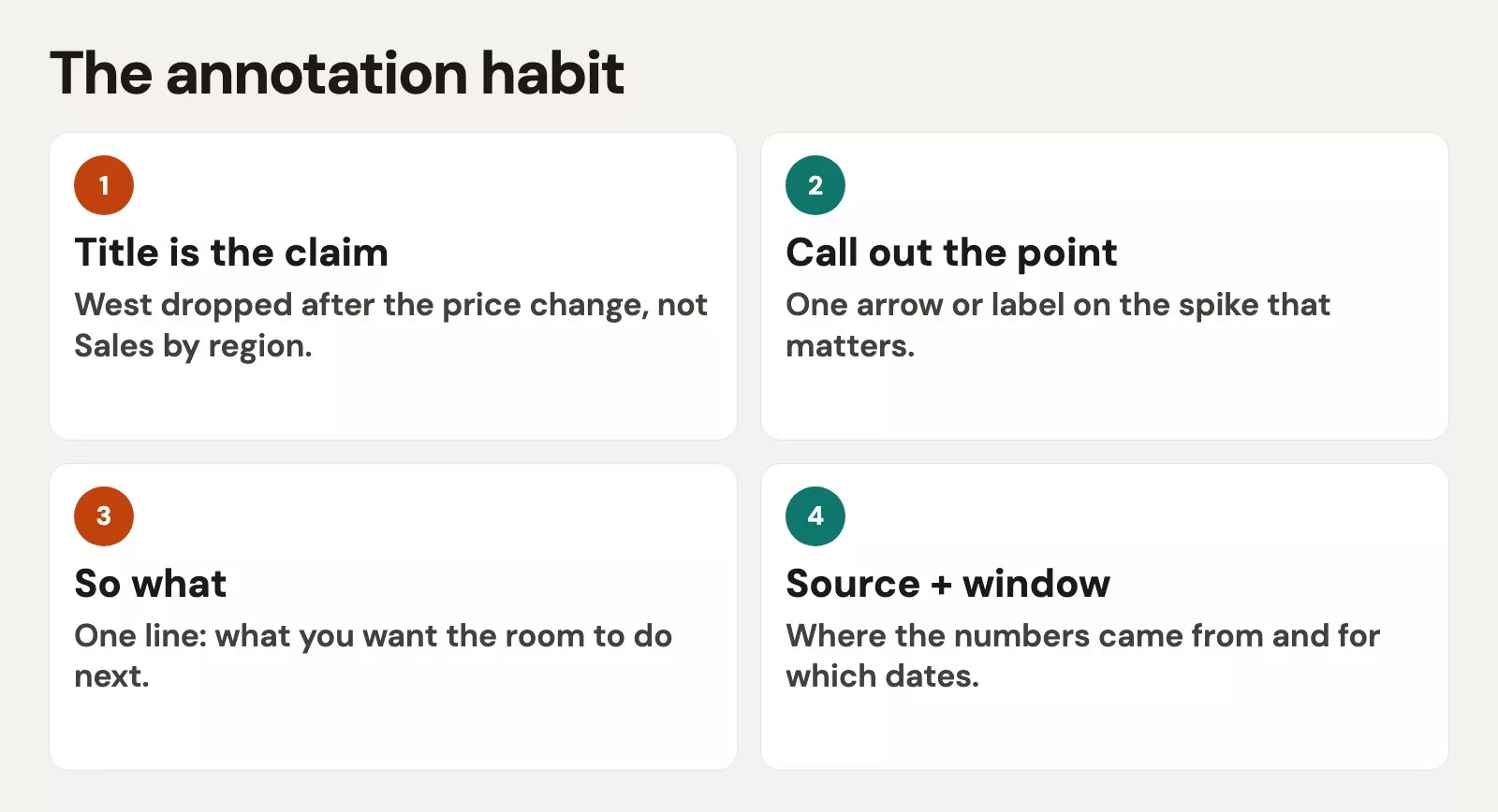
Titles that claim an insight without lying
Default titles in charting tools are often field names, such as “Sum of Amount by Region,” “Sheet 1,” or “Chart.” Those are filing labels, and they help the author find the object in a workbook. They do not help a reader decide anything.
A claim title is a short sentence, or part of one, that answers “what should I notice?” It is not a novel and it is not a press release. It is specific enough to be wrong if the data is wrong, which is a good thing, because a vague title can never be checked.
| Weak title | Stronger claim title | Why better |
|---|---|---|
| Revenue by region | West trails plan by 18%; East is ahead | States the gap and who leads |
| Weekly active users | WAU flat for six weeks after March peak | Names the pattern in time |
| Support tickets | Priority-1 tickets doubled after the release | Links metric to an event |
| Pipeline overview | Coverage is 2.1× vs 3.0× target | Puts actual against standard |
| Churn analysis | SMB churn rose; enterprise held steady | Segments the story |
How far can a title go?
Stay inside what the visual can support. If the chart shows two things moving together in time, do not title it as if one caused the other. If you only have three weeks of data, do not announce a “new normal.” If your definition is “closed-won this fiscal year,” do not say “company growth” as if it included expansions and services.
A useful pattern has three parts.
- What changed, or what is true now.
- Compared to what, such as plan, prior period, a peer, or a threshold.
- Where it concentrates, if the chart shows a cut of the data such as region, segment, or product.
Subtitles can hold the method, for example “Open pipeline ÷ remaining quarterly plan, as of 2026-03-14,” where open pipeline means the sales deals still in progress. Putting the method in the subtitle keeps the main title readable and heads off arguments about definitions in the middle of a meeting.
Callouts, labels, and reference lines
Direct labels beat distant legends
When you have only a few series, put the labels next to the lines or at the end of the bars. A legend on the far right forces the eye to travel from the color swatch back to the mark and back to the legend again. That cost adds up on projectors and phones. With many series you may still need a legend, but try small multiples (a row of tiny charts, one per group) before you invent a rainbow of twelve lines. The earlier posts on color and on dashboards both warn about that path.
One primary callout
A callout is a short note with a line or highlight pointing at the key mark. Use one primary callout for an explanation chart. Two is a stretch, and five is a second essay glued on top of the first. A good callout answers “look here” with a number and a short reason, such as “West: 1.4× coverage” or “Spike = inventory freeze week.”
Bad callouts restate the axis (“this is revenue”) or narrate every bar. If every bar needs a speech bubble, you may want a table instead, or you may not have chosen a main idea yet, which the earlier post on focus covered.
Reference lines and bands
Targets, goals, last year’s level, and control limits (the range where normal variation stays) should usually be drawn on the chart, not only mentioned out loud. A horizontal line at “plan” turns a set of bars into a race with a finish line. A band for the “normal range” stops people from panicking at noise. Label the line inside the plot area with something like “Plan 3.0×,” so nobody wonders what the dashed stroke means.
Highlight without lying
Grey out most of the bars and color the one that matters, or bold one line and fade the rest. Do not change the axis mid-story to exaggerate the highlight, as the earlier post on honest axes warned. Also avoid using red only to mean “bad,” because some readers cannot tell red from green, and the color post covered this. Pair color with position or a pattern when the stakes are high.
The “so what” line
Many charts stop at description, such as “West is lower.” Description is necessary, but decisions need implication. The “so what” is one or two sentences under the visual, or spoken right after it, that connect the claim to an action, a risk, or a choice.
Here are four templates that work in real meetings.
- Action: “So what: shift two account executives into West discovery for three weeks, and re-check coverage Monday.”
- Risk: “So what: at current coverage, plan attainment depends on a late-quarter spike we have not seen in two years.”
- Choice: “So what: either cut plan by 8% or fund a pipeline program, because the status quo is a bet and not a forecast.”
- Watch: “So what: no action this week, but if the gap widens past 20% next Friday, open a formal recovery plan.”
None of these say “insights were generated” or “we should use synergies.” Each one names a move, a risk, a fork in the road, or a rule for when to wait. If you cannot write a “so what,” you may not be ready to present, and you may still be exploring. That is fine at your desk, but it is expensive in a room of twelve people.
Footnotes that protect trust
Small text is not where you hide bad news. It is where you put the contract, and it should carry five things.
- The as-of date, and the time zone if it matters.
- The metric definition in one line.
- The filters applied, such as segment, region, or product.
- The source system or the certified table name.
- Known caveats, such as “excludes partner-sourced deals” or “partial week.”
This is the public face of the quality scorecard mindset from the data quality series. You are not writing a legal brief. You are preventing two dashboards from fighting because nobody labeled what one row stands for.
Worked example: coverage by region
This uses the same fictional software team as the earlier post on focus. The analyst builds a horizontal bar chart of pipeline coverage by region, meaning how much open pipeline there is compared with what is still needed to hit plan. The numbers are fine, but the first draft of the annotation is not.
Before: a field-name title and bare bars. The numbers are accurate but there is no takeaway.
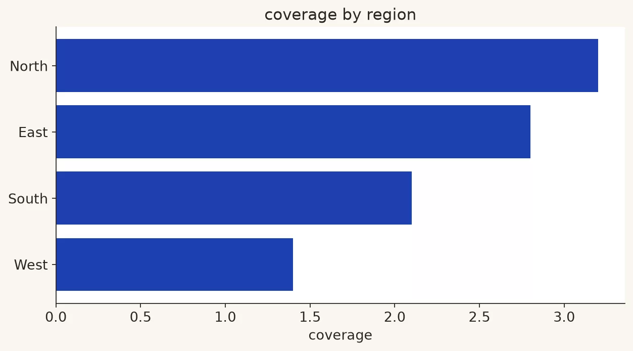
Before
- The title reads “Coverage by Region.”
- The legend shows one series labeled “calc_field_12.”
- There is no target line.
- There is no callout.
- The speaker says, “As you can see, West is a bit soft, but overall things are mixed, and East is strong, so it depends…”
The room learns that the analyst has feelings about the numbers. It does not leave with a decision.
After
- The title reads “West coverage is 1.4× vs 3.0× target; company sits at 2.1×.”
- The subtitle reads “Open pipeline ÷ remaining quarterly plan; as of Friday close.”
- A vertical or horizontal reference line sits at 3.0× and is labeled “Target.”
- The West bar is highlighted, and the other regions are muted.
- A callout on West says “Largest gap to target (−1.6×).”
- The so what says “Fund a three-week West discovery blitz, and re-measure coverage next Monday before changing plan.”
- The footnote says “Source: ops.pipeline_cert; excludes closed-lost; partner deals included.”
The bars are the same, but the meeting outcome is different. The visual now has a guided reading path, which runs from claim to proof to focus to implication to trust notes.
| Region | Coverage (×) | vs target (3.0×) | Annotation role |
|---|---|---|---|
| East | 3.4 | +0.4 | Muted support |
| Central | 2.8 | −0.2 | Muted support |
| West | 1.4 | −1.6 | Highlight + callout |
| International | 2.2 | −0.8 | Muted support |
| Company | 2.1 | −0.9 | In title as context |
If you build this from code, keep the titles and annotations in the script (a small program) so the exports stay honest when someone refreshes the data. Here is a sketch of that habit in Python style. The tool choice is optional, but the habit is not.
import matplotlib.pyplot as plt

regions = ["East", "Central", "West", "International"]
coverage = [3.4, 2.8, 1.4, 2.2]
target = 3.0
colors = ["#9ca3af", "#9ca3af", "#c2410c", "#9ca3af"]  # highlight West

fig, ax = plt.subplots(figsize=(8, 4))
ax.barh(regions, coverage, color=colors)
ax.axvline(target, color="#111827", linestyle="--", linewidth=1)
ax.text(target, 3.35, "Target 3.0×", ha="center", fontsize=9)
ax.set_xlabel("Pipeline coverage (×)")
ax.set_title("West coverage is 1.4× vs 3.0× target; company sits at 2.1×")
ax.annotate(
    "Largest gap (−1.6×)",
    xy=(1.4, 2),
    xytext=(2.0, 2.35),
    arrowprops=dict(arrowstyle="->", color="#111827"),
    fontsize=9,
)
ax.text(
    0,
    -0.35,
    "So what: fund a 3-week West discovery blitz; re-check next Monday.",
    transform=ax.transAxes,
    fontsize=9,
)
# footnote / source left for slide footer or fig.text
plt.tight_layout()
What that code draws is an annotated export you can put on a slide.
You can get the same annotated result in any business intelligence (BI) tool by using reference lines, color rules, and text boxes. The library (a package of ready-made code) is not the point. The reading path is.
Explore mode vs explain mode, with words this time
The first post in the charts series split exploring from explaining, and annotation rules differ between the two.
- Explore: temporary labels, messy notes, and “what if” titles are fine, because you are still thinking. Save your versions.
- Explain: use a claim title, one focus, a so what, and footnotes, because you are handing the chart off.
- Persuade: keep the axes and definitions honest, use a stronger narrative order, and never invent certainty the data lacks.
Dashboards often sit between exploring and monitoring. They may use shorter titles and more permanent layout labels such as “Bookings vs plan,” because users come back every day. Even then, exception callouts such as “West below threshold” and hover definitions earn their keep. Static executive exports still need full claim titles.
A five-minute annotation checklist
Before you paste a chart into Slack or a deck, answer these questions out loud.
- Can someone retell the takeaway from the title alone?
- Is there a visible standard to compare against, such as a target, a prior period, or a peer?
- Does one mark clearly own the attention?
- Is there a so what that names an action, a risk, a choice, or a watch rule?
- Would a skeptical peer accept the definitions in the footnote?
- If the color disappeared, would the message still hold through labels and position?
If you fail the first question, rewrite the title before you fuss with fonts. The title is the most valuable annotation you have.
Common mistakes
- Filename titles. “Chart 1,” “Sheet2,” and “Plot” tell the reader nothing, so rename them like an adult.
- A claim without a comparison. “Strong sales” is a mood, while “Sales +12% vs plan” is a claim.
- Callout spam. If everything is highlighted, nothing is.
- A so what written as corporate fog. “Drive alignment” is not a next step.
- Hiding definitions. Unclear definitions come back later as a fight.
- Annotation that contradicts the scale. A calm axis under a panicked title trains people to distrust you.
- Relying only on your voiceover. Readers who see the chart later, in email or in a recorded quarterly business review (QBR) pack, get nothing from what you said.
Quick recap
- Annotation is a guidance layer made of titles, labels, callouts, references, a so what, and footnotes.
- Claim titles beat field-name titles, and claims should stay inside what the chart can support.
- One primary callout plus a visible standard, such as a target or a prior period, guides the eye.
- The so what names an action, a risk, a choice, or a watch rule in plain language.
- Footnotes carry definitions and as-of details, so trust survives without your voiceover.
If they cannot retell it, you did not finish the chart.
How to practice this week
- Take three charts you already shipped and rewrite only the titles into claim form. Send the new titles to a teammate without the charts, and ask what they expect to see.
- Add one reference line, such as a target or the prior period, to a live monitoring chart that lacks one, so viewers can tell at a glance whether a value is good or bad.
- For your next decision slide, write the so what before you open the charting tool. Then build the visual that proves it. If the visual cannot prove it, change the claim and not your ethics.
- If you live in notebooks, keep the title and annotation code next to the plot so the export stays repeatable (see the chart anatomy habits in Python for analytics).
- Skim the Learn hub if you need a refresher on foundations before you write bolder claims.
The last post in this series is about common chart crimes and how to fix them. It turns everything so far into an audit list covering pies, 3D charts, rainbow heatmaps, dual-axis tricks, and more, with repairs that keep trust intact.
Series notes
This is Part 6 of Charts that make sense. Next: common chart crimes and fixes.
Sources
Research and further reading used for this article:
- Edward Tufte, The Work of Edward Tufte and Graphics Press: https://www.edwardtufte.com/tufte/
- Stephen Few, Perceptual Edge library: https://www.perceptualedge.com/library.php
- Cole Nussbaumer Knaflic, storytelling with data: https://www.storytellingwithdata.com/
- Data Visualization Society: https://www.datavisualizationsociety.org/
- matplotlib annotation documentation: https://matplotlib.org/stable/api/_as_gen/matplotlib.pyplot.annotate.html
- W3C, WCAG overview (text alternatives and contrast): https://www.w3.org/WAI/standards-guidelines/wcag/
- Analytics Made Simple, Learn hub: https://analyticsmadesimple.com/learn/
- Analytics Made Simple, Analytics foundations: https://analyticsmadesimple.com/series/analytics-foundations/
- Analytics Made Simple, Data quality for people who ship numbers: https://analyticsmadesimple.com/series/data-quality/
- Analytics Made Simple, Python for analytics: https://analyticsmadesimple.com/series/python/
Keep going
Same lessons in your feed
Short diagrams, hooks, and weekly tutorials on Substack, Instagram, X, and Facebook.