
A lagging indicator tells you what already happened, and a leading indicator warns you early enough to act. If a review only shows the first kind, the room can celebrate a green bookings number while the sales pipeline (the deals still in progress) quietly thins out.
Say your Friday sales review shows a green bookings tile, so everyone relaxes. Over the weekend three large deals that looked like sure things slip to next quarter. The warning was already there, because the number of qualified deals in the pipeline had been thin for a week. It sat on page two of the dashboard in a smaller font. The room focused on the number that reports wins and ignored the one that warns of trouble. That pattern is so common that it feels like weather, but it comes from how the metrics were designed.
Two clocks on the same business
A lagging indicator tells you what already happened. Examples are revenue last month, customers lost last quarter, support tickets closed yesterday and gross margin for the fiscal period. Lagging metrics are usually clearer, more trusted and more closely tied to the outcome leadership cares about. They also arrive late, long after the work that produced them.
A leading indicator moves earlier. It is a measurable signal that tends to change before the lagging outcome, and it is one you can still influence. Examples are the qualified pipeline created this week, kickoff calls completed within the promised time, and the share of new accounts that reach their first useful result in the first seven days. Leading metrics are often messier and easier to game, but they are where coaching happens.
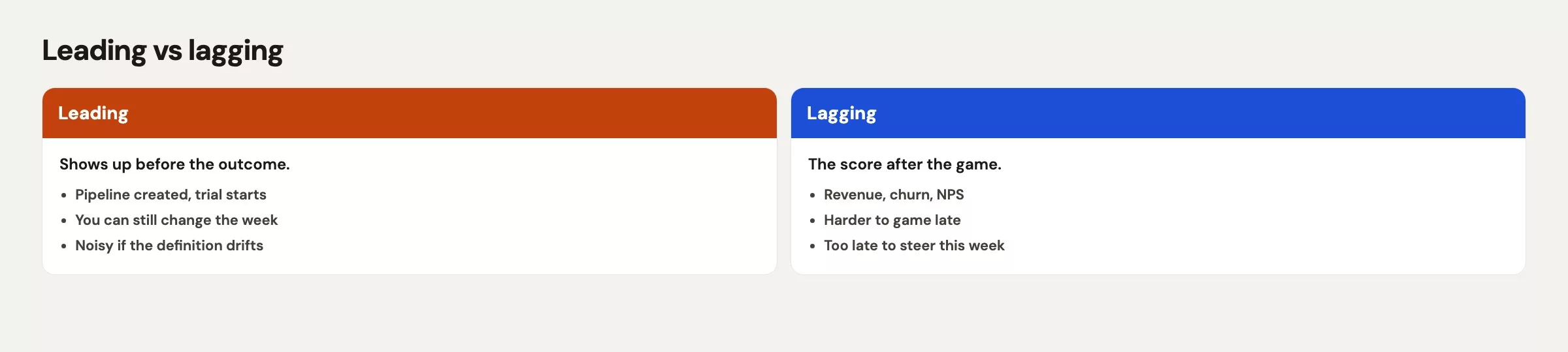
Think of a kitchen timer and a restaurant review. The timer is the leading signal, because it tells the cook when to pull the bread. The review is the lagging signal, because it tells you whether customers liked dinner. You need both. If you only watch reviews, you learn too late, and if you only watch timers, you might serve perfectly timed bread that nobody ordered.
Rule of thumb: Lagging metrics judge the season. Leading metrics coach the next play.
Why teams get stuck on lagging metrics
Lagging metrics feel grown-up. They show up in board packs, and finance already checks them against the books. Nobody wants to defend “number of discovery calls” to a skeptical director when “bookings” is sitting right there. So the scorecard fills with outcomes, and the organization gets very good at explaining things after the fact.
Outcomes do matter, and wanting them is fine. The trouble starts when they are the only thing on the wall. When every conversation begins with last month’s number, people learn to explain the gap instead of preventing it. The meeting turns into archaeology, where everyone digs through the past until a story turns up. That is useful once, but it gets expensive as a weekly habit.
The basics of analytics still apply here. In Analytics foundations, the loop runs from question to analysis to decision and back to measuring again, and it does not stop at a report followed by a shrug. Leading indicators put measurement closer to the decision step, while the work can still change.
What makes a leading indicator real (not a vanity count)
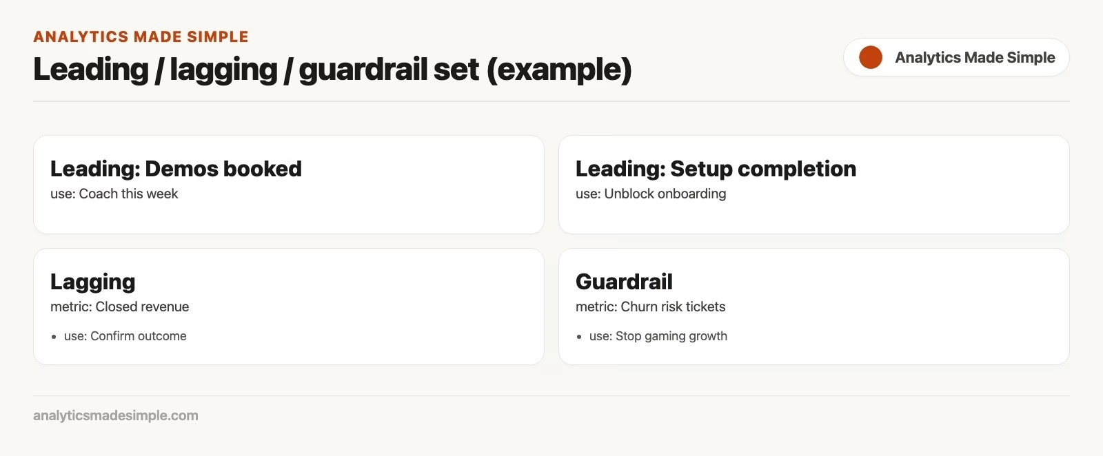
Example: one set of leading, lagging and guardrail metrics side by side. A guardrail metric is a limit you agree not to cross, such as a maximum discount.
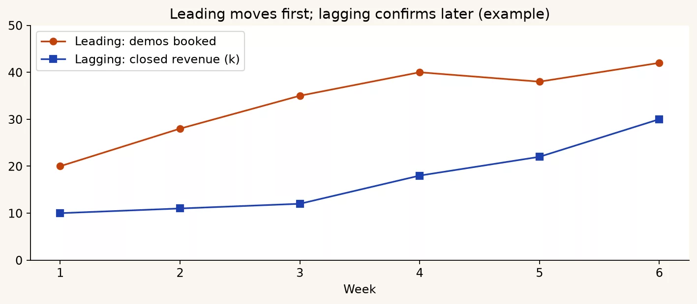
Another example: leading demos compared with lagging revenue over several weeks.
Not every early number is a leading indicator. “Emails sent” comes early, but it is often only weakly related to revenue. A useful leading indicator usually has four properties.
- Timing: it reliably moves before the lagging outcome, or at least early enough for you to act on it.
- A cause you can explain: you can say why moving this number should help the outcome, even if the real world is noisy.
- Control: the team can change the inputs without needing a miracle from another department.
- Honesty under pressure: if people push the number up, the side effects are either acceptable or easy to spot.
That last property matters because people bend any number they are paid on, and a later post in this series covers that gaming in depth. For now, keep a light touch. If the only way to hit the leading metric is to spam, lie or redefine it, then it is a trap and not a coaching tool.
Data quality matters here too. A leading metric built on half-filled CRM fields (the CRM is the system where your sales team records customers and deals) will teach people to fill in fields and not to sell better. If the data is messy, fix the definitions and the missing values with habits from the data quality series before you put the metric on a bonus plan.
How to pair leading and lagging without drowning
Here is a practical pattern for one objective.
- One primary lagging metric that defines success for the period.
- One to three leading metrics that predict or make possible that lagging result.
- One health metric, also called a guardrail, that catches side effects such as margin, quality, customer effort or refund rate.
That set is small on purpose. If you need twelve leading metrics, you probably have several objectives pretending to be one. Go back to the earlier post on linking objectives to measures and split the objectives apart.
The review rhythm can differ for each kind. Leading metrics often deserve weekly attention. Lagging metrics may be monthly or quarterly, with a weekly “are we on pace?” view only when the delay is short enough to be useful. A later post in this series goes deeper on meetings that people actually want to attend. The design idea starts here, which is not to force every metric onto the same clock.
A worked example: one sales team, two clocks
A single business story makes the difference concrete. Imagine a sales team at a business-to-business company that sells a collaboration product to mid-sized companies. Their quarterly objective is: Grow new annual recurring revenue (ARR, the yearly value of active subscriptions) without hurting the win rate through panic discounting.
Lagging side: what “won” means
The main lagging metric is new ARR closed in the quarter, leaving out expansions that save an existing customer, which are tracked separately. A second lagging metric is the win rate on qualified opportunities, meaning the share of real prospects that buy. The lagging guardrail is the average discount on deals that were won.
These numbers tell the executive team whether the quarter worked, but they only arrive when deals close. By the time new ARR turns red in week 11, the behaviors that could have fixed it already happened in weeks 3 through 8.
Leading side: what to coach this week
The team picks three leading metrics that each have a clear story.
- Qualified pipeline created ($) each week, using a shared definition of “qualified,” which means a budget conversation happened, the problem is confirmed and a next step is scheduled.
- Pipeline coverage ratio for the quarter, which is the qualified open pipeline divided by the ARR target still to go, refreshed weekly.
- Stage 2 to Stage 3 conversion rate over a rolling four weeks, which shows whether the quality of early sales conversations is slipping before close rates show it.
Managers can add one optional process metric, the percent of open opportunities with a next step dated in the next 14 days. It sits close to daily behavior, and it is useful only if the CRM records are honest. If reps invent fake next steps, you have taught people to look compliant without doing the work. Check the definitions and the data quality before you celebrate a green tile.
The table below puts the pairing in one place. QTD means quarter to date, and ICP means ideal customer profile, the kind of company you most want to sell to.
| Metric | Type | When it moves | How a manager uses it | Failure if used alone |
|---|---|---|---|---|
| New ARR closed (QTD) | Lagging | When deals close | Judge quarter health; set hiring and capacity | Explains failure after the window to fix pipeline |
| Win rate (QTD) | Lagging | As outcomes land | Spot quality vs volume problems | Too late to repair weak discovery from month one |
| Avg discount on closed-won | Lagging guardrail | At close | Catch “win at any price” behavior | Misses discounts already promised in open pipeline |
| Qualified pipeline created ($/week) | Leading | Early in the funnel | Coach prospecting and qualification this week | Can become junk pipeline if “qualified” is soft |
| Pipeline coverage vs remaining target | Leading | Weekly | Decide whether to add volume or fix conversion | Coverage on paper if stages are inflated |
| Stage 2 to 3 conversion (4 week) | Leading | Mid-funnel, before close | Inspect discovery quality and ICP fit | Noise if stages mean different things by rep |
A week that uses both clocks
Here is a snapshot from week 6, with illustrative numbers that do not describe any real company.
LAG (QTD):
  New ARR closed:        $1.8M  (plan pace: $2.1M)
  Win rate:              22%    (target band: 24 to 28%)
  Avg discount:          14%    (guardrail: <= 12%)

LEAD (last 7 days / current):
  Qualified pipeline created:  $420k  (weekly need: ~$500k)
  Coverage vs remaining:       2.4x   (team standard: 3.0x)
  Stage 2 to 3 conversion:     31%    (baseline: 38%)
  Opps with next step <=14d:   61%    (standard: 85%)

COACHING READ:
  Behind on lag, and lead is not rescuing us.
  Action this week: tighten qualification definition,
  double down on ICP accounts, inspect three stuck Stage 2 deals,
  freeze discretionary discounting on new quotes.
The exact thresholds are not what matters here. What matters is the shape of the conversation. Without leading metrics, the meeting can only say “we are behind on ARR.” With them, the meeting can say where to step in while stepping in still works.
When you chart this, the purpose of the chart still decides the design. A weekly operations view might feature coverage and conversion, with ARR as background. A monthly executive view might flip that order. The data-viz series covers the job each chart should do, and this series covers the job each metric should do, so the two work well together.
Leading does not mean “more activity forever”
Activity metrics are tempting because they move whenever people move, and calls logged, emails sent and meetings held are all examples. Sometimes activity is the right leading measure, especially early in a rebuild. Over time, activity without quality becomes a treadmill where people hit their call quotas and still miss revenue. Then leadership concludes that leading indicators do not work, when the real problem was a weak definition of quality.
Prefer leading metrics that build quality into the number and not only motion. Four examples follow.
- Qualified pipeline instead of raw pipeline
- Reaching a first useful result instead of counting logins.
- Problems solved on the first contact with customer satisfaction held steady, instead of tickets closed at any cost.
- Experiments finished with a decision written down, instead of “tests launched”.
If you build these metrics in SQL (the standard language for asking a database for data) or Python, write the quality filters into the metric itself and not into a spoken footnote that nobody remembers. A small script that anyone can rerun, like those in the Python for analytics path, can help. Use it only after the definition is stable on paper, and the next post in this series gives you a template for writing that definition.
Other domains, same pattern
The sales example is one domain, and the same pattern carries over to others.
| Domain | Lagging | Leading (examples) | Guardrail |
|---|---|---|---|
| Product activation | 90-day retention | 7-day first-value rate; setup completion | Support tickets per new account |
| Customer support | CSAT / NPS period score | First response time; reopen rate | Handle time that harms quality |
| Marketing | Pipeline or revenue attributed | Qualified demo requests; content-assisted opps | Cost per qualified lead |
| Data platform | Stakeholder trust survey; incident count | Freshness SLA hit rate; failed job rate | Unplanned schema changes |
Always ask what you actually improved if the leading number rises and the lagging one never does. That question keeps vanity numbers out of the system.
How this ties back to your goals
The chain from the first post in this series, which runs from objective to behavior to measure, still sits underneath every leading and lagging choice. The objective names the win, and the behaviors name the work. Leading measures usually sit closest to those behaviors, while lagging measures sit closest to the outcome. Targets apply to both, each on its own clock.
If a leading metric has no behavior behind it, it becomes a dashboard (a screen of charts and numbers that updates on its own) pet that nobody acts on. If a lagging metric has no leading partner, the team gets very good at postmortems. If neither has a written definition, both turn into topics of negotiation and stop being management tools.
A short pairing sentence helps in meetings: “We track coverage and Stage 2 to 3 conversion so we can fix the quarter while new ARR can still move, and new ARR remains the score that says whether the quarter worked.” That sentence is the two-clock model in plain English.
Write that sentence on the scorecard itself when you can, because people reuse slides. A metric without its partner and its purpose will be copied into the wrong meeting and treated as the whole truth. Context travels poorly unless you pack it with the number.
If you are building the underlying tables in SQL or a notebook (a document that mixes code and its results), name the columns so the type is obvious. Use new_arr_closed_qtd for lagging, qualified_pipeline_created_7d for leading and avg_discount_closed_won for the guardrail. Good names will not fix a bad definition, but they stop accidental swaps when someone pulls the wrong field into a chart from the data-viz toolkit.
Common mistakes
- Only lagging metrics on the wall. That works well for assigning blame and poorly for coaching.
- Only leading metrics on the wall. You get busy teams and confused executives with no proof of outcomes.
- Calling any early metric “leading.” An early number with a weak cause behind it is only a vanity number.
- Soft qualification. Pipeline coverage looks healthy now, and the win rate collapses later.
- Different stage definitions for each rep. Your mid-funnel conversion rate turns into fiction.
- Weekly deep dives on annual lagging metrics. The clock does not match the signal.
- Paying a bonus on a leading metric with no guardrail. People will hit the number in ways you did not intend.
- Ignoring data quality. Leading metrics magnify bad CRM data faster than lagging finance numbers do.
Quick recap
- Lagging indicators report outcomes, and leading indicators help you act earlier.
- Pair one main lagging metric with a few quality-aware leading ones and a guardrail.
- Leading does not mean raw activity.
- Use different review clocks, with weekly coaching for leading metrics and period-end judgment for lagging ones.
- Soft definitions and dirty data turn “leading” metrics into empty ritual.
- Sales, product, support and marketing all use the same two-clock pattern.
How to practice this week
- Pick one lagging metric your team already loves, such as revenue, retention, customer satisfaction or cost.
- Write the objective sentence it serves, using the chain from the first post in this series.
- Propose two leading candidates and one guardrail. For each leading candidate, write the causal sentence: “If this rises, we expect ___ to improve because ___.”.
- Check control by asking who can change the inputs this month, because a leading metric nobody can move is only a forecast.
- Check honesty by asking how a clever person would game it, and note the risk for later.
- Put the pair on one page for next week’s meeting, with the lagging status, the leading status and one action.
The next post in the series covers definitions and metric specs, which list the owner, the level of detail, the formula, the filters and the caveats, so “qualified pipeline” means the same thing on Tuesday as it did on Monday. The KPI (key performance indicator, a number the team is judged on) primer and the data quality habits are still good related reading for keeping leading metrics honest.
Series notes
This is Part 2 of Metrics that matter. The previous post covered how to get from an objective to a measure. The next one covers definitions and metric specs.
Sources
- BMC, Leading vs lagging indicators overview: https://www.bmc.com/blogs/leading-vs-lagging-indicators/.
- Amplitude, Leading vs lagging indicators (product analytics framing): https://amplitude.com/blog/leading-lagging-indicators.
- What Matters, OKRs explained (objectives vs measurable results): https://www.whatmatters.com/okrs-explained.
- Analytics Made Simple, All About KPIs: https://analyticsmadesimple.com/analytics/all-about-kpis/.
- Analytics Made Simple, Analytics foundations: https://analyticsmadesimple.com/series/analytics-foundations/.
- Analytics Made Simple, Data quality series: https://analyticsmadesimple.com/series/data-quality/.
- Analytics Made Simple, Charts that make sense: https://analyticsmadesimple.com/series/data-viz/.
- Analytics Made Simple, Learn hub: https://analyticsmadesimple.com/learn/.
Keep going
Same lessons in your feed
Short diagrams, hooks, and weekly tutorials on Substack, Instagram, X, and Facebook.