
Pick a few key performance indicators (KPIs), the numbers your team is judged on, and tie each one to a goal and a decision you would actually make. Treat every other number as background detail. Say your weekly meeting opens with a slide of 28 charts and someone says “we’re green.” Two minutes later the room argues about a dip nobody can explain, three charts moved only because tracking changed, and one “KPI” is just page views with a fancy name. You leave with more screenshots than decisions.
This post helps you choose KPIs that change what people do, avoid numbers that only look good, and set up a simple weekly routine. It pairs well with reading a number like an adult and the one-page analytics brief.
What you’ll learn
- KPI vs metric vs target vs objectives and key results (OKRs), the goal-setting method many companies use.
- How to pick a short list with owners and decision rules.
- Leading vs lagging indicators in practical terms.
- A ladder from activity noise up to decisions.
- Failure modes: too many KPIs, set-and-forget, bad quality.
Definitions that fit on a sticky note
| Term | Meaning | Example |
|---|---|---|
| Metric | Any measured quantity | Tickets opened per day |
| KPI | A metric that steers a goal | Median first-response time |
| Target | The number you aim for | ≤ 4 minutes |
| Diagnostic | Explains movement in a KPI | Staffing hours, ticket mix |
| OKR | Goal framework; KPIs often measure KRs | Objective: faster support; KR: p50 response ≤ 4m |
If nothing would change in your calendar when the number moves, it is probably not a KPI, though it might still be useful. Just do not put it on the executive strip.
The metric ladder
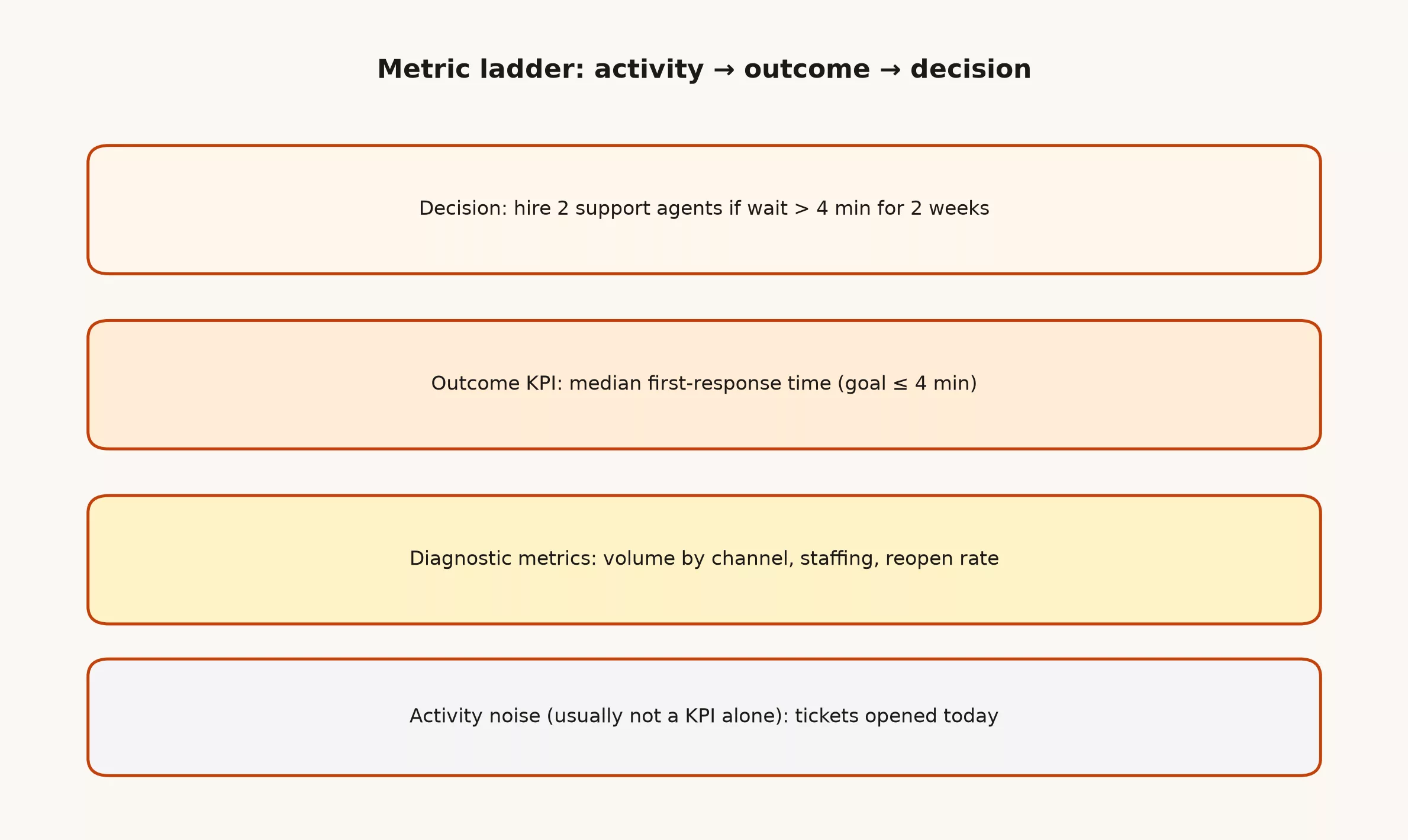
Always work top-down from the core business decision, such as deciding whether to hire agents if wait times remain elevated, followed by the outcome metric and diagnostics. Bottom-up “we track everything” creates dashboard (a screen of charts that tracks key numbers) landfills.
How to choose KPIs
1. Start from a decision and a goal
Write the decision in a sentence. “If trial-to-paid conversion stays under 8% for two weeks after the pricing test, we roll back.” Then pick the measure that would trigger that decision. If you cannot name the decision, you are decorating.
2. Prefer fewer
A team can truly steward a handful of KPIs, because beyond that threshold collective attention drops off. Many teams run three to five primary metrics and keep a deeper diagnostic pack for analysts.
3. Make the definition boring and exact
Document grain, filters, time zone, and owner using the same discipline as data governance. Reporting conversion rate without a clear denominator story is a team dispute waiting to happen.
KPI: trial_to_paid_7d
Numerator: accounts with first paid invoice within 7 days of trial start
Denominator: trials started in period (exclude internal + QA accounts)
Time zone: UTC
Owner: Growth analytics
Decision rule: < 8% for 14 days post-change → recommend rollback
4. Balance leading and lagging
| Type | What it tells you | Example |
|---|---|---|
| Lagging | Outcomes after the fact | Monthly recurring revenue, churned accounts |
| Leading | Earlier signals you can still act on | Activation rate in first 24h, sales cycle stage movement |
Lagging without leading means you learn late. Leading without lagging means you optimize theater, so use both and show how they connect.
5. Assign an owner and a review rhythm
Owner means “person who explains movement and drives the response,” not “person who built the chart once.” Weekly for operational KPIs; monthly for slower ones is a common pattern. Reviews without owners are slideshows.
Worked example: support team strip
| KPI | Why it is key | Diagnostic friends |
|---|---|---|
| Median first-response time | Customers feel speed here | Staffing, volume by channel |
| % resolved in one touch | Quality of answers | Macro usage, reopen rate |
| CSAT on closed tickets | Perceived quality | Topic tags, agent cohort |
Notice what is not on the strip: raw ticket count alone. Volume matters for staffing models, but celebrating “more tickets” as success is how you reward chaos.
Good habits
- Show the definition next to the chart (tooltip or linked card)
- Annotate tracking changes on the timeline.
- Compare to a baseline period and, when relevant, a target band.
- Separate scorecard KPIs from sandbox exploration.
- Retire KPIs that no longer map to a decision.
Things to watch out for
Too many KPIs
If everything is key, nothing is. Cut until each remaining KPI has an owner and a decision rule.
Vanity metrics
Big numbers that always go up (raw page views, emails sent) feel comforting. Ask what decision they change. If the answer is “awareness,” dig one level deeper into quality of awareness.
Set and forget
Business mix shifts. A KPI that mattered at 20 employees can mislead at 200. Schedule reviews of the KPI list itself, not only the values.
Quality issues
A beautiful KPI on broken events is fiction. Pair KPIs with basic quality checks (null rates, duplicate events, timezone bugs). When tracking breaks, mark the chart instead of narrating a fake story.
Misaligned incentives
If you pay people on a metric they can game, they will game it. Pair quantity with quality, or audit samples. Goodhart’s law is not a joke; it is a planning assumption.
KPIs and strategy documents
OKRs, scorecards, and north-star frameworks can all work. The failure mode is the same: copying a template metric list from another company. Your KPI set should fall out of your strategy and operating decisions, not from a generic software blog, so borrow the structure but not the numbers.
A lightweight weekly ritual
- Open the strip (3-5 KPIs) with definitions visible, so nobody argues about what a number means while you discuss what it did.
- For each mover: what changed, is it real, what will we do?
- Log one action or explicit “watch only”
- Park deep dives in a separate analysis ticket with a brief.
A focused thirty-minute review with a disciplined parking lot easily beats a two-hour tour of forty dashboard tiles.
Quick recap
- KPIs are few, owned, and tied to decisions; metrics can be many.
- Write exact definitions, targets, and decision rules, so a metric means the same thing in every meeting.
- Use a ladder: decision → outcome KPI → diagnostics → activity, so every metric connects back to a decision.
- Mix leading and lagging; watch for vanity and gaming.
- Review the list itself on a calendar, not only the sparkline.
When two KPIs conflict like speed versus quality, do not hide the tradeoff in a weighted score that nobody understands. Present both numbers side by side and decide the operational policy openly. Composite indices can help later, but they are a poor initial move when organizational trust is low.
For leadership audiences, pair each KPI with a single plain sentence on what good looks like this quarter. Numbers without narrative get misread. Narrative without numbers is a pep talk. Leadership needs both delivered concisely.
If you are rebuilding a scorecard after a reorg, archive the old one with a date stamp instead of silently editing history. People remember dashboard screenshots for quarters. A clear “scorecard v3 effective June 1” note saves conspiracy theories about moved goalposts.
Write the messy edge cases in the open. Hidden footnotes become tribal knowledge and then become outages.
If two teams need different definitions, name both clearly instead of forcing a fake compromise that satisfies nobody.
Ship the smallest useful artifact this week: a definition card, a quality check, or a retired vanity chart. Momentum always beats a lengthy manifesto.
Teach newcomers where the source of truth lives. Onboarding is a governance surface whether you designed it or not.
When something fails, prefer a short postmortem over a new committee. Fix the rule or the test that should have caught it.
Sources
- https://en.wikipedia.org/wiki/SMART_criteria.
- https://en.wikipedia.org/wiki/Performance_indicator.
- https://en.wikipedia.org/wiki/OKR.
Keep going
Same lessons in your feed
Short diagrams, hooks, and weekly tutorials on Substack, Instagram, X, and Facebook.