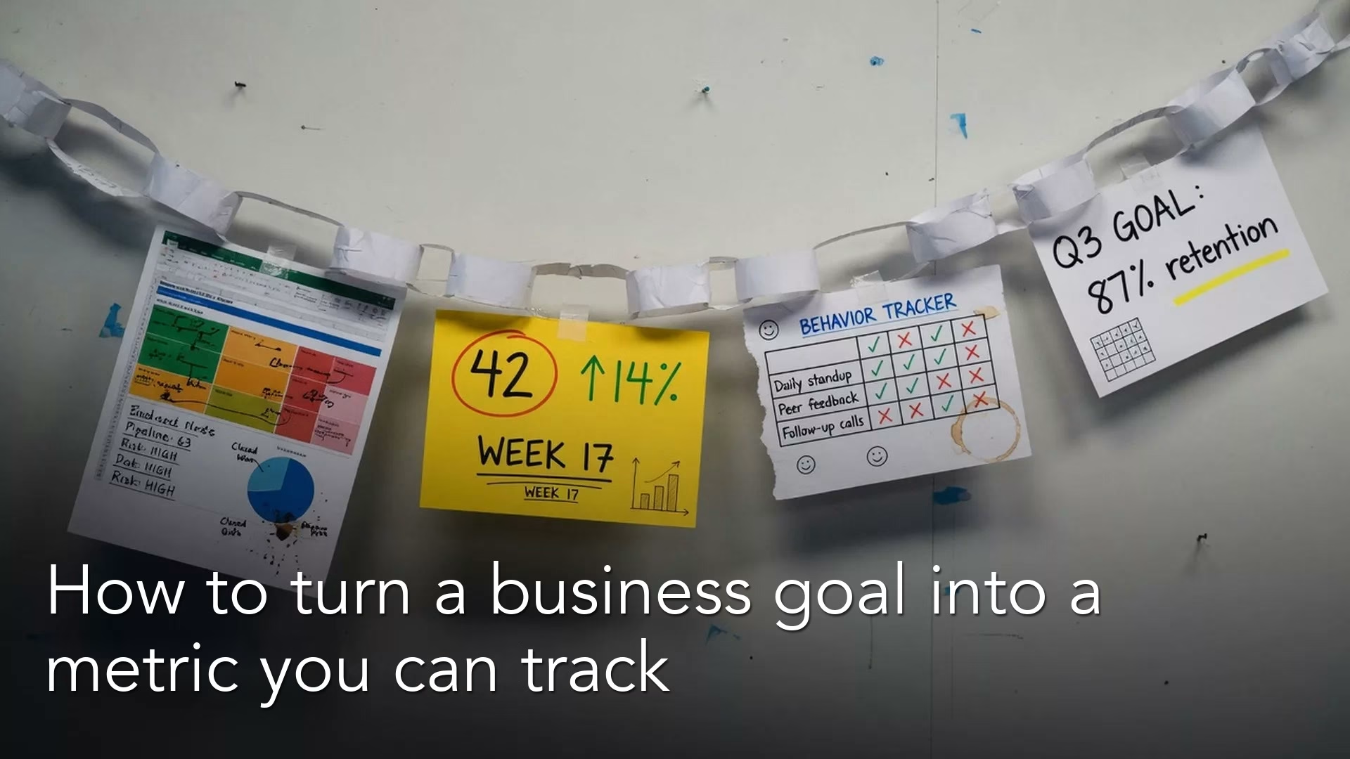
A useful metric starts with a clear goal, not with a chart. Say you open a leadership deck whose first slide, titled “Key metrics,” shows twelve tiles. Three are green, four are red, and the rest are a yellow that nobody ever defined. You ask, “Are we winning?” and the room debates colors instead of customers. An hour later the only decision is to add two more tiles for next week. That is not really a metrics problem. It is a goal problem wearing a chart costume.
This post opens Metrics that matter, a series for managers and analysts who have to define key performance indicators, or KPIs (the numbers a team tracks to judge progress) that drive action and not just decorate a dashboard (a screen of charts that updates on its own). We will not rewrite the basics. If you want a friendly starting point on what a KPI is and why a few good ones beat a zoo of metrics, read our introduction to KPIs first. Here we build the chain that sits under every useful KPI: objective → behavior → measure → target.
Why metrics fail before the spreadsheet opens
People often start with tools. They open a business intelligence (BI) workspace, drag in fields, and hope a tile becomes strategy. The tools are fine, but starting with them is how you end up measuring what is easy instead of what matters. The same habit shows up when someone says “we need more data” without naming the decision the data would support. The analytics foundations series keeps returning to that idea, which is to ask the question first and produce the output second.
A metric is a stand-in, which analysts call a proxy. It represents something you care about but cannot put on a wall as one pure truth. Revenue stands in for value exchanged. Net promoter score, which comes from a survey question about recommending you, stands in for loyalty. Time to first value stands in for how quickly a product starts helping. Stand-ins are useful as long as you remember what they stand for, and they become dangerous when you treat them as the goal itself. Later posts in this series cover gaming a metric, a problem often summed up as Goodhart’s law. For now the fix is simpler: write out the goal chain before you lock in the number.
A goal-setting method called objectives and key results (OKRs) popularized a useful sentence shape: we want an objective, as measured by key results. John Doerr’s public writing on OKRs, and the wider “measure what matters” idea, is not a religion you have to adopt. It is a reminder that vague ambition without measured progress is just talk, and measured progress without ambition is just bookkeeping. You can use OKRs, a strategy memo, a product brief, or a one-page goal statement, and the chain below works in all of those formats.
Rule of thumb: If you cannot explain how a number connects to something people can do differently this month, it is a scoreboard and not a management tool.
The chain: objective → behavior → measure → target
The first picture below compares a weak chain with a strong one.
| step | weak | strong |
|---|---|---|
| 1 Objective | Grow | Activate teams in 14 days |
| 2 Behavior | Be better | Finish setup checklist |
| 3 Measure | Users | % teams setup-complete |
| 4 Target | More | 60% by Q end |
The next picture shows a filled-in chain.

Think of the chain as four links. If you skip one, the metric usually snaps under pressure.

1. Objective: what winning looks like in plain language
An objective is a direction that people can repeat without a glossary. It is not a formula and it is not a dashboard title. Good objectives sound like this: “New customers get value in the first week,” “Support resolves issues without endless handoffs,” or “We grow revenue without burning margin on discounting.”
Bad objectives sound like labels from a software menu, such as “Improve CRM hygiene,” where the CRM is the customer relationship management system sales uses, “Increase engagement,” or “Optimize funnel.” Those phrases hide disagreement. One person’s engagement is a count of sessions, another’s is weekly active accounts, and a third person’s is paid conversion. Until you finish the sentence in ordinary language, every metric is a guess.
Write the objective as if you were explaining it to a smart colleague who does not work on your team. If they ask what changes for customers or for the business, you should be able to answer in one breath. If you need three slides of background before the objective makes sense, it is still a project plan and not a goal.
2. Behavior: what people do differently if we are serious
This is the link most teams skip. Behavior is the bridge between ambition and measurement. If the objective is “new customers get value in the first week,” the behaviors might include onboarding calls finished within two days, setup checklists completed inside the product, and a standard playbook used on every new account. They might also include product fixes for the biggest obstacles that keep new customers from getting started.
Behavior matters because a measure without behaviors becomes a spectator sport, where people watch the line go up or down and shrug. A measure with behaviors becomes a coaching tool. A manager can ask which behavior slipped, and does not have to ask who to blame for the red tile.
The people you are measuring should be able to control the behaviors. If your sales team cannot change warehouse shipping times, do not put shipping-driven customer satisfaction on their personal scorecard and call it accountability. Put it on the team that owns the process, or treat it as a shared limit with a shared action plan.
3. Measure: the proxy you will count honestly
A measure is the number, or small set of numbers, that best stands for progress. It needs a clear group of people or things it covers, a clear time window, and a definition someone else can rebuild. That habit of rebuilding is the same discipline you use in data quality work. If two analysts cannot reproduce the number, you do not have a metric, you have a rumor with a chart.
Choose measures that are close enough to the behavior to react when people change what they do, and close enough to the objective to stay meaningful. “Emails sent” is close to a marketing behavior but often far from business value. “Revenue” is close to business value but often arrives too late to coach anyone. A later post in this series goes deep on leading indicators, which move early, and lagging indicators, which move late. For now, just notice the tradeoff when you pick the measure.
Also decide what you will not measure yet. A short scorecard is a decision, while a long scorecard is often a fear of choosing. If everything is key, nothing is.
4. Target: the line that turns a measure into a commitment
A target answers three questions: what number, by when, and under what assumptions. Without a target, a measure is just weather, which is interesting but does not tell you whether to change the plan.
Targets can be a threshold (“above 85% on-time activation”), a range (“between 12 and 15 demos per rep per week”), or a trend (“cut the median time to first value from 14 days to 7 days by the end of the third quarter”). They should be hard enough to force tradeoffs, and honest enough that people do not hide problems to protect a bonus.
Write the assumptions next to the target, for example “assumes no major product outage and current pricing.” Assumptions prevent false panic when the world changes. They also prevent false celebration when you hit a number by quietly changing the definition halfway through.
How the chain looks in real language
Here is a compact fill-in pattern that you can paste into a document or ticket.
OBJECTIVE (plain language):
We want ________________ so that ________________.

BEHAVIORS (what changes this month):
1. ________________
2. ________________
3. ________________

MEASURE (the proxy we will count):
Name: ________________
Population: ________________
Window: ________________
Formula idea: ________________

TARGET (commitment + timing):
By ________ we will reach ________.
Assumptions: ________________
Owner who can change the behaviors: ________________
If you cannot fill in a row without making something up, stop. The blank is useful information, because it means the team does not yet agree on the goal, the work, or the definition. That disagreement is cheaper to surface in a document than in a board meeting.
Worked example: B2B product activation
Imagine you work at a mid-sized software company, and leadership says, “We need better retention.” That sentence points the right way but gives nobody anything to do, because retention is an outcome that arrives late. The team needs a chain.
Objective: New customers reach a first useful outcome inside the product within seven days of signup, so they stay long enough to expand.
Behaviors: Customer success books a kickoff call within 48 hours. Product fixes the top three setup obstacles found in support tickets first. Sales stops selling packages that need connections to other software that do not exist yet. Marketing spells out the “first win” in onboarding emails.
Measure candidates: the percent of new accounts that complete a defined “first value” event within 7 days, the median hours from signup to first value, and the percent of kickoffs held within 48 hours, which is an early signal of whether the process is working.
Target: Raise the 7-day first-value rate from 42% to 60% by the end of the quarter. Leave out internal test accounts, and define “first value” as exporting a live report and not as viewing a sample dashboard.
Notice how much definition work hides in that paragraph. Who is counted, what event counts, what is excluded, and when the clock starts are not nitpicks. They are the difference between a KPI and a fight. A later post in this series turns that definition work into a one-page metric specification.
Here is the same example as a table you can adapt.
| Chain link | Team draft (weak) | Team draft (stronger) |
|---|---|---|
| Objective | Improve retention | New customers reach a first useful outcome in 7 days so they stay and expand |
| Behavior | Work harder on onboarding | Kickoff within 48 hours, fix the top 3 setup obstacles, and stop selling connections that do not exist |
| Measure | Engagement score | Percent of new paid accounts that export a first live report within 7 days |
| Target | Go up | 42% to 60% by the end of the quarter, leaving out test accounts, where the event is a live export |
| Owner | “The data team” | Customer success operations owns the kickoff promise, the product manager owns the obstacles, and analytics owns the definition and the report |
The stronger column is longer on purpose, because clarity is not the same as complexity. You pay a little in documentation now to avoid a large political cost later.
Stress tests before you put a metric on a wall
Before a number becomes “official,” run these five checks out loud.
- Decision test: If this number got 10% worse, what would we do next week? If the answer is “look at more charts,” you are not ready.
- Behavior test: Can the team being measured change the inputs without cheating on the definition?
- Definition test: Can two people rebuild the number from source data with the same result?
- Lag test: How late does the signal arrive compared with the work? If it is very late, pair it with an early signal, which a later post in this series covers.
- Side-effect test: What ugly behavior would this metric reward if people chased it above everything else? We only touch on this here, and a later post covers gaming a metric in depth.
These checks are also a culture tool, because they let analysts push back without sounding like blockers. An analyst can say, “I can build the tile, but we have not passed the decision test yet.” That sounds professional and not picky.
Where this sits next to charts, SQL, and quality
A metric chain is not a choice about how a chart looks. Once the chain is solid, you still need honest charts, and the series Charts that make sense (series slug data-viz) covers that, starting with purpose, then chart type, then axes. A beautiful activation chart with a fuzzy definition is still a fuzzy definition.
The same is true for data pipelines and code. You can build the measure in SQL (the standard language for asking a database for data), in a warehouse model, or in a small Python script from the Python for analytics path. Good implementation matters, but it cannot invent a missing objective. If stakeholders argue about which file is right, you may have a quality issue and a definition issue at the same time. Fix the definition on paper first, and then fix the data path.
The basics still apply here. If you do not know the problem you are solving, a longer KPI list will not help, and the metric chain is simply problem framing applied to performance management.
What the chain is not
A few limits keep this framework from turning into a show.
The chain does not require you to adopt OKRs if your company uses another goal system. Strategy memos, product briefs, and annual plans all work. The four links still apply: what you want, what people will do, what you will count, and what “enough” looks like by when.
The chain is not a license for endless metrics. One objective can support a small set of measures, often one main late-arriving outcome plus a couple of early process signals. If you need twelve chains for one team meeting, you probably have twelve goals and not one scorecard. That is a strategy conversation and not an item for the BI team’s to-do list.
The chain also does not make the data itself trustworthy. You can write a perfect chain and still ship a number built on late events, broken joins, or a population nobody agreed on. When that happens, fix the definition and the pipeline (the automatic steps that load the data) together, and do not just add another tile.
Common mistakes
- Starting with the fields you happen to have. “We have a pageview column, so pageviews are strategic” confuses what is available with what is important.
- Skipping behavior. The team stares at outcomes and never names the work that moves them.
- Targets without assumptions. Without them, every outside shock turns into a story of internal failure.
- Owning the number but not the process. Analytics “owns” the dashboard while nobody owns the promise to hold a kickoff call within 48 hours.
- Twelve priorities. A scorecard that cannot fit on one screen often means the strategy has not chosen yet.
- Confusing a project milestone with a KPI. “Launch the new onboarding flow” is work, while “raise 7-day first value” is a performance measure tied to an objective.
- Changing definitions mid-quarter to hit a target. That is fiction and not management. Write the change down, reset the starting point, and say so out loud.
- Treating the basics as optional forever. If your team still confuses a metric with a KPI, send them back to our introduction to KPIs before you expand the scorecard.
Quick recap
- Useful metrics hang on a chain of objective, behavior, measure, and target.
- If you skip behavior, you get dashboards that people only watch.
- If you skip the definition, you get meetings that argue about the number and not about the work.
- Targets need timing and assumptions, and not only a bigger arrow.
- Check the decision, the behavior, whether someone else can rebuild the number, the lag, and the side effects before you promote a tile to “KPI.”
- This series designs the whole system, and our introduction to KPIs remains the friendly starting point on what a KPI is.
How to practice this week
- Pick one metric that already appears in a weekly meeting, so the practice improves a number people actually use.
- Write the four links for it, and leave blanks if you must. Do not make things up just to look complete.
- Run the five checks with a partner who did not build the dashboard.
- Rewrite the metric title as a human sentence: “We track X because we want Y.”
- If the behavior row is empty, schedule a 30-minute working session with the process owner before you try to “improve the dashboard.”
- Optional: sketch how you would pull the measure with SQL or Python, but only after the definition sentence is stable.
For more paths across foundations, quality, charts, and tools, use the Learn hub.
Series notes: This is Part 1 of Metrics that matter. The next post covers leading versus lagging indicators, with one business example you can adapt to your own sales funnel.
Sources
- What Matters (John Doerr / OKR resources), OKRs explained: https://www.whatmatters.com/okrs-explained
- What Matters, home and Measure What Matters materials: https://www.whatmatters.com/
- Analytics Made Simple, All About KPIs (prequel): https://analyticsmadesimple.com/analytics/all-about-kpis/
- Analytics Made Simple, Analytics foundations: https://analyticsmadesimple.com/series/analytics-foundations/
- Analytics Made Simple, Data quality for people who ship numbers: https://analyticsmadesimple.com/series/data-quality/
- Analytics Made Simple, Charts that make sense (
data-viz): https://analyticsmadesimple.com/series/data-viz/ - Analytics Made Simple, Learn hub: https://analyticsmadesimple.com/learn/
Keep going
Same lessons in your feed
Short diagrams, hooks, and weekly tutorials on Substack, Instagram, X, and Facebook.