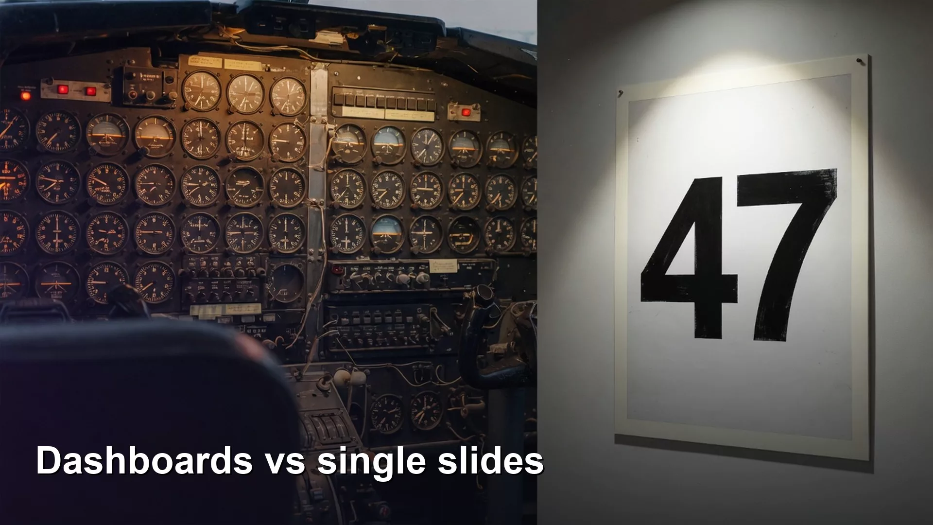
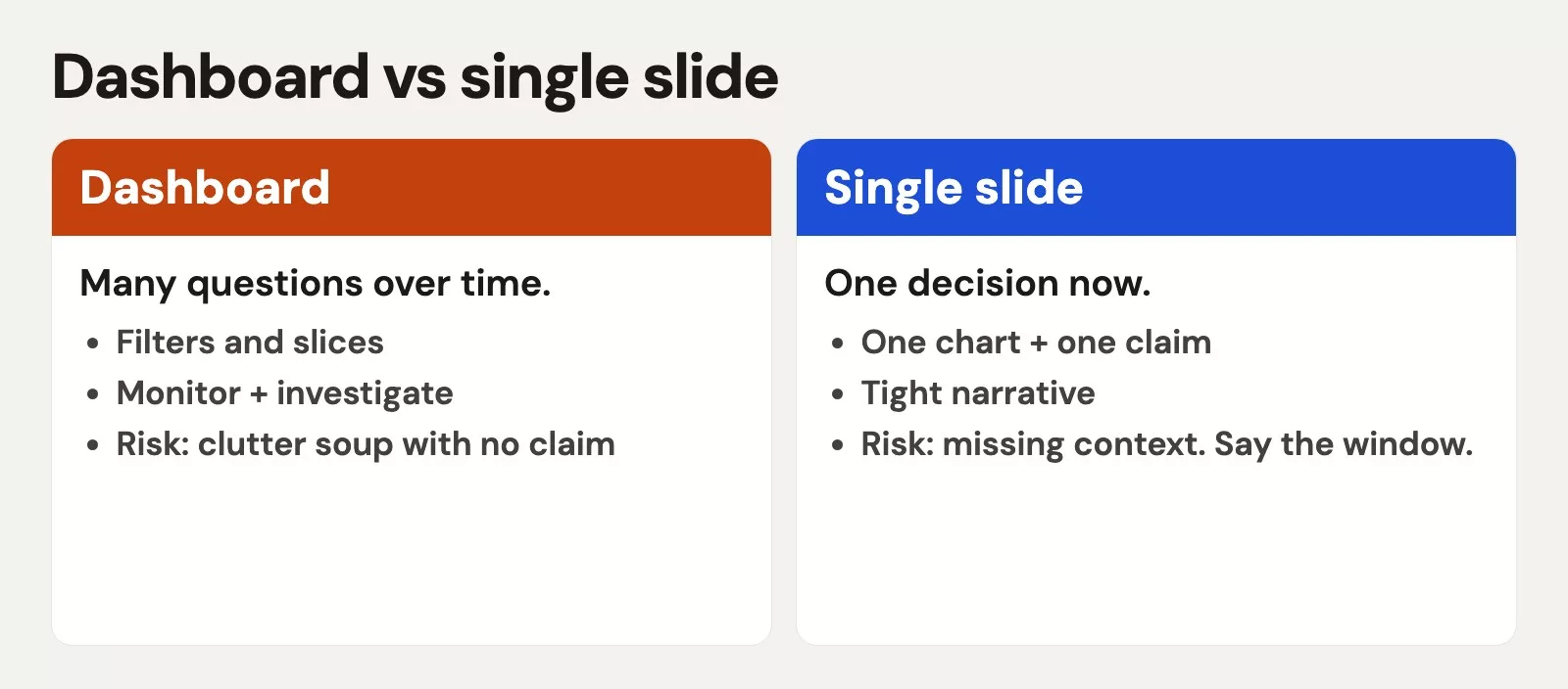
A dashboard and a single slide do different jobs, and most bad reporting comes from asking one of them to do the other’s work. A dashboard is a page you return to so you can spot change. A slide is a message you show once so people leave with one decision. Pick the format that matches the job, and the meeting gets easier.
Say you walk into your weekly operations review. It opens with a “dashboard” that is really twelve slides squeezed onto one screen: twelve number cards, four tiny trend lines, a map, a pie chart, and a table nobody can read past row three. You ask whether the team is on track for the quarter, and nobody answers. Someone else asks which chart to look at first, and the room goes quiet again. The meeting drifts into hunting through old screenshots.
An operations lead in that spot split the busy page in two: a live monitor for five watch numbers, and a one-idea slide for the Friday decision. The meeting got shorter and the action items got clearer. The old page still existed as a tab nobody opened.
This post is about layout and audience, not new chart types. If you already build honest bars and lines, the Python for analytics path covers chart anatomy. If you clean numbers before you show them, Data quality for people who ship numbers covers that. Both rest on one habit from Analytics foundations: decide the decision before you decorate the page. The Learn hub has the full path map.
Two products, two contracts
People use the word dashboard for almost anything with charts, and that blur leads to bad design. It helps to treat dashboards and slides as two products, each with its own promise to the reader.
Living dashboard: monitor and explore
A dashboard is a persistent workspace. Someone returns to it on a schedule, or when something feels off. Filters change, time ranges shift, and the reader may click into detail. The promise is: help me notice change and find the next question fast. Density can be higher because the audience knows the layout and comes back often, but that is still not permission to dump every number the warehouse can produce.
Good dashboards have a clear top of the page. The reader should see what to check first and what counts as normal versus time to act. Stephen Few’s work on information dashboards stresses showing the most critical information at a glance, with a design that respects how people perceive things, instead of a random collage of widgets. You do not need his book on your desk to use the idea. If the first five seconds do not answer “is anything wrong?”, the layout has failed at its job.
Single slide or one-pager: explain and decide
A single slide, or a frozen export you send by email, is a message. The audience may see it once, and they cannot hover or change a filter. The promise is: leave with one claim and one next step. That means less on the page, more written explanation on top of the chart, and a title that does real work. If you paste a full dashboard screenshot into a board deck, you are forcing a monitoring tool to persuade people, which it was never built to do.
When someone says “just put the dashboard on slide 4,” translate that to “put a decision view on slide 4.” In practice that means fewer marks, larger type, and a written “so what.” A later post in this series goes deep on annotation, which is the habit of writing your point right on the chart. For now, notice the split between the two products.
| Question | Lean dashboard | Lean single slide |
|---|---|---|
| Primary job | Monitor and explore | Explain and decide |
| Return visits | High (daily or weekly) | Often once per meeting |
| Interaction | Filters, drill-down, hover are fine | Static; no required interaction |
| Density | Moderate, with a layout the reader knows | Low; one idea dominates |
| Success test | “I know if I need to act” | “I can retell the claim” |
Rule of thumb: If the audience will not live in the page, do not put a dashboard in front of them. Give them a message.
One idea per view, and what “idea” means
“One idea” does not mean “one number.” It means one question that leads to a decision, and the layout is built to answer it. These count as one idea each:
- Are we on pace for third-quarter bookings against plan?
- Which three regions need help this week?
- Did the new pricing change conversion in a way that survived last week’s promotion noise?
The next set looks like one idea but is really five wearing a trench coat:
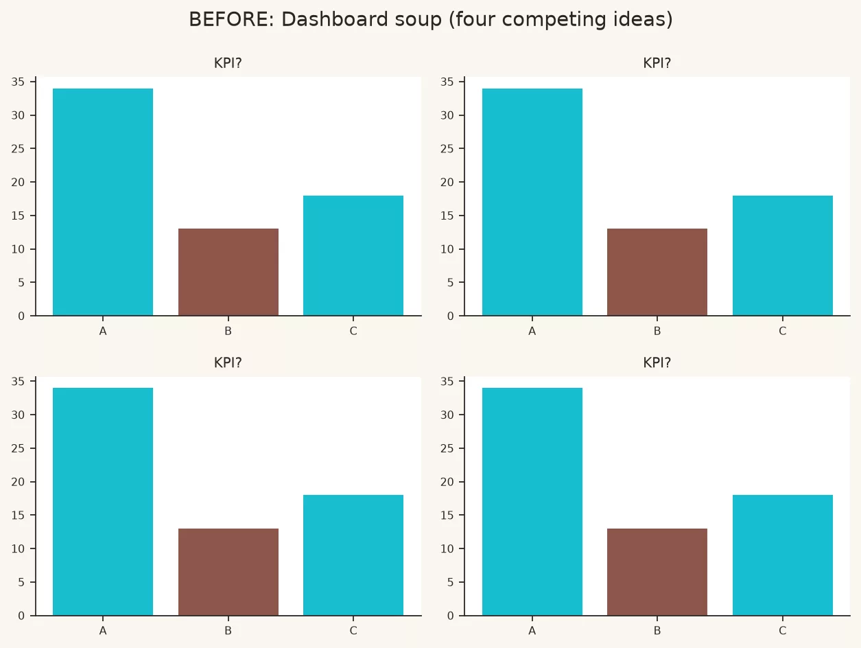
- A “revenue health” page that gives bookings, churn, customer satisfaction scores, pipeline (the sales deals still in progress), and marketing spend equal weight
- A home page that mixes finance close status with product experiment results and hiring numbers
- An “executive view” that is really three vice-presidents’ dashboards tiled together with no story order
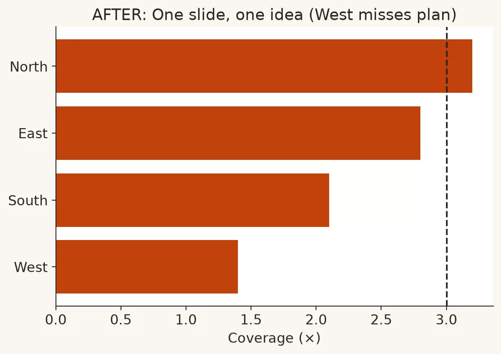
Visual example: below, a four-panel wall of numbers next to a single decision slide. It is the same organization with a different job for each view.
When you need several ideas, you can still have them. Use multiple views: tabs, linked pages, a short run of slides, or one dashboard with a clear order of importance where the smaller panels only support the main question. Order of importance is not the same as dumping. The top left (or top center, depending on how your readers scan a page) should own the main answer, and the supporting charts should explain “why” or “where” instead of starting a second, unrelated parade of numbers.
This is the same discipline as choosing a chart’s purpose, which the first post in this series covered. Explore mode can wander, but explain mode cannot. A weekly leadership review is explain mode, even if the file is labeled “dashboard.”
Declutter like you mean it
Decluttering is not minimalism as fashion. It means removing anything that competes with the answer. Edward Tufte writes about cutting “non-data ink,” which is any ink that does not carry information, and the idea is useful if you treat it as a practical edit pass instead of a purity contest. In workplace tools, the clutter is usually one of these:
- Duplicate titles, where the page title, chart title, and axis title all say “Revenue”
- Decorative gradients, drop shadows, 3D effects, and a logo watermark on every tile
- Gridlines so dense the chart looks like graph paper
- A legend on a chart that has only one series
- Tables that repeat the exact values already shown as bars
- Filters nobody uses that still take up a full row of screen space
- Color used as wallpaper instead of meaning, which the earlier post on color and labels covers
Run this edit pass on any view before you share it:
- Write the question in one sentence above the design, even if only you will see it.
- Circle the one chart that answers it. Everything else has to justify its seat.
- Delete or shrink any tile that answers a different meeting’s question.
- Remove decoration: borders, double backgrounds, unneeded legends, 3D effects, and chart junk, because every extra mark competes with the number you want people to see.
- Align and size: make one main visual larger, and keep the supporting panels smaller and consistent.
- Label the data directly when you can, because a label next to a line beats a legend far away when you have only a few series.
- Check it on a phone or projector. If the type becomes unreadable at presentation distance, the view is still cluttered.
Layout patterns that survive real meetings
The monitor strip
The top row holds three to five key numbers, each with a small trend line or arrow and a target or last-period comparison. The middle holds one main time series or ranked bar chart for the operating question. The bottom holds a detail table or a second cut by region, product, or owner, which people open only when the top says “look deeper.” This works for weekly operations because the eye path is trained: status first, then the story, then the detail.
The decision slide
Use one big visual and one title that states the claim, not a label like “Q3 Metrics.” Add two or three callouts at most, and a short “so what and next step” line under the chart. A footnote can carry the source, date range, and definition. There is no filter bar and no second story competing for attention. If leadership needs a second idea, that becomes slide two instead of a second hero chart fighting the first.
The comparison board
When the question is “which of these needs help,” use small multiples (the same small chart repeated for each group) or a ranked bar chart with a clear threshold line. Do not invent twelve different chart types for twelve regions. Use the same encoding for every slice. Teams often vary chart types “to keep it interesting,” and that meaningless variety is a classic dashboard failure because it makes comparison impossible.
Worked example: the weekly operations mashup
Imagine a mid-sized software company. Every Monday, the revenue operations team (the people who keep sales data and tools running) shares a page called “Growth Dashboard.” Stakeholders complain it is “busy,” and it still cannot say whether the sales pipeline is big enough to hit the quarter’s target. The table below inventories what is on the page today and what we keep.
| Tile on the old page | What question it answers | Keep on monitor? | Keep on decision slide? |
|---|---|---|---|
| Bookings month to date vs plan | Are we on pace? | Yes (primary number) | Yes (hero if that is the meeting) |
| Pipeline coverage by stage | Is the sales funnel healthy? | Yes (main chart) | Yes, if coverage is the claim |
| Win rate 12-week trend | Is conversion drifting? | Yes (secondary) | Only if it drives the claim |
| Marketing spend by channel pie | Where did the dollars go? | No (different meeting) | No |
| Customer satisfaction gauge | Are customers happy? | Maybe a separate customer page | No |
| World map of logo placements | Where are customers? | No (decoration) | No |
| Full opportunity table (200 rows) | Who owns what? | Link out or use a filter panel | No |
| Open hiring headcount | Hiring status | No (wrong audience) | No |
The redesign turns one page into two products.
Monitor page, for people who live in the numbers. A strip across the top shows bookings month to date against plan, pipeline coverage, and win rate with a change from last week. The main panel shows pipeline by stage as horizontal bars with a target line for coverage. A secondary panel shows the win-rate trend, and filters are limited to region and segment. The marketing pie, the map, the satisfaction gauge, the hiring number, and the giant table all leave the page. The table becomes a linked detail view for the operations team instead of a wallpaper of rows.
Decision slide for the quarterly business review. In this made-up example, the title reads “Pipeline coverage is 2.1x vs the 3.0x target; the West region is the gap.” One ranked bar chart shows coverage by region, with a callout on the West. The footnote says how coverage is calculated: open pipeline divided by quarterly plan, as of Friday close, excluding lost deals. The next-step line reads “Double discovery capacity in the West for three weeks, then re-check coverage next Monday.” The data family is the same, but the product is different, and it carries one idea.
Notice what we did not do. We did not “fix” the dashboard by shrinking fonts so twelve tiles still fit. We split the jobs, which is the whole lesson in work clothes.
A tiny spec you can paste into a ticket
When you request a build, or build one yourself, write a short contract first. It works in any tool and takes two minutes.
VIEW: Weekly pipeline monitor (dashboard)
PRIMARY QUESTION: Is pipeline coverage healthy enough to hit plan?
AUDIENCE: RevOps + sales leaders (weekly return users)
PRIMARY VISUAL: Coverage by region (bars) + company coverage KPI
SUPPORT: Stage mix, win-rate sparkline
FILTERS: region, segment (default = all)
NOT IN SCOPE: marketing spend, NPS, hiring, world map
DEFINITIONS: coverage = open pipeline / remaining plan (see wiki)
REFRESH: daily 06:00 local HQ
SUCCESS: user can answer primary question in under 10 seconds

VIEW: QBR coverage decision (single slide)
PRIMARY CLAIM: [write the claim after the numbers, not before]
PRIMARY VISUAL: one chart only
ANNOTATIONS: gap to target + worst region
FOOTER: as-of date, definition, source table
SUCCESS: non-analyst can retell claim without the speaker notes
If you cannot fill in the primary question or the main claim line, you are not ready to design. Go back to the foundations habit and settle the question before you pick a chart.
When more tiles are honest
Sometimes the complexity is real. A control room for a delivery network may need many signals, and a month-end accounting tracker may need many workstreams. Even then the fix is not a random collage. Use these four habits:
- Sections with headers that name the question each band answers
- Status first, using red, amber, and green only when the definitions are strict, and pairing each with an icon and text so color is never the only signal
- Progressive disclosure, which means a summary page first and detail pages behind it
- Consistent encoding, so “bar length always means money” holds across the whole page
Also respect data quality. A beautiful monitor built on dirty dates or mixed-up row definitions is a confidence machine pointed at the wrong wall. The data quality series shows how to link metrics to known issues, and known issues written down beat silent “trust me” tiles.
Common mistakes
- Screenshotting the monitor into the board deck. The interaction dies but the clutter survives, so rebuild it as a decision slide.
- Equal-sized tiles for unequal importance. Order of importance is a feature, so make the main answer larger.
- Number cards with no comparison. A lonely “$1.2M” is not monitoring. Showing it against plan, last week, or a target is monitoring.
- Filter sprawl. Every filter is a fork in the story, so keep defaults sensible and hide advanced filters.
- One page for every audience. Sales, finance, and product do not share one brain, so split the views by job.
- Decorative maps and gauges that take up space without changing a decision.
- Adding tiles instead of answering complaints. “We cannot find X” often means the order of importance failed, not that X needs a thirteenth widget.
Quick recap
- Dashboards monitor and explore, and single slides explain and decide, so do not force one product to do both jobs.
- One idea per view means one question that leads to a decision, not necessarily one number.
- Decluttering is an edit pass that removes decoration, duplicates, and tiles that belong to other meetings.
- Use a clear order of importance, consistent encoding, and progressive disclosure when the complexity is real.
- Write a short view contract (question, audience, what is in scope, what is out) before you build.
Your Monday page does not need more widgets. It needs a clearer job description.
How to practice this week
- Pick one real page you own or inherited, and write its primary question in plain language.
- List every tile in a table like the worked example, and mark each one keep, move, or delete.
- Build or sketch two outputs from the same data: a monitor layout and a one-idea decision slide.
- Show both to one person who did not build them, and ask them to answer the primary question in ten seconds on each.
- If you plot from code, reuse the clean chart anatomy from the Python series instead of inventing a new style for every export.
The next post in the series covers the annotation habit, where titles, callouts, and a “so what” line turn a clean layout into a message people can retell. After that comes a catalog of common chart mistakes and fixes, so you can audit work under pressure.
Series notes
This is Part 5 of Charts that make sense. The previous post covered color and labels. The four posts before this one covered purpose, chart choice, axes, and accessibility.
Sources
Research and further reading used for this article:
- Stephen Few, Perceptual Edge library (dashboard design essays and resources): https://www.perceptualedge.com/library.php
- Edward Tufte, The Work of Edward Tufte and Graphics Press: https://www.edwardtufte.com/tufte/
- Data Visualization Society: https://www.datavisualizationsociety.org/
- Nightingale, the Data Visualization Society’s journal on visualization practice: https://nightingaledvs.com/
- W3C, Web Content Accessibility Guidelines (WCAG) overview: https://www.w3.org/WAI/standards-guidelines/wcag/
- Analytics Made Simple, Learn hub: https://analyticsmadesimple.com/learn/
- Analytics Made Simple, Analytics foundations: https://analyticsmadesimple.com/series/analytics-foundations/
- Analytics Made Simple, Data quality for people who ship numbers: https://analyticsmadesimple.com/series/data-quality/
- Analytics Made Simple, Python for analytics: https://analyticsmadesimple.com/series/python/
Keep going
Same lessons in your feed
Short diagrams, hooks, and weekly tutorials on Substack, Instagram, X, and Facebook.