
You do not need perfect data to answer a question. You need data that is good enough for the decision, plus a plain note about what is missing. Say leadership wants a churn answer (the share of customers who leave) by tomorrow morning. Your data pipeline (the automatic steps that load data) runs two days behind, three product teams disagree on who counts as a “customer,” and free trials are still mixed into the paid table. Someone will say the words that freeze every analyst: “We should wait until the data is perfect.”
Perfect data never shows up, but good enough data does. This post in the Analytics foundations series is about knowing the difference, saying it in plain language, and still making a decision you can defend on Monday.
Perfect is not a data plan
In school, wrong answers get red marks, but at work a late answer can cost more than a slightly wrong one. That does not mean you should send out bad data. It means the standard is this: is the data accurate enough for the decision in front of us, with the cost of waiting included?
In the earlier post on what problem you are actually solving, we started with the decision and not the data warehouse (the central database that holds company data for reporting). Here we ask a follow-up: how solid does the evidence need to be for this decision? Repricing a whole product line needs more certainty than choosing which onboarding email to try in a simple test (an A/B test) next week.
Data quality experts talk about dimensions like accuracy, completeness, consistency, and timeliness. Those words are useful, but they mean little without a decision to anchor them. A dataset that is 99% complete sounds great until the missing 1% turns out to be your highest-value customers. One that is 80% complete can be fine if the missing rows are random noise and the question only needs to know which way things are heading.
A continuum, not a cliff
People talk as if data is either “ready” or “not ready,” but reality is a spectrum with five zones. You do not need a statistics degree to place yourself on it, only honesty about the decision and about the holes in the data.
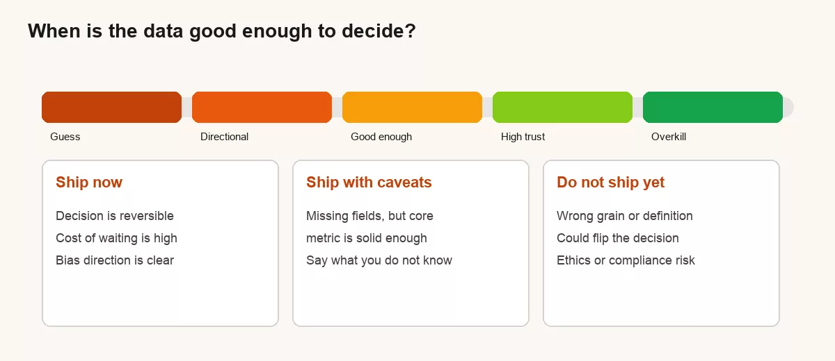
1. Guess
There is no measurement, or the measurement is so broken that you are basically storytelling. That is fine for brainstorming and dangerous if you present it as analysis.
2. Directional
You can say “up or down,” “Region A looks worse than Region B,” or “this channel is not the hero.” Definitions may be messy, so this level is good for prioritizing and for deciding where to dig next.
3. Good enough
Example:
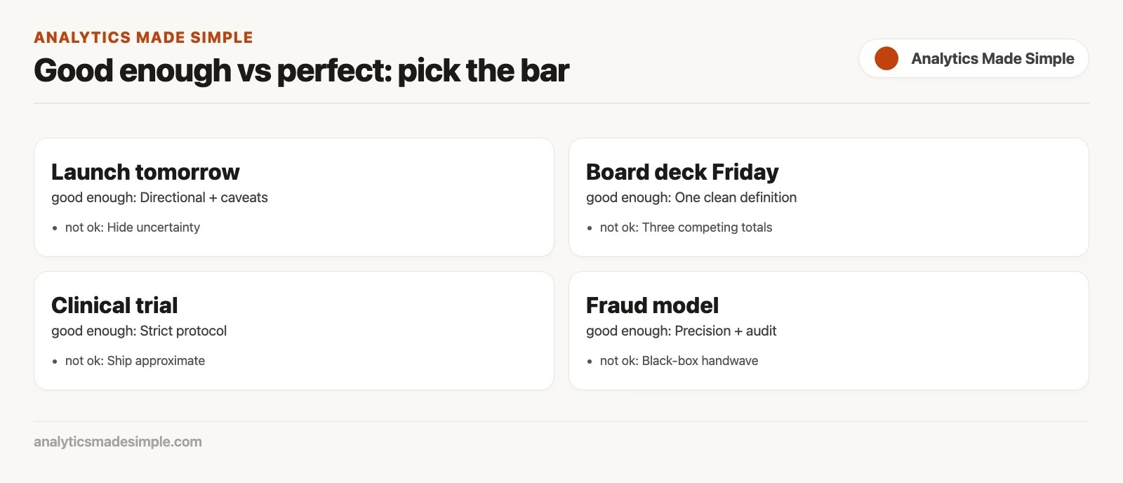
The core definition is written down and the known biases are named. The answer would not flip if you fixed the small holes tomorrow, which is why most day-to-day decisions belong in this zone.
4. High trust
Here the definitions have been audited, the data pipelines are monitored, and every metric has a named owner. You need this level for regulated reporting, for executive goals that drive bonuses, and for anything that will be compared month after month in public.
5. Overkill
You are polishing a metric while the decision window closed last week. Overkill is not the same as being thorough, because it spends effort on certainty that the decision does not need.
Three questions that tell you when data is good enough
Before you open another dashboard (a screen of charts that tracks key numbers), answer these out loud. Do it with the person who asked for the number if you can.
- What decision will change? If nothing changes either way, you are decorating a slide and not analyzing anything.
- What would flip the decision? If the number needs to move from 3% to 30% to matter, a fuzzy 3-ish is fine. If 3.1% vs 2.9% rewrites the plan, you need sharper work.
- Is the decision reversible? Cheap tests can run on directional data. Irreversible spend, layoffs, or legal commitments need higher trust.
These three questions fit the analytics loop, which runs from question to evidence to decision and then measures again. Good enough data keeps that loop turning, while waiting for perfect data stops it because the loop never starts.
Worked example: the “almost churn” report
Say the head of product wants monthly paid churn for a board update. In this made-up example, you know free trials leak into the paid table for about 4% of rows. You also know refunds show up a week late. The board meets tomorrow, so you have to choose what to hand over.
| Option | What you deliver | Risk | When it is OK |
|---|---|---|---|
| Hide and polish | Nothing until every trial is fixed | The board ends up using someone else’s number | Almost never for tomorrow’s meeting |
| Ship a fake-clean number | “Churn is 2.41%” | False precision, trust dies later | Never |
| Ship good enough with caveats | “~2.4% paid churn, trials partly mixed, refunds lag one week” | Someone ignores the caveats | Most operational and many board contexts if caveats are written |
| Ship a range + next step | “Likely 2.2-2.7% after trial cleanup; we will hard-fix by Friday” | Range feels “soft” to some leaders | When direction is clear and cleanup is scheduled |
Notice that the good enough path is not sloppy, because it is specific. It names the bias, gives a usable number, and sets a cleanup date, which is what professional work looks like. Pretending the number is laser-perfect is not.
Confidence language for non-stats people
You do not need to say “95% confidence interval” in a sales standup unless that room already speaks statistics. You do need to stop sounding either more certain or more hopeless than the data allows.
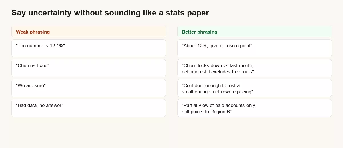
A few phrases that work in real meetings:
- “Directionally…” when you trust the sign, not the third decimal.
- “Best estimate, known bias: …” when the hole is known and bounded.
- “Not decision-ready for X, decision-ready for Y.” Example: not ready to reprice, ready to pick which region to investigate.
- “If the missing 5% were all worst case, the decision still holds.” This is the plain-English way to test how sensitive your answer is.
- “I would bet a lunch on this, not the budget.” It is informal, memorable, and honest.
If you do use a formal interval, keep the interpretation humble. A 95% confidence interval is a way to show how uncertain an estimate from a sample is. It does not mean the truth sits inside those two numbers with 95% probability, even though people wish it did. For most business rooms, a clear range plus a named bias beats a misused interval every time. For careful scientific wording of intervals, see resources like the Cochrane Handbook discussion of imprecision and intervals.
A practical quality checklist (before you hit send)
| Check | Question | If “no” |
|---|---|---|
| Definition | Can I write the metric in one sentence without jargon? | Do not ship until you fix the sentence. |
| Row meaning | Do I know what one row in the table stands for (one customer, one order, one day)? | Stop, because mixing up what a row means creates fake trends. |
| Population | Who is in and who is out? | Name the exclusion in the deliverable. |
| Time | Is the time zone, lag, and period clear? | Label “as of” and lag explicitly. |
| Flip test | Could known issues reverse the decision? | If yes, dig more or downgrade the claim. |
| Owner | Who fixes the data after we ship? | Assign a next step, not a shrug. |
This checklist is small on purpose, because ten-page data quality frameworks die in drawers while six questions that fit on a sticky note actually get used.
A lightweight SQL quality sketch
You do not need a full data-monitoring platform to refuse false precision. A few checks on the extract you are about to trust go a long way. The query below is written in SQL, the standard language for asking databases questions. It counts rows, flags known junk, and measures how big the junk is compared with the total.
-- Sketch: how big is the known mess before we quote churn?
WITH base AS (
  SELECT
    customer_id,
    plan_type,
    canceled_at,
    is_trial,
    refunded_at
  FROM analytics.customers
  WHERE as_of_date = DATE '2026-07-01'
),
flags AS (
  SELECT
    COUNT(*) AS n_customers,
    COUNT(*) FILTER (WHERE is_trial) AS n_trials_mixed,
    COUNT(*) FILTER (WHERE refunded_at IS NOT NULL) AS n_refunds,
    COUNT(*) FILTER (WHERE canceled_at IS NOT NULL) AS n_canceled
  FROM base
  WHERE plan_type <> 'internal'
)
SELECT
  n_customers,
  n_canceled,
  ROUND(100.0 * n_canceled / NULLIF(n_customers, 0), 1) AS churn_pct_raw,
  ROUND(100.0 * n_trials_mixed / NULLIF(n_customers, 0), 1) AS trial_mix_pct,
  ROUND(100.0 * n_refunds / NULLIF(n_customers, 0), 1) AS refund_pct
FROM flags;
If trial_mix_pct is 0.2%, you can usually quote a single number and mention the small leftover. If it is 12%, you either clean first or report a cleaned and a raw number side by side. The query is not magic, and the decision rule behind it is this: size the bias before you narrate the metric.
When waiting is the adult move
“Good enough” is not a free pass to be lazy. Wait, or dig harder, in these situations.
- The decision is hard to reverse and expensive, so a mistake would stick.
- You discovered that stakeholders dispute the metric definition, which means you do not have one problem but three.
- Ethics, privacy, or legal reporting is involved, because errors there carry real consequences.
- A known bug could flip the sign of the result, not just the second decimal.
- You are about to feed the number into a dashboard that people will treat as the final truth for months.
Even then, your job is not to become perfect. Your job is to name the blocker, estimate the fix, and offer a temporary directional view if one is safe.
Common mistakes
- False precision: reporting 12.473% because the spreadsheet showed it.
- Silent caveats: you know about the trial mix problem, but the slide does not mention it.
- Perfection as avoidance: endless cleaning to avoid a hard recommendation.
- One number for every audience: finance, product, and support may each need a different level of detail, so say which one you are giving.
- Confusing data with insight: a clean table is still not a decision. See the post on data, information, and insight.
Quick recap
Good enough data is not mediocre data. It is evidence that matches the stakes of the decision, with biases named and next fixes owned, while perfect data is a myth that only delays learning. Place the decision on the continuum, ask what would flip it, speak with honest confidence, and keep the analytics loop moving.
The next post in the series covers how to read a number carefully, including rates versus counts, denominators, and seasonality. Related posts already live cover key performance indicators and data literacy.
How to practice this week
- Pick one metric you already report, so the practice improves something people already read. Write its definition in one sentence.
- List the two biggest known data holes, and size them if you can, even roughly.
- Rewrite your last update in confidence language: direction, caveat, decision implication.
- Ask the stakeholder: “What would flip this decision?” Write the answer down. That answer tells you how precise the number really needs to be.
Sources
- Cochrane Handbook, Chapter 15 (interpreting results, confidence intervals, imprecision): https://www.cochrane.org/authors/handbooks-and-manuals/handbook/current/chapter-15
- DAMA International, data quality dimensions (accuracy, completeness, consistency, timeliness, and related concepts) in the DAMA-DMBOK body of knowledge: https://www.dama.org/cpages/body-of-knowledge
- Statsig, plain-language overview of confidence intervals in product and experimentation contexts: https://www.statsig.com/perspectives/confidence-intervals-how-they-help
- Analytics Made Simple, series links used above: problem framing, data vs information vs insight, analytics loop, KPIs, data literacy.
Keep going
Same lessons in your feed
Short diagrams, hooks, and weekly tutorials on Substack, Instagram, X, and Facebook.