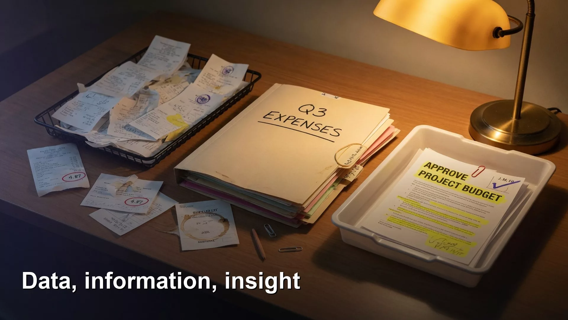
Data is raw facts, information is those facts organized so you can read them, and insight is the one conclusion that changes what you decide. Knowing which of the three you are holding tells you what is still missing.
Say a coworker drops a spreadsheet in your team channel and says, “Here’s the data.” Another replies with a chart and says, “Here’s the insight.” You have to make a budget call by Friday, and you still feel weirdly uninformed.
You are not being difficult. You are reacting to three different things that people keep calling by the same casual names. In this post we separate data, information, and insight in plain language, with workplace examples you can reuse in meetings without sounding like a textbook.
Here we look at what you are holding in your hands once your problem is clear: raw facts, organized facts, or something that actually changes a decision.
What you’ll learn
Example:
- Clear definitions of data, information, and insight (no jargon tax).
- One running workplace example at each layer.
- How to tell which layer a slide or dashboard (a screen of charts that updates on its own) is stuck on.
- A simple ladder you can climb on purpose (not by accident).
- How this fits roles, literacy, and the rest of the foundations series.
Why the mix-up costs real money
Teams ship “data dumps” and call them insights. Leaders ask for “more data” when they already have more rows than they can read. Analysts feel pressure to decorate tables until they look smart. None of that is inherently wrong or malicious. All of it burns calendar time.
If you only remember one idea from this article, make it this: more data is not the same as better understanding, and better understanding is not the same as a decision you trust. Each step up the ladder needs different work, different skills, and a different definition of “done.”
For how analytics sits next to BI (business intelligence, the reports and dashboards a company runs on) and data science as job labels, see Analytics, BI, Data Science, and More. That post is about roles and disciplines. This one is about the raw material those roles shape.
Data: the raw stuff
Example:
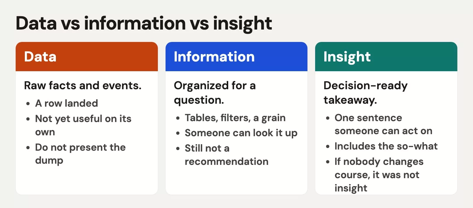
Data is recorded facts or measurements, still close to how they were captured: a row in a database, a sensor reading, a form submission, or a line in a log file. On their own, individual data points do not argue for a plan; they simply exist as raw inventory.
Everyday examples:
- A list of order IDs with timestamps and dollar amounts.
- Support tickets exported to a CSV file (a plain spreadsheet file with values separated by commas).
- Pageview events from your site.
- Survey answers sitting in a form tool.
Data can be correct and still useless for a decision if nobody has organized it, defined it, or asked a question of it. Data can also be messy: missing fields, wrong types, duplicate keys. Messy data still qualifies as data. Cleaning it is work you do on data so you can build information later.
Workplace example (data layer)
Ops exports last month’s shipments: 12,441 rows, one per package, with columns for warehouse, carrier, ship date, and delivery date. That export is data; opening it and scrolling is not analysis yet, but simply reviewing an inventory of facts.
Information: data with structure and meaning
Information is data that has been cleaned, labeled, filtered, summarized, or placed in context so a human can understand what is going on. Information answers “what happened?” and often “how much?” or “where?” It still might not tell you what to do next.
You create information when you:
- Agree on definitions (what counts as a “late” shipment?).
- Pick a grain (one row = one package, not one order).
- Filter noise (test accounts, cancelled orders).
- Aggregate (late rate by warehouse and week).
- Present a clear table or chart with labeled axes and units.
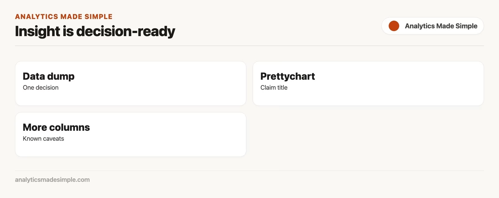
A dashboard full of accurate KPIs (key performance indicators, the few numbers a team tracks to see how it is doing) is usually information, not insight, until someone ties a number to a choice. That outcome is completely fine. Organizations need reliable information every day. The mistake is calling the dashboard “insights” and then wondering why nobody acts.
Workplace example (information layer)
From the same shipment export, you compute: percent of packages delivered more than two days after ship date, by warehouse, for the last eight complete weeks. You show a small table and a line chart. Viewers can see Warehouse B’s late rate climbed from 4% to 11%. That is solid information because people now know what happened, even if they still need to choose their next step.
Insight: understanding that changes a decision
Insight is a specific understanding, grounded in information, that reduces uncertainty about a decision. Insight is not a vibe, a hot take, or a slide title with a lightning bolt emoji. Insight answers “so what?” and points toward “now what?”
Good insight usually includes:
- A claim a skeptic could check against the information.
- A link to a decision owner and a real choice.
- Caveats (what you do not know yet).
- A suggested action or experiment, even if the action is “investigate X first”.
Insight is rarer than information because it requires judgment, domain knowledge, and the problem framing from part 1. Two analysts can share the same information and disagree on insight. That disagreement is healthy if it is about interpretations and tradeoffs, not about whether the table was built correctly.
Workplace example (insight layer)
You dig one level deeper into Warehouse B. The rise in late packages lines up with a carrier change for ground shipping on the west region, not with staffing hours. You recommend: (1) keep the new carrier for two more weeks on a small set of products only, (2) compare late rate and cost per package against the previous carrier on a fair sample, (3) decide go or no-go at next ops review. The primary decision owner is operations. The number is no longer “interesting.” It is a lever.
That package (claim + evidence + decision + next step) is insight. Looking at a chart alone was not enough.
Side-by-side: same story, three layers
| Layer | What you have | Typical output | Question it answers | “Done” looks like |
|---|---|---|---|---|
| Data | Raw recorded facts | Export, table, event stream | What was captured? | Accessible, documented fields |
| Information | Organized, defined, summarized facts | Clean metric, dashboard, report | What happened? | Agreed definitions, readable view |
| Insight | Decision-ready understanding | Recommendation with caveats | So what / now what? | Owner can choose with less uncertainty |
If your meeting ends with “interesting, thanks” and no owner takes an action item, you probably delivered information (or even raw data) dressed as insight.
A tiny worked example with numbers
Imagine five support tickets (data):
| Ticket | Created hour | Category | Resolved in hours |
|---|---|---|---|
| 1 | 21 | Billing | 30 |
| 2 | 10 | Login | 4 |
| 3 | 22 | Billing | 28 |
| 4 | 14 | Login | 3 |
| 5 | 23 | Billing | 26 |
Information: After-hours tickets (hour ≥ 20 or hour < 8) are 3 of 5. Billing tickets average much longer resolution than login tickets.
Insight (example): If the decision is whether to staff a night billing specialist, the pattern that matters is not “we have tickets at night.” It is “billing issues created at night sit almost a full day.” Recommendation: pilot one after-hours billing responder two nights a week for a month, measure median resolve time for night billing tickets, then expand or stop.
Those five rows show three different levels of usefulness. The jump from information to insight required a real decision around staffing rather than a fancier chart.
Optional SQL: from rows to information
You do not need SQL to understand the ladder. When you implement, SQL (the language used to ask databases for data) is a common way to turn data into information. The example below makes a small table of made-up support tickets, then counts them by time of day and topic:
-- Made-up practice data: one row per support ticket
CREATE TABLE support_tickets AS
SELECT * FROM (VALUES
  (TIMESTAMP '2026-09-02 09:15', 'billing', 3.0, FALSE),
  (TIMESTAMP '2026-09-03 14:40', 'login',   1.5, FALSE),
  (TIMESTAMP '2026-09-04 21:10', 'login',   9.0, FALSE),
  (TIMESTAMP '2026-09-05 23:30', 'billing', 12.0, FALSE),
  (TIMESTAMP '2026-09-06 02:05', 'login',   7.5, FALSE),
  (TIMESTAMP '2026-09-08 11:00', 'billing', 2.5, FALSE),
  (TIMESTAMP '2026-09-09 22:45', 'spam',    0.1, TRUE)
) AS t(created_at, category, resolve_hours, is_spam);

-- Information: ticket counts and average hours to resolve, by time of day and category
SELECT
  CASE
    WHEN EXTRACT(HOUR FROM created_at) >= 20
      OR EXTRACT(HOUR FROM created_at) < 8
    THEN 'after_hours'
    ELSE 'business_hours'
  END AS daypart,
  category,
  COUNT(*) AS tickets,
  ROUND(AVG(resolve_hours), 1) AS avg_resolve_hours
FROM support_tickets
WHERE created_at >= DATE '2026-09-01'
  AND is_spam = FALSE
GROUP BY 1, 2
ORDER BY 1, 2;
Running it in DuckDB (a free database that runs on your own computer) prints:
daypart        | category | tickets | avg_resolve_hours
after_hours    | billing  |       1 |              12.0
after_hours    | login    |       2 |               8.3
business_hours | billing  |       2 |               2.8
business_hours | login    |       1 |               1.5
That query (a request for data written in SQL) produces information. The insight still lives in the sentence you write for the staffing decision, plus the caveats (seasonality, product launches, incomplete resolve timestamps). For checking machine-written SQL before you trust it, see How to Check AI-Written SQL Before You Ship It.
How to tell what you are looking at
Use this quick self-check on any slide, thread, or dashboard tile:
- Mostly data: raw tables, “here’s the extract,” no definitions, no summary of what changed.
- Mostly information: clean metrics, trends, comparisons, clear labels, still no recommendation tied to an owner.
- Insight: “Because of X, we recommend Y for owner Z by date D, assuming A and B; next check is C.”.
If your organization loves the word “insights” in folder names, translate in your head: “Is this folder full of charts (information) or decisions (insight)?” Rename your own work honestly. Clarity always beats internal branding.
Climbing the ladder on purpose
A practical sequence for almost any request:
- Frame the problem (part 1): decision, owner, deadline, success shape.
- Locate data that could speak to it. Catalog the relevant fields, record grain, and note what is missing.
- Build information: definitions, filters, summaries, one clear view.
- Draft insight: one paragraph recommendation with caveats. If you cannot write it, you are not done, or the decision was never real.
- Decide and learn: record what was chosen and what you will measure next (foreshadows part 3, the analytics loop).
Skipping steps is how you get beautiful information nobody uses, or “insight” that is actually someone’s opinion with a chart wallpaper.
Common mix-ups (and kinder fixes)
1. Calling a data dump “analysis”
Fix: Always add definitions and a one-screen summary of what moved. If you only have time for one chart, make it the one tied to the decision.
2. Calling every chart an insight
Fix: Reserve “insight” for the sentence that connects evidence to a choice. Charts serve as helpful information vehicles.
3. Demanding insight with no decision owner
Fix: Go back to framing. Without an owner, the best you can do is information. That can still be valuable, but label it honestly.
4. Insight without checkable evidence
Fix: Point to the table, metric definition, and time window. Insight that cannot be audited becomes politics.
5. Stopping at information because insight feels “subjective”
Fix: Insight is judgment plus evidence, not pure opinion. Write the recommendation as a proposal: “Based on X, I recommend Y; risks are Z.” Invite challenge. That is adult collaboration, not soft science.
How this shows up in roles and literacy
Different jobs live on different rungs more of the time:
- Data engineering often ensures data is available, reliable, and movable.
- Analytics / BI often turns data into trusted information (metrics, self-serve, reports).
- Decision owners (PMs, marketers, ops leads, founders) need insight, even if an analyst drafts it with them.
- Data science may push into prediction and experiments, still worthless without a decision frame.
Everyone benefits from data literacy: knowing which layer you are on and what question it can honestly answer. For career maps, see Data Jobs Demystified.
Practice: label last week’s work
Take three deliverables from your last week (Slack answers count). For each, write one of: data / information / insight. Then ask:
- If it is data, what would it take to make information?
- If it is information, what decision could it serve, and who owns that decision?
- If it is insight, did anyone actually decide something?
Fifteen minutes of labeling will tell you whether your team is drowning in extracts, swimming in dashboards, or occasionally changing the business on purpose.
What’s next in this series
Part 3 covers the analytics loop: question to data to transform to answer to decision to measure again. That loop is how data, information, and insight keep cycling instead of dying in a slide archive. Later parts tackle “good enough” data and how to read numbers without fooling yourself.
When you are ready to build information with queries, the SQL series and Learn hub are waiting. Foundations first so the tools have somewhere useful to point.
FAQ
Is a KPI insight?
Usually not on its own. A KPI is a carefully defined piece of information. Insight is what you conclude and recommend because of how that KPI (and related context) looks. See All About KPIs for metric design.
Can insight exist without new data?
Yes. Sometimes the breakthrough is connecting information you already have to a decision you were avoiding. While collecting new data is optional, gaining new clarity is essential.
Isn’t “insight” just a buzzword?
It became one because people overused it. You can still use the word if you back it with evidence and a decision. If that feels too loaded, say “recommendation with evidence” instead. The ladder matters more than the branding.
Where does machine learning fit?
Models consume data and produce scores or predictions, which are a form of information (or proposed insight if they directly drive a choice). Without a decision frame, a model is an expensive way to generate more numbers.
Quick recap
- Data = recorded facts, still raw.
- Information = structured, defined, summarized facts that answer “what happened?”.
- Insight = understanding that reduces uncertainty for a real decision.
- Climb the ladder on purpose: frame, then data, then information, then insight.
- Label your work honestly so meetings stop rewarding decoration over decisions.
In one sentence: Data is what you captured, information is what you can understand from it, and insight is what you are willing to decide because of it.
Your next step
Take the last chart or table you shared and label it honestly: is it data, information, or an insight someone could act on? If it is information, add one sentence saying which decision it should change. That sentence is the difference between a report people read and one they skim.
Sources
Research and further reading used for this article:
- CMC Canada: Are you solving the right analytics problem? (problem clarity before methods)
- Indiana Wesleyan University: Data-driven decision-making overview (goals, quality, common pitfalls)
- AMS: What problem are we actually solving? (part 1 of this series)
- AMS: Analytics, BI, and data science differences
- AMS: What is data literacy?
- AMS: Data jobs demystified
- AMS: All about KPIs
- AMS: Learn hub
Keep going
Same lessons in your feed
Short diagrams, hooks, and weekly tutorials on Substack, Instagram, X, and Facebook.