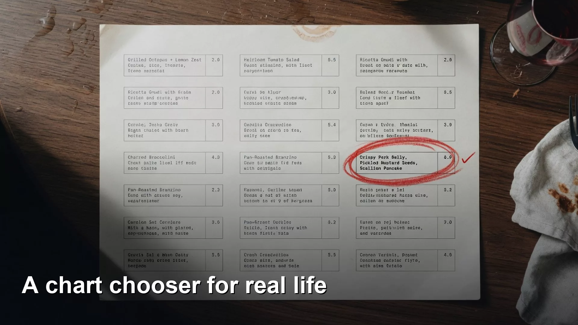
The right chart is the one that matches the question you are asking, and not the one that looks most impressive. Say your manager asks for “a nice chart of the funnel,” which means the steps from a demo to a paid customer. You open the template gallery and find a 3D pie, a stacked area chart that looks like a mountain range, and a radar chart that somehow made it into the product. You pick the one that looks busiest, because busy feels thorough. Two minutes later the room is arguing about the colors instead of the drop between demo and paid.
This post is part of the Charts that make sense series. The earlier post covered purpose, which means deciding whether a chart is for exploring, explaining, or persuading. Now we pick a shape that matches the question. Choosing a chart is not about fashion. It is about matching a relationship in the data to a mark that people can read under harsh office lights before a nine o’clock meeting.
Start with the relationship, not the template
Chart tools sell templates, but your brain needs relationships. The Financial Times Visual Vocabulary and many teaching charts from Stephen Few’s work sort graphics by what you are trying to show. Those goals include size, change over time, parts of a whole, spread, and how two measures move together. You do not need the full map on day one, because four relationships cover most workplace decks.

Start by asking what main relationship you want someone to see in under five seconds. Then pick the mark that makes that relationship easy to see. If two relationships both matter, you may need two charts, because one overloaded chart is not thrift. It is confusion with a legend.
Rule of thumb: Choose the chart that makes the wrong conclusion hard to reach, and not the chart that makes the right conclusion look fancy.
1. Comparison: who or what is bigger?
Comparison answers questions about ranking and size, such as which region sold more, which product line is slowest, or which campaign spent more than it returned.
Example chart for comparison, shown below:
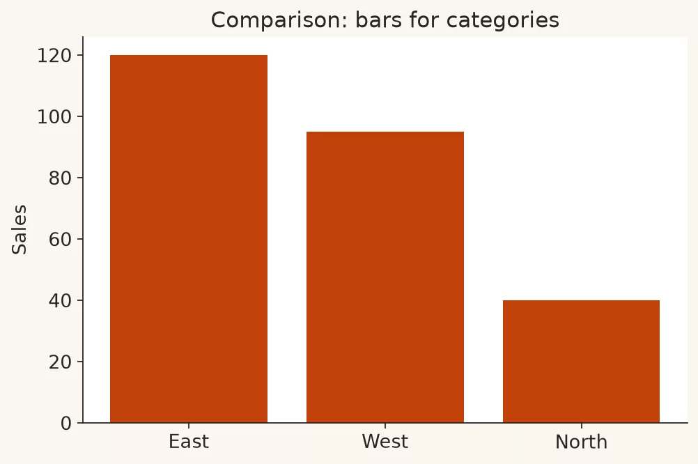
Default marks: horizontal or vertical bars. Horizontal bars work best when the category names are long. Sort on purpose, by value when you are ranking, and in a natural order only when the order itself is the story.
Good for: categories that share one main measure, and a few series side by side if they are clearly named.
Weak for: long time series, where a line works better. It is also weak for subtle shifts in parts of a whole, where careful stacked bars or a table of shares work better. Tiny differences across dozens of categories are better filtered, grouped, or put in a table.
Here is a workplace example. If the question is which three support queues need overtime this weekend, a sorted bar of open tickets by queue is almost always better than a pie of “queue mix.” The decision is a ranking, and a pie does not show a ranking well.
2. Trend: how did this change over time?
Trend answers questions about change, seasonal patterns, and turning points. Did orders recover after the outage? Is the weekly active user line flat while marketing spend rises?
Example chart for trend, shown below:
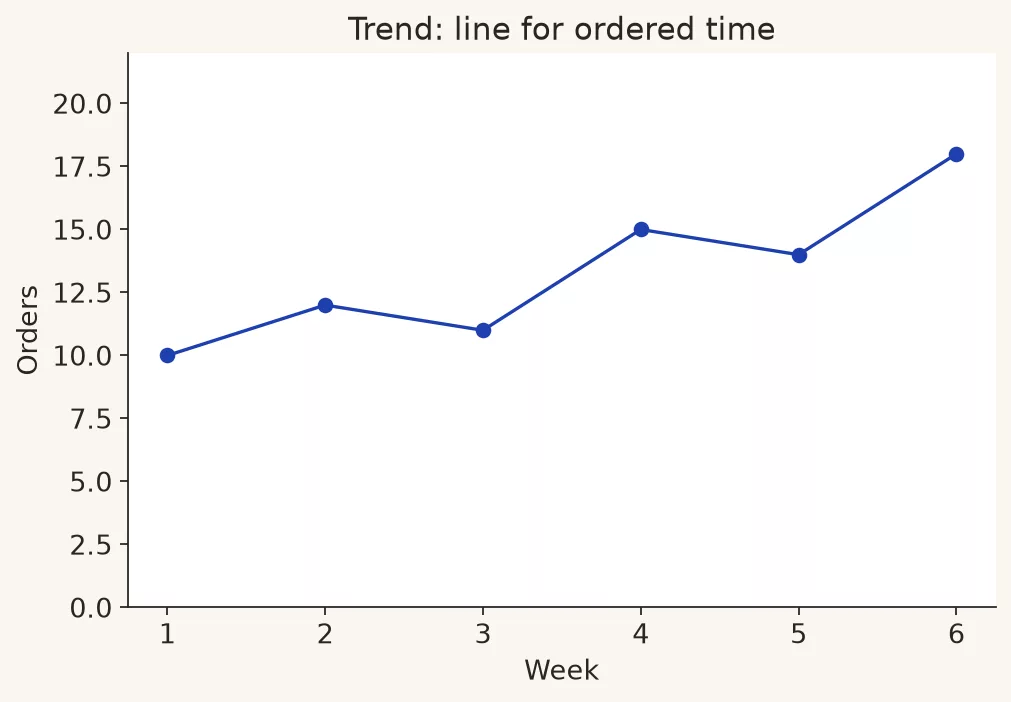
Default marks: lines for continuous time, and connected dots when the points are sparse. Bars can work for a few periods, but lines show change more clearly when the path matters.
Good for: one main series, or a few series that do not tangle into spaghetti. Short notes on the chart for events such as a launch, an outage, or a price change beat a rainbow legend.
Weak for: many categories over time, where a set of small side-by-side charts or a ranked snapshot works better. It is also weak for parts of a whole that must add up every period, because stacked areas can mislead when the eye follows the tops instead of the segments.
If you already built time totals in SQL (the standard language for asking a database for data) or pandas (a popular Python tool for tables), keep the time steps honest. A daily line with weekend zeros can look like a heart monitor, which is as much a problem with the shape of the data as with the chart. The basics and the quality checks still apply here, and you can read more in the analytics foundations series and the data quality series.
3. Composition: what makes up the whole?
Composition answers questions about the parts of a whole. What share of revenue does each plan bring in? What mix of ticket types arrived this week?
Example chart for composition is shown below. It uses stacked bars, and it keeps the number of categories modest.
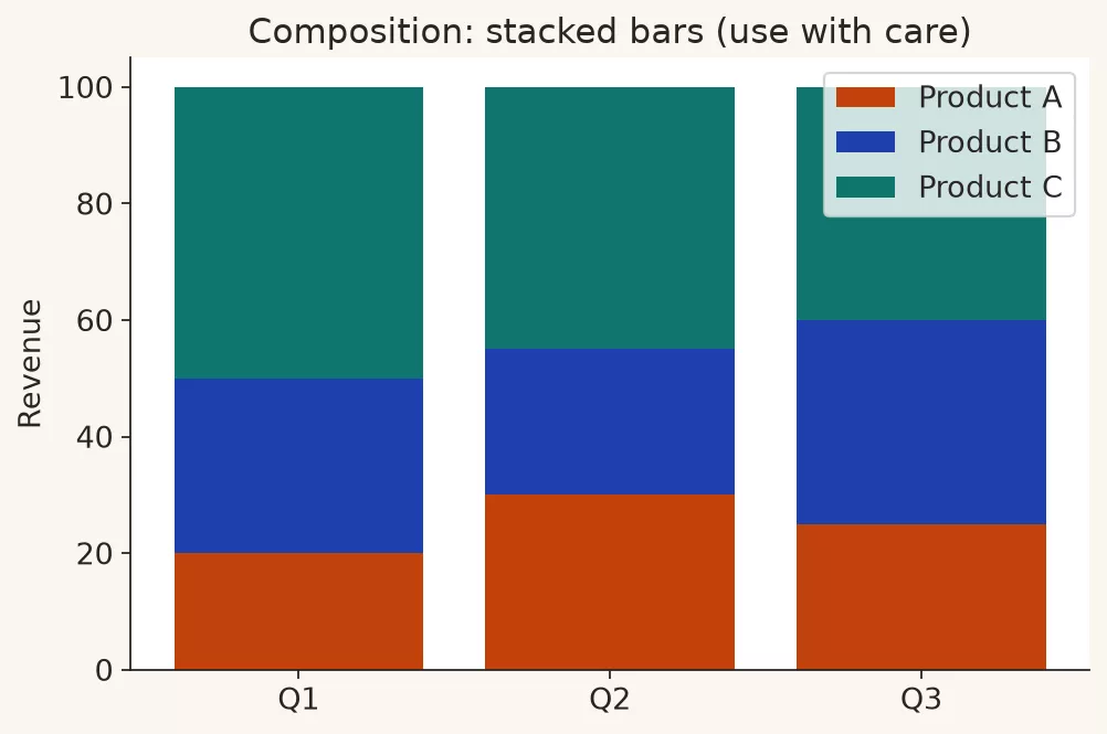
Default marks: stacked bars for comparing the mix across a few periods or categories, a simple bar of shares when you care about one period, and a table when exact percents matter more than a picture. Pies are optional and fragile. They work best with two to four large slices and clear labels, and they should never be the default for twelve product lines.
Good for: a small number of parts, stable definitions, and audiences who already know the total.
Weak for: many tiny slices, mixes whose definition changes partway through, and ranking questions that people misread inside a pie as “who is biggest.”
If the real question is a ranking, do not force a composition chart onto it. “East is 41% of tickets” is composition, while “East has the most tickets” is comparison. The two are related, but they belong on different slides.
4. Distribution: how are values spread?
Distribution answers questions about how values spread out, which way they lean, and which ones sit far from the rest. Are deal sizes clustered, or does one giant deal create the average? How long do tickets stay open for most customers?
Example chart for distribution, shown below:
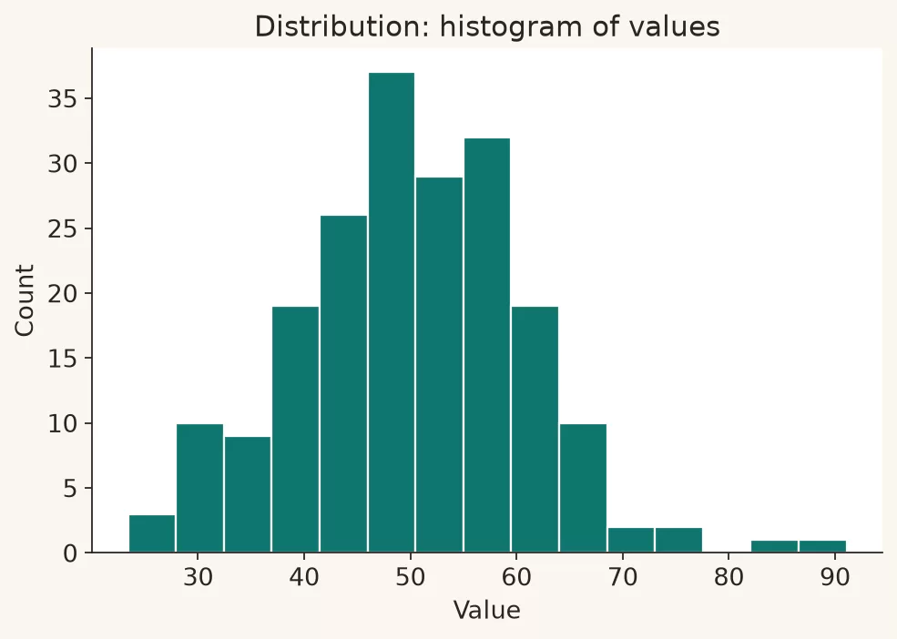
Default marks: a histogram, which is a set of bars that count values in ranges, for one continuous measure. A box plot or violin plot compares spreads across groups, and a strip or beeswarm plot shows individual points when you need to see people or deals without squashing them into one average.
Good for: challenging stories that rely only on the average, checking quality, and planning capacity where the slow tail matters.
Weak for: executive slides that only need a ranking, and tiny samples where a histogram looks scientific while hiding that there are only seven data points.
Distributions are underrated in slide decks. Many bad decisions start with “the average is fine” while half the customers wait twice as long. A single bar for the mean does not show how values spread, and it can hide the risk.
A useful phrase at work is “show me the middle and the tail.” The middle can be a median, which is the value in the center. The tail can be the 90th percentile (the value that nine in ten cases fall below), a count of long waits, or a simple histogram. Customer support, logistics, and sales cycles all live in the tail more than leaders admit. If your chart type cannot show spread, do not pretend a single bar answered the risk question.
Another trap is mixing unlike groups in one histogram, such as ticket ages for self-serve and enterprise customers together, or deal sizes across products with very different prices. When groups differ that much, compare them in separate panels placed side by side. One combined histogram can invent a “two-humped mystery” that is really just two products sitting in the same plot.
The 30-second chooser
| If the question sounds like this | Relationship | Start with |
|---|---|---|
| Which is biggest or smallest? | Comparison | Sorted bars |
| How did this change? | Trend | Line over time |
| What share of the total? | Composition | A stacked bar or bars of shares |
| How spread out are values? | Distribution | A histogram or a box plot |
| Do two measures move together? | Relationship | A scatter plot, used carefully |
| Do people need exact values to look up? | Reference | Table |
Scatter plots earn a place when the claim is that two measures move together or fall into clusters. They fail when people treat the shape of the cloud as proof that one thing causes the other. For most Monday decks, the four big jobs above cover the work.
When a table is the better chart
Analysts sometimes treat tables as something you graduate away from, which is backwards. Tables win in these situations.
- Exact values matter more than the pattern
- There are few rows but many measures
- People need to look up a single cell, such as what the West region did in week 4
- You would need a novel-length legend to explain the graphic
A clean table with one highlight can beat a decorative radial chart every day of the week. Making a chart is optional, but clarity is not.
Worked example: one dataset, four questions
Here is a small product sales extract for one quarter, where the units are order counts and the dollars are revenue.
| Product | Jan orders | Feb orders | Mar orders | Q1 revenue |
|---|---|---|---|---|
| Starter | 120 | 130 | 125 | $48,000 |
| Pro | 80 | 95 | 110 | $132,000 |
| Enterprise | 12 | 15 | 18 | $210,000 |
| Add-ons | 200 | 210 | 230 | $41,000 |
Question A: comparison
Suppose the question is which product drove the most revenue in the first quarter. You would draw sorted horizontal bars of first-quarter revenue, and Enterprise wins. Order counts would mislead here, because Add-ons are frequent and cheap. The chart type follows the measure that matches the decision.
Question B: trend
Suppose the question is whether Pro is gaining momentum in orders. You would draw a line for Pro orders from January through March, perhaps with Starter as a quiet comparison. A pie of the March mix does not answer a question about momentum.
Question C: composition
Suppose the question is what the revenue mix looks like. You would show each product’s share of first-quarter revenue as a simple bar of percents, or as a stacked bar if you also show last quarter. A four-slice pie can work if it is labeled with values, but bars make Enterprise’s lead easier to compare later when you add a fifth product.
Question D: distribution
This summary table cannot show how deal sizes are spread inside Enterprise. If the real risk is that three giant deals created the average, you need the deal-level extract and a histogram or box plot. The chooser also tells you when the table itself is at the wrong level of detail for the question. In that case, go back to SQL or the data warehouse (a central database built for reporting) and pull the detail, and do not reach for a fancier chart of the wrong data. The SQL series and Python series are for that step.
# Pseudo: map question -> view (not a full plotting tutorial)
question = "which product drove revenue"
if question.startswith("which") or "rank" in question:
    chart = "sorted_bar"
elif "over time" in question or "momentum" in question:
    chart = "line"
elif "share" in question or "mix" in question:
    chart = "share_bar_or_careful_stack"
elif "spread" in question or "typical deal" in question:
    chart = "histogram_or_box"
else:
    chart = "table_until_sure"
# If grain is wrong for chart, stop and re-aggregate upstream.
Never-do-this (and what to do instead)
| Never | Why it fails | Do this instead |
|---|---|---|
| 3D bars, pies, or exploded slices | Perspective distorts magnitude | Flat 2D bars or lines |
| Pie with 8+ slices | People cannot compare angles | Sorted bars or a table |
| Rainbow categorical colors by default | Legend hunting, print fails | Few hues, labels on marks |
| Dual axis for unrelated metrics | Invented “relationships” | Two charts or indexed series |
| Stacked area for many series | Middle layers are unreadable | Lines, small multiples, or ranking |
| Map when region names would do | Pretty geography, weak ranking | Bars sorted by value |
| Radar / spider for ordinary KPIs | Hard to read, easy to overclaim | Bars or a simple table |
These are not matters of taste. They are about whether people can read the chart under real meeting conditions, with a washed-out projector, people sitting in the back, and five minutes on the agenda. If a chart only works when you explain it for three minutes, it is still an exploring chart sitting in an explaining slot.
Also watch for chart types that drift across a series of weekly slides. Week one uses bars because ranking mattered, and by week four the slide has quietly become a stacked area because someone liked the look, and now the room is back to debating colors. Keep the type stable when the question is stable. Change the type when the question changes, and say so in one line of the title, so people do not have to relearn the visual language every Monday.
If you build charts from SQL results, keep the totals close to the question. A perfect chooser cannot rescue data at the wrong level of detail. Build the table for the relationship you need, and then pick the mark. That order matches how solid analytics work already runs in the SQL series: which says to query the data, meaning ask the database for exactly what you need, for the decision and not for a random dump that you hope a chart will magically clarify.
Common mistakes
- Picking the template that matches the brand colors instead of the question.
- Using composition charts for ranking decisions.
- Showing trends with unordered categories along the bottom. Time belongs in order, but labels like priority levels do not make a trend.
- Spaghetti lines: eight series crowded into one plot when small side-by-side charts would be clearer.
- Average-only bars when the distribution is the risk.
- Charting before checking definitions. A perfect line of the wrong metric is still wrong, so check quality first when totals disagree.
- Assuming hover pop-ups will save a dense static export. A PDF or a screenshot loses the hover.
Quick recap
- Match the relationship to the mark: comparison, trend, composition, or distribution.
- Start from the question, not the template gallery.
- Tables are valid. 3D and pie overload usually are not.
- If the data is at the wrong level of detail, fix the data step and not the chart’s appearance.
- One chart, one primary relationship.
How to practice this week
- Take three charts from a recent deck and label each one as comparison, trend, composition, or distribution.
- For each, write a better question that the chart should answer. If the type does not match, redesign it in ten minutes.
- Replace one pie with sorted bars and show both to a colleague, then ask which ranking they can read faster.
- Find one place where a table would beat a chart, and ship the table without apology.
- Keep a sticky note with the four jobs on your desk until choosing becomes automatic.
More learning paths live on Learn.
Series notes: This is Part 2 of Charts that make sense. The next post covers axes, scales, and honest baselines, because a good chart type with a dishonest scale still misleads.
Sources
- Financial Times, Visual Vocabulary: https://github.com/ft-interactive/chart-doctor/tree/master/visual-vocabulary
- Stephen Few, Perceptual Edge: https://www.perceptualedge.com/
- Alberto Cairo, functional visualization teaching: https://www.albertocairo.com/
- Datawrapper Academy, chart type guidance: https://www.datawrapper.de/charts
- From Data to Viz (decision tree for chart types): https://www.data-to-viz.com/
- matplotlib gallery (implementation examples when you plot in Python): https://matplotlib.org/stable/gallery/index.html
- Analytics Made Simple, the earlier post in Charts that make sense, reachable via Learn: https://analyticsmadesimple.com/learn/
Keep going
Same lessons in your feed
Short diagrams, hooks, and weekly tutorials on Substack, Instagram, X, and Facebook.