A chart can be correct, with honest axes, and still fail once it reaches the projector. Color and labels are accessibility decisions, not brand decoration. If a colleague cannot tell which line is which, the analysis was wasted at the last step.
Say you build a status chart that uses only traffic-light red and green. On the black-and-white printout for the meeting, “on track” and “blocked” come out the same gray. Labels next to the bars would have survived the printer. The color legend did not.
Here is the same trouble on a projector. The legend is a row of soft pastels. Red means down, green means up, and red also means “Enterprise” because the brand guidelines said so. Someone in the back asks which line is West. Someone else is colorblind. That person has been decoding charts by position for years while the meeting talks about “the red one.” The printouts for people who joined offline turn everything into similar grays. The analysis did not fail, and the last mile did.
Color is a privilege, not a requirement
People compare position and length more easily than they compare hue, which is why bars and lines work so well. Color should reinforce a story that already exists in position. It should not carry the whole story alone. The Web Content Accessibility Guidelines (WCAG) state the web version of this idea. Success criterion 1.4.1, called Use of Color, says not to use color as the only way to show information. Charts are not exempt just because they live in a slide.
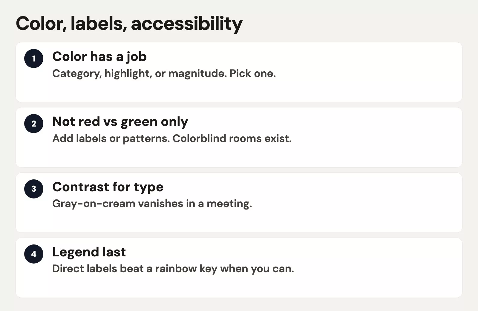
In practice, ask yourself three questions about any workplace chart:
- If you removed all hue, could someone still rank the categories?
- If the chart is printed in grayscale, does the story survive?
- If two series share a color family, do labels still separate them?
Rule of thumb: Design the chart in grayscale first. Add color only where it reduces search time, because a chart that works in gray still works for readers who cannot see some colors.
Do not rely on red and green alone
Red and green traffic lights are corporate muscle memory, with green meaning good and red meaning bad. Many people with red-green color vision deficiency cannot tell those two hues apart reliably. Even people with typical color vision run into trouble. Red and green fight with brand colors and with holiday art on the same slide. Projectors wash them out too.
Visual example: below, a red and green only status chart sits next to a blue and orange version with numeric labels. The meaning of the second one survives grayscale and colorblind viewing.
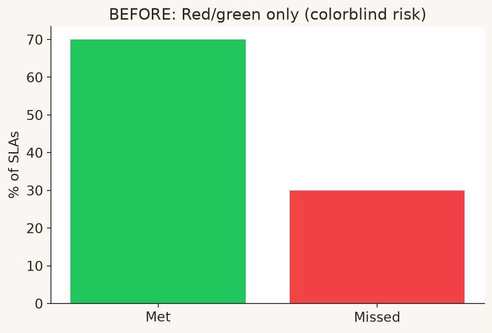
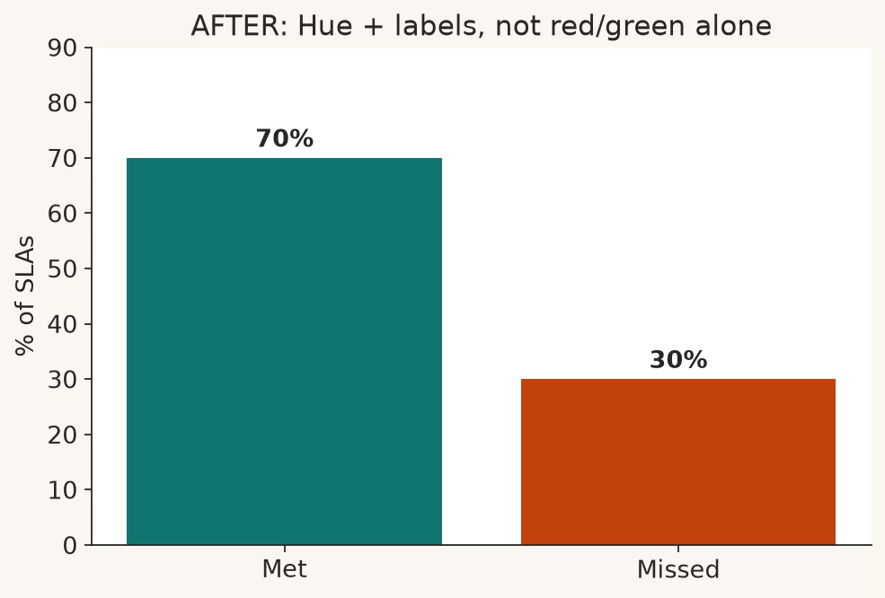
Better patterns for showing status include these four:
- Use a shape or icon plus color, such as a triangle versus a circle, and not only hue
- Use text labels such as “Above target,” “On track,” and “Below target” so people who cannot tell red from green still read the status”
- Use a single hue ramp for magnitude, and a separate neutral color for missing data, so more always looks darker and a gap never looks like a low value
- Use blue and orange pairs when you need two hues that separate better than red and green do for many viewers
ColorBrewer was developed for mapmaking, and it remains a practical palette reference for ordered, two-direction, and unordered color schemes, including colorblind-friendly options. You do not need to memorize hex codes, which are the short codes that name a color on screen. You do need a short approved set for your team, so that every deck does not invent a new rainbow.
Team habits help more than personal taste. Publish a tiny internal note that lists four category colors, one ramp for ordered values, and one ramp for values around a midpoint. Add a neutral gray for “other” or “not selected.” Link ColorBrewer or your design system once. Then stop debating hex codes in every analytics review. Consistency is an accessibility feature. When West is always the same hue across decks, people look at the numbers instead of relearning the legend.
Be careful when you use brand colors as data colors. Brand orange for the company logo is fine in a corner. Brand orange that means “bad,” “selected,” and “Enterprise segment” all at once is a collision. Reserve alert color for alerts and category colors for categories. If brand guidelines fight readability, readability wins for analytical charts. Marketing can keep the poster, and operations needs the truth at a glance.
Palette types you actually need
| Palette type | Use when | Workplace example |
|---|---|---|
| Qualitative | Categories with no order | Regions, product lines |
| Sequential | Low to high of one measure | Ticket volume heat by day |
| Diverging | Values around a meaningful midpoint | Difference from plan, plus or minus |
A common mistake is using a rainbow scale for ordinary amounts. Rainbows create false boundaries and odd emphasis in the yellow band. Prefer a single-hue ramp for volume. Use a two-direction ramp only when the midpoint is real, such as zero variance, break-even, or a 50% share.
Keep category colors few. If you need eight categories, you probably need filtering, grouping into “Other,” small multiples (the same small chart repeated for each group), or a table. Color is not a filing system for infinite series.
Labels beat legends
Legends make the eye travel from mark to legend and back again. Direct labels put the name right next to the line or bar. Titles state the claim. Subtitles carry the units and filters, and axis titles name the measure. Together they cut the “what am I looking at?” tax that eats the first thirty seconds of a meeting.
Use this label checklist:
- Title: what happened or what to decide, not “Chart 1”
- Subtitle: the time window, the unit, and the population filter
- Axis titles: needed when the unit is not obvious from the tick labels
- Direct labels: series names at the end of lines when space allows
- Value labels: used sparingly on bars, when exact numbers matter and clutter stays low
- Footnotes: definition caveats, missing weeks, and currency
Annotation is its own habit, and a later post in this series covers it. For now, one idea is enough. If a color legend is the only way to name four lines, try labeling the lines instead. Your colorblind colleague and your grayscale PDF will both thank you.
Contrast that survives projectors
WCAG 2.1 gives contrast guidance for text, expressed as ratios between text and background. The usual numbers are about 4.5 to 1 for normal text and 3 to 1 for large text. That is Level AA, the middle of the three levels. Chart text is still text. Light gray labels on a cream background may look “minimal” on your laptop and then vanish in a conference room.
These contrast habits help for charts:
- Prefer dark text on a light background for labels in print and slides
- Avoid thin light-gray gridlines that make eyes strain, and either keep grids light but present or remove them if labels already orient the reader
- Do not place low-contrast white text on yellow bars
- Test the slide in presentation mode from the back of a room when the decision is expensive
Accessibility is not only compliance language. It is reliability. More people understand the number faster, including you on a phone between meetings.
Patterns, order, and non-color encodings
When categories must stay distinct without hue, you have four options:
- Line styles, such as solid and dashed, for two or three series
- Marker shapes on sparse series
- A consistent left-to-right or sorted order, so position carries identity
- Small multiples on the same scale, instead of one crowded multi-color plot
Patterns on bars can help in print, but dense hatching can look like noise on a projector. Prefer direct labels and fewer series before you invent a texture zoo.
Tool notes without a product tutorial
In spreadsheets, the default palettes are often bright and unordered even when your data is a smooth range, so override them. In reporting tools such as Tableau and Power BI (business intelligence software), pick colorblind-safe palettes. Check the grayscale or colorblind preview if your team uses one. In Python, matplotlib and related libraries let you set palettes explicitly and export sharp, high-resolution figures so labels stay readable (see Python for analytics). The tool is not the standard. The standard is a chart that is readable without hue, labeled without hunting, and honest without theater.
Worked example: from traffic lights to readable status
Imagine an operations team that reviews a weekly service scorecard. The old version uses red and green cell fills only. The table below is the underlying data, where SLA means service level agreement, the promise about how quickly tickets get handled.
| Queue | SLA met % | Target | Vs target (pp) | Open tickets |
|---|---|---|---|---|
| Billing | 97.2 | 95 | +2.2 | 40 |
| Onboarding | 93.1 | 95 | -2.0 | 120 |
| Technical | 94.8 | 95 | -0.2 | 210 |
| Enterprise | 98.5 | 97 | +1.5 | 25 |
The old design has four problems:
- Status is only a red or green fill
- Onboarding and Technical both look “bad” with no sense of how bad
- The open ticket load is invisible, so any staffing talk is ungrounded
- Enterprise green looks like victory even if the volume is tiny
To redesign it for explaining or persuading, you would make these five changes:
- Use horizontal bars for the SLA met %, with a target reference line at each queue’s target
- Add direct labels with the queue name, the SLA value, and “below target” text where needed
- Add a second small bar or label for open tickets so the load is visible
- Use one accent color for below-target queues, instead of a full red and green system
- Write the title as “Onboarding misses SLA with high open volume; Technical is near target with the largest queue”
# Pseudo styling rules (tool-agnostic)
for row in scorecard:
    label = f"{row.queue}: {row.sla:.1f}% (target {row.target}%)"
    if row.sla < row.target:
        status_text = "below target"
        accent = "highlight"  # one accent, not red/green pair
    else:
        status_text = "on or above target"
        accent = "neutral"
    draw_bar(value=row.sla, label=label, accent=accent)
    annotate(f"{row.open_tickets} open")
# Grayscale test: export without accent colors and re-read labels.
After the redesign, a colorblind viewer and a grayscale printout still show the ranking, the distance to target, and the load. That is what makes a chart good enough to decide from. It also connects to the foundations, because the metric definitions still need to be trustworthy (see data quality and analytics foundations). A pretty, accessible chart of the wrong SLA definition is still wrong.
For a quick peer review, attach the chart to a team chat message and ask three questions:
- What is the takeaway in one sentence?
- Which series or category is which, without guessing from a legend?
- What would you still understand if this were grayscale?
If the answers diverge wildly, fix the labels and encodings before you debate the business recommendation. Many “data disagreements” are really decoding disagreements. Clear charts cut down on fake conflict. The room can then spend its time on real choices.
Common mistakes
- Red and green only status systems with no text or shape backup.
- Rainbow heatmaps for ordinary ordered data.
- Legends far from the marks, with eight near-identical hues.
- Light gray everything for a “clean” look that fails in real rooms.
- Encoding two meanings with one color, such as brand color and alert color.
- Tiny labels that only the author can read on a laptop.
- Relying on hover tooltips for names that never appear on the static export.
Quick recap
- Do not make color the only encoding.
- Avoid red and green only status, and add text, shape, or position.
- Prefer direct labels over legend marathons.
- Check contrast for projectors and grayscale.
- Fewer series and clearer titles beat a clever palette.
How to practice this week
- Print one dashboard (a screen of charts that updates as new data comes in) page in grayscale, or drain the color from a screenshot. Then fix anything that disappears.
- Replace one red and green status column with text plus a single accent color.
- Move series names from a legend onto the chart for one multi-line plot.
- Pick a palette of four category colors at most for your team, and reuse it for a month.
- Increase the label size one step on your default template, and check it on a projector if you can.
Browse more paths on Learn. The next post in the series compares dashboards with single slides. Color and labels work best inside views that do not try to answer every question at once.
Series notes
This is Part 4 of Charts that make sense. The previous post covered axes and scales, and the next one covers dashboards versus single slides.
Sources
- W3C Web Accessibility Initiative, Understanding Success Criterion 1.4.1 Use of Color: https://www.w3.org/WAI/WCAG21/Understanding/use-of-color.html
- W3C Web Accessibility Initiative, Understanding Success Criterion 1.4.3 Contrast (Minimum): https://www.w3.org/WAI/WCAG21/Understanding/contrast-minimum.html
- ColorBrewer 2.0 (colorblind-friendly palette reference): https://colorbrewer2.org/
- Stephen Few, Perceptual Edge: https://www.perceptualedge.com/
- Alberto Cairo: https://www.albertocairo.com/
- matplotlib documentation on colors and colormaps: https://matplotlib.org/stable/users/explain/colors/colormaps.html
- The IBM design language guide to color for data visualization (colorblind-safe guidance): https://www.ibm.com/design/language/color
- Analytics Made Simple, Python for analytics: https://analyticsmadesimple.com/series/python/
Keep going
Same lessons in your feed
Short diagrams, hooks, and weekly tutorials on Substack, Instagram, X, and Facebook.