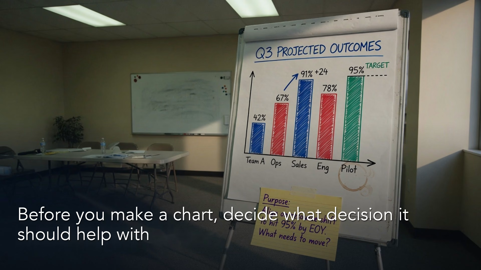
A chart earns its place in a deck only when it helps someone make a decision. Most charts skip that step, and the room can tell.
Imagine you are finishing a slide deck, and you paste in a colorful chart from the weekly export to cover the metrics section. Nobody can name the decision the chart supports, the title just says “Revenue overview,” and the colors are loud. The room nods because the chart looks like analytics happened. Then your director asks a simple question: “So what do we do differently on Monday?” The chart did not fail at being pretty. It failed at having a job.
This post opens a series called Charts that make sense, written for people who put charts into decks, chat threads, and dashboards (screens of charts that update as new data comes in). We start before chart types, axes, or color palettes, with the purpose of the chart. If you skip purpose, every later choice is decoration with a legend.
A chart is a job, not a decoration
Finish this sentence out loud before you click Insert Chart: This chart helps someone decide whether to ___. If you cannot finish it, you are making atmosphere, which is fine for personal exploration but a problem when it lands in a leadership deck as if it were a recommendation.
That habit matches Analytics foundations: question before output. A plot without a question is a screenshot of your curiosity, while a plot with a question is a decision tool. Stephen Few’s practical writing on business graphs keeps returning to the same idea, which is that graphs exist so people can see relationships in numbers that a table hides behind effort. If the relationship is not clear, the graph has not done its work.
Alberto Cairo’s teaching on functional visualization makes a related point: charts are arguments about data, not free art. You can still care about craft, because craft is how the argument stays honest and readable, but craft does not mean adding more gradients.
Rule of thumb: If the chart vanished and nothing in the meeting would change, it was decoration.
Tools do not fix this problem. Google Sheets, Tableau, Power BI (Microsoft’s business intelligence, or BI, tool for reports), and notebook plots (charts made in a notebook, a document that mixes code, results, and notes) all make it easy to produce a default chart in under a minute. Defaults are not evil, but they are unfinished, and your job is to finish the sentence that the default never asked.
Think about the last deck you sat through. Count how many charts were there “for completeness.” Completeness is not a job. It is a fear of being asked a question you did not prepare for, and a shorter deck with three purposeful charts beats twelve slides of atmospheric graphics every time. Leadership rarely complains that you removed a chart that never changed a decision, but they do notice when every slide demands attention and none of them answers the open question.
Purpose also protects your calendar, because when a stakeholder asks for “a visual,” you can answer with a clarifying question instead of a two-hour detour: “Are we still exploring, or do you need a chart people can share as the explanation?” That one sentence saves you a rebuild, and it also trains the organization to treat charts as communication products with owners, not as automatic exports from every query (a request that pulls data from a database).
Three jobs: explore, explain, persuade
Most workplace charts fall into three jobs. They can share the same data, but they should not share the same design.

Explore: find what is going on
Explore can look messy on purpose, because you are hunting for a pattern and not presenting one.
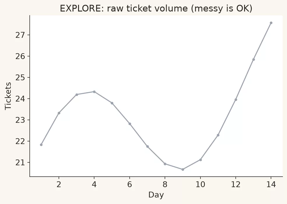
Exploration charts are for you, your pair, or a small working group that still expects surprises. You are allowed some mess here, so you may keep extra series, rough filters, and notes in the margin. The success test is not beauty but learning: what pattern appeared that you did not expect?
Typical explore moves:
- Plot raw weekly values before you average them.
- Split by region and notice one region drives the total.
- Compare count and rate side by side so a small base does not trick you.
- Zoom into a weird spike and check the date the data was pulled.
Exploration often sits next to data quality work from the data quality series. A spike can be a real campaign, or it can be a batch of records that loaded late, so exploring with a suspicious eye is professionalism rather than cynicism.
Do not ship explore charts as final. The common failure is pasting your tangled notebook plot into a board pack because that is what you were looking at. What you were looking at is a lab bench, and the board should get a clean lab report.
Explain: help people see the same story
Explain is cleaner: one claim, fewer series, a takeaway the room can share.
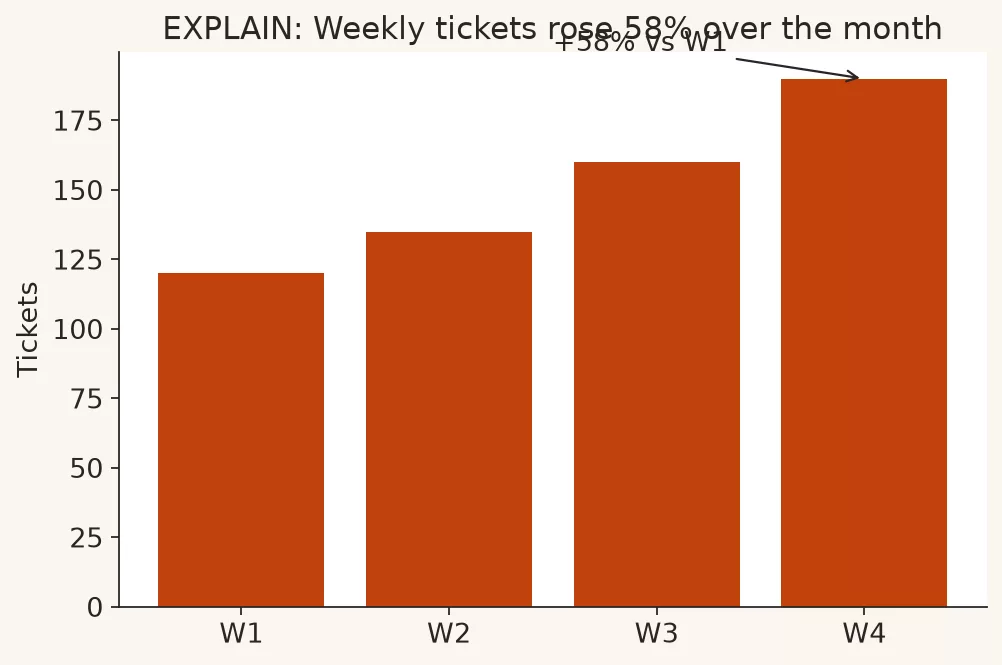
Explanation charts are for shared understanding. The audience should leave with the same picture of what happened, even if they still disagree about what to do. Titles get clearer and lines get fewer, and labels answer the first two questions people will ask. You remove the noise that only made sense while you were hunting.
Typical explain moves:
- Show the trend with one comparison line, not six overlapping brands.
- Put the unit and time window in the subtitle so nobody has to guess.
- Highlight the one category that changed the total.
- Add a short note for known caveats (definition change, missing week, currency).
Explanation is where axis honesty and label craft matter most, because many people will only see this one view. If your SQL (the standard language for asking a database for data) or Python work already produced a clean table (see the Python for analytics path, especially the plotting part), the explanation chart is the communication layer on top of numbers you already trust.
Persuade: make a decision easier to take
Persuasion charts still have to be true, so they are not a free pass to cut the axis until your favorite option looks heroic. Persuasion means you have a recommendation, and you design the view so the relevant comparison is unavoidable.
Typical persuade moves:
- Lead with the option ranking that matches the decision.
- Show cost or risk next to upside so the pitch is not one-sided.
- Use a before and after comparison, or a with and without comparison, when the action is a change.
- Write a title that states the claim, then let the chart prove it.
Persuasion fails in two opposite ways. The soft way is to present every series and hope the room invents the recommendation. The hard way is to overstate by design, with a clipped baseline, two vertical axes that invent a fake relationship, or color that screams emergency. Both waste trust, and trust is the only long-term currency analysts have.
A purpose checklist before you chart
Use this as a sticky note next to your monitor. It takes two minutes, and it saves twenty minutes of rework after the first review comment.
| Prompt | Example answer |
|---|---|
| Who is the primary viewer? | The operations lead in the Tuesday stand-up |
| What decision is open? | Move two support hires between regions |
| Job of this chart? | Explain volume so the move is grounded |
| What must be true in the data? | Same definition of “active ticket” for all regions |
| What can we drop? | Brand colors, unused product lines, daily noise |
| What is the one sentence if the chart freezes? | East and West carry most volume this month |
If the decision is not open, you may not need a chart at all. A status that never drives action can live in one sentence, such as “Tickets are within normal range.” Charts earn their space when a relationship is hard to see in text.
Same data, three jobs: worked example
Imagine a mid-size software company looking at support ticket volume by region for the last six weeks. The product team wants more staffing, finance wants proof, and operations wants a plan that will not create a new fire elsewhere. Here is the weekly total table after a clean data pull.
| Week | East | West | North | South | Total |
|---|---|---|---|---|---|
| W1 | 420 | 390 | 140 | 95 | 1045 |
| W2 | 435 | 400 | 150 | 90 | 1075 |
| W3 | 450 | 410 | 155 | 100 | 1115 |
| W4 | 480 | 430 | 160 | 105 | 1175 |
| W5 | 510 | 455 | 165 | 110 | 1240 |
| W6 | 530 | 470 | 170 | 108 | 1278 |
Nothing exotic here, just four regions over six weeks with a rising total. Purpose still decides the chart.
Explore version
In exploration you might plot all four regions as lines, keep the daily extract open in another tab, and check whether South’s flatness is real or a reporting lag. You might also plot each region’s share of the total, because a rising total with a stable South share is a different story from a rising South share. You might sketch a grid of small charts, one per region, so the scales stay comparable, and you keep notes such as “W4 East spike after release notes?” Mess is allowed at this stage.
Here is a rough workflow (the usual sequence of steps for getting a task done) that works in any tool:
# Explore notebook sketch (not a share slide)
# 1) plot each region over weeks
# 2) plot region share of total
# 3) flag weeks where any region moves >10% week over week
# 4) write questions in a cell, not a title:
#    - Is East growth support load or product adoption?
#    - Is South under-reported or truly smaller?
for region in ["East", "West", "North", "South"]:
    plot_line(week, tickets[region], label=region)
annotate_open_questions()
do_not_export_to_board_pack()
Explain version
For the weekly ops review you need shared understanding. One good explain chart is a stacked or grouped view of volume with a clear subtitle: “Weekly support tickets by region, W1 to W6.” Even better is a line for total plus a bar ranking of the latest week’s volume, if your tool can keep both honest. The title can be factual without being theatrical: “Ticket volume rose about 22% from W1 to W6; East and West still dominate.”
What you drop for explain: daily noise, unused brand colors, product-line breakdowns that nobody asked for this week. What you keep are the units, the time window, and the relative size of regions, so that “South is exploding” does not win the room through percentages alone.
Persuade version
Suppose the recommendation is: add capacity to East first, watch West, do not staff South based on percent growth alone. The persuade chart ranks latest-week volume (or a short average of recent weeks) and shows growth in a secondary encoding only after the absolute level is clear. The title states the claim: “Staff East first: it carries the largest volume and the largest recent increase.”
You might also show a small table under the chart with headcount already assigned, because persuasion without constraints is fantasy. Charts do not hire people. Managers do, working with incomplete information, and your job is to reduce that gap without inventing certainty.
| Job | Primary view | Title style | What you hide |
|---|---|---|---|
| Explore | All series, extra cuts | Questions, not claims | Almost nothing yet |
| Explain | Few series, clear units | What happened | Lab notes and dead ends |
| Persuade | Decision ranking with context | What we should do | Distracting alternatives |
How purpose changes design choices
Purpose is not a soft preface. It changes concrete choices:
- Chart type: ranking bars for a staffing decision, lines for a trend explanation, scatter only if the relationship is the point.
- Aggregation: daily for explore, weekly for explain, latest window for persuade.
- Annotation density: heavy notes in explore, few sharp callouts in explain, one claim-aligned callout in persuade.
- Audience control: interactive filters for analysts, and a static image for a board PDF that cannot be clicked.
- Uncertainty: show missing weeks and definition changes early instead of hiding them to keep the story clean.
If you later use matplotlib in a notebook (covered in Python for analytics), the code is not the hard part. The hard part is knowing whether you are exporting a scratch figure or a share figure. Two folders named scratch/ and share/ help with that, and this simple split stops exploration mess from becoming the official chart.
Purpose also changes how you handle disagreement. In exploration, disagreement is fuel: two people can chase different cuts and compare notes. In explanation, disagreement about the picture is a problem to resolve with definitions and filters. In persuasion, disagreement about the action is expected, but disagreement about the facts on the slide should already be closed. If stakeholders still argue about what a number means, you are not ready to persuade, so go back to explain, or further back to data quality and metric definitions.
A practical meeting trick: label the slide corner with the job in tiny type for your own drafts (EXPLORE, EXPLAIN, PERSUADE). Remove the label before you send. The label is not there for branding. It makes you pause long enough to notice when you are about to paste a lab bench into a decision packet.
Common mistakes
- Default titles. A title like “Chart 1” or “Sheet1” tells the room you did not finish the thought.
- One chart, three jobs. A single slide tries to explore, explain, and sell a reorganization at once, so split it into separate charts.
- Persuasion without a decision owner. Pretty ranking charts shown to an audience that cannot act become theater.
- Explaining with exploration clutter. Six lines in six colors is not thorough, only unresolved.
- Hiding caveats to keep the story smooth. Smooth stories break in the Q&A and take your credibility with them.
- Treating the chart as the analysis. The analysis is the chain from question to definition to number to claim, and the chart is only the last mile.
- Copying a template that was built for a different job. Last quarter’s “executive overview” may not fit this week’s staffing decision.
Quick recap
- A chart is a job: help someone decide, understand, or discover.
- Explore charts can be messy, explain charts must be shared, and persuade charts must be true and shaped around a decision.
- The same table can serve three jobs with three different designs.
- Write the decision sentence before you open the chart tool.
- If the chart can vanish without changing the meeting, cut it.
How to practice this week
- Pick one chart you already sent in the last two weeks.
- Label it explore, explain, or persuade, and be honest about which one it really was.
- Write the decision sentence it was supposed to support. If you cannot, rewrite the chart or delete it.
- Produce a second version for a different job using the same table, and notice what you remove.
- Ask a colleague to state the takeaway in one sentence without you coaching. If their sentence mismatches yours, the chart is still exploring.
When you want more paths around charts, metrics, and SQL foundations, start from Learn. The next post in this series picks chart types for comparison, trend, composition, and distribution, with a short never-do-this list.
Sources
- Stephen Few, Perceptual Edge (practical guidance on graphs for business): https://www.perceptualedge.com/
- Stephen Few, Show Me the Numbers (book site overview and resources): https://www.perceptualedge.com/library.php
- Alberto Cairo, teaching and books on functional visualization: https://www.albertocairo.com/
- Edward Tufte, principles on graphical excellence and integrity: https://www.edwardtufte.com/tufte/
- Financial Times, Visual Vocabulary (chart purpose by relationship type): https://github.com/ft-interactive/chart-doctor/tree/master/visual-vocabulary
- Analytics Made Simple, Analytics foundations series: https://analyticsmadesimple.com/series/analytics-foundations/
- Analytics Made Simple, Python for analytics (including plotting habits): https://analyticsmadesimple.com/series/python/
Keep going
Same lessons in your feed
Short diagrams, hooks, and weekly tutorials on Substack, Instagram, X, and Facebook.