
Someone drops a single number into Slack: “We hit 12,000 signups.” Half the channel celebrates. Half asks if that is good. Nobody asks the adult questions: compared to what, out of how many, over what period, and is that a count or a rate?
This is Part 5 of Analytics foundations. You will practice reading numbers the way careful analysts do: with denominators, baselines, and a healthy suspicion of lonely metrics.
What you’ll learn
- Why counts and rates tell different stories (and how both can be true)
- How to hunt for the missing denominator
- The “compared to what?” checklist: prior period, plan, peer, and counterfactual
- Seasonality in one page: when a spike is just December being December
- A small table and chart pattern you can reuse in any weekly review
A number without a frame is a vibe
Example:
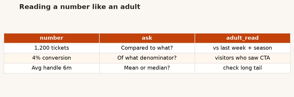
Humans love single numbers. They fit in a title slide. They feel like facts. But most workplace numbers are ratios: something divided by something, or something compared with something else. When we hide the second half, we create vibes with extra steps.
In Data vs information vs insight, we said insight is what changes a decision. A raw count rarely does that alone. “12,000 signups” only becomes decision fuel when you know whether conversion is healthy, whether quality of signup is rising, and whether last year was 4,000 or 40,000.
Counts vs rates (both can be true)
A count answers “how many?” A rate answers “how many per unit of opportunity?” Signups are a count. Signups per visitor (conversion rate) is a rate. Revenue is a count (well, a sum). Revenue per customer is a rate-ish measure (an average).
Here is the classic trap: marketing spends more on ads. Signups go up. Conversion rate goes down. Leadership hears only the count and orders more spend. Product hears only the rate and panics. Both numbers can be correct. They answer different questions.
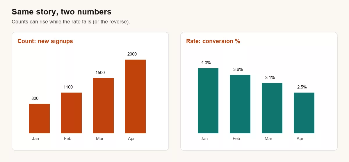
| Month | Visitors | Signups (count) | Conversion (rate) |
|---|---|---|---|
| Jan | 20,000 | 800 | 4.0% |
| Feb | 30,500 | 1,100 | 3.6% |
| Mar | 48,400 | 1,500 | 3.1% |
| Apr | 80,000 | 2,000 | 2.5% |
If the decision is “are we acquiring more customers in absolute terms?” the count wins. If the decision is “is our funnel efficient?” the rate wins. If the decision is “should we scale this channel?” you need both, plus cost per signup and quality downstream (activation, retention, revenue).
Denominators: the quiet half of every rate
Every rate has a denominator. Adults ask what is in it.
- Churn rate: canceled / active at start? Or canceled / ever paid? Those are different businesses.
- Click-through rate: clicks / emails sent, or clicks / emails delivered, or clicks / unique openers?
- Defect rate: defects / units shipped, or defects / units inspected?
- Utilization: busy hours / paid hours, or busy hours / clock hours?
If two teams argue about a rate, start by writing both formulas on a whiteboard. Half of “data wars” end when the denominators show up. This is the same spirit as fixing the problem statement in Part 1: clarify before you compute.
Small denominators lie with a straight face
A 50% conversion rate on 4 visitors is a coin flip with a press release. A 3.1% conversion rate on 50,000 visitors is a fact with weight. When the base is tiny, prefer counts plus “too early to call,” or use longer windows.
Compared to what?
Every impressive number is one comparison away from boring, and every boring number is one comparison away from urgent. Keep four baselines in your pocket:
| Baseline | Question it answers | Watch-out |
|---|---|---|
| Prior period | Are we better than last week/month/year? | Seasonality and one-off events |
| Plan / target | Are we on the path we funded? | Targets can be fantasy |
| Peer / segment | How do we look vs another region, product, or cohort? | Apples vs oranges if definitions differ |
| Counterfactual | What would have happened without the change? | Harder; needs experiments or careful design |
In a weekly business review, you rarely need all four. You almost always need at least one. “Revenue was $1.2M” is incomplete. “Revenue was $1.2M, +8% vs last year, −3% vs plan” is adult.
Seasonality in one page
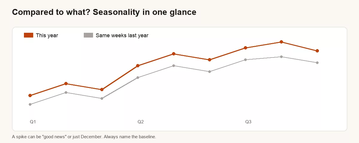
Seasonality means the calendar itself moves the number: holidays, school years, tax season, industry conference weeks, weather. If you compare January to December without saying so, you are performing comedy, not analysis.
Practical habits:
- Prefer same period last year for anything with annual cycles (retail, education, travel, B2B that slows in August).
- Use trailing 4 or 12 weeks when single weeks are noisy.
- Annotate known events: product launches, outages, price changes, big campaigns.
- If you must compare sequential months, say “vs prior month” and note seasonal context in one clause.
This is not advanced forecasting. It is refusing to be surprised by Christmas every Christmas.
Worked example: the “record week” that was not a strategy win
A support lead posts: “We closed 4,200 tickets this week, a record!” The adult reading:
- Count vs rate: tickets closed is a count. What about tickets opened? Backlog? Closed per agent?
- Denominator: more agents? longer hours? a new self-serve bot dumping easy tickets into “closed”?
- Compared to what? vs last week, vs the same week last year, vs plan for staffing?
- Seasonality / events: was there a product bug spike that also created the record?
A better Slack message: “Closed 4,200 tickets (+18% vs last year). Opened 4,050. Backlog down 3%. Two agents on overtime. Product incident on Tuesday drove ~600 extras.” Same celebration energy, much less chance of learning the wrong lesson.
A small SQL pattern for count + rate together
When you build a weekly extract, return the ingredients, not only the garnish. Future you will thank present you.
SELECT
  DATE_TRUNC('week', event_date) AS week_start,
  COUNT(*) FILTER (WHERE event_type = 'signup') AS signups,
  COUNT(*) FILTER (WHERE event_type = 'visit') AS visits,
  ROUND(
    100.0 * COUNT(*) FILTER (WHERE event_type = 'signup')
      / NULLIF(COUNT(*) FILTER (WHERE event_type = 'visit'), 0),
    2
  ) AS signup_rate_pct
FROM analytics.web_events
WHERE event_date >= CURRENT_DATE - INTERVAL '90 days'
  AND event_type IN ('visit', 'signup')
GROUP BY 1
ORDER BY 1;
You can chart signups and the rate on dual axes or side by side. The important part is never shipping the rate without the base sizes nearby.
Percent change vs percentage points
Quick hygiene item that saves arguments:
- Rate moves from 2% to 3%: that is a +1 percentage point change, and a +50% relative change.
- Both are true. They feel different. Say which one you mean.
- For small base rates, relative percent changes sound dramatic. Prefer points plus the absolute levels.
Example: “Conversion rose from 2.0% to 3.0% (+1.0 pt, +50% relative) on 40k visits.” Now nobody can play games with the adjective “huge.”
Common mistakes
- Celebrating counts while efficiency collapses.
- Rates with mystery denominators.
- Comparing this week to last week during a seasonal cliff.
- Mixing fiscal calendar and calendar month without labeling.
- Averages of averages (store-level rates averaged as if stores were equal size).
- Treating a lonely KPI as a strategy. For metric design more broadly, see All About KPIs.
How to practice this week
- Take three numbers from your last meeting deck. For each, write count or rate, and the denominator if it is a rate.
- Add one baseline to each: prior year, plan, or peer segment.
- Find one chart that only shows sequential months. Add a same-period-last-year note or series if you can.
- Rewrite one Slack “we hit X” message into adult form: level, change, baseline, caveat.
A one-page adult reading card
When a number shows up in a meeting, run this card in your head (or literally print it). It takes thirty seconds and prevents most self-owns.
- Name it: What is the metric called, and who owns the definition?
- Type: Count, sum, average, rate, or index?
- Window: Which dates, and is the data complete for that window?
- Base: If it is a rate, what is the denominator size?
- Baseline: vs last year, plan, or peer?
- Story risk: What alternate story would still fit this number?
If you cannot answer items 1-4, you are not ready to argue about item 6. That is not gatekeeping. That is how you avoid making a strategy out of a spreadsheet glitch. Pair this card with the confidence language from Good enough vs perfect data so you can say what you know without overselling it.
Teams that institutionalize this habit ship calmer reviews. The loudest number stops winning by default. The best framed number wins, which is what you want if the goal is better decisions rather than better theater.
Quick recap
Adult number reading is not cynicism. It is literacy. Ask whether you are looking at a count or a rate, what sits in the denominator, what baseline makes the number meaningful, and whether the calendar is doing half the work. Pair counts with rates when activity and efficiency can diverge. Prefer year-over-year thinking when seasons matter.
That closes the core five-part Analytics foundations arc: problem, data vs insight, the loop, good enough data, and reading numbers. From here the master plan moves toward spreadsheets-as-data and then Python. Keep using the analytics loop so every number has a job.
Sources
- Hubbard, Douglas W. How to Measure Anything (practical framing of measurement as reducing uncertainty for decisions). Overview: https://www.howtomeasureanything.com/
- OpenIntro Statistics (accessible treatment of rates, proportions, and why sample size matters): https://www.openintro.org/book/os/
- NIST / SEMATECH e-Handbook ideas on operational definitions and measurement (why “what counts” must be explicit): https://www.itl.nist.gov/div898/handbook/
- Analytics Made Simple internal links: foundations series parts 1 to 4, KPIs, data literacy.
Keep going
Same lessons in your feed
Short diagrams and hooks on Instagram, X, and Facebook.
Merch on Etsy
Open store → You're On Mute White Ceramic Coffee Mug, Data Science Mug, Data Mug, Analytics Mug, Statistics Mug, Programming Mug, Gift Mug, Coffee Mug
View on Etsy →
You're On Mute White Ceramic Coffee Mug, Data Science Mug, Data Mug, Analytics Mug, Statistics Mug, Programming Mug, Gift Mug, Coffee Mug
View on Etsy →
 Imbalanced Classes Mouse Pad, Data Science Mouse Pad, Analytics Mouse Pad, Imbalanced Mouse Pad
View on Etsy →
Imbalanced Classes Mouse Pad, Data Science Mouse Pad, Analytics Mouse Pad, Imbalanced Mouse Pad
View on Etsy →
 Y Hat Mouse Pad, Data Science Mouse Pad, Analytics Mouse Pad, Y Pred Mouse Pad
View on Etsy →
Y Hat Mouse Pad, Data Science Mouse Pad, Analytics Mouse Pad, Y Pred Mouse Pad
View on Etsy →
 You're On Mute White Ceramic Coffee Mug, Data Science Mug, Data Mug, Analytics Mug, Statistics Mug, Programming Mug, Gift Mug, Coffee Mug
View on Etsy →
You're On Mute White Ceramic Coffee Mug, Data Science Mug, Data Mug, Analytics Mug, Statistics Mug, Programming Mug, Gift Mug, Coffee Mug
View on Etsy →