Claude Motion turns a chart, a report, or a short walkthrough into a short animated video, and because Claude builds it from code, you can change any word, number, or timing before you download it. Claude Dashboards do a different job: they connect to your company’s figures and keep the charts up to date. Use Motion to tell one story once, and a dashboard for a question you will ask again next week.
Imagine you have one chart that matters this month, say sign-ups for your club’s website or your shop’s new loyalty card. You want everyone at the next team meeting to see what changed without you narrating every bar. A still slide gets a glance. A 20-second animation that builds the bars one month at a time and then lands on the number gets attention, and until now it meant opening a video editor you do not know how to use.
Anthropic launched both on October 8, 2026 as betas, which means early versions that may still change. This post shows how to turn one chart into a short explainer with Motion, step by step, and how to tell when a live dashboard is the better tool. Plan details below were checked on October 13, 2026, and betas change often.
What each of the two new Claude features makes
Claude Motion makes a short animation that plays like a video. Claude writes code that moves your text, charts, shapes, and images around the screen, and the result exports as an MP4 file, the common video format that plays almost anywhere. Anthropic’s launch article says it does not use a video generation model, so there is no generated footage and no AI-generated people. Everything on screen is something you gave it or something drawn from your numbers.
Claude Dashboards make a page of charts that stays connected to your data. A dashboard is a screen of charts and numbers you check again and again, like the dials in a car. The Dashboards help article says Claude writes a SQL query for each chart, which is the short instruction a database understands, and runs it against your data source. Each chart shows its query and when its data was last refreshed.
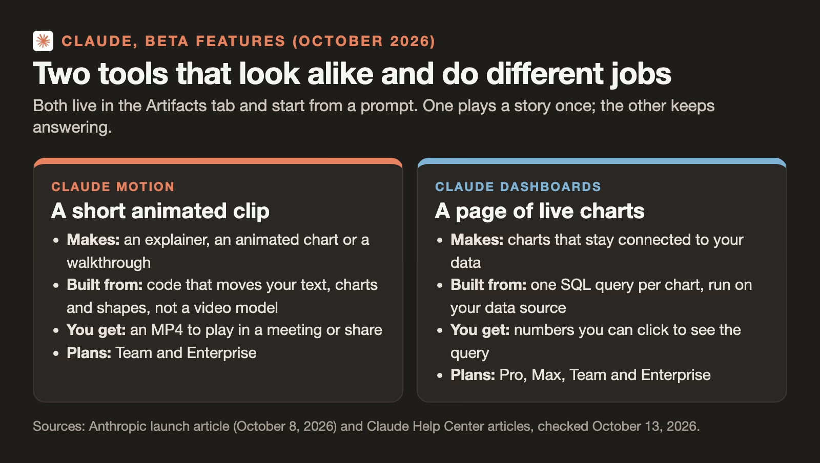
The simplest way to keep them apart: Motion is a finished clip about the past, and a dashboard is a window onto data that keeps moving. One is made to be played once to a room. The other is made to be opened again on Thursday.
Who can use them, and how to turn them on
The two features are open to different plans, so check yours before you plan a meeting around one. Both count toward your plan’s usage limits, and the Motion help article says longer or more complex animations use more of the limit than a normal message (checked October 13, 2026).
| Feature (beta) | Plans | Switched on? | What you get |
|---|---|---|---|
| Claude Motion | Team, Enterprise | On for Team; off for Enterprise until an owner turns it on | A short animation, exported as MP4 |
| Claude Dashboards | Pro, Max, Team, Enterprise | Off for Enterprise until an owner turns it on | Live charts, each with its SQL query and last refresh time |
On Team plans, Motion is on by default. On Enterprise, both features stay off until an owner turns them on in Organization settings, under Artifacts, according to the help articles for Motion and Dashboards. If you work at a company and cannot find either option, ask your Claude admin rather than signing up for a personal plan. Company data does not belong in a personal account.
Neither the launch article nor the Motion help article gives limits on clip length, resolution, or frame rate (checked October 13, 2026). Keep clips short until you know how your plan handles them.
How to turn one chart into a 20-second explainer
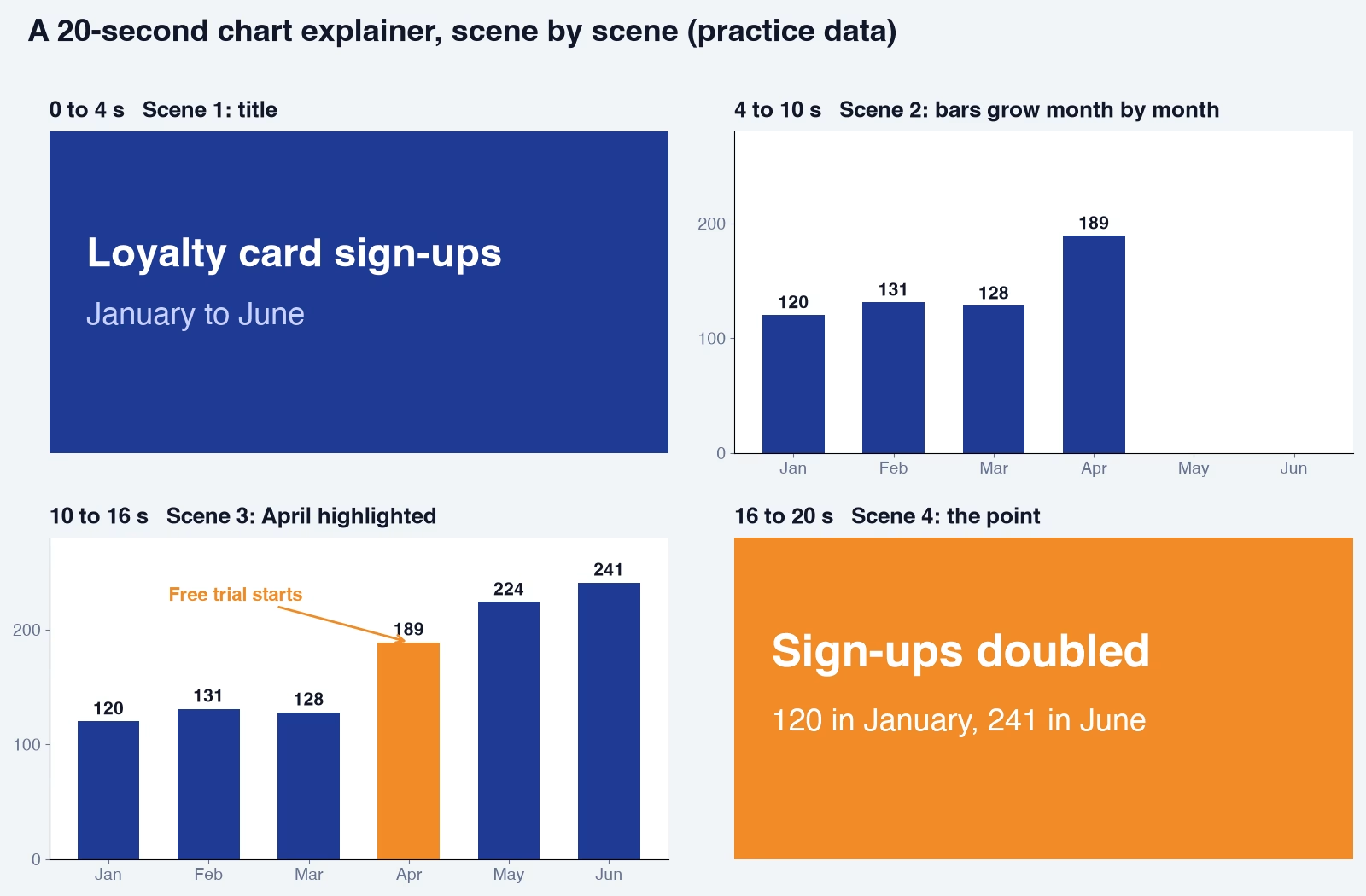
The worked example below uses made-up numbers for practice: monthly sign-ups for a small online shop’s new loyalty card, from January to June. January had 120 sign-ups, and June had 241. A free trial started in April. That gives the clip one point to make: sign-ups doubled after the free trial began.
Start with one point, not one chart
Write the sentence you want people to remember before you open Claude. “Sign-ups doubled after the free trial started” is a point. “Here is our sign-up data” is not, and an animation of a chart without a point is just a slower slide. If the habit of adding notes to charts is new to you, the same rule applies: say what the chart means, in words, on the chart.
Give it the data and the setting
You can ask for an animation in any chat, choose Motion from the Output menu in the message box, or start from a Motion template in the Artifacts tab, per the Motion help article. Anthropic’s launch article also mentions typing /motion in the message box. The help article adds that results improve when you say who will watch, where it will play, and roughly how long it should run, and when you attach the report, data, or images it should use.
Here is a prompt for the sign-ups clip. It asks for a plan first, because fixing a list of scenes is faster than fixing a finished animation.
/motion
Make a 20-second animation for our monthly team meeting. It plays on a big screen with no sound.
Use the attached data: monthly loyalty card sign-ups, January to June.
The one point: sign-ups doubled after the free trial started in April.
Give me a scene plan first, as a numbered list with timings. Do not build it yet.
Scenes I want:
1. Title, 4 seconds: "Loyalty card sign-ups, January to June"
2. Bars grow one month at a time, 6 seconds
3. April bar turns orange with the label "Free trial starts", 6 seconds
4. Final card, 4 seconds: "Sign-ups doubled: 120 in January, 241 in June"
Keep the y-axis starting at zero. Use dark blue for bars and orange for the highlight.
Put every point in words on screen, since there is no sound.
Two lines in that prompt do most of the work. “Keep the y-axis starting at zero” stops the bars from exaggerating growth, a classic chart mistake. “No sound” matters because many meeting rooms and phones play video muted, so the words have to be on screen.
Read the scene plan, then let it build
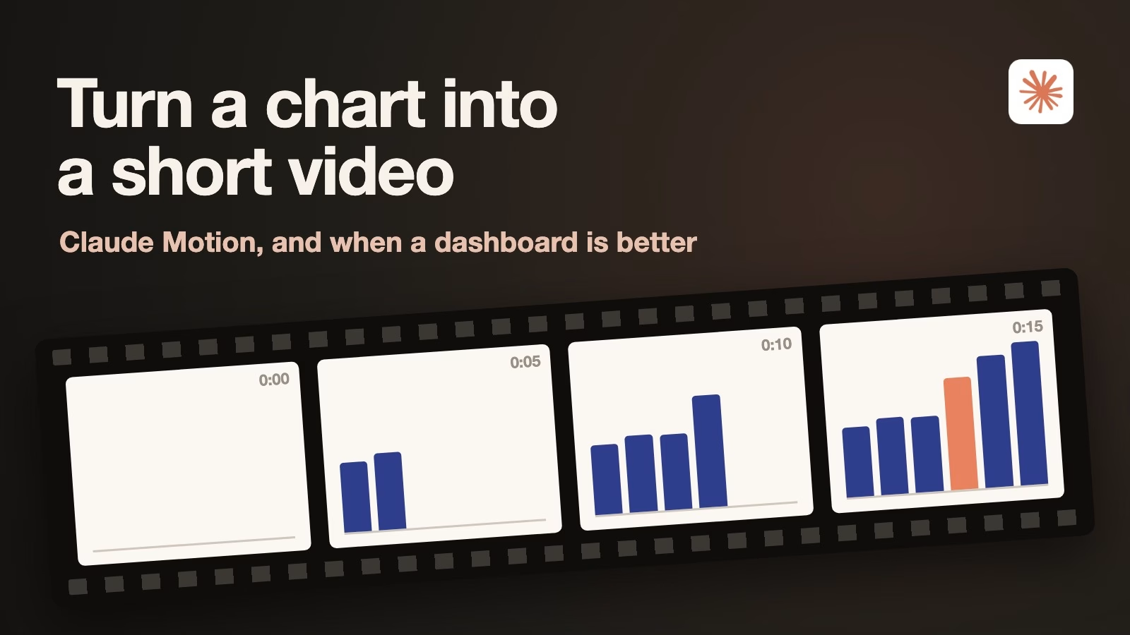
The plan should come back as four scenes with timings that add up to 20 seconds. Check that each scene carries one idea and that the last scene says the point in plain words. Then tell Claude to build it. The storyboard below shows what the four scenes look like as still frames, drawn from the same practice numbers.
Change one detail at a time
Because the animation is code, you can change a single word, number, or timing and the rest stays the same. You can make the change in the editor or ask in chat. The help article’s own example is “Slow down the second scene.” A few more that fit this clip:
- “Change the April label to: Free trial launched.”
- “Hold the final number for two more seconds.”
- “Make the bars grow one month at a time, not all at once.”
- “Use the dark blue for every bar except April, which stays orange.”
Ask for one change per message. When you bundle five changes, it gets harder to see which one broke the timing.
Check every number, then export
Before you export, pause on each scene and compare every number on screen with your source data. Motion draws from what you gave it, but a typo in the prompt or a misread column still ends up on the big screen. When it matches, click Export and choose MP4. Animations start private, and you share one from its Share button, per the help article.
If you want to keep editing in another tool, Anthropic’s launch article lists hand-offs to Adobe, Descript, HeyGen, Higgsfield, invideo, Luma AI, and Runway, with Canva and Captions coming soon.
Why an animation built from code is easier to check
A video generation model invents pixels. You describe a scene, and it paints frames that look right, which is why those tools sometimes produce a chart with seven bars when you asked for six, or a number that drifts between frames. Motion works the other way. Claude writes instructions such as “draw a bar for April at this height, then fade in this label,” and a player runs those instructions. The bar for April is 189 tall because 189 is in the code.
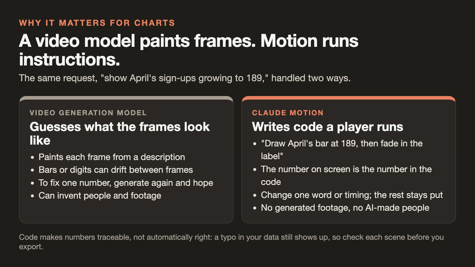
That does not make the clip correct on its own. If you typed 198 instead of 189, the code draws 198 perfectly. What it gives you is a clip where each number has one source you can find and fix, instead of a video you would have to regenerate and hope.
This site’s short social videos are built the same way. A script lays out the type, bars, and cards as a web page, moves them with timed animation rules, captures each frame, and stitches the frames into an MP4. No video model is involved, which is why a typo fix takes a minute instead of a new render that might come out different.
When a live dashboard is the better choice
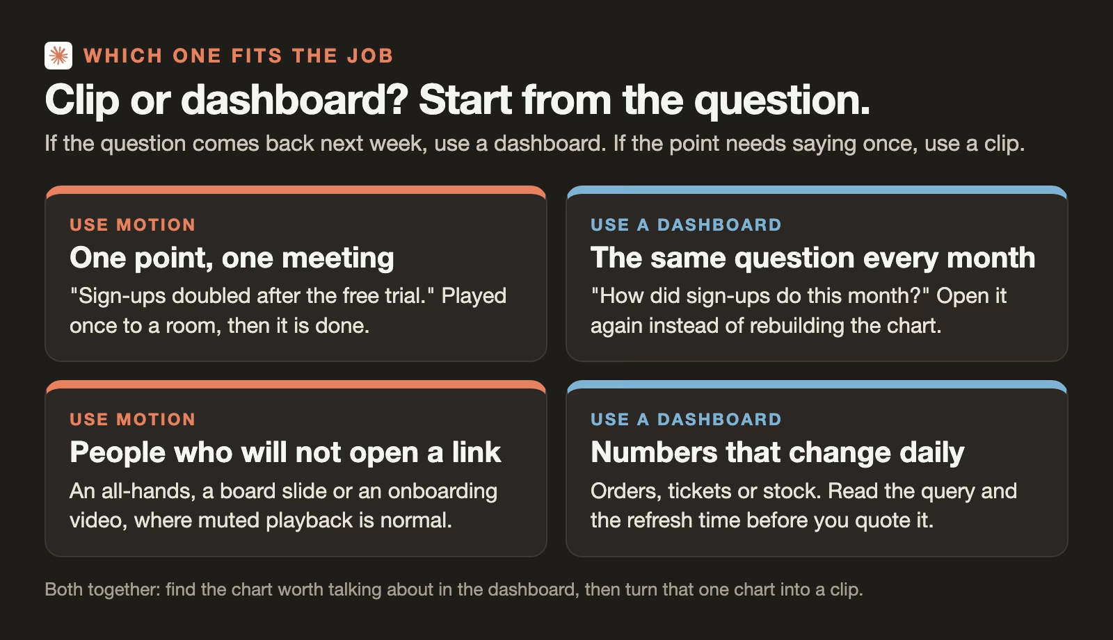
Use a dashboard when the question will come back. If someone asks “how did sign-ups do this month?” every month, a clip made in June is out of date by July. A dashboard connected to the source answers it again each time you open it.
The help article lists data warehouses such as Amazon Redshift, BigQuery, ClickHouse, Databricks, and Snowflake as sources, plus apps already connected to Claude, such as Salesforce. A data warehouse is a large database built for reporting. You ask for a dashboard in plain words, for example Anthropic’s own sample, “Build a dashboard of this quarter’s revenue by region,” and Claude writes the queries and draws the charts.
The part to trust carefully is the query. Anthropic says you can click any number to see the query behind it. Do that for the main number on every new dashboard, and check three things: which table it reads, which date it uses (an order date and a ship date give different months), and whether it leaves out refunds, test accounts, or cancelled orders. If it counts something you did not mean, tell Claude in plain words and look again. Teams that already keep one agreed definition per metric have an easier time, because the right answer is written down somewhere.
Anthropic describes Dashboards as best for quick, exploratory questions, and points to other tools for deeper analysis. Its launch article lists hand-offs to Amplitude, Grafana, Hex, Mixpanel, Omni, Perplexity, PostHog, and Sigma, with Databricks Genie, Looker, monday.com, and Tableau coming soon. Each chart shows when its data was last refreshed, but the help article does not say how often that happens (checked October 13, 2026), so read the timestamp before you quote a number.
The two also work together. Build the dashboard, find the one chart worth talking about, and turn that chart into a 20-second clip for the meeting. The dashboard stays live for the people who need it, and the clip makes the point for everyone else.
Mistakes that make a chart video worse
- Animating every chart in the report. One clip, one point. If you have three points, make three short clips or keep the slides.
- Letting motion replace the label. Bars that grow look nice, but the room still needs the sentence on screen that says what changed.
- Cutting the y-axis to make growth look bigger. Keep bars starting at zero, and say so in the prompt.
- Running too long. Twenty to thirty seconds is plenty for one point, and Anthropic’s own example is a 30-second explainer for an all-hands meeting.
- Quoting a dashboard number without reading its query and its refresh time.
- Putting company data into a personal Claude account because the work account does not have the feature yet.
What to try this week
Pick one chart from a report you already send. Write its point as one sentence, then ask Claude for a scene plan with the prompt above, adjusted to your numbers. If your plan includes Motion, build the clip, check each number against the source, and play it once for a colleague before the meeting. If you only have Dashboards, connect one data source and click through the query behind your most important number.
For more on where these features sit among Claude’s other tools, see Claude Design and Claude Science and how the Claude chat app differs from Claude Code, Cowork, and the API.
Sources
- Anthropic: Build live dashboards and animate explainers with Claude (October 8, 2026) (launch date, how Motion works without a video model, MP4 export, /motion, hand-off tools, Dashboards sources, query on click, plan summary)
- Claude Help Center: Get started with Claude Motion (plans and defaults, how to start, editing, export, sharing, usage limits)
- Claude Help Center: Get started with Claude Dashboards (plans and defaults, one SQL query per chart, refresh timestamp, data sources, sharing, usage limits)
- Claude on X: Claude Motion announcement (October 8, 2026) (no video model, editable words, numbers and timing, Team and Enterprise beta)
Keep going
Same lessons in your feed
Short diagrams, hooks, and weekly tutorials on Substack, Instagram, X, and Facebook.