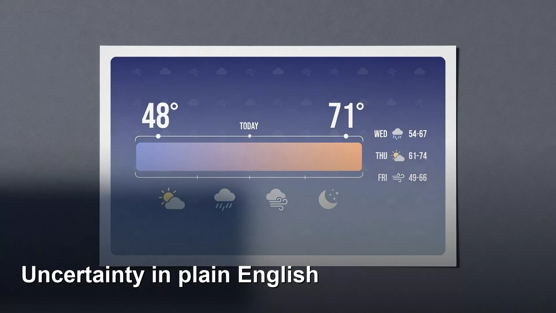
When you report a number such as “conversion is 12.4%,” also report the range around it, because the range tells people how much to trust the number. A wide range simply means the data is thin, and it says nothing bad about the person presenting it. Also remember that a difference can be real without being big enough to matter.
Say your dashboard (a screen of charts that tracks key numbers) shows conversion at 12.4%. Someone asks if that is good, someone else asks whether it is “significant,” and a third person asks for the confidence interval. Nobody in the room agrees on what those words mean. The meeting stalls.
Point estimates are headlines; intervals are the article
A point estimate is your single best summary from the data you have, such as 12.4% conversion, a $48 average order value, or a median of 3.2 days to first value. It is useful, but it is incomplete. If you only ship the headline, people treat the third decimal place as destiny.
An interval estimate gives a plausible range instead. It says that, given this sample and these assumptions, the true rate or average sits somewhere between X and Y. Different methods make different kinds of interval. You will hear of confidence intervals, credible intervals, and bootstrap intervals. When you explain results to colleagues, the shared idea matters more than the name: numbers wiggle, and the wiggle has a size.
Rule of thumb: If a decision would flip when the true value sits at the other end of a reasonable interval, you do not have a decision yet. You have a measurement problem or a patience problem.
Confidence intervals in plain English
A common 95% confidence interval has a specific long-run meaning. If you repeated the same sampling process many times, about 95% of the intervals you built would cover the true fixed value. That is not the same as saying “there is a 95% probability the true value is in this interval.” People blur the two constantly. For workplace decisions, you can say the following.
“Using a standard 95% interval for this sample, the conversion rate is estimated at 12.4%, with a plausible range of about 11.1% to 13.7% under our model assumptions.”
Some statements sound similar but are wrong, and each one fails for a different reason.
- “We are 95% sure every user converts between 11% and 14%.” This is wrong because intervals describe the group, not individual people.
- “There is only a 5% chance we are wrong about everything.” This is wrong because the 5% has a narrower meaning than that.
- “The interval proves the metric cannot leave this band next week.” This is wrong because future changes in the process break the assumptions.
Intervals also inherit the quality of the sample they came from. A beautiful interval on a biased sample is a precise picture of the wrong population, so the earlier post on sampling and bias still applies.
What makes intervals wide or narrow
Sample size
More independent observations usually shrink uncertainty, but the gains get smaller each time. Going from 100 to 400 helps far more than going from 10,000 to 10,300 for the same rate. If someone demands three more decimal places, ask how many more weeks of data that will cost.
Base rate and variability
A 50% conversion rate has more variance than a 2% rate at the same sample size (n), because in percentage points the middle of the range is noisier. Averages with heavy tails, such as revenue per user or time on site, need larger samples or sturdier summaries. Medians and trimmed means are not “giving up,” since they simply match the summary to the shape of the data.
Dependence
Suppose you treat 10,000 events from 200 users as 10,000 independent rows. Your interval will be overconfident, because one person’s events tend to look alike. Group the data by user or account whenever outcomes within a person are correlated. Experiment platforms often randomize by user for this reason. Fake precision from ignored grouping is a classic trap.
Coverage of the frame
Statistical intervals do not account for gaps like “we only track 70% of mobile web” unless you model them. Add a plain-words uncertainty note when the measurement gaps are large. Precise-looking numbers on top of missing tracking are how companies surprise themselves in finance reviews.
| Situation | Interval tends to be… | Analyst move |
|---|---|---|
| Small n | Wide | Collect more or decide with wider risk tolerance |
| Huge n, biased frame | Narrow but misleading | Fix sampling story before celebrating precision |
| User-level clustering ignored | Too narrow | Cluster-aware variance or experiment unit |
| Heavy-tailed revenue | Unstable means | Medians, winsorizing, or segmented means |
| Definition thrash week to week | Not a stats problem | Stabilize metric contract first |
Margin of error without the survey nostalgia
Pollsters made “plus or minus 3 points” famous. That is a margin of error tied to a method and a confidence level, usually for a proportion near 50% with a certain sample size. You can borrow the spirit of it in product analytics by reporting a point estimate and a half-width when your audience already thinks in margins.
Here is a rough rule for a proportion from a simple random sample. It is a teaching approximation and not a license to skip real tools. The standard error (a measure of typical sampling wobble) is about sqrt(p*(1-p)/n), and a 95% margin is roughly twice that. With p = 0.12 and n = 2,500, sqrt(0.12*0.88/2500) is about 0.0065, so the margin is about 1.3 percentage points. That means 12% is roughly 10.7% to 13.3% under those assumptions. Change n or p and the width changes, and if you change the dependence or the bias, the formula stops being honest.
Worked example: 12% vs 10%, should we celebrate?
Celebrate cautiously: the gap is probably real, but it sits close to the edge of what this sample can show, so do not report “+20% lift” as settled. Here are the made-up numbers. Variant A converts 240 out of 2,000 visitors, which is 12.0%. Variant B converts 200 out of 2,000, which is 10.0%. The absolute gap is 2.0 points and the relative lift is 20%. Marketing likes the relative number, so you build simple intervals for both. This uses a normal approximation for teaching, while real work may use Wilson, Bayesian, or bootstrap methods.
| Variant | Conversions | n | Rate | Approx 95% interval |
|---|---|---|---|---|
| A | 240 | 2,000 | 12.0% | 10.6% to 13.4% |
| B | 200 | 2,000 | 10.0% | 8.7% to 11.3% |
The intervals overlap a little. Overlap is not a formal test on its own. It is a warning light: the gap might be real and still sit near the edge of what this sample can pin down. A proper comparison of two proportions will give a clearer decision rule, and the earlier post on A/B test design covers that. For now, the point is this: do not ship “+20% lift” as a board-ready fact from raw point estimates alone.
Python sketch for a quick interval on a proportion
import math

def prop_interval(successes, n, z=1.96):
    p = successes / n
    se = math.sqrt(p * (1 - p) / n)
    return p, p - z * se, p + z * se

for label, k, n in [("A", 240, 2000), ("B", 200, 2000)]:
    p, lo, hi = prop_interval(k, n)
    print(f"{label}: {p:.1%} (approx {lo:.1%} to {hi:.1%})")
Treat this as a pocket calculator for building intuition. Production experiment tools, stats packages, or your analytics engineer’s preferred method should own the official readouts. The skill you are building is knowing what question the interval answers.
Statistical significance is not the same as importance
A result can be statistically significant and tiny. With millions of users, a 0.05 point change can clear a p-value threshold (the cutoff used to call a result significant) and still not cover the engineering cost. A result can also miss the threshold and still be useful for a low-stakes copy tweak, if the downside is small and the interval mostly sits above zero lift. The earlier post on A/B tests and the experimentation culture series dig into decision rules. The language fix here is to keep three ideas apart.
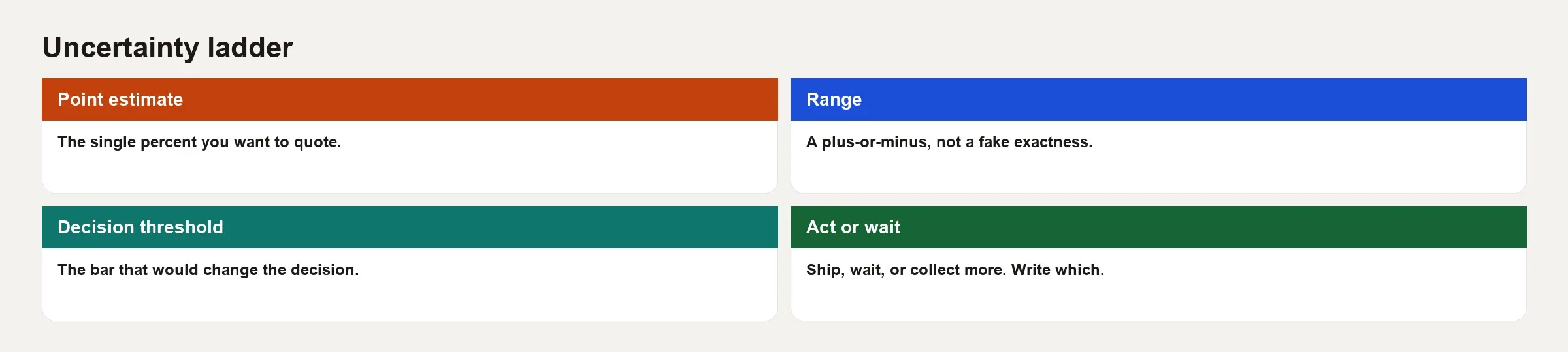
- Uncertainty: how wide is the range?
- Effect size: how big is the change in business units?
- Decision threshold: how big must it be before you act?
Keep those three separate in the write-up. Squeezing them into one word, “significant,” is how meetings get confused.
Talking about uncertainty without sounding weak
Leaders sometimes hear a range as hedging. You can translate it into decision language, and the three examples below show how.
- “Best estimate is 12%, with a range that still clears our 10% goal even on the low end.”
- “Best estimate is +2 points, but the low end of the range is near zero. I recommend one more week or a tighter experiment, because the cost of shipping is high.”
- “The interval is narrow because the sample is large, but coverage is only logged-in web. Offline and app are out of scope.”
You are not weaker for saying this. You are preventing a false ship. That is the job. Pair it with clear metric definitions from the metrics series, so the interval attaches to a stable meaning.
Prediction intervals and “will next week look like this?”
A confidence interval for an average or a rate is about an underlying value, not about every future observation. If you need to know where tomorrow’s daily conversion will land, you want a prediction-style view that includes day-level noise, seasonality, and drift in the process. Dashboards that show only a trailing 28-day point estimate train executives to panic at normal daily wobble. Consider adding bands to time series, or at least the historical spread of daily values, so that “down 0.3 points today” comes with context.
Common mistakes
- Reporting five decimal places with no uncertainty and a sample of a few hundred.
- Treating non-overlapping intervals as the only valid test, or treating overlap as automatic proof of no difference.
- Ignoring grouping, so that every event looks independent.
- Equating p < 0.05 with “true and important.”
- Equating p > 0.05 with “no effect exists.”
- Building intervals after peeking at twenty slices and only showing the pretty one, which is uncertainty theater.
- Using survey margin-of-error slogans on convenience samples without the design assumptions behind them.
How to practice
- Pick three KPIs (key performance indicators, the numbers your team is judged on) on your main dashboard, and add a sample size and a one-line uncertainty note to each, so readers can tell a real change from noise.
- Recompute a proportion interval for a metric you recently called a “win,” and check whether the low end still clears the goal.
- Find a metric where users contribute many rows, and ask whether your variance treats rows or users as the unit.
- Rewrite one Slack update so it includes the estimate, the range, and the decision implication in three sentences.
- Optionally, plot the last 90 days of a daily rate and mark the middle 80% of days so normal wobble is visible.
The next post in this series covers A/B test intuition for analysts, which is where uncertainty meets intentional design. For learning paths, use Learn. When you write analysis code with AI help, keep validating the filters and grains, as in how to check AI-written SQL (the standard language for asking a database for data).
Quick recap
- Ship point estimates together with intervals or clear uncertainty notes.
- Confidence intervals measure sampling uncertainty under stated assumptions, and they do not fix bias.
- Width depends on sample size, variability, dependence, and, honestly, the quality of your measurement.
- Keep uncertainty, effect size, and decision thresholds separate in your language.
- Overlap and p-values are tools and not morality plays.
- Decision-ready communication ties the range to what would change a ship or no-ship call.
Your next step
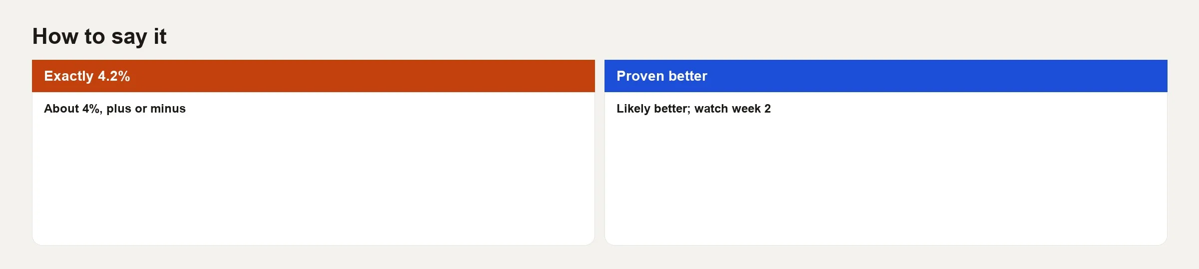
In your next report, add a range or a plain uncertainty note next to the key number, such as about 4%, plus or minus one point. Ask one reader whether it changed how they read the result. Small, honest ranges prevent the false confidence that a bare number invites.
Series notes
This is Part 3 of Statistics for analysts.
Sources
- OpenIntro Statistics, confidence intervals chapters (free textbook): https://www.openintro.org/book/os/
- NIST Engineering Statistics Handbook, confidence intervals overview: https://www.itl.nist.gov/div898/handbook/prc/section1/prc14.htm
- American Statistical Association, statement on statistical significance and p-values: https://www.amstat.org/asa/files/pdfs/p-valuestatement.pdf
- Cumming, Geoff. Work on estimation and confidence intervals in scientific communication (new statistics emphasis). Overview articles via https://thenewstatistics.com/
- Kohavi, Tang, and Xu. Trustworthy Online Controlled Experiments (uncertainty and decision thresholds in online metrics). https://experimentguide.com/
Keep going
Same lessons in your feed
Short diagrams, hooks, and weekly tutorials on Substack, Instagram, X, and Facebook.