
Before you copy the winning group’s playbook, check whether the groups are actually comparable. Ask whether the mix of users, the starting point, or the product itself is what moved. A fair comparison starts by writing down the sentence you are testing, and only then running the query (a request that asks a database for data).
Say your dashboard (a screen of charts that updates on its own) shows two cities. City A converts visitors into customers at 4.8%, and City B converts at 3.1%. Someone draws a roadmap arrow toward “copy whatever City A is doing.” Nobody asks whether City A is mostly desktop renewals while City B is mostly new mobile signups after a local ad burst. The chart is accurate, but the comparison is not fair, because the two cities are made of different kinds of people.
Comparing groups is everyday analyst work. You compare segments, regions, plans, cohorts (people who started in the same period), channels, and versions. It is also where trouble starts. A silent change in the mix of people, a famous puzzle called Simpson’s paradox, or a cherry-picked starting point can invent a strategy out of noise. You do not need a PhD to avoid the common traps. You need a checklist and the discipline to show the denominator, which is the total each rate is divided by.
Write the comparison sentence before you query
Fill in this template, and refuse to ship the chart until every slot is complete:
Among [population], how does [outcome] differ between [group A] and [group B], measured over [time window], with unit [user/account/session], after applying [shared filters]?
If you cannot fill a slot, the query will quietly invent an answer for you. Shared filters matter most. Comparing “all mobile” to “desktop enterprise renewals last Black Friday” is not a group comparison at all. It is two different studies stacked on one slide.
Tie the outcome to a precise definition, the way the metrics series teaches. Group labels are dimensions, meaning the categories you slice by, and outcomes are metrics, meaning the numbers you measure. Mixing loose labels like “engaged users” with precise counts is how meetings multiply.
The three things that move a group rate
When Group A’s rate is higher than Group B’s, at least one of these three things is true:
- Composition: A has a different mix of subtypes, such as more enterprise customers, more returning customers, or more people in the US.
- Behavior or treatment: something about A really does perform differently inside comparable subtypes.
- Measurement: tracking, eligibility, or timing differs between the groups.
Strategy wants the second one to be true. Dashboards often show the first one dressed up as the second, and the tracking setup quietly contributes the third. Your job is to pull them apart. Then a product manager will not approve a rewrite that only reflects a shift in mix.

Mix shifts: the silent product manager
Overall conversion can rise while every segment stays flat, if high-converting segments grow as a share of traffic. Overall conversion can also fall while every segment improves, if low-converting segments grow faster. That is not a paradox for people who check the composition. It is an ordinary Tuesday.
Always carry two views so you can tell which story you are in:
- Overall rate for the business scoreboard.
- Segment rates plus segment mix for diagnosis.
If leadership only sees the overall rate, they will praise a change in traffic mix as product genius. Sometimes your acquisition strategy really did improve. Say so clearly. Just do not call it a checkout redesign win if the checkout segment rates never moved.
Standardization in plain English
When the mix differs, you can reweight each group’s rates to a common mix. Statisticians call this standardization. For example, you hold both regions to the same plan-tier mix. Then you recompute a weighted conversion rate. You are asking, “If the mix were the same, would the gap remain?” If the gap shrinks a lot, composition was doing the heavy lifting. If the gap stays, look for real differences within segments, or for measurement issues.
You do not need advanced methods on day one. A spreadsheet with segment rates and a shared column of weights already prevents most self-deception.
Worked example: the “Pro plan is better” slide
The growth team claims that Pro plan users convert to annual billing at 22% and Basic users at 11%, so everyone should be pushed to Pro. You pull a fairer cut. These are toy numbers made up for teaching:
| Plan | Segment | Users | Annual conversions | Rate |
|---|---|---|---|---|
| Basic | New self-serve | 8,000 | 640 | 8% |
| Basic | Returning | 2,000 | 400 | 20% |
| Basic | All Basic | 10,000 | 1,040 | 10.4% |
| Pro | New self-serve | 1,500 | 135 | 9% |
| Pro | Returning | 3,500 | 875 | 25% |
| Pro | All Pro | 5,000 | 1,010 | 20.2% |
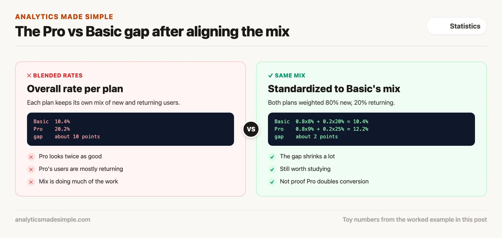
Overall, Pro looks twice as good. Inside the new self-serve group, though, Pro is only one point higher (9% against 8%). Inside the returning group Pro is higher (25% against 20%), but Pro’s mix is mostly returning users. Force new self-serve users onto Pro without changing who they are, and you should not expect the overall 20% rate to follow.
To tell a standardized story, put both plans on Basic’s mix of 80% new and 20% returning:
- Basic standardized: 0.8×8% + 0.2×20% = 10.4% (the same as overall Basic by construction here).
- Pro standardized to Basic’s mix: 0.8×9% + 0.2×25% = 12.2%.
The gap shrinks from about 10 points overall to about 2 points after the mix is aligned. That gap is still worth studying. It is not “Pro doubles annual conversion for everyone.” The product decision changes as a result. You might improve how Basic handles returning users. Or you might test Pro’s value on new users with a real experiment, instead of pushing everyone based on a blended rate.
SQL sketch: rates with counts, not rates alone
SELECT
  plan_tier,
  user_segment,
  COUNT(*) AS users,
  SUM(converted_annual) AS conversions,
  ROUND(100.0 * SUM(converted_annual) / COUNT(*), 1) AS conv_pct
FROM annual_billing_eligible
WHERE eligible_date BETWEEN DATE '2026-01-01' AND DATE '2026-03-31'
  AND country IN ('US', 'CA', 'GB')  -- shared frame
GROUP BY 1, 2
ORDER BY 1, 2;
Always select the counts. Future you will be grateful when someone asks whether that 25% is based on 12 people.
Baselines that do not gaslight the room
A comparison needs a baseline, meaning the point you measure against, and there are three common kinds:
- Peer baseline: Group A against Group B in the same window.
- Time baseline: this period against the prior period for the same group.
- Target baseline: against a goal you set in advance, and not after seeing the data.
Changing the baseline after you see the chart is a way to always win. So write the comparison down in the ticket or the analysis plan before you look, for example: “We will compare week 12 to week 11 for the same eligibility, and we will also show US against UK with shared filters.” If you add more cuts later, label them exploratory so nobody mistakes them for the plan.
When descriptive comparison is enough (and when it is not)
A descriptive comparison is enough when the decision is “where should we look,” and not “what caused this.” It guides prioritization, quality checks, and lists of hypotheses. On its own, it does not prove that changing Group B to look like Group A will bring over Group A’s result.
Claims about cause need a real design. That can be an experiment, which the later posts in this series and the experimentation culture series cover. It can also be a strong quasi-experiment, or domain knowledge so solid that the room accepts the leftover risk. Suppose someone says “the data proves the blue button causes conversion,” and the blue button only shipped to logged-in desktop users in one country. What you have is a comparison, and a comparison is not a proof.
Common mistakes
- Ranking segments on rate alone, without the count and the mix.
- Declaring a winner across unequal eligibility, when one group never saw the offer.
- Ignoring measurement differences by platform or region.
- Using open-ended “engaged” groups that were defined after looking at outcomes, which makes the segments circular.
- Making multiple quiet cuts until a flattering slice appears, then presenting it as the main analysis.
- Comparing before and after without checking concurrent changes such as pricing, ads, or outages.
- Assuming the groups are equal inside because overall rates match, which can hide segments moving in opposite directions.
How to practice
- Take one “Segment X is better” claim from last month and rewrite it with the comparison sentence template.
- Add a mix table showing the share of traffic by subtype for each group, because a difference in mix can explain a gap that looks like a real effect.
- Recompute one standardized rate in a spreadsheet, using a shared column of weights.
- Set a minimum-count rule with a partner, for example no rate callouts under 200 units without a caveat.
- Label one analysis “descriptive prioritization” and another “causal claim needs experiment” so the language sticks.
The next post covers uncertainty and confidence in plain English, so that “12% vs 10%” comes with a sense of how stable it is. Browse the Learn hub for related paths. For the pipeline (the automatic steps that load your data) and definition habits that keep group labels trustworthy, see the data quality series.
Quick recap
- Write the comparison sentence (population, outcome, groups, window, unit, shared filters) before you write any SQL (the standard language for asking a database for data).
- An overall gap can come from composition, from true differences within groups, or from measurement quirks.
- Show rates together with counts and mix, and not rates alone.
- Standardize to a common mix when groups differ in composition.
- Commit to baselines in advance, and do not shop for a flattering reference after seeing results.
- Descriptive comparisons help you prioritize, while a claim that something will transfer usually needs a better design.
Apples to apples: the fairness checklist
Same time window and seasonality context
Do not compare this week’s new-feature cohort to last year’s holiday cohort without saying so. Line the windows up, or use several windows to show the result holds. If one group only exists after a launch date, the other group’s history before that date is not a fair twin.
Same eligibility
Both groups should pass the same rules for “could have been measured.” Suppose Group B includes users who never saw the paywall because of a geographic block. Conversion to paid is then a different experiment from Group A, where everyone saw it.
Same unit and grain
Session conversion and user conversion will disagree, and so will account-level retention and seat-level activity. Fix the grain first, which means deciding what one row in your table stands for. One row meaning one honest thing is required for any comparison.
Same metric definition
If finance’s “revenue” includes tax in one export and leaves it out of another, your region comparison turns into an argument about definitions. Pin the definition ID, or the name of the dbt model (the saved query that builds the table), in a footnote.
Enough volume in each cell
A 50% conversion rate on 8 users is a story about 4 people, and it is not a strategy. Show counts next to rates. Gray out any cell below a minimum count you agreed on with stakeholders. The next post in this series covers uncertainty more formally. For now, refuse to rank tiny slices.
Series notes
This is Part 2 of Statistics for analysts. The next post covers intervals and significance.
Sources
- OpenIntro Statistics. Comparing groups and observational studies chapters. https://www.openintro.org/book/os/
- Harvard Business Review / classic analytics writing on Simpson’s paradox in business settings; a clear technical walkthrough is available from the Stanford Encyclopedia-style explanations and many stats notes. Accessible overview: https://plato.stanford.edu/entries/paradox-simpson/
- CDC principles of epidemiology: adjusted rates and confounding concepts transferable to business mix. https://www.cdc.gov/csels/dsepd/ss1978/lesson3/section5.html
- Kohavi, Tang, and Xu. Trustworthy Online Controlled Experiments (why observational segment gaps are not automatic ship decisions). Book site and related materials: https://experimentguide.com/
- UK Office for National Statistics methodology notes on comparing rates and compositions (public-sector clarity worth stealing). Example hub: https://www.ons.gov.uk/methodology
Keep going
Same lessons in your feed
Short diagrams, hooks, and weekly tutorials on Substack, Instagram, X, and Facebook.