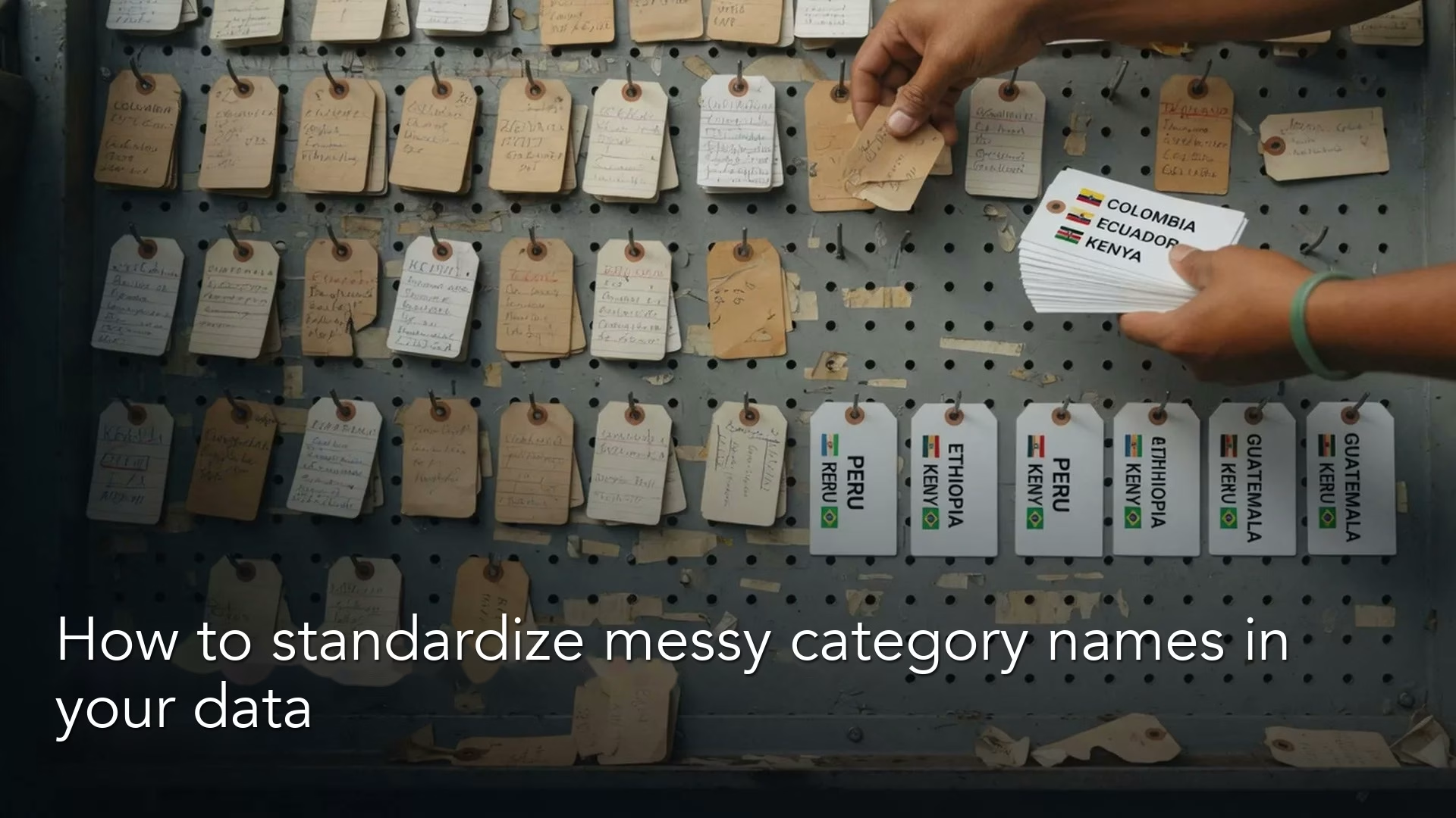
When the same thing is spelled many different ways in your data, every chart that sorts by it quietly lies. The fix is a small lookup table that turns every messy spelling into one agreed spelling, plus a habit of not inventing new spellings.
Say your region chart should show eight real markets, but it has forty-seven labels: US, usa, United States, U.S., a few with stray spaces, and a lonely “Americas” that someone typed because the form allowed free text. The summary table looks impressive, yet it is mostly a spelling contest. People keep fixing this by hand in one-off files, and each fix disappears the next time the data refreshes.
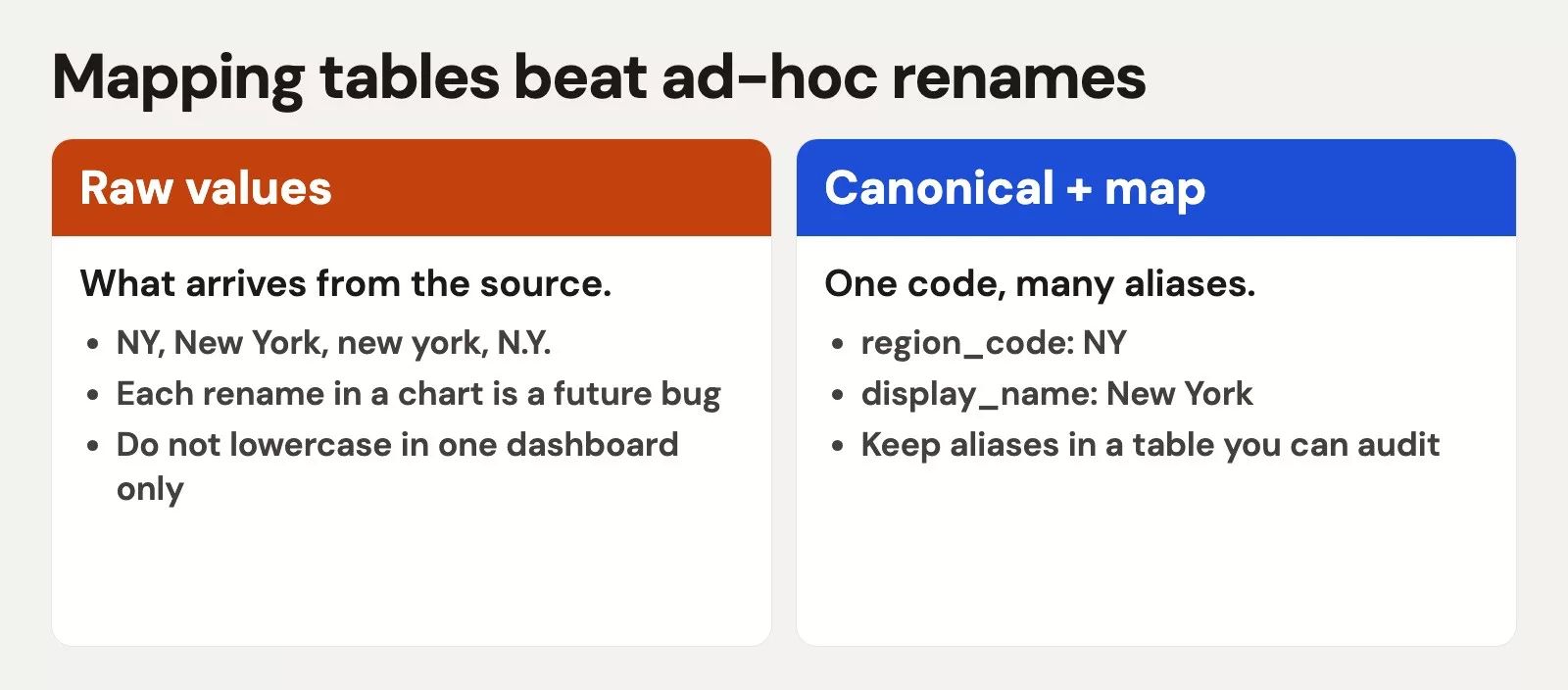
The lookup table is called a mapping table. It links each raw value to one canonical value, which is just the agreed spelling. The common failure is what we will call “Other hell,” where everything awkward falls into a catch-all bucket so large that it stops meaning anything.
This is the fourth post in the data quality series for people who ship numbers. After covering dimensions, profiling, and careful duplicate removal, we now standardize names and categories so that grouped totals tell the truth. The approach is hands-on and does not need a twelve-month steering committee.
Canonical values: the short official list
A canonical value is the agreed spelling for a category in your analytics, and it also carries an agreed level of detail. You would write United States once instead of keeping six cousins, and Paid Search once instead of every tracking tag string (UTM tags are the labels added to web links to record where a visit came from). Canonical does not mean the only string that will ever appear in source systems. Sources stay messy, while your reporting layer speaks one dialect.
Choose the level of detail on purpose. You could stop at “Paid Search,” or you could split it into “Paid Search: Brand” and “Paid Search: Non-brand.” Finer detail means more mapping work and cleaner cuts, while coarser detail means simpler charts that hide some structure. Let the decision you need to make pick the answer, the same habit taught in Analytics foundations.
Write the allowed list somewhere visible, such as a seed CSV (a plain spreadsheet-style text file) file in the repo, a small table in your warehouse, or a documented sheet with an owner. If the list lives only in one person’s head, you do not have standards. You have folklore.
Mapping tables beat giant CASE statements
A mapping table is a two-sided dictionary. A raw value goes in, and the canonical value comes out. A few optional columns help a lot, including the source system, dates when the rule applies, who approved the mapping, and notes.
| Column | Purpose |
|---|---|
| raw_value | What appeared in the extract (or a normalized form of it) |
| canonical_value | What analytics should display and group on |
| attribute | Which field: region, channel, status, plan_name |
| source_system | Optional: CRM vs billing vs ads |
| valid_from / valid_to | Optional: when the rule applies |
| updated_by / notes | Humans leave breadcrumbs |
You could instead write a 200-line CASE expression (SQL’s way of saying “if this value, then that label”) in every query (a written request for data), but copies multiply. Someone updates the ads dashboard (a screen of charts that tracks key numbers) and forgets the finance one. A mapping table keeps the alias list in one place, and your queries join to it once. When a new raw value appears, you add a row and do not have to hunt through SQL.
This is the same “put the rules in data” instinct as keeping structural truth out of one-off spreadsheet edits, which the series on moving from spreadsheets to real data covers.
Normalize before you map
Before you match values, remove the variation you can avoid. Do these five things first.
- Trim whitespace from both ends.
- Collapse repeated spaces inside the value into one.
- Lowercase the value for matching, and store display labels separately if you need pretty title case.
- Unify obvious punctuation differences (
U.S.versusUS) with deliberate rules. - Decide whether an empty string maps to null or to a canonical
Unknown.
Normalizing is not the full standard, because it only makes the alias list shorter. You still need human judgment for cases like EMEA versus Europe, if your company treats those as different levels of detail.
import re
import pandas as pd

def norm_label(s: str) -> str:
    if s is None or (isinstance(s, float) and pd.isna(s)):
        return ""
    s = str(s).strip().lower()
    s = re.sub(r"\s+", " ", s)
    s = s.replace("u.s.", "us").replace("u.s", "us")
    return s

df = pd.DataFrame({"region_raw": ["US", " usa", "U.S.", "EMEA", "Europe", ""]})
df["region_norm"] = df["region_raw"].map(norm_label)
print(df)
Here is what that code prints, shown as an image with the counts for each cleaned value.
Apply the map in SQL and Python
Imagine a mapping table called map_channel that looks like this.
| raw_value | canonical_value |
|---|---|
| google_cpc | Paid Search |
| google / cpc | Paid Search |
| fb_ads | Paid Social |
| Paid Social | |
| newsletter | |
| email_blast | |
| (direct) | Direct |
| none | Direct |
In SQL you apply the map by normalizing on the join key, so that small differences in spelling still find their match.
SELECT
  e.event_id,
  e.utm_source AS channel_raw,
  COALESCE(m.canonical_value, 'Unmapped') AS channel,
  CASE WHEN m.canonical_value IS NULL THEN 1 ELSE 0 END AS is_unmapped
FROM web_events e
LEFT JOIN map_channel m
  ON lower(trim(e.utm_source)) = lower(trim(m.raw_value));
Here is the output of that query.
| event_id | channel_raw | channel |
|---|---|---|
| 1 | ||
| 2 | Google Ads | |
| 3 | fb | Meta |
| 4 | unknown_xyz | Unmapped |
The same idea in Python looks like this.
import pandas as pd

events = pd.DataFrame(
    {
        "event_id": [1, 2, 3, 4, 5],
        "utm_source": ["google_cpc", "Google / CPC", "tiktok_ads", "newsletter", None],
    }
)
mapping = pd.DataFrame(
    {
        "raw_value": ["google_cpc", "google / cpc", "fb_ads", "newsletter", "none"],
        "canonical_value": ["Paid Search", "Paid Search", "Paid Social", "Email", "Direct"],
    }
)

events["raw_norm"] = events["utm_source"].fillna("").str.lower().str.strip()
mapping["raw_norm"] = mapping["raw_value"].str.lower().str.strip()

out = events.merge(mapping[["raw_norm", "canonical_value"]], on="raw_norm", how="left")
out["channel"] = out["canonical_value"].fillna("Unmapped")
print(out[["event_id", "utm_source", "channel"]])
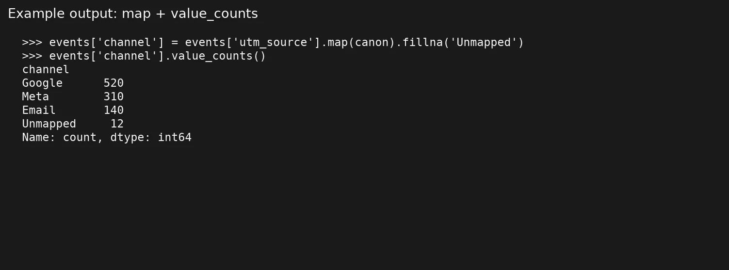
Notice that tiktok_ads becomes Unmapped and does not silently become Other. That is on purpose, because Unmapped works as an alarm while Other is often a graveyard.
Other hell and Unknown limbo
Other hell is what happens when the catch-all bucket becomes the largest slice of the pie. It usually points to free-text inputs, incomplete mapping, or a set of categories that no longer matches how the business sells. Unknown limbo is the same problem for blanks, where empty values are labeled Unknown and then ignored forever. Catch-alls are allowed, and they are useful tools, but they fail when they stop being temporary.
A few operating rules keep you honest.
- Track the percent unmapped and the percent Other as quality metrics, in the same family as the null rates from the earlier post on profiling.
- Set a threshold, for example investigate when Other exceeds 5% of rows or 10% of revenue.
- Review the top unmapped raw values every week, and promote the frequent ones into the map.
- Split Other only when a segment is large enough to change decisions.
- Never map everything to Other just to make a chart’s legend shorter.
SELECT
  channel,
  COUNT(*) AS n,
  ROUND(100.0 * COUNT(*) / SUM(COUNT(*)) OVER (), 2) AS pct
FROM (
  SELECT COALESCE(m.canonical_value, 'Unmapped') AS channel
  FROM web_events e
  LEFT JOIN map_channel m
    ON lower(trim(e.utm_source)) = lower(trim(m.raw_value))
) s
GROUP BY channel
ORDER BY n DESC;
Here is the result, shown as a chart of each channel’s share.
| channel | n | pct |
|---|---|---|
| 520 | 53.0 | |
| Meta | 310 | 31.6 |
| 140 | 14.3 | |
| Unmapped | 12 | 1.2 |
If Unmapped or Other leads the chart, you do not have a visualization problem. You have a category problem, and it needs a fix in the mapping and not in the chart.
A worked example: campaign channels for a weekly growth review
Start with a raw weekly extract of made-up data.
| signup_id | utm_source | revenue |
|---|---|---|
| 1 | google_cpc | 120 |
| 2 | Google / CPC | 80 |
| 3 | fb_ads | 60 |
| 4 | 40 | |
| 5 | tiktok_ads | 90 |
| 6 | newsletter | 30 |
| 7 | 50 | |
| 8 | partner_acme | 200 |
| 9 | Partner_Acme | 150 |
| 10 | referral | 20 |
Without mapping, a simple count of values treats Google twice, Facebook twice, and Acme twice. Paid Social looks weak, and partner revenue looks split into pieces. Someone will fix it by hand in the slide, and the next extract will undo their heroics.
To fix it properly, extend the map with the new raw values.
| raw_value (normalized) | canonical_value |
|---|---|
| google_cpc | Paid Search |
| google / cpc | Paid Search |
| fb_ads | Paid Social |
| Paid Social | |
| tiktok_ads | Paid Social |
| newsletter | |
| partner_acme | Partners |
| referral | Referral |
| Direct / Unknown |
After you apply the map, the growth table becomes something a team can discuss.
| channel | signups | revenue |
|---|---|---|
| Partners | 2 | 350 |
| Paid Search | 2 | 200 |
| Paid Social | 3 | 190 |
| Direct / Unknown | 1 | 50 |
| 1 | 30 | |
| Referral | 1 | 20 |
Here is the SQL that produces the revenue rollup.
WITH cleaned AS (
  SELECT
    s.signup_id,
    s.revenue,
    lower(trim(coalesce(s.utm_source, ''))) AS raw_norm
  FROM signups s
),
mapped AS (
  SELECT
    c.signup_id,
    c.revenue,
    COALESCE(m.canonical_value, 'Unmapped') AS channel
  FROM cleaned c
  LEFT JOIN map_channel m
    ON c.raw_norm = lower(trim(m.raw_value))
)
SELECT
  channel,
  COUNT(*) AS signups,
  SUM(revenue) AS revenue
FROM mapped
GROUP BY channel
ORDER BY revenue DESC;
Here is a pandas twin for the same rollup, which is handy when you live in notebooks from the Python for analytics path.
signups = pd.DataFrame(
    {
        "signup_id": range(1, 11),
        "utm_source": [
            "google_cpc", "Google / CPC", "fb_ads", "facebook", "tiktok_ads",
            "newsletter", None, "partner_acme", "Partner_Acme", "referral",
        ],
        "revenue": [120, 80, 60, 40, 90, 30, 50, 200, 150, 20],
    }
)
signups["raw_norm"] = signups["utm_source"].fillna("").str.lower().str.strip()
mapping["raw_norm"] = mapping["raw_value"].str.lower().str.strip()
# mapping must include tiktok_ads, partner_acme, referral, and empty string rows as above
m = signups.merge(mapping[["raw_norm", "canonical_value"]], on="raw_norm", how="left")
m["channel"] = m["canonical_value"].fillna("Unmapped")
print(m.groupby("channel", as_index=False).agg(signups=("signup_id", "count"), revenue=("revenue", "sum"))
      .sort_values("revenue", ascending=False))
print("unmapped_rate", (m["channel"] == "Unmapped").mean())
Alias lists and ownership
An alias list is simply every raw form that points to one canonical value. Treat it as a living document with a few clear rules.
- Give it one owner, or a small rotation, and do not let everyone edit whenever they like.
- Use pull requests or a lightweight approval for high-revenue categories, because a wrong mapping there changes the numbers leaders watch most.
- Schedule a job that lists raw values seen in the last N days that have no row in the map.
- Keep versions in git when the map is a CSV, or use table history in the warehouse when it is SQL, so you can see who changed a mapping and roll it back.
When marketing launches a new partner code, the map update belongs on the launch checklist. If the map falls behind, the Unmapped share rises, which is a much better failure than silently pushing values into Other.
Names of people and companies: a careful note
Standardizing categories such as region, channel, and status is usually safer than “standardizing” the names of people. Personal names carry culture, punctuation, and legal spellings. Company names have legal entities and trading names. A safer approach follows three habits.
- Use external stable IDs when you have them, because names change and IDs do not.
- Display the source name, and standardize only the attributes you truly need to sort rows into groups.
- Use the identity maps from the earlier post on duplicates and not a fantasy of renaming humans into a single “canonical name.”
If you must clean names to match records, keep the original columns, always, so you can check or undo any match later.
Common mistakes
- Mapping only in the reporting tool. The next extract, or the next tool, brings the chaos back.
- Building categories so detailed that nobody maintains them. Forty channels with three events each is just noise.
- Hiding unmapped values as Other. When you do that, you lose the alarm signal that tells you the map is falling behind.
- Using case-sensitive joins. A value like
Partner_Acmeand its lowercase twinpartner_acmedeserve the same fate, so compare them in lowercase. - Changing canonical labels without a migration note. Time series break when “Paid Social” becomes “Social Paid” halfway through the year.
- Standardizing in place on the raw landing table. Keep the raw data and map downstream so you can reprocess it.
- Forgetting to weight reviews by revenue. A rare code with huge revenue matters more than a common code worth pennies.
Quick recap
- Canonical values are the short official list, and aliases are everything the sources actually send.
- Mapping tables centralize standardization better than copy-pasted
CASEblocks. - Normalize lightly, map deliberately, and keep the raw columns.
- Treat Unmapped as an alarm, and treat Other as a temporary bucket with a measured size.
- The next post covers dates, time zones, and fiscal calendars, the silent dashboard killers.
How to practice this week
- Pick one high-chatter field, such as channel, region, status, or plan, and dump its distinct values with counts.
- Propose a canonical list of 5 to 15 values, and agree on the level of detail with one stakeholder.
- Build a mapping table in SQL, a CSV, or a sheet, and join it in one report only, as a pilot.
- Publish the unmapped rate next to the chart for two weeks, and watch how fast new aliases appear.
- If joins and grouping need a refresher, use the SQL tutorials or the paths on Learn, then come back for the next post on dates and time zones.
Series notes
This is Part 4 of Data quality for people who ship numbers. Related: Analytics foundations, From spreadsheets to real data.
Sources
- pandas documentation,
DataFrame.merge: https://pandas.pydata.org/docs/reference/api/pandas.DataFrame.merge.html - pandas documentation, working with text data (string methods for normalization): https://pandas.pydata.org/docs/user_guide/text.html
- PostgreSQL string functions (lower, trim): https://www.postgresql.org/docs/current/functions-string.html
- Collibra overview of data quality dimensions (consistency context): https://www.collibra.com/blog/the-6-dimensions-of-data-quality
- DAMA International DMBOK overview: https://www.dama.org/cpages/body-of-knowledge
Keep going
Same lessons in your feed
Short diagrams, hooks, and weekly tutorials on Substack, Instagram, X, and Facebook.