Clean charts can still lead a room to a bad decision when the question behind them hides a thinking trap. Learn the common traps, such as averaging averages or picking a flattering time window, so you can spot them in seconds. Say the chart is tidy, the database query (a written request for data) ran without errors, and the slides look sharp, yet the room still makes a worse call than if nobody had opened a laptop. The numbers were only as honest as the questions nobody asked about them.
This is a short companion to Analytics foundations, especially Reading a number like an adult and Data vs information vs insight. You will learn the traps that show up most often at work, how to spot them in five seconds, and what to say instead of “looks fine to me.”
Five traps that fake certainty

1. Survivorship bias
What it is: You study only the things that “made it” into the table. Failed pilots, churned customers, killed products, and rejected applicants never show up, so the remaining set looks smarter, healthier, or more successful than reality.
Workplace version: Someone claims “our power users love feature X,” where power users means people still active after 90 days. The people who hated the feature already left, so you are only interviewing the ones who stayed.
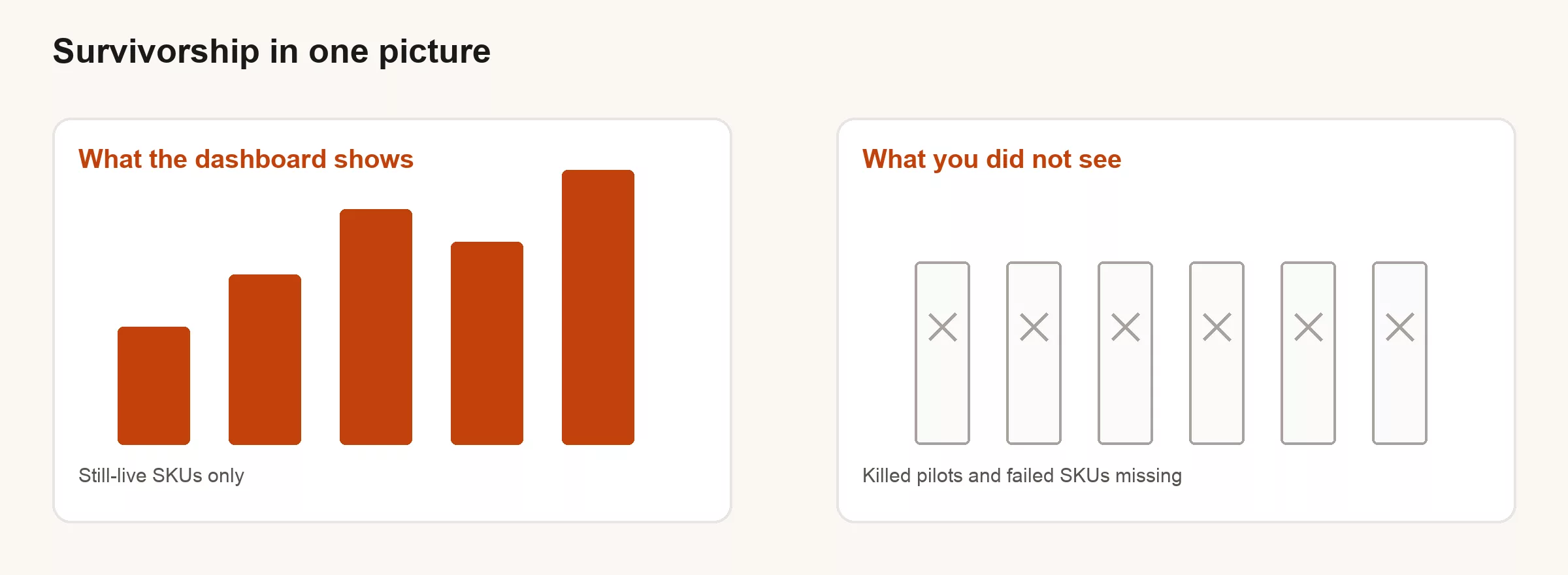
What to ask: “Who is missing from this dataset by construction?” “What would we see if we included canceled, deleted, or never-activated records?”
2. Cherry-picking
What it is: Choosing the window, segment, or metric that tells the story you already wanted. This is not always intentional; it is often unconscious, but it is always dangerous in a decision meeting.
Workplace version: Someone announces “Revenue is up 18%,” but the window happens to cover the week of a one-time enterprise deal. Or “Conversion improved,” after mobile traffic quietly got dropped from the denominator.
What to ask: “Show me the same metric last year same week, last 12 weeks, and without the one-off.” If the story only lives in one cut of the data, it is a cherry, not a trend.
3. Average of averages
What it is: Averaging group-level rates as if each group were the same size. A store with 10 customers and a store with 10,000 customers are not equal votes, even though a naive average treats them that way.
| Store | Customers | Conversion |
|---|---|---|
| A | 100 | 10% |
| B | 100 | 10% |
| C | 10,000 | 2% |
| Naive average of rates | (10+10+2)/3 = 7.3% | |
| Customer-weighted rate | ~2.2% |
The naive average says “about 7%.” The business actually lives near 2%. Present the 7% number and someone will staff and spend as if you had a miracle funnel that does not exist.
What to ask: “Is this weighted by volume?” “Can I see the overall rate and the distribution, not only the mean of the group rates?”
4. Wrong grain
What it is: Mixing up what one row means. Order lines get counted as orders, sessions get counted as users, and a join makes the row count explode until “revenue” doubles for no real reason.
Workplace version: A join to a marketing attribution table multiplies each order by the number of touchpoints it had. Suddenly “orders” are up threefold and nobody actually changed the product.
-- Smell test: if a join multiplies rows, aggregates can lie.
-- Count distinct keys before and after the join.
SELECT
  COUNT(*) AS row_count,
  COUNT(DISTINCT order_id) AS orders,
  SUM(amount) AS revenue_sum
FROM analytics.orders_joined_touches;
If row_count is much larger than orders, you are one careless SUM away from fiction, so fix the grain before you fix the slide title.
5. No baseline (“compared to what?”)
What it is: A lonely number with no prior period, plan, peer, or comparison point. Reading numbers like an adult covers this in more depth, but it still earns a spot here because it is the most common trap in Slack.
Workplace version: “We hit 12,000 signups.” Without visits, last year’s number, a plan, or a quality check, you cannot know whether to celebrate or investigate.
What to ask: Always force one baseline: versus last year, versus plan, or versus a peer segment. Two comparisons are better than one. Zero comparisons is theater.
Honorable mentions (still common)
| Trap | Smell | Fix |
|---|---|---|
| Percent vs points | “Up 50%” from 2% to 3% | Say both points and relative change |
| Overall vs segment reversal | Overall up, every segment down (or reverse) | Show mix shift + segment rates |
| Seasonality amnesia | Dec vs Nov “growth” | Same period last year |
| Silent definition change | Metric jumps on a Tuesday | Changelog for metric definitions |
| Overfitting the anecdote | One customer story drives strategy | Quantify how common the story is |
A review checklist you can paste into a PR or deck
TRAP CHECK (before this number leaves the room)
[ ] Who is missing from the data by design? (survivorship)
[ ] Would another time window reverse the story? (cherry-pick)
[ ] Are rates volume-weighted? (avg of avgs)
[ ] Does one row mean what we think? (grain)
[ ] Compared to what? (baseline)
[ ] Definition same as last month?
[ ] Exclusions listed in plain language?
[ ] Decision this number should change: ________
How traps connect to the foundations series
- Problem first: traps thrive when the decision is fuzzy. Use a one-page brief.
- Data vs insight: a trap-free chart can still be only information. Insight changes a decision.
- Good enough: do not wait for perfect data to avoid traps. Many traps are reasoning errors on fine data.
- Reading numbers: rates, denominators, and baselines are trap detectors.
A mini scene: the “record conversion” that was not
Marketing posts a win: conversion jumped from 2.1% to 3.4% after a landing page rewrite, and leadership wants to scale the same design to every campaign. Before anyone approves that, walk the trap check:
- Cherry-pick: the test week included a brand TV spot. Remove those days and the lift halves.
- Survivorship: the report only includes visitors who accepted cookies and completed a bot check, so a chunk of mobile browser users dropped out of the sample before it was even built.
- Avg of avgs: country-level conversion rates were averaged equally, so a huge but modest-converting market got drowned out by a handful of tiny, high-rate geographies.
- Grain: “conversion” mixed newsletter signups and paid checkouts into one funnel step.
- Baseline: there was no same-week comparison from last year, no holdout group, and no plan target, so “up” floated free of any real context.
None of those issues required special expertise to catch. They required a habit: treat every shiny number as a suspect until the trap check passes. Scaling the design without that habit would have burned budget chasing a story, not a real mechanism.
What to say in the room (scripts)
- “Before we decide, who is missing from this table by design?”
- “Can we see the same cut without the one-off week?”
- “Is this rate volume-weighted, or an average of group rates?”
- “What does one row mean after the join?”
- “Compared to last year, plan, or peer, which baseline should we use?”
These lines can sound slightly pedantic the first time you use them, but by the tenth time they sound like leadership, because by then they have already saved a quarter of arguing over the wrong number.
Mix shifts, without the textbook
You do not need a statistics lecture to get hurt by mix. Overall conversion can rise while every channel falls on its own. That happens when traffic shifts toward a higher-converting channel, and the reverse can happen just as easily. The trap is presenting the overall number as proof the product got better, when really the mix of traffic did the work.
Build the habit: when leadership asks whether things are better, show the overall number and at least one segmentation that matters, such as channel, plan, or region. If the overall number and the segments disagree, lead with the disagreement, not the prettier chart. Mix shift is not a niche statistics trick. It is how portfolios, funnels, and regional rollups quietly mislead busy people every week.
Definition drift: the quiet cousin of cherry-picking
Last month “active user” meant a login. This month it means any API (the way one program asks another for data) call, including background syncs nobody sees. The metric jumps, someone claims a growth miracle, and nobody actually shipped one. Somebody shipped a definition change without telling anyone.
Treat metric definitions like code. If you cannot point to a written definition and the date it changed, you are flying without instruments. Pair this habit with the one-page brief’s grain field, so “active” is never just a vibe in a decision document. Silent definition changes are how two honest analysts become permanent enemies over numbers that never meant the same thing to begin with.
Building a culture that catches traps early
Trap checks work better as norms than as personal pedantry. Require a compared-to-what line on every metric in a decision deck. In code review, ask for row counts before and after joins on any financial aggregate. Keep a living doc of metric definitions with owners and the last change date. Reward the people who kill bad charts early, not only the people who ship more charts.
None of this slows a healthy team down. It slows a theater team down, which is the point. Fix the culture first if it treats every question as a threat. Keep funding accidents if it treats every number as innocent until proven guilty. Keep the foundations series open for more on rates, baselines, and denominators, and use the one-page brief for cleaner asks before the traps even appear. Traps are cheaper to prevent at the question stage than to unwind in a board meeting with twelve people and a frozen smile.
Quick recap
Clean data can still support dirty conclusions. Watch for survivors only, cherry-picked windows, unweighted averages of rates, wrong grain, and lonely numbers with no baseline. A short checklist beats a long argument after the deck is already in the meeting.
For templates that prevent fuzzy asks, use the one-page analytics brief companion. For the full foundations arc, start at the series landing.
How to practice this week
- Take one chart from last week’s meeting. Run the trap check and write down which trap was closest.
- Rebuild one average-of-averages metric with a weighted rate, then compare the two numbers.
- For one “success” cohort, estimate who never entered the table in the first place.
- Add a “compared to what” line to your next Slack metric update, because a number without a baseline cannot tell anyone whether things got better.
Sources
- Classic discussion of survivorship bias in analysis (Abraham Wald / WWII aircraft armor as a teaching story; many modern summaries, e.g. Wikipedia overview): https://en.wikipedia.org/wiki/Survivorship_bias
- OpenIntro Statistics on averages, weighted means, and proportions: https://www.openintro.org/book/os/
- Analytics Made Simple foundations: problem framing, data vs insight, good enough data, reading numbers
Keep going
Same lessons in your feed
Short diagrams, hooks, and weekly tutorials on Substack, Instagram, X, and Facebook.