
To see whether customers stick around, group them by when they started and follow each group on its own clock, instead of looking at one blended number. Decide what “active” means before you build anything, or your chart will mislead you without anyone noticing. Analysts call each group a cohort, and the share still active after a set number of weeks is retention.
Say your dashboard (a screen of charts and numbers that updates on its own) shows retention at 32%, and a product manager asks whether that is better than last month. You cannot answer, because half of the “active users” signed up this week. The 32% blends brand-new customers with people who have been around for a year, so it says almost nothing about either group.
Cohort means a shared start and a shared clock
A cohort is a set of people who share a starting event in the same slice of time. The classic example is every user whose account_created date falls in the week of January 6. Their “week 0” is that signup week. “Week 4 retention” means they were active in the fourth week after signing up, and it does not mean the fourth calendar week of the year.
That relative clock is the whole point. A count of monthly active users (MAU) mixes customers of every age together. Cohort retention compares like with like, so you can see how January signups behave at week 4 compared with how February signups behave at week 4.
The idea in four steps
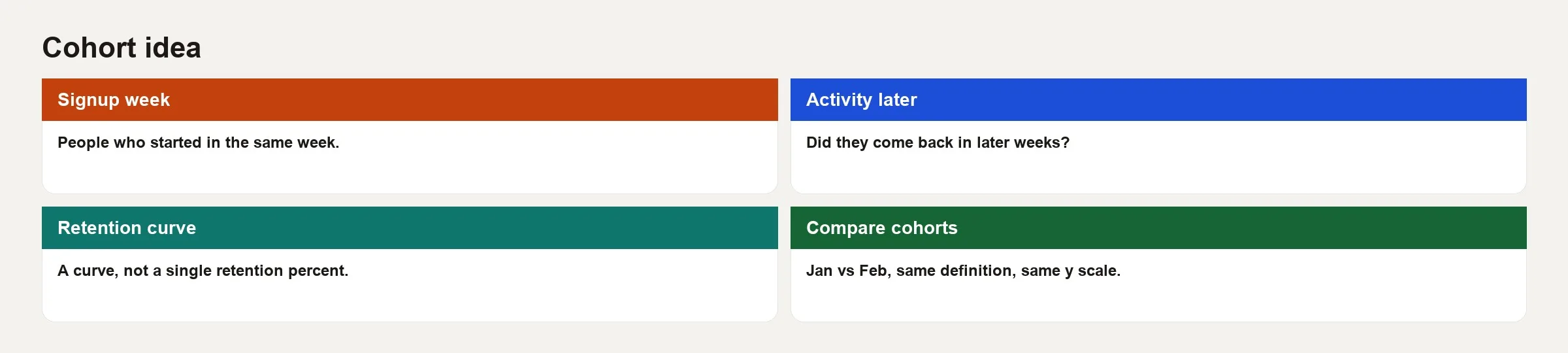
- Signup week, or whatever starting bucket you choose: give each user a cohort label based on the starting event.
- Activity later: decide what counts as retained, such as a session, a key action, or a paid status.
- Retention curve: for each age (week 1, week 4, week 8, and so on), divide the number of active users by the size of the cohort.
- Compare cohorts: ask whether February’s curve sat above January’s after a product change.
The starting event is not always signup. For a shop, the first purchase is often the better starting point. When signing up is cheap and real value comes later, use the first time someone reaches an activated state. To study cancellations after money changes hands, use the first payment. Whichever you choose, name it in the metric title, for example signup_cohort_w4_retention, and avoid a generic label like “retention.”
Reading a retention grid
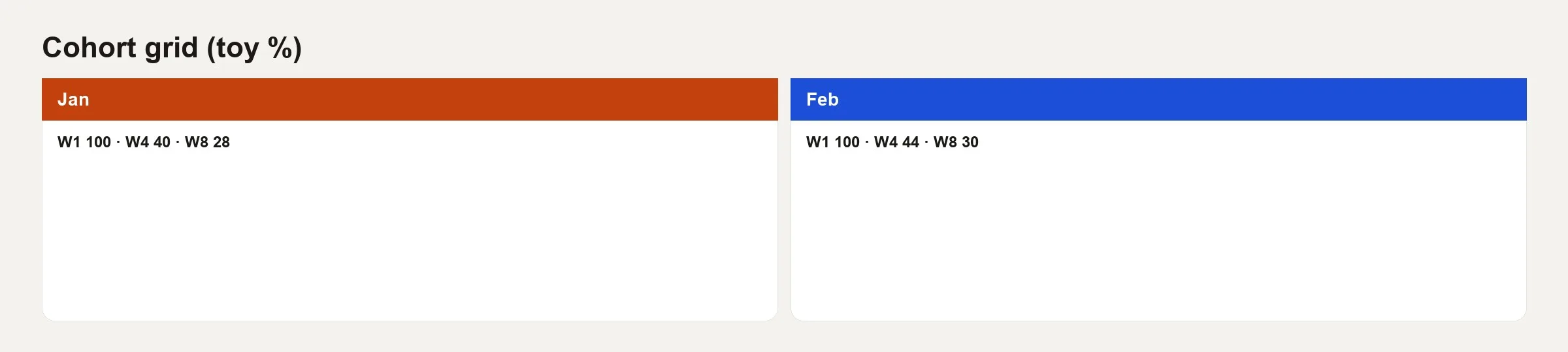
A grid puts cohort labels on the rows and ages on the columns. Each cell is the percentage of the original cohort that is still active, or still paying, at that age. Here is a toy example.
| Cohort | W1 | W4 | W8 |
|---|---|---|---|
| Jan | 100% | 40% | 28% |
| Feb | 100% | 44% | 30% |
You can read the grid honestly if you follow a few habits.
- A week 1 value of 100% often means “active in the week of signup” by construction, if signing up counts as activity. Some teams call the signup week week 0 and the next week week 1, so label your axes.
- Compare the same column across rows to judge whether newer cohorts are better than older ones, for example February against January at week 4.
- Compare across the columns in one row to see how fast people drop away, whether it is a steep fall early or a slow bleed.
- Do not compare January’s week 8 to February’s week 4 as if they were the same milestone, because those customers are at different ages.
- Leave cells for recent cohorts blank or mark them as immature, and never fill them with zero.
In the toy grid, February looks slightly healthier at week 4 and week 8. That could come from the product, the season, a change in where customers came from, or plain noise. Cohorts remove the bias of mixing ages, but they do not tell you what caused a change.
Define “active” carefully
Retention is only as good as your definition of activity. Four common choices each have a catch.
- Any session is easy to measure, but it is often inflated by push notifications and accidental opens.
- A key action is tied to the activation idea from the earlier post in this series, and it gives a better product signal.
- Paid retained means the customer is still subscribed and has not cancelled, which finance cares about.
- Revenue retained means the customer is still paying above a set amount, and it captures growth and shrinkage in spending.
Pick one main retention definition for the company story, and keep the others as secondary views. Five “retention” charts with five different meanings is how leadership loses trust in the word.
Acquisition cohorts and behavioral cohorts
Acquisition cohorts start from the first touch or the signup time. They are great for judging channel quality and onboarding changes.
Behavioral cohorts start from a customer doing something specific, such as creating a first project or sending a first invite. They help you understand people who reached a milestone. They are a poor way to ask whether paid marketing works better, unless you carefully connect them back to acquisition.
Do not mix the two in one unlabeled chart. For example, if users who invited a teammate retain at 70% and all signups retain at 30%, you cannot read the gap as a score for a channel, because the first group already did something that predicts staying.
Business customers and account-level cohorts
For products with several seats per customer, account cohorts often matter more than user cohorts. An account that signed up in January may add seats in March, and user-level signup cohorts will miss that growth. So you need three definitions in place.
- An account start date, such as the first paid invoice, the first activated seat, or the date the sales deal closed.
- What retained means: still paying, at least one seat active, or usage above a set level.
- Whether the headline counts logos (the number of customers) or annual recurring revenue (ARR).
Logo retention can look fine while net revenue retention (NRR) tells a different story. NRR is the share of last period’s revenue that you kept after cancellations, downgrades, and upgrades. Both are cohort ideas with different definitions of success, so label each one.
Worked example: signup cohorts for a notes app
Imagine the same notes app from the earlier post on customer stages. The starting event is the account_created week. A user counts as active if they made at least one note_created or note_edited event in the age week. Cohort size is the number of users who signed up that week, after filters.
For toy numbers, the January week cohort has N = 2,000 users, and the February week cohort has N = 2,200. The activity counts produce the percentages in the grid above. January week 4 has 800 active users, which is 40%, and February week 4 has 968, which is 44%.
-- Weekly signup cohort retention sketch
-- age_week 0 = week of signup; 1 = next week, etc.

WITH signups AS (
  SELECT
    user_id,
    date_trunc('week', account_created_at) AS cohort_week,
    account_created_at
  FROM analytics.user_signups
  WHERE is_employee = FALSE
),
activity AS (
  SELECT
    user_id,
    date_trunc('week', event_at) AS activity_week
  FROM analytics.events
  WHERE event_name IN ('note_created', 'note_edited')
  GROUP BY 1, 2
),
aged AS (
  SELECT
    s.cohort_week,
    s.user_id,
    CAST(
      date_diff('week', s.cohort_week, a.activity_week)
      AS INTEGER
    ) AS age_week
  FROM signups s
  JOIN activity a ON a.user_id = s.user_id
  WHERE a.activity_week >= s.cohort_week
)
SELECT
  cohort_week,
  age_week,
  COUNT(DISTINCT user_id) * 1.0
    / MAX(cohort_size) AS retention_rate
FROM aged
JOIN (
  SELECT cohort_week, COUNT(*) AS cohort_size
  FROM signups
  GROUP BY 1
) c USING (cohort_week)
WHERE age_week IN (0, 1, 4, 8)
GROUP BY 1, 2
ORDER BY 1, 2;
The exact date functions differ between BigQuery, Snowflake, and DuckDB, but the logic is the same. You need a starting bucket, an age counted in periods, and a count of distinct active users divided by the original size. When an AI assistant writes this SQL (the standard language for asking a database questions), check the age calculation and how it treats immature cohorts. The post on how to check AI-written SQL shows how.
Curves beat a single retention number
A single “retention = 32%” with no age attached is incomplete. Use three views instead.
- A small set of headline ages, such as week 1, week 4, and week 8, or day 1, day 7, and day 30.
- Full curves when you need a deeper look.
- Segment overlays, such as channel or platform, as secondary views, decided in advance whenever they feed a ship decision.
A steep drop early often means people never got to the first useful moment. Parallel curves that sit higher after a feature launch may mean better onboarding. Curves that start fine and then dive around day 30 may point to billing problems or notification fatigue. The shape gives you a hint about where to look, and you still need an experiment to confirm the cause. The series on experimentation culture explains how.
Seasonality, mix shifts, and false victories
February cohorts may retain better because of the season and not because of your redesign. A change in where customers come from, with more from brand search and fewer from paid social, can move cohort quality without any product change. Always ask what else changed in acquisition when the curve moved.
Also watch for survivor bias in “power user cohorts.” Studying only users who reached month 6 tells you about survivors, and it says little about typical signups.
Rolling, classic, and range retention
Analytics tools use different counting rules, so know which one you are looking at.
- Classic N-day counts a user only if they were active on exactly day N, which is strict.
- Unbounded, or “on or after,” counts activity on day N or any later day, and it can inflate late ages.
- Range counts any activity within a window, such as days 7 through 13 for “week 2.”.
- Bracket or rolling rules are specific to each platform, so read the docs before you compare with warehouse SQL.
If your business intelligence (BI) tool says 40% and your SQL says 36%, compare the counting rules first, before you argue about the company’s philosophy.
Common mistakes
- Calling calendar retention “cohort retention.”.
- Comparing immature cells with mature cells.
- Treating tiny cohorts (N = 40) as strategy truth.
- Changing the definition of “active” mid-year without versioning it.
- Using user cohorts to tell an account revenue story without a bridge between them.
- Chasing one lucky week’s cohort instead of a run of weeks.
- Ignoring reinstalls and merged identities that create duplicate starting events.
Linking cohorts back to funnels and conversion
Cohorts do not replace funnels. A funnel shows where people get stuck in a flow, and a cohort shows whether the people who entered keep showing up and paying. A healthy activation step with weak week 8 retention means you taught people to start but not to stay. A weak signup step with strong retention among those who finish may mean your targeting or your signup screen is the constraint, and the core product may be fine.
In practice, put one funnel card and one cohort curve on the same one-pager for product reviews. They come from the same week’s acquisition story and use the same definitions, and they show two views of time: the path through the flow and the age of the customer.
Quick recap
Cohorts give customers a shared start and a shared clock, and retention grids compare ages honestly. Define the starting event, the meaning of active, and when a cohort counts as mature. Curves and a few headline ages beat a single blended percentage. This post closes the series on customer analytics basics, which covered stages, conversion math, and time-based cohorts, so that customer numbers mean the same thing on Monday and in the board deck.
How to practice this week
- Write your main starting event and your main “active” event in one sentence each, because a cohort chart means nothing until both are defined.
- Build a toy grid with 2 cohorts and 3 ages from real data, even if N is small.
- Mark which cells are still immature today.
- Compare a warehouse number with your product analytics tool for one cell, and write down the counting-rule gap.
- Share one curve-shape insight with a partner, such as an early drop or a late drop, without claiming a cause.
Series notes
This is Part 3 of Customer analytics basics.
Sources
- Croll and Yoskovitz, Lean Analytics (retention and cohort thinking by model): https://leananalyticsbook.com/.
- Amplitude Docs on retention analysis and cohort charts: https://help.amplitude.com/hc/en-us/articles/230403947-Retention-Analysis.
- Mixpanel Docs on retention: https://docs.mixpanel.com/docs/reports/retention.
- Reforge blog on retention and engagement (practical product analytics essays): https://www.reforge.com/blog.
- Google’s Happiness, Engagement, Adoption, Retention, and Task success (HEART) paper (experience quality alongside retention-style measures): https://research.google/pubs/pub36299/.
Keep going
Same lessons in your feed
Short diagrams, hooks, and weekly tutorials on Substack, Instagram, X, and Facebook.