A pretty retention heatmap can still lie to you. Before you trust the green fade, make sure the time periods line up, mark the groups that are not finished yet, and build the plain table first.
Say you open a heatmap that looks beautiful, with deep green on the left, a soft fade to the right, and a little note that says “retention improving.” Someone zoomed the vertical axis so a drop from 42% to 38% looks like a dramatic recovery. The newest group has only twelve customers and a heroic month-one rate. Nobody mentions that the older groups used a different definition of “active” before the company moved to a new CRM (the system the sales team uses to track customers).
What a cohort chart claims
A cohort retention chart puts customers into groups based on a shared starting event, such as their first paid month, signup month, or contract start. Then it measures how many are still around at later ages, meaning month 0, month 1, month 2, and so on. The chart can take one of three shapes:
- Lines: one line for each cohort, with age along the bottom and the retention rate up the side.
- Heatmap: each row is a cohort start, each column is an age, and the color shows the rate.
- Bars: the retained count or rate at one fixed age, compared across cohorts.
Every cell is a ratio or a count that rests on a stack of definitions from the earlier post on churn and retention: who counts, what active means, which time window applies, and how you report it. The chart does not free you from that stack. It raises the cost of getting the stack wrong, because people remember pictures far longer than they remember footnotes.
Cohorts in a finance pack usually mean accounts that became paying in a given month and are still paying at a later age, or still paying at least a set amount of monthly recurring revenue (MRR). Cohorts based on product activity, such as people who opened the app in week 1, follow the same logic but divide by a different number. So do not paste a product curve into a revenue meeting without a label the size of a billboard.
Rule of thumb: If the chart needs a five-minute spoken footnote to be true, put the footnote on the chart, because your voice does not travel with the image when someone forwards it.
Honesty rules for retention charts
Start with the simple do and avoid pairs below. They are not matters of taste, since each one describes a way that audiences get misled.
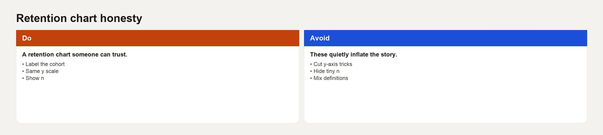
Label the cohort and the outcome
A few title patterns help the reader see exactly what is being measured:
- “Logo retention by first paid month (still paying at month age)”.
- “Gross MRR retained from starting cohort MRR by age”.
- “Net MRR including expansion for cohorts by first paid month”.
If both the gross and the net versions appear in the same pack, give them different titles, and preferably different colors or chart types, so nobody skims them as twins.
Same y-scale when comparing
A row of small charts with different vertical ranges is a classic way to mislead. If January’s chart runs from 0% to 100% and February’s runs from 70% to 90%, February looks calmer and “better managed” even when it is worse. Use a shared 0% to 100% axis for rate charts unless you have a strong, labeled reason to zoom in, and even then show a full-scale inset.
Show n
A cohort of 8 customers can print a perfect 100% month-two retention because of one happy customer. A cohort of 800 tells you something far more solid. So show n, the number of customers in the cohort, in the legend, as a label at age 0, or in a companion table. A heatmap without n is decoration, not analysis.
Avoid cut-axis theater
A truncated axis, one that starts above zero, makes small moves look like matters of life and death. Sometimes you really do need to see a 2-point change. In that case, use a second chart or a table of differences instead of a single dramatic axis that forgets where the baseline is.
Do not mix definitions across cohorts
Suppose “active” meant “logged in” before May and “paid an invoice” after May. Then you do not have one series, because the method changed halfway through. Draw a vertical line, split the chart, or recompute the history under one definition. Breaks that nobody mentions are how “retention improved after the reorg” becomes corporate folklore.
Incomplete periods and survivor tricks
The newest cohort has not lived through month 6 yet. If your heatmap colors those empty future cells as zero, you invent a death spiral that never happened. If you color them a “no data” gray without a legend, people still guess wrong. The standard practice is to plot only the ages that the cohort has fully completed by your as-of date, and to leave the future blank or hatched.
Another trick is averaging every cohort’s month-3 rate without weights. A tiny cohort and a huge cohort should not count equally if you claim a company-wide picture. Weight the average by cohort size, or show the spread of the rates instead of one heroic average.
Money and expansion create a third trap. A curve that counts customers (logo retention) and a curve that counts net revenue can move in opposite directions, because customers can leave while the ones who stay spend more. The math allows that. What you cannot do is put the word “retention” in the title without saying which kind you mean.
A worked example with four cohorts and an honest table first
Build the table before the chart. The toy table below shows logo retention, meaning the share still paying, for accounts first paid in each month. Each value is the retained count divided by the starting count. Ages a cohort has not reached yet are marked n/a. They are not zero, and they are not a dash that readers might misread.
| Cohort | n | M0 | M1 | M2 | M3 |
|---|---|---|---|---|---|
| Jan | 100 | 100% | 82% | 74% | 70% |
| Feb | 80 | 100% | 80% | 72% | 68% |
| Mar | 90 | 100% | 85% | 76% | n/a |
| Apr | 12 | 100% | 92% | n/a | n/a |
These are the observations worth writing in plain prose next to any chart like this one:
- April’s 92% at month 1 looks the best, but with only 12 accounts it is the least trustworthy.
- January and February can be compared through month 3, while March has not finished month 3 yet.
- A line chart should never invent April month 2 by carrying a number forward or by plotting zero.
Here is a toy sketch in SQL (the language for asking a database questions) that builds the same month-by-month logo retention table:
WITH base AS (
  SELECT account_id, DATE_TRUNC('month', first_paid_at) AS cohort_month
  FROM accounts
  WHERE first_paid_at IS NOT NULL
),
aged AS (
  SELECT
    b.cohort_month,
    b.account_id,
    DATE_DIFF('month', b.cohort_month, d.month_start) AS age_month,
    d.is_paying
  FROM base b
  JOIN account_month d
    ON d.account_id = b.account_id
)
SELECT
  cohort_month,
  age_month,
  COUNT(*) AS accounts_observed,
  AVG(CASE WHEN is_paying THEN 1.0 ELSE 0.0 END) AS logo_retention
FROM aged
WHERE age_month >= 0
  AND cohort_month + INTERVAL '1' MONTH * age_month
      <= DATE '2026-04-30'  -- only completed ages
GROUP BY 1, 2
ORDER BY 1, 2;
The filter on completed ages is what keeps the chart honest. Adjust the query to your own warehouse, because the idea matters more than the function names. Never compute month-6 retention for a cohort that is only three months old.
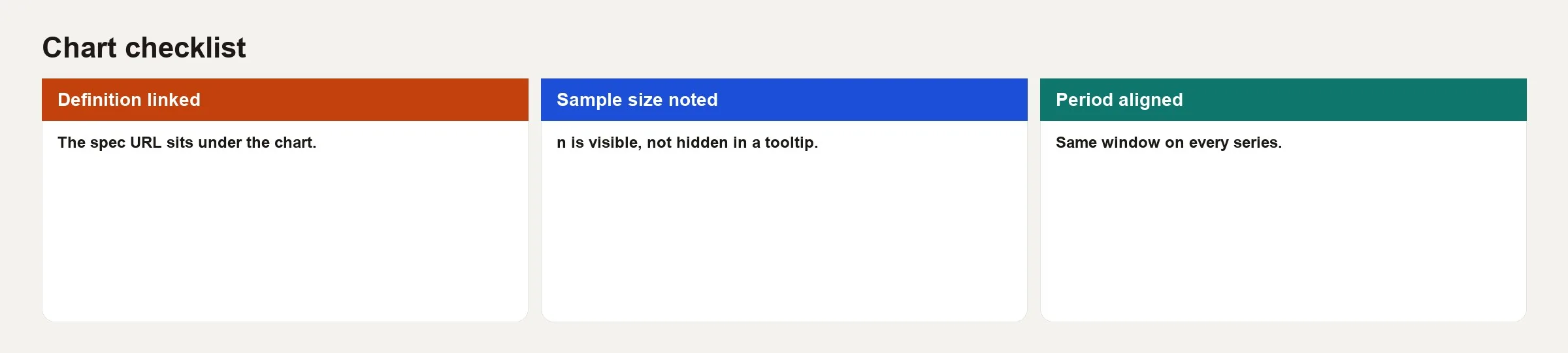
Before any retention chart leaves your laptop, run the checklist card: the definition is linked, the sample size is noted, and the periods are aligned. If any box is empty, the chart is still a draft and is not ready to support a decision.
Heatmaps versus lines
Heatmaps are good for scanning many cohorts and ages at once. They are bad at comparing two close rates, because the color steps hide small differences. Lines are good for showing shape and for comparing a few cohorts, but they turn into spaghetti quickly. A practical pack often uses three things:
- A table with n and the key ages (months 1, 3, 6, and 12).
- A line chart of the last six complete cohorts on a shared axis.
- An optional heatmap in the appendix for the people who like digging through history.
Color scales should step in one direction, from light to dark, and should be safe for colorblind readers. A scale that centers on an arbitrary “good” threshold can smuggle a target into the picture. If 70% is your internal target, draw a reference line on a line chart, and do not re-sort the heatmap colors until everything below target looks like crisis red.
Aligned periods and calendar scars
Month-end billing, annual renewals that cluster in January, and the long buying cycles of big companies all leave calendar scars in your data. A cohort that starts in December may show odd month-1 behavior because of holidays and invoice timing, and product quality has nothing to do with it. Annotate the scars you know about. Do not explain every dip with a story about the product when the dip is only seasonal cash timing.
Line up the periods when you compare channels or segments. If your self-serve cohorts are monthly and your enterprise cohorts are quarterly, say so. Forcing both onto one monthly chart without enough enterprise volume creates noise that looks like insight.
Common mistakes
- Plotting incomplete ages as zero, which invents churn that never happened.
- Hiding n, which turns luck into strategy.
- Mixing logo and net revenue curves under one legend color family without labels.
- Changing y-scales across slides in the same deck.
- Comparing pre-migration and post-migration cohorts without a break marker.
- Using a rainbow heatmap that implies ranking the eye cannot decode.
- Averaging unweighted cohort rates and calling it “company retention.”
- Presenting the chart without the definitions written in a footnote.
How to practice
- Reproduce one official retention chart from a table with n and completed ages only.
- Redraw it with a forced 0% to 100% y-axis and with n labels. Note what story changes.
- Compute M3 logo retention for the last six complete cohorts. Mark any cohort with n under 30 as low confidence.
- Add a one-sentence definition under the chart that a new hire could understand.
- If you also track product activity retention, place it on a different slide so the meeting cannot blend the two by accident.
That closes Finance analytics for non-finance, a three-post arc covering the vocabulary of annual and monthly recurring revenue, definitions for churn and retention, and charts that do not smuggle a story past the definition. For more structured learning paths, visit the Learn hub. When metric definitions need the same care as data pipelines, revisit the metrics series and the data quality series.
Quick recap
- Cohort charts claim a start event, an age, and a retention definition.
- Label the cohort, the outcome, and n, and keep the vertical scales comparable.
- Do not plot incomplete ages as failure, and either leave them out or mark them n/a.
- Building the table before the chart catches small samples and method changes early.
- Heatmaps are for scanning and lines are for comparing, and both need honest color and axes.
- Run the checklist: link the definition, note the sample size, and align the periods.
Your next step
Rebuild your main cohort chart from its table first: cohort label, size, age, and outcome, with incomplete ages marked n/a. Then compare the chart with the table. If anything looks different, the table is right, and the chart was misleading readers.
Series notes
This is Part 3 of Finance analytics for non-finance. Previous: ARR/MRR and churn vocabulary.
Sources
- ChartMogul. Cohort analysis and retention reporting guides for subscription businesses. https://blog.chartmogul.com/cohort-analysis/.
- Amplitude. “Playbooks: retention” (product-analytics cohort framing; useful contrast with commercial retention). https://amplitude.com/docs/analytics/charts/retention-analysis.
- Google. “Data visualization: chart junk and scales” style guidance appears across Material and analytics education posts; see also Few’s principles commonly taught via Stephen Few on chart integrity.
- Paddle. SaaS metrics resources (ties cohort thinking back to MRR movement). https://www.paddle.com/resources/saas-metrics.
- Observable / Mike Bostock materials on scales and visual encoding (general viz craft for honest axes). https://observablehq.com/@d3/learn-d3-scales.
Keep going
Same lessons in your feed
Short diagrams, hooks, and weekly tutorials on Substack, Instagram, X, and Facebook.