

The leadership offsite ends with a triumphant slide: “Our North Star is weekly active teams.” Heads nod. Two weeks later, Support is still measured on ticket close time, Sales on bookings, Product on feature ship count, and Finance on gross margin. Nobody is wrong. Nobody is aligned. The star is bright in the strategy deck and invisible in the Monday standups. When someone asks “are we winning?”, five different scorecards answer five different games.
This is Part 4 of Metrics that matter. Parts 1 through 3 walked the chain from goal to measure, leading versus lagging indicators, and the metric spec sheet (owner, grain, formula, filters, caveats). Now the portfolio problem: how one North Star relates to team scorecards, and when one metric is too few or too many. If definitions still feel soft, stay with the spec habits from earlier in this series. Foundations about naming the decision first still apply (Analytics foundations). When you visualize the stack, keep charts honest (Charts that make sense). For the wider path map, see the Learn hub.
What you’ll learn
Example:
- What a North Star metric is for (and what it is not)
- How team scorecards should connect without cloning the same number six times
- When one metric is too few, and when a wall of KPIs is too many
- A worked “metric stack” for a fictional B2B product team, with a clear table
- Common mistakes that create fake alignment and how to practice a cleaner stack
What a North Star is for
Example:
Product teams popularized the phrase North Star metric: one number that best captures the value customers get from the product, and that the company can grow in a sustainable way. Amplitude’s North Star Framework (developed with practitioners including John Cutler) treats the North Star as the center of a small system: the metric, a clear statement of the value it represents, and a handful of input metrics that teams can actually move. The point is not poetry. The point is shared attention.
A good North Star is:
- Value-shaped: it rises when customers succeed with the product, not only when you spend more on ads
- Understandable: a smart non-specialist can explain it in one sentence
- Measurable: you can define grain, filters, and a trustworthy data path (see Part 3)
- Actionable at company level: many teams can contribute without one team “owning growth alone”
- Not pure vanity: raw signups with no usage, or page views with no outcome, rarely qualify
A North Star is not:
- A replacement for revenue, cash, or compliance when those are board-level realities
- A personal OKR for every individual contributor
- A single number you put on the wall so you never need a scorecard again
- A slogan you choose because a competitor tweeted it
Think of the North Star as the company’s shared answer to: “If customers keep getting more of the core value, which metric would climb?” Everything else in the metric system should either feed that climb, protect the business while you climb, or flag when the climb is fake.
Rule of thumb: If two teams can hit their local targets while the North Star is flat for two quarters, your stack is decorative, not directional.
Team scorecards: local control, shared direction
A team scorecard is a short set of metrics a team reviews on a fixed cadence to run its work. Support needs queue health. Sales needs pipeline and win rate. Platform needs reliability. Finance needs working capital. Forcing every team to report only the company North Star is lazy management dressed as focus. Those teams still have jobs that must not break while product value grows.
Healthy scorecards have three layers of intent:
- Contribution metrics: how this team feeds the North Star or its input metrics (example: activation rate for onboarding)
- Health or guardrail metrics: what must not get worse while you chase the contribution (example: churn, defect rate, NPS of open tickets)
- Work metrics: operational signals the team uses to manage throughput (example: cycle time, backlog age). Work metrics are tools, not strategy. Keep them off the company “are we winning?” slide unless they are truly strategic.
The connection between layers is a story, not a coincidence of names. “We ship features” is not automatically “customers get value.” You need a chain like Part 1: objective, behavior, measure, target. Product shipping velocity can sit on a team scorecard as a work metric. It should only sit next to the North Star if you can show how shipping changes the value metric for a defined population.
Alignment is a tree, not a mirror
Bad alignment copies the same KPI into every deck. Good alignment is a tree: one crown metric, a few input branches, and team leaves that attach to a branch. Support’s first-response time can attach to an input like “teams successfully complete their first week,” if slow support is killing activation. Sales bookings attach to growth and cash, and may be a peer of the product North Star rather than a child of it. That is fine. Companies are not pure product organisms. They are product, GTM, and operations sharing a P&L.
When leaders say “everything ladders up,” ask them to draw the ladder. If the drawing needs three asterisks and a prayer, you do not have a ladder. You have a slogan.
When one metric is too few
One number can focus a room. One number can also hide the fire in the next room. You need more than a North Star when:
- Trade-offs are real. Growth versus quality, speed versus safety, acquisition versus retention. A single metric will tempt people to sacrifice the unlabeled side.
- Different time horizons matter. Lagging revenue and leading activation both matter. Part 2 covered that split. A North Star that only moves slowly still needs leading inputs for weekly work.
- Risk is asymmetric. Reliability, privacy, and compliance failures can end the company while the product metric looks fine for a month.
- The business has multiple value engines. Marketplace, two-sided products, or multi-product portfolios often need more than one crown metric, plus a clear owner for each.
- Incentives are high-stakes. The moment pay, promotion, or public ranking hangs on one number, gaming pressure rises. Part 5 goes deep on that. Here, note the design implication: pair the star with guardrails before you attach bonuses.
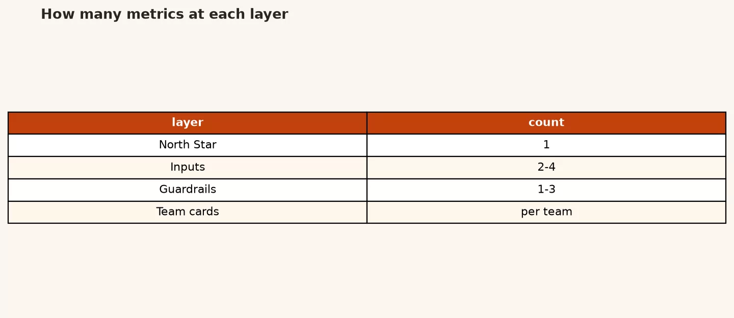
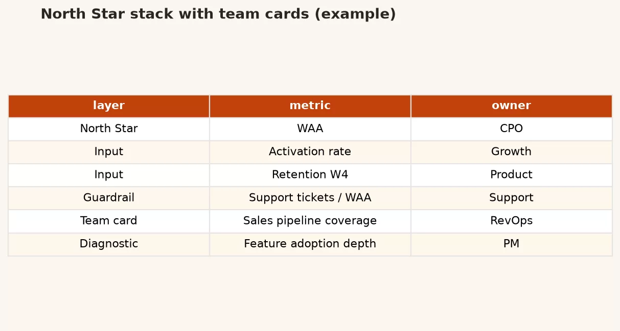
A practical pattern many product orgs use: one North Star + three to five input metrics + a short guardrail set. The North Star answers “are customers getting more core value?” Inputs answer “which lever is stuck?” Guardrails answer “what are we not allowed to break?” That is still a small system. It is not one lonely number pretending to be a strategy.
When too many metrics kill the signal
The opposite failure is familiar: forty tiles on the “exec dashboard,” twelve OKRs per team, and a weekly meeting that is a tour of red and green dots. Too many metrics fail for three reasons.
1. Attention is finite
If everything is a priority metric, nothing is. People optimize what gets asked first in the meeting. The rest becomes ambient anxiety. Dashboard design from the data-viz series applies here: one primary question per view. A scorecard is a product for human attention. Treat it that way.
2. Ownership blurs
Metrics without owners become weather reports. Everyone comments. Nobody commits. Part 3’s spec sheet forces an owner. If you cannot name who moves the number and who can change the definition, cut the metric from the active scorecard or demote it to a diagnostic you open only when something looks wrong.
3. Conflict hides in the pile
When Sales, Product, and Customer Success each bring eight metrics, trade-offs never surface as explicit choices. They surface as quiet sabotage: discounting that ruins unit economics, feature flags that juice activation and destroy trust, ticket deflection that improves close time and enrages customers. A smaller shared stack makes trade-offs discussable.
How many is “too many”? There is no sacred integer. A useful check: can the team recite the active scorecard from memory, and can they say what decision each number informs? If not, you are collecting metrics, not using them.
A simple stack: North Star, inputs, team cards
Here is a mental model you can draw on a whiteboard. The diagram placeholder below is the visual version of the same idea.
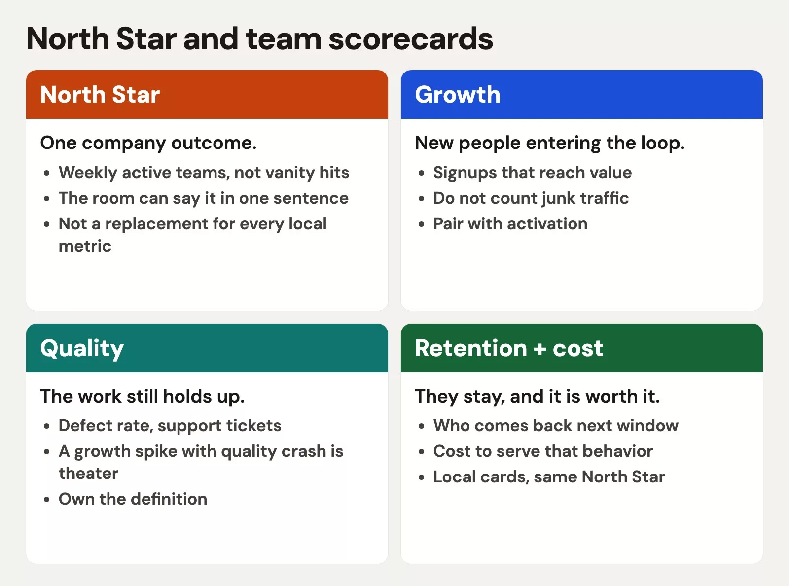
Read the stack top to bottom:
- North Star: shared customer-value outcome for the company or product line
- Input metrics: few levers that explain movement in the star (acquisition of the right users, activation, engagement, retention, or expansion depending on the model)
- Team scorecards: contribution metrics tied to inputs, plus guardrails and a couple of work metrics for local control
- Diagnostics: deeper charts and segments you open when an input moves, not every week by default
Diagnostics are where analysts shine. They are not the same thing as the scorecard. If every cut lives on the weekly slide, you will never finish the meeting. Keep diagnostics one click away, with clear definitions and quality checks from Data quality for people who ship numbers.
Worked example: Northwind Analytics Suite
Imagine a B2B product, Northwind Analytics Suite. Customers are mid-market ops teams. The core value is: ops managers complete weekly decision reviews inside the product with trustworthy data. After a workshop, leadership picks a North Star:
North Star: weekly active decision workspaces (workspaces where at least one manager completed a “decision review” ritual in the last 7 days).
Why not “weekly active users”? Because a user who logs in to download a CSV is not the same as a team that runs the ritual the product is built for. Why not revenue alone? Revenue matters for the board, but it lags product value and can rise on multi-year contracts while product engagement dies.
They choose three inputs:
- Activated workspaces: new workspaces that complete first review within 14 days of create
- Review completion rate: share of scheduled reviews completed on time
- Trusted data share: share of reviews where no critical data-quality flag fired (ties product value to data quality honestly)
Guardrails at company level: logo churn, severity-1 incidents, and sales discount rate (so growth does not buy fake adoption).
Team scorecards then attach without cloning the North Star onto every desk:
| Team | Contribution metrics | Guardrails | Work metrics (local) | How it connects |
|---|---|---|---|---|
| Product / Growth | Activated workspaces; time-to-first-review | Support tickets per new workspace; feature rollback rate | Experiment cycle time | Feeds activation input |
| Core Product | Review completion rate; feature adoption of review template | P1 incidents; crash-free sessions | Story cycle time | Feeds completion input |
| Data Platform | Trusted data share; freshness SLA hit rate | Failed pipeline count; schema break incidents | Mean time to recover | Feeds trusted-data input |
| Customer Success | Workspaces with CS-led review in first 30 days; expansion-ready accounts | Logo churn; CSAT on onboarding | Accounts per CSM | Protects and amplifies activation |
| Sales | Qualified pipeline of ICP accounts; win rate | Discount rate; logo quality score | Stage conversion times | Feeds growth of right customers; peer of product star, not a clone |
Notice what is missing from the company “winning” slide: every team’s backlog size, every individual’s activity count, and vanity signups. Those can exist in tools. They are not the shared scoreboard.
A sample weekly narrative might look like this pseudo status note (plain text your PM can paste into Slack):
NORTH STAR (trailing 7d)
weekly_active_decision_workspaces: 1,842  (WoW +2.1%)

INPUTS
activated_workspaces_14d: 96   (target 110)  <- miss
review_completion_rate: 0.74   (target 0.78)
trusted_data_share: 0.91       (target 0.90) <- ok

GUARDRAILS
logo_churn_90d: 1.8% (watch)
sev1_incidents_7d: 0
avg_discount_rate: 12% (cap 15%)

STORY
Activation lag is concentrated in self-serve SMB.
CS-led first review still hits target.
Action: ship checklist empty-state; CS pilot for mid-tier.
That is a stack in use: few numbers, clear ownership, a story, and a next action. Part 6 will turn this into a meeting that does not suck. Here, notice the design: the North Star is not alone, and the team cards are not a junk drawer.
How to choose the right altitude
Managers often fight about altitude. Should the company watch weekly active users or net revenue retention? Should a squad watch button clicks or activated accounts? Use altitude questions:
- Who can change it this quarter? If nobody in the room can move it, it is context, not a team KPI.
- What decision changes if it moves 10%? If no decision changes, it is trivia.
- Does it still mean the same thing next quarter? Definitions that thrash monthly are not North Stars.
- Is it a proxy or the thing itself? Proxies are fine if labeled. Unlabeled proxies become lies.
Analysts can help by refusing to “just add the metric” without a one-line decision statement. That is the same discipline as problem framing in foundations: data without a decision is expensive decoration.
Common mistakes
- North Star as brand slogan. Pretty name, fuzzy formula, three warehouses disagreeing. Fix the spec first.
- Copy-paste alignment. Every team reports the same company metric and none of the levers. Feels aligned. Changes nothing.
- Scorecard as data lake UI. If the weekly card needs a scroll bar, you built a catalog, not a scorecard.
- Ignoring money and risk. Product North Stars can coexist with revenue and risk metrics. Pretending finance is optional is how “great product, dead company” stories get written.
- No guardrails. One metric with bonus attached and no “do not break” list is an invitation to Part 5’s failure modes.
- Changing the star every quarter. Inputs can evolve. The crown metric should move rarely, with a written reason.
- Hiding quality. If data quality is not on the stack when the product depends on trustworthy numbers, you are measuring theater. Link quality SLAs into inputs the way Northwind did.
How to practice this week
- Inventory: list every metric that appeared in your last two exec or team reviews. Count them. Be brave.
- Label: mark each as North Star candidate, input, guardrail, work metric, or diagnostic. Most will be diagnostic or work.
- Draft a stack: one crown, three to five inputs, guardrails, and one team card for your team only. Use the Part 3 spec template for the crown and each input.
- Draw the tree: on a whiteboard, connect team metrics to inputs with arrows. Delete any metric that cannot earn an arrow or a clear “peer board metric” label.
- Pressure-test: ask, “How could we hit every local target while the North Star stays flat?” Write the loopholes. Those loopholes become guardrails or definition fixes.
- Read next: Part 5 on gaming and Goodhart, because a clean stack with bad incentives still fails. For charting the stack without noise, revisit data-viz. For building the tables behind inputs in code, the Python for analytics path still helps.
Quick recap
- A North Star focuses shared attention on customer value. It is not the only number a company needs.
- Team scorecards should contribute to inputs, protect guardrails, and keep a few work metrics local.
- One metric is too few when trade-offs, risk, and time horizons matter. Too many metrics exhaust attention and hide conflict.
- Design a stack: crown, inputs, team cards, diagnostics. Draw the tree. Spec what you keep.
- Alignment is earned when local wins move the shared star without burning the business down.
Next in the series: how people break metrics on purpose and by accident, and how to design for that reality.
Sources
Research and further reading used for this article:
- Amplitude, About the North Star Framework: https://amplitude.com/books/north-star/about-north-star-framework
- Amplitude, North Star Playbook (resource hub): https://amplitude.com/resources/north-star-playbook
- Amplitude, Every product needs a North Star metric: https://amplitude.com/blog/product-north-star-metric
- Amplitude, Introducing the North Star Playbook: https://amplitude.com/blog/introducing-north-star-playbook
- Reforge, Don’t Let Your North Star Metric Deceive You: https://www.reforge.com/blog/north-star-metric-growth
- Analytics Made Simple, Learn hub: https://analyticsmadesimple.com/learn/
- Analytics Made Simple, Analytics foundations: https://analyticsmadesimple.com/series/analytics-foundations/
- Analytics Made Simple, Data quality for people who ship numbers: https://analyticsmadesimple.com/series/data-quality/
- Analytics Made Simple, Charts that make sense (data-viz): https://analyticsmadesimple.com/series/data-viz/
- Analytics Made Simple, Python for analytics: https://analyticsmadesimple.com/series/python/
Merch on Etsy
Open store → Mute Mouse Pad, Data Science Mouse Pad, Analytics Mouse Pad, You're On Mute
View on Etsy →
Mute Mouse Pad, Data Science Mouse Pad, Analytics Mouse Pad, You're On Mute
View on Etsy →
 Y Hat Mouse Pad, Data Science Mouse Pad, Analytics Mouse Pad, Y Pred Mouse Pad
View on Etsy →
Y Hat Mouse Pad, Data Science Mouse Pad, Analytics Mouse Pad, Y Pred Mouse Pad
View on Etsy →
 You're On Mute White Ceramic Coffee Mug, Data Science Mug, Data Mug, Analytics Mug, Statistics Mug, Programming Mug, Gift Mug, Coffee Mug
View on Etsy →
You're On Mute White Ceramic Coffee Mug, Data Science Mug, Data Mug, Analytics Mug, Statistics Mug, Programming Mug, Gift Mug, Coffee Mug
View on Etsy →
 Boxplot Mouse Pad, Data Science Mouse Pad, Analytics Mouse Pad, Box Plot, Whisker Plot
View on Etsy →
Boxplot Mouse Pad, Data Science Mouse Pad, Analytics Mouse Pad, Box Plot, Whisker Plot
View on Etsy →