“Bad data” is not a diagnosis. It is a feeling, and you can only fix a problem once you can say which kind it is. This post gives you five plain words for the ways data goes wrong, so a vague complaint turns into a ticket someone can act on.
Picture a meeting that opens with a calm question that is not calm at all: “Why are these numbers wrong?” Your customer system says 12,400 active customers. Finance says 11,900. The marketing export says something else again. Someone mutters “bad data” as if that explained anything, and everyone looks at the analyst.
Bad data is real, but the phrase is too vague to act on. When you cannot name what is wrong, you fall back on panic cleaning: you fill blanks, delete “weird” rows, force a match, and hope the slide deck holds. That is how you fix the wrong thing, quietly break history, and still get blamed next quarter.
This series is for analysts who own dashboards, handoffs, and Monday morning explanations, not for big-company master data programs. We start with language, because the right words turn “this feels off” into a fixable ticket.
“Bad data” is not a root cause
In everyday work, “bad data” usually means one of three feelings. The total does not match another system, a chart looks implausible, or a stakeholder found a counterexample in two minutes. Those feelings matter, but they are not a plan.
Data quality guides, from the Data Management Association (DAMA) to vendor handbooks to many dusty governance decks, break quality into dimensions. A dimension is a measurable way data can fail for a particular use. You do not need fifteen of them on day one. You need a short list you can say out loud in a team huddle without sounding like a white paper.
Here is the decision rule for this whole series:
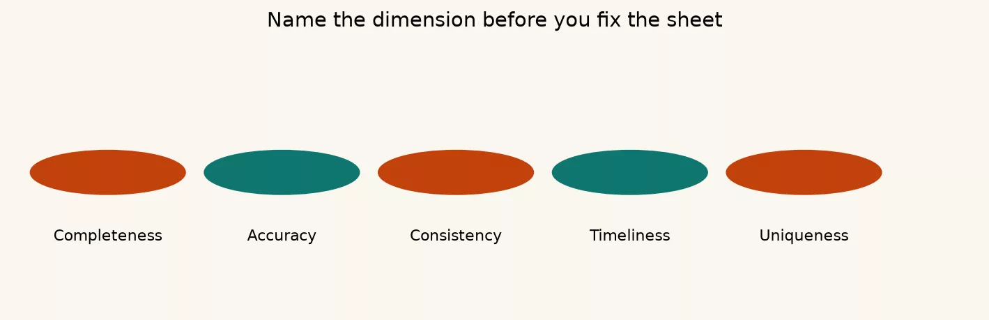
Name the dimension before you fix the row. Cleaning without a named failure mode is gambling with history.
If you have lived in spreadsheet trouble, the same instinct shows up in the series on moving from spreadsheets to real data, where you structure the problem first and transform second. Quality work applies that idea to trust, not just to tidy columns.
Five dimensions you can use on Monday
We will use five dimensions that come up constantly when people ship numbers: completeness, accuracy, consistency, timeliness, and uniqueness. Validity, which asks whether a value obeys a format or an allowed list, often rides along with accuracy and consistency. Integrity, which asks whether keys and references hang together, matters most later in the series when we get to joins and duplicates.
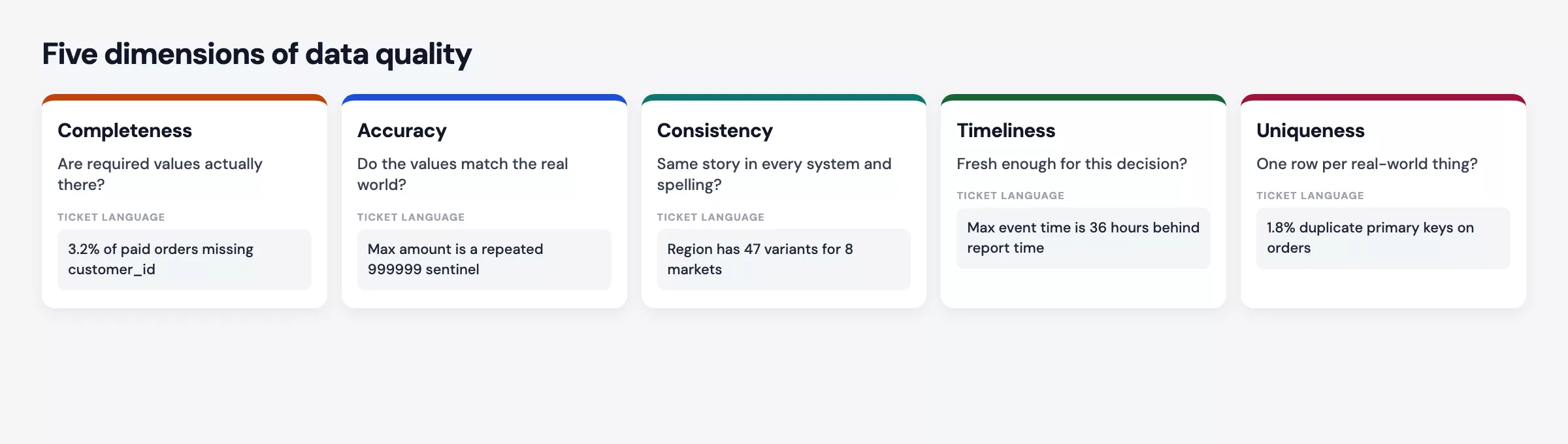
Each dimension answers a different question. Mixing them up is how you “fix completeness” by inventing zeros and then call the result accuracy.
1. Completeness: is the required field present?
Example:
Name the dimension first:
Completeness is about whether the values that should exist for a purpose actually exist. A blank region on an optional survey field is not the same crisis as a blank order_id on an export of paid invoices.
Workplace example: You build a conversion funnel from form submissions, and ten percent of rows have no utm_source, the tag that says which campaign brought the visitor. Marketing wants the share of leads by channel. If you drop those rows, the conversion rate rises for every named channel and you hide a real path into the business, such as direct visits or broken tags. If you group them as “Unknown,” the chart stays honest about the missing tags. The problem is completeness, and inventing a channel would not be accuracy. It would be fiction.
Completeness is always relative to a required set, so write that set down. For a billable order it might be the order ID, customer ID, amount, and order date. Everything else can stay incomplete without breaking the metric.
2. Accuracy: does the value match reality (or a trusted source)?
Accuracy means the value is correct against the real world or against an agreed source of truth. A cell can be complete, look valid, and still be wrong, such as a phone number with the right length but the wrong digits, or a status of “Closed” on a ticket that is still open.
Workplace example: Support tickets show an average handling time of 4 minutes. You shadow a few tickets and find that agents close and reopen cases to meet their service-level agreements (SLAs, the promised response times), so the clock restarts each time. The field is filled, so it is complete. It is the same across every export, so it is consistent. It is still inaccurate as a measure of how long a customer really waited. Accuracy needs a definition of truth, not just a column with no blanks.
Analysts cannot always visit the warehouse floor. You can still improve accuracy by checking samples, reconciling against finance ledgers, or comparing system events with what users actually saw. When you cannot verify a number, say so: “We measure system close time, not what the customer lived through.” That sentence counts as quality work.
3. Consistency: do related values agree across places and rules?
Consistency means agreement. The same fact should not disagree with itself across systems, tables, or business rules unless someone has documented why. Think of a customer email that differs between the sales system and billing, or an order marked “Shipped” while inventory still shows “In warehouse.” Another example is a region called “Europe” in one table and a broader group of Europe, the Middle East, and Africa in another, when both claim to sit in the same hierarchy.
Workplace example: The sales pipeline report shows $2.1M for the quarter, and Finance’s booking report shows $1.8M. After an hour of defensiveness, you learn that Sales counts deals at the “Commit” stage while Finance counts signed contracts that have a booking date. Both numbers can be right under their own definitions, so this is a consistency of definition as much as a data problem. Until you agree on what one row means and on the rules, every join and reconciliation will look like a fight.
This is where the analytics foundations series pays off, because the question and the metric definition come before any chart polish.
4. Timeliness: is the data fresh enough for the decision?
Timeliness asks whether the data is fresh enough for when you decide. Yesterday’s inventory snapshot can be perfect for a weekly board pack and useless for same-day warehouse picking. Late data is not a moral failing. It is a mismatch between how often the data refreshes and how fast the decision moves.
Workplace example: Leadership asks for “current churn” in a morning huddle, but your churn table refreshes later that day from overnight batches. You present yesterday’s number with no timestamp, and someone checks a live product admin panel and sees different counts. The data is not necessarily wrong for its pipeline, but it is too slow for a live debate. Label the as-of time on everything you share. If the decision needs faster data, escalate the pipeline instead of stretching a batch metric into a real-time claim.
5. Uniqueness: is each real-world entity represented once where it should be?
Uniqueness means one real-world thing gets one row, or one key, at the level of detail you claim. Duplicate customers, double-counted invoices, and repeated event rows all distort rates and totals. Sometimes duplicates are legitimate history, such as a table where every status change gets its own row. The bug is claiming unique customers while you count event rows.
Workplace example: A “unique users this week” tile doubles after a tracking change fires two pageview events for every page load. Completeness looks better because there are more events, while the accuracy of “users” collapses. Uniqueness at the wrong level is how growth charts go vertical for one sprint and then need a quiet correction.
A later post in this series goes deep on removing duplicates without shredding history. For now, remember that uniqueness is a claim about what one row stands for, and it is not a reason to delete every repeated value you dislike.
The dimensions at a glance
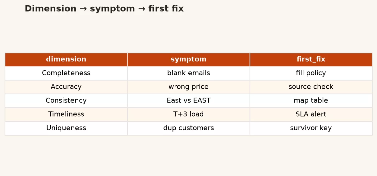
Keep this table near your keyboard. When someone says “bad data,” make them choose a row.
| Dimension | Core question | Typical symptom | Wrong “fix” people reach for |
|---|---|---|---|
| Completeness | Is required info present? | Nulls, blanks, sparse joins | Fill with zero or “N/A” without policy |
| Accuracy | Does it match reality or source of truth? | Sample checks fail; stakeholders produce counterexamples | Average away outliers that are real |
| Consistency | Do related values and definitions agree? | Two systems disagree; rules conflict | Hard-code one system as always right |
| Timeliness | Fresh enough for this decision? | Live debate vs batch lag; missing as-of labels | Present stale numbers as “current” |
| Uniqueness | One entity per claimed grain? | Inflated counts; fuzzy duplicates | Delete rows before preserving lineage |
Worked example: one messy export, five labels
Imagine a weekly CSV from a ticketing tool, used for a “customers helped” metric. Here is a tiny slice, made up but familiar:
| ticket_id | customer_email | status | region | closed_at | handle_minutes |
|---|---|---|---|---|---|
| 1001 | alex@example.com | closed | US | 2026-03-10 14:02 | 12 |
| 1002 | closed | usa | 2026-03-10 15:40 | 8 | |
| 1003 | sam@example.com | Closed | EMEA | 2026-03-09 09:11 | 4 |
| 1001 | alex@example.com | closed | US | 2026-03-10 14:02 | 12 |
| 1004 | jo@example.com | open | APAC | 2026-03-11 08:00 | 3 |
Walk the rows with dimensions instead of vibes.
- Completeness: Ticket 1002 has no email. If the metric is “helped customers,” you cannot tie it to a person, so flag it and do not invent an email.
- Accuracy: Ticket 1004 is open but has a
closed_attime and a handling time, which conflicts with the status rules. Investigate before you average the handling time. - Consistency: The regions
USandusa, and the statusesclosedandClosed, are the same ideas with different spellings. The mapping comes later in the series, and for now naming the issue as a spelling mismatch is enough. - Timeliness: If this file landed in the morning with a 24-hour lag, do not title the chart “Live support load.”
- Uniqueness: Ticket 1001 appears twice, so counting rows inflates volume. Decide whether that is a load bug or intentional history.
A quick SQL profile already separates the dimensions. The next post in the series digs into profiling, and this is a preview of the idea.
SELECT
  COUNT(*) AS row_count,
  COUNT(DISTINCT ticket_id) AS distinct_tickets,
  COUNT(*) - COUNT(customer_email) AS missing_email,
  COUNT(*) FILTER (WHERE status ILIKE 'closed' AND closed_at IS NULL) AS closed_without_time,
  COUNT(*) FILTER (WHERE status ILIKE 'open' AND closed_at IS NOT NULL) AS open_with_close_time
FROM tickets_raw;
If row_count is bigger than distinct_tickets, you have a uniqueness conversation. If missing_email is high, you have a completeness one, and if open tickets have close times, you have an accuracy or process bug. The query does not fix anything, it only assigns names, and that is the win.
In Python, the same idea follows the profiling habits from the Python for analytics series: count nulls, count values, and look for duplicates before you change anything.
import pandas as pd

df = pd.read_csv("tickets_raw.csv")
print("rows", len(df))
print("distinct ticket_id", df["ticket_id"].nunique())
print("null email", df["customer_email"].isna().sum())
print(df["status"].value_counts(dropna=False))
print(df["region"].value_counts(dropna=False))
print("dup ticket rows", df.duplicated(subset=["ticket_id"]).sum())
Name it before you fix it: a mini playbook
When the team chat turns red, use this sequence.
- Restate the decision. Ask which choice this number supports, such as hiring, spending, or whether a service promise was broken.
- State what one row means. A row might be a ticket, a customer on one day, or an invoice line, and you cannot count well until you say which.
- Pick a primary dimension. You can have secondary issues, but lead with one.
- Show a metric for that dimension, such as percent null, percent mismatch, hours of lag, or the duplicate rate.
- Propose a fix path that matches the dimension. For completeness, capture the missing value or document the gap. For accuracy, correct the source or redefine the measure. For consistency, map or align the definitions. For timeliness, label the lag or speed up the feed. For uniqueness, use keys and merge rules, carefully.
This is the opposite of “I’ll clean it in the notebook so the chart looks fine.” Silent cleaning in a notebook is how two teams end up shipping two different truths.
Common mistakes
- Treating all quality as null-filling. Nulls are one kind of symptom, and wrong values and duplicate keys are not cured by
fillna(0). - Confusing validity with accuracy. A date of 2099-01-01 can pass a type check and still be nonsense for “last purchase.”
- Declaring one system always right. Consistency problems need a defined source of truth for each field, not tribal loyalty to the customer system.
- Hiding lag. Stakeholders will invent their own “live” comparison, so put as-of timestamps on exports and dashboards.
- Deleting duplicates on sight. Some repeats are history, and uniqueness fixes need keys and a record of where rows came from, which the later post on duplicates covers.
- Skipping definitions. Many data quality fights are really metric definition fights wearing a data costume.
How to practice this week
- Pick one dashboard people argue about, and write five bullets, one per dimension, even if a bullet just says “not the issue here.”
- Add an as-of timestamp to one export you send regularly.
- Compute three rates on a raw table: the percent null on a key field, the percent of duplicate keys, and the hours since the newest event.
- When someone says “bad data,” reply with a dimension name and one number, and watch how the conversation changes.
- Browse the hands-on paths on the Learn page if you want a refresher on SQL or Python before the profiling drills in the next post.
Quick recap
- “Bad data” is a feeling, while the dimensions are a language for diagnosing it.
- Completeness, accuracy, consistency, timeliness, and uniqueness cover most analyst pain.
- Each dimension implies a different fix, and mixing them up creates quiet damage.
- Name the dimension, measure it, then clean, because that order protects trust.
- Next comes profiling before you polish, so you stop cleaning blind.
If you already work in SQL, keep the SQL series nearby for the queries. Quality is not a separate career track, it is how reliable numbers get shipped.
Sources
- DAMA International, Data Management Body of Knowledge (DMBOK) overview: https://www.dama.org/cpages/body-of-knowledge
- DAMA NL research paper on dimensions of data quality (PDF): https://www.dama-nl.org/wp-content/uploads/2020/09/DDQ-Dimensions-of-Data-Quality-Research-Paper-version-1.2-d.d.-3-Sept-2020.pdf
- IBM documentation on data quality dimensions: https://www.ibm.com/docs/en/ws-and-kc?topic=quality-data-dimensions
- Collibra, “The 6 dimensions of data quality”: https://www.collibra.com/blog/the-6-dimensions-of-data-quality
- Wang, R. Y., & Strong, D. M. (1996). Beyond accuracy: What data quality means to data consumers. Journal of Management Information Systems. (Classic academic framing of quality as fitness for use.)
Keep going
Same lessons in your feed
Short diagrams, hooks, and weekly tutorials on Substack, Instagram, X, and Facebook.