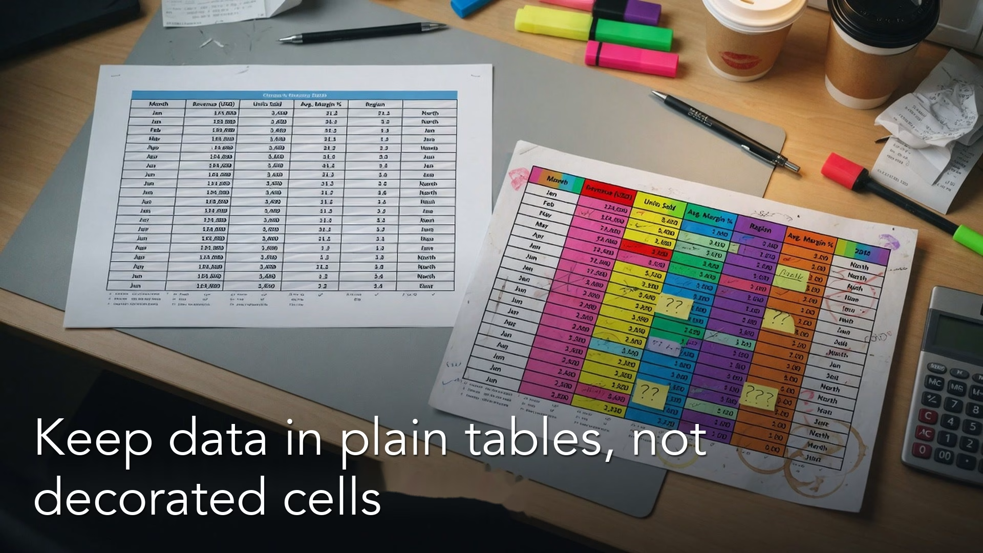
A spreadsheet that looks organized to a person often confuses the software that has to read it. Filters, pivot tables (summaries that total rows by group) and exports to other programs all expect a plain grid. A “pretty” sheet with merged cells and stray notes is not one.
Say you open a sheet with months across the top, people down the side, a total row shaded yellow, a note in column R that says “ask your coworker in finance,” and three merged cells that hold the real story. It feels productive, and it works until you try to filter it, combine it with another table, or export it. Then the grid fights you. This post is part of the series on moving from spreadsheets to real data. The earlier post on when a spreadsheet becomes a liability explained why messy sheets cost you. Here we get concrete about what a real table looks like inside a sheet, why freeform cells cause silent mistakes, and how a tidy layout makes pivots, SQL (the language databases use to answer questions) and simple sanity checks work.
A table is a promise to your future self
In analysis, a table is not “anything with grid lines.” It is a set of rows that all describe the same kind of thing, sitting under columns that mean the same thing every time. That boring consistency is what lets tools help you, because a filter or a pivot can only trust what it can predict. Freeform cells are great for reports that people read on a screen, but they are hostile to any software that has to compute.
If you have ever broken a pivot by inserting a blank row for “spacing,” you already know the tension between how a sheet looks and how it is built.
Three rules that prevent most of the pain
One header row
Column names should sit in exactly one row, with no stacked titles above them inside the data range. A title belongs above the table or on a separate dashboard (a screen of charts that updates as new data comes in) tab, because a filter or pivot will treat anything inside the range as data and get confused by a banner.
One value per cell
Example:
| messy_cell | tidy_row |
|---|---|
| East 10 (see tab2) | region=East amount=10 |
| final? | status=draft |
| 12,000 | amount=12000 type=decimal |
If a cell says “Acme / Beta,” you have two facts crammed into one place, and no filter can pull them apart. Split them into two cells. The same goes for “10 (est.)” when you need a real number: keep the 10 in the column and put the “estimate” flag in its own column, so the math still works.
One kind of thing per column
A column named amount should not hold “N/A” in one row, “see notes” in another and 12.5 in a third. Mixed contents force everyone who uses the sheet to guess what a cell means. It is better to leave the cell blank and add a status column, or to pick one way of marking a missing value and write it down where the next person can find it.
Tidy and wide are the same facts in different shapes
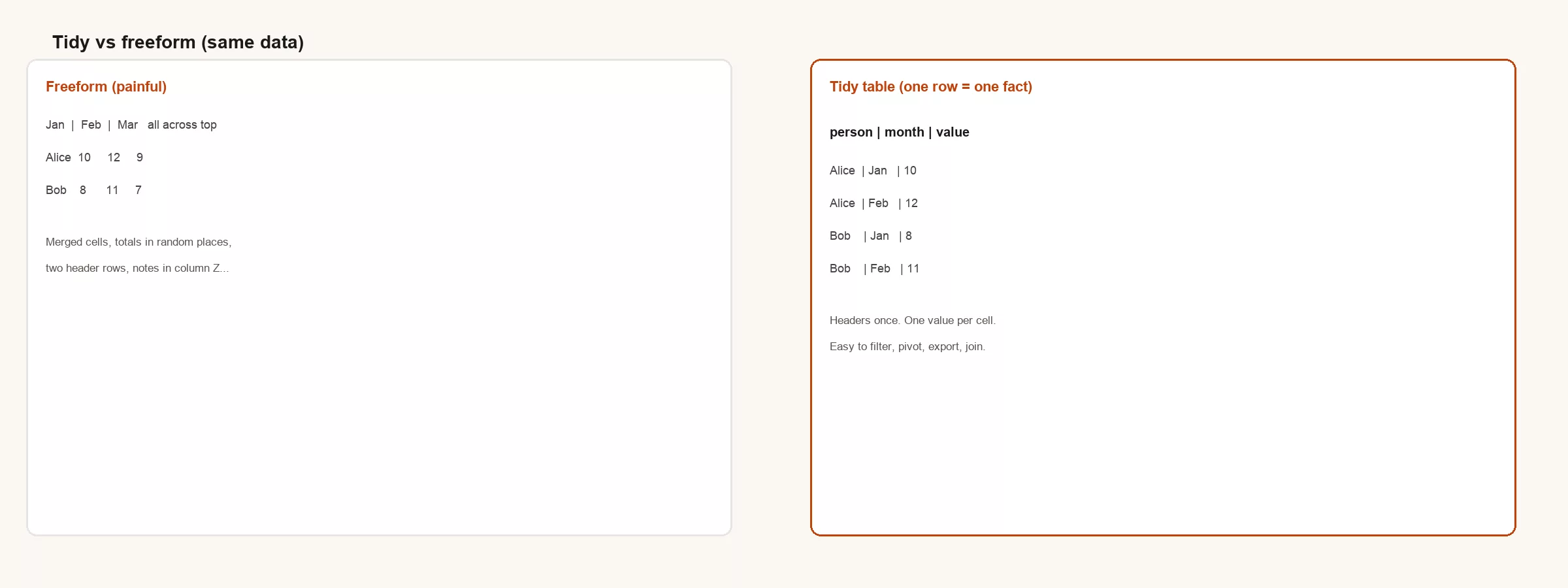
A wide layout spreads a repeating measure across columns, such as Jan, Feb and Mar. It looks like a report. A tidy layout (some people call it long) puts each of those measures in its own row and adds a month column, so it looks less like a slide and more like a database. Analysis almost always wants the tidy shape first, and you can turn it back into a wide table later when you need a chart.
| Question | Wide freeform | Tidy table |
|---|---|---|
| Filter to one month | Delete columns carefully | Filter month = Jan |
| Add a month | Insert column, fix formulas | Add rows |
| Join to another file | Painful | Join on keys + month |
| Load to SQL | Often needs reshape | Natural load |
Freeform habits that look harmless
Messy freeform vs tidy columns:
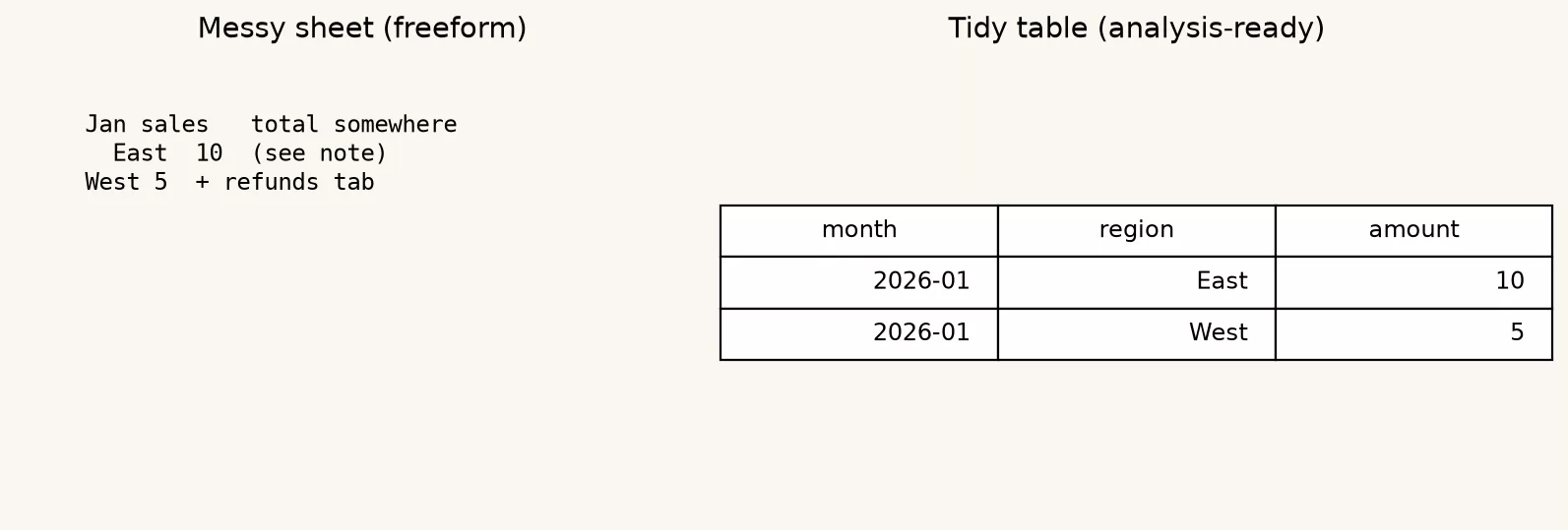
Each of the habits below feels fine while you are typing, and each one causes trouble later.
- Merged cells used as labels, which make filters and sorts misbehave because the label belongs to several rows at once.
- Totals inside the body of the table, which get counted twice the moment someone sums the whole column and forgets to leave them out.
- Color used as data. “Red means late” is invisible to SQL and to colorblind teammates, so put the status in a column instead.
- Several tables on one tab with gaps between them, which turns the sheet into a treasure map that only its author can read.
- Notes in random cells. Give notes their own column or a separate log tab so they stay attached to the right row.
Worked example: monthly headcount
Imagine you track headcount by team across months in a wide grid. Leadership asks for the average headcount by team for the first quarter, plus a join to a cost file that is keyed by team and month (a join means lining up two tables on a shared column). In the wide sheet you would rewrite formulas by hand. In a tidy sheet you would filter and join, which takes a minute.
team,month,headcount
Engineering,2026-01,12
Engineering,2026-02,13
Sales,2026-01,8
Sales,2026-02,9
That CSV-shaped layout (a plain text table with commas between the values) is not “less professional” than a pretty matrix. It is more honest about what one row means, which here is one team in one month. Analysts call that the grain of the table, and every good table has one.
Turning a pretty report into an analysis table
- Copy the data range to a new tab named data_tidy, and never destroy the presentation tab first, so you can always go back to the original.
- Unmerge everything, then fill down any labels that used to live only in merged header cells.
- Delete blank spacer rows and total rows from the body, or mark them in a row_type column if you must keep them, because spacer and total rows get counted as data.
- Make sure there is one header row with unique, plain names, either in snake_case (words joined by underscores) or in clear words without punctuation tricks, because tools read the first row as column names.
- Reshape wide months into long form if a measure repeats across columns.
- Save a dated snapshot before the next refresh, so you can always go back to what you had.
Where this leads next
The earlier post named the risk, and this one names the structure that reduces it. Next come keys and IDs, which are the columns that let two tables be joined. Cleaning gets easier once columns are consistent, exports fail less often when tables are really tables, and a written table contract records the rules so nobody has to remember them.
Questions to ask in the meeting
- “Is this range for presenting, or is it a table we analyze?”
- “What does one row mean?”
- “Can we keep a tidy tab even if the dashboard tab stays pretty?”
- “Which columns are numbers we add up, and which are labels we group by?” Grouping by a label means sorting rows into groups, such as one per team, and totaling each group.
Personal sheets versus shared ones
On a personal sandbox, freeform is fine. On a shared sheet that a whole team treats as the official numbers, freeform is an incident waiting to happen, and the cost lands on whoever inherits the file late the night before a board meeting. Structure is a kindness to that person.
Common mistakes
- Treating the dashboard layout as the only copy of the data.
- Storing meaning only in formatting, such as color or bold.
- Leaving totals in the body of a table that people analyze.
- Renaming headers in the middle of the year without keeping a record of the change.
More on presentation debt
Presentation debt is the quiet cousin of technical debt: shortcuts that make a sheet look better today and cost more to work with tomorrow. Every merged cell that makes a slide prettier makes a filter harder, and every total row that pleases a manager becomes a trap for the next analyst who sums a column without noticing it. The fix is not to ban presentation. You keep the pretty view but separate it from the analysis table, the same way you separate a chart from the query (a written request for data from a database) behind it.
When stakeholders insist the analysis tab must “look like the board pack,” offer two tabs with a written rule. The tidy tab is the official copy, and the pretty tab is derived from it. If someone edits only the pretty tab, treat that as a process bug, because this one social rule prevents more wrong numbers than a dozen clever formulas.
Also watch for analysis by screenshot. If the only lasting record is a PNG (an image file) of a pivot, you do not have a table, you have a moment, and a moment cannot be reconciled next quarter. Keep the tidy rows that produced the screenshot, with a date and an owner, even if nobody has asked for them yet.
Teams that do well over the long run make structure the default and prettiness an optional layer on top. That costs a little more in the first hour and saves a great deal over the next year. The first step down from the liability described earlier is to make the data rectangular, boring and honest about what one row means.
Here is a simple test. If a new teammate cannot describe one row of your sheet in a single sentence, the sheet is still freeform, and you should fix that before building another dashboard on top of it. Structure comes first, then charts, and only after that the arguments about what the numbers mean, which get rarer once the structure is sound.
Wide reports still have a place
Wide matrices are excellent for a person scanning a short time series, and finance packs often need months across the columns. The mistake is storing that matrix as the only copy of the truth. Generate the wide view from tidy facts when you need it, and keep the tidy facts whenever you must compute, join or reload.
In Google Sheets you can keep both. A data_tidy tab is fed by imports, and a report tab uses QUERY, pivot tables or array formulas (formulas that fill many cells at once) to spread the data back out for display. The report can break without harm, because the tidy tab can always be reloaded. That lopsided arrangement is intentional and healthy.
Why “it works in my pivot” is not enough
Pivots can paper over a messy structure until the day they cannot. A layout that only works because you memorized which rows to exclude is a ritual, not a table, and rituals do not survive vacations, handoffs or SQL. If your process needs a person to remember secret blank rows, you are one absence away from a wrong total.
Invest in boring structure while the file is still small, because presentation debt compounds the longer you wait. Teams that keep a tidy tab next to a pretty tab have fewer late-night rescues. Pretty tabs communicate and tidy tabs compute, so you need both, with a clear rule about which one is in charge: the tidy tab owns the truth, and the pretty tab is only a view of it.
Quick recap
Real tables have one header row, one value per cell and consistent columns. Tidy layouts store repeating measures as rows, which is the shape most tools expect. Freeform presentation is fine for people reading slides, but analysis needs structure, so convert presentation ranges into tidy tabs before you join, clean or export.
Practice this week
- Pick one wide sheet you use every month. Create a tidy copy and write one sentence about what a row means, either in a note above the table or on a tab named _meta.
- Remove one merged-cell label from a range you analyze, because merged cells break sorting, filtering, and exports.
- Replace one “color means status” habit with a real status column.
- Export the tidy tab to CSV (a plain text file of rows and columns that any spreadsheet can open) and open it. If it still makes sense outside the spreadsheet, you did it right.
Sources
- Wickham, Hadley. “Tidy Data.” Journal of Statistical Software (concepts of tidy tables; readable summary widely available): https://doi.org/10.18637/jss.v059.i10
- Analytics Made Simple series: From spreadsheets to real data; Analytics foundations on grain and definitions
Series notes
This is Part 2 of the series From spreadsheets to real data. Up next: keys, IDs and joining in plain English.
Keep going
Same lessons in your feed
Short diagrams, hooks, and weekly tutorials on Substack, Instagram, X, and Facebook.