In Power BI, Microsoft’s business intelligence (BI) tool for reports and dashboards, a measure is a saved calculation that answers a question, while a column just holds a value for each row. The skill to learn is writing the calculation, in a formula language called DAX (the formula language in Power BI), so it matches the business question you were actually asked. You also need to understand how filters change the answer, and to test the number before it lands on a dashboard card.
Say a manager asks, “What was net revenue for East last month, ignoring returns that were still open?” You drag net_amount onto a card, add two slicers (the buttons that filter a report), and hope. Sometimes that works. Often it almost works, which is worse, because the number is close enough to survive the meeting and wrong enough to steer a decision.
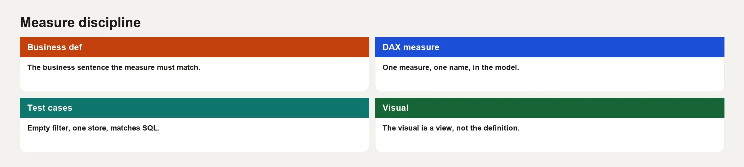
Columns are raw material, and measures are answers. This is the second post in the Power BI starter, and it follows the earlier post on the star model. Here you will learn to write answers that match the question.
Measures versus columns, without the mystique
A column stores one value per row, or a value calculated once per row when the model refreshes. A measure computes a result for the current filter context, which means whatever slicers, row headers, and filters the chart is applying right now. When you drag net_amount into a chart and let Power BI “Sum” it, you create an implicit measure. That is fine for a private experiment. For anything shared, write an explicit measure with a name people can search for and a definition people can read.
Why bother? There are four good reasons:
- One definition. “Net Revenue” means the same formula on every page.
- Room to grow. Today it is a sum, and tomorrow it is a sum with a status filter and a currency rule.
- Reviewability. A teammate can review and document a named object, but not a silent default.
- Hiding raw fields. You can hide
net_amountfrom the report view and make authors go through the measure.
Rule of thumb: If two people might sum the same column differently, for example with or without tax, or with or without open returns, write it as a measure with a written rule instead of leaving a default total.
Filter context in plain English
When a chart asks a measure for a number, Power BI already has a set of filters switched on. It might be year 2026, region East, category Stationery, and perhaps a page-level filter for “status = shipped.” That package of filters is the filter context. Your measure runs inside it unless you deliberately change it with functions like CALCULATE.
Row context is different. It appears when DAX walks through a table one row at a time, such as in a calculated column or inside an iterator like SUMX, which does a calculation for each row and then adds up the results. Beginners often write a calculated column when they needed a measure, or they use an iterator when a plain SUM was enough. Start with measures and simple totals, and reach for iterators only when the business rule really means “for each row, do X, then add it up.”
Here is a practical test: change a slicer. If the number should change and does not, your measure is ignoring filter context, or the field is not related to the table. If the number changes when it should not, for example a “company total” card that still narrows to each row’s region, you need to remove or adjust filters on purpose. You usually do that with CALCULATE plus ALL or REMOVEFILTERS.
Name measures after the question
Bad names are Measure 1, Sum of net_amount, and rev2_final. Good names sound like the sentence a stakeholder used: Net Revenue, Orders, Avg Order Value, Net Revenue Prior Year, and Return Rate %. Put the units in the name or in the format string, not only in a chart title that someone will delete.
Keep a short dictionary on an “About metrics” page or in your team wiki:
| Measure name | Business meaning | Grain / notes |
|---|---|---|
| Net Revenue | Sum of net_amount on order lines | Line grain; excludes tax in this model |
| Orders | Distinct order_id | Do not count lines |
| Avg Order Value | Net Revenue / Orders | Blank if Orders is 0 |
| Units | Sum of quantity | Line grain |
If finance and sales disagree about what “revenue” means, do not encode the fight in three silent measures with similar names. Bring the conflict into the open, pick a definition for this report, and label it. Link to your company’s metric owner when you have one. Analytics Made Simple treats metrics as contracts for exactly this reason, and the series on metrics that matter explains why.
Core patterns you will reuse
1. Simple aggregation
Net Revenue =
SUM ( fact_order_lines[net_amount] )
Use this when the column in your fact table (the table of events, such as order lines) already matches the business rule. Format the result as currency.
2. Distinct count for entities
Orders =
DISTINCTCOUNT ( fact_order_lines[order_id] )
Counting rows counts lines, but counting distinct order_id counts orders. Say the grain out loud every time you choose, where grain means what one row stands for.
3. Safe ratios
Avg Order Value =
DIVIDE ( [Net Revenue], [Orders] )
DIVIDE avoids the error you get from dividing by zero. Prefer it over the / operator for any ratio that can land on an empty filter.
4. CALCULATE to shift the question
Net Revenue Stationery =
CALCULATE (
    [Net Revenue],
    dim_product[category] = "Stationery"
)
CALCULATE changes the filter context first and then works out the expression. You can add filters, remove filters, or swap which relationship is used. A readable CALCULATE beats nested cleverness. If a measure needs a paragraph of comments to explain it, split it into smaller intermediate measures.
5. Time intelligence with a real date table
Net Revenue Prior Year =
CALCULATE (
    [Net Revenue],
    SAMEPERIODLASTYEAR ( dim_date[date] )
)
This only behaves if dim_date is marked as a date table, covers every day you need, and relates correctly to the fact table. Time intelligence is not a substitute for a broken date table. The date work from the earlier post is the price you pay for these functions.
Measures for the sales starter
Reuse the toy model from the earlier post: fact_order_lines, dim_date, dim_customer, and dim_product. The business questions for this page are:
- What is net revenue?
- How many orders were there?
- What is the average order value?
- What share of net revenue is Stationery?
The measure set
Net Revenue =
SUM ( fact_order_lines[net_amount] )

Units =
SUM ( fact_order_lines[quantity] )

Orders =
DISTINCTCOUNT ( fact_order_lines[order_id] )

Avg Order Value =
DIVIDE ( [Net Revenue], [Orders] )

Net Revenue Stationery =
CALCULATE (
    [Net Revenue],
    dim_product[category] = "Stationery"
)

Stationery Revenue Share =
DIVIDE ( [Net Revenue Stationery], [Net Revenue] )
On the toy data from the earlier post, with no filters, Net Revenue is 145, Orders is 2, Avg Order Value is 72.5, and the Stationery share is 100% because both products are Stationery. That last result is intentional. Your test page should make “boring correct” numbers easy to see before you add messy categories.
A test matrix on a blank page
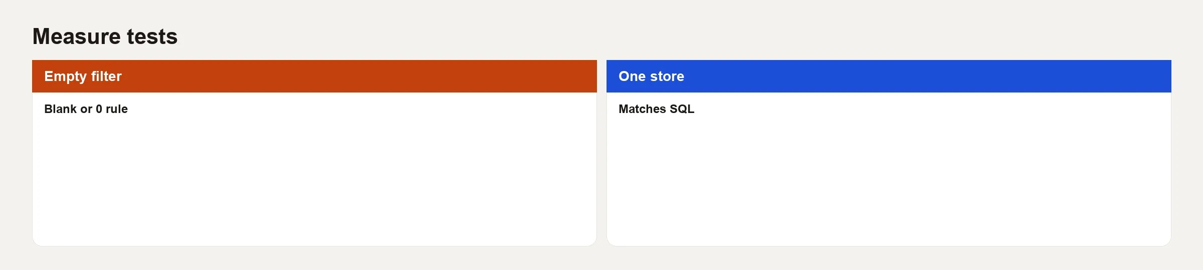
Build a matrix (a grid chart) with dim_customer[region] on the rows and the measures on the columns. Then build a second matrix with dim_product[product_name], and finish with cards for the totals. You are looking for numbers that agree with each other, not for a pretty page.
| Check | Action | Expected on toy data |
|---|---|---|
| Total revenue | Card with Net Revenue | 145.00 |
| Orders vs lines | Orders card vs row count | 2 orders, 3 lines |
| Region East | Slicer East | Net Revenue 65.00, Orders 1 |
| Region West | Slicer West | Net Revenue 80.00, Orders 1 |
| AOV math | Compare AOV to Revenue/Orders | Matches DIVIDE result |
| Share bounds | Stationery Revenue Share | Between 0 and 1 (format as %) |
When the question needs USERELATIONSHIP
Suppose the fact table also has ship_date_key, with an inactive relationship to dim_date. Revenue by ship month is a different question from revenue by order month, so you need to tell the measure to use the other relationship.
Net Revenue by Ship Date =
CALCULATE (
    [Net Revenue],
    USERELATIONSHIP ( fact_order_lines[ship_date_key], dim_date[date_key] )
)
Label the measure so nobody mistakes it for the default, and put a note on the page: “Uses ship date, not order date.” Silent swaps of which date is used are how finance and operations end up arguing over two different totals.
Calculated columns: use sparingly
Calculated columns are worked out at refresh time and stored. They are good for fixed labels built from other columns, such as a simple status band or a joined display name, when you cannot push the logic upstream. They are a poor home for “total revenue” style logic, because they do not recompute with chart filters the way measures do.
If you catch yourself writing a calculated column that adds something up, stop, because you almost certainly want a measure. If you need a flag for a slicer, such as “Is High Value Customer,” a column or an upstream attribute can be the right tool. Prefer fixing the dimension in Power Query, where each query (a saved set of steps that pulls in and reshapes data) runs before the data loads, or in the warehouse when the flag is a lasting business rule.
Variables make DAX readable
As measures grow, VAR and RETURN keep the intent visible:
Avg Order Value =
VAR Revenue = [Net Revenue]
VAR OrderCount = [Orders]
RETURN
    DIVIDE ( Revenue, OrderCount )
This style also helps when something breaks, because you can temporarily return one of the variables to see which piece is blank. Blank is not always wrong. An empty filter context should often return blank instead of zero, so charts do not draw misleading zeros. Choose zero only when zero is a true business fact.
Common mistakes
- Counting lines when you meant orders. Compare
COUNTROWSwithDISTINCTCOUNTof the entity key. - Using the slash operator for ratios. Prefer
DIVIDE, and think about empty sets. - Piling six filters into one CALCULATE with no intermediate measures. Split it up so a human can read it.
- Using time intelligence without a proper date table. The functions will “work” and still give wrong answers.
- Two measures with almost the same name and different filters. Rename them until the difference is obvious.
- Business logic that lives only in chart-level filters. The next page forgets the filter, and the metrics drift apart.
- Skipping checks on a blank page. If you did not compare East and West on known data, your confidence is only for show.
Quick recap
- Measures answer questions inside a filter context, while columns store row values.
- Name measures after the business question, and keep a short dictionary.
- Master sums, distinct counts,
DIVIDE, and smallCALCULATEpatterns before you attempt clever DAX. - Time intelligence depends on a real, marked date table and honest relationships.
- Test on a blank page with known toy or reconciled totals before you decorate.
Next: the following post publishes the dataset and report without confusing “shared” with “trusted.” It covers workspaces, refresh schedules, row-level security (RLS, which limits who sees which rows), and a short launch checklist.
How to practice this week
- Day 1: Take three questions from a real stakeholder chat thread, and write the measure names before you write any DAX.
- Day 2: Build a simple sum, a distinct count, and a ratio measure on your own star model, and hide the raw amount columns from report view.
- Day 3: Build the test matrix. Force a wrong distinct count on purpose, screenshot the wrong total, and then fix it. Keep the screenshot in your notes.
- Day 4: Add one
CALCULATEmeasure that encodes a real business rule, such as one category, one status, or one channel. - Day 5: Write a five-line dictionary for your measures and paste it into a text box on an About page. Share it with one teammate and ask them to try to break your definitions.
Series notes
This is Part 2 of Power BI starter. The previous post covered the star model, and the next covers publishing, sharing, and trust.
Sources
- Microsoft Learn: Create measures for data analysis in Power BI Desktop
- Microsoft Learn: CALCULATE function (DAX)
- Microsoft Learn: DIVIDE function (DAX)
- Microsoft Learn: SAMEPERIODLASTYEAR function (DAX)
- SQLBI: Row context and filter context in DAX
Keep going
Same lessons in your feed
Short diagrams, hooks, and weekly tutorials on Substack, Instagram, X, and Facebook.