
To make portfolio projects look real, start each one from a business decision, use messy data you had to clean, and show what you would recommend and why. Say you open a typical analytics portfolio, and you can predict the next slide before it loads. You will see Titanic survival, iris flowers, a perfect dashboard (a screen of charts that tracks key numbers) with no stakeholders, and a README (the introduction file for a project) that says “insights” without naming a single decision. Recruiters and hiring managers have seen a thousand of these, and your color palette will not impress them. They want evidence that you can do the job. That means you can frame a question, know what one row of your data means, handle messy data, show your work, and recommend something a real person could act on Monday morning.
This post is a stand-alone guide to building portfolio projects that do not look fake. You will get a stack of layers every project should show, a self-scoring rubric, a worked example for a fictional subscription product, and a list of habits that make even good analyses read like class assignments.
What “looks fake” actually means
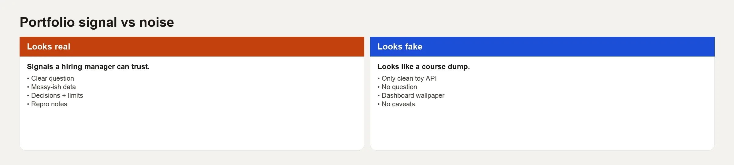
Using public data does not make a project fake, because public data is fine. A project looks fake when it pretends the hard parts did not exist. Reviewers notice a handful of patterns.
- Perfect tables with no explanation of what data is missing.
- Metrics with no paragraph that defines them.
- Charts that answer a question nobody asked.
- SQL (the standard language for asking a database for data) that never checks row counts after a join.
- Conclusions that could not change a budget, a roadmap or an operations process.
- AI-polished prose that never shows a doubt, a dead end or a tradeoff.
Real work is messy in ways you can describe. You write down your assumptions, show a wrong join that you fixed, admit a gap in the data, and recommend a decision with a note on how confident you are. That texture is exactly what most portfolios sand off.
The believable project stack
Treat a portfolio piece as a thin slice of real production analysis, and not as a science fair poster.
Each layer should leave something behind that a reader can open, either in the code repository (a project’s folder of code and its history) or in the write-up.
| Layer | What it answers | Artifact |
|---|---|---|
| Question | Who needs what decision by when? | question.md with success criteria |
| Data reality | What exists, what is broken, what grain? | Data dictionary notes + quality notes |
| Method | How did you compute the answer? | SQL/Python with comments on grain |
| Checks | Why should anyone trust the number? | Assertions, row counts, edge cases |
| Narrative | What should a busy reader take away? | One-page memo, not a novel |
| Decision | What changes if we believe you? | Explicit recommendation + risks |
If a layer is missing, the project starts to look like a copy of a tutorial, even when the code is clever. Clever work with no decision behind it is still homework.
Choose a problem that can finish
Ambitious titles kill portfolios. “AI-powered global retail brain” is not a project, while “Which customer segment should we call first for renewal next month?” is one.
Good problem shapes
- A weekly or monthly metric that the operations team already argues about.
- A step in a sales or signup funnel where people drop out, along with a proposed fix.
- A retention question about groups of customers, with a clear choice about how to define them.
- A question about cost or profit per customer, with one recommended experiment.
Weak problem shapes
- Generic exploratory data analysis (EDA) with nobody who owns the decision.
- Predictive models that ignore the cost of false alarms.
- Dashboard galleries with twelve pages of filters.
- Copies of Kaggle competitions where a leaderboard score is the only result.
If you lack a workplace problem, invent a realistic stakeholder and stick with that role throughout. Write the role and the constraint they face in the README. Reviewers know it is simulated, but they still prefer a coherent fiction to a leaderboard number with no human in the story.
Make the data look like work data
You do not need private company data. You need data that behaves the way work data behaves.
- Missing values that matter, and not only random noise.
- Duplicate keys or events that arrive late.
- Timezone or currency traps, if they apply.
- A definition choice, such as whether revenue from a free trial counts as revenue.
- A join that can repeat rows and inflate totals if you are careless.
Write down what you did about each issue. A paragraph that says you excluded test accounts tagged is_internal = true because they inflate activation is more impressive than a neural network nobody asked for. Habits from the data quality series belong in portfolio write-ups and not only in production teams.
Show method without drowning the reader
Hiring managers skim. Engineers dig into the details, so write for both.
- At the top of the README, put the question, the answer and the recommendation in under 15 lines.
- Next, give the metric definitions in plain English.
- Then outline the method in a few bullet steps and not as a diary.
- Then link to the SQL or Python and add a short section on your checks.
- Put full notebooks in an appendix, and only if they are needed, so readers reach the answer before they reach the code.
Use SQL when the work lives in a data warehouse (the central database that holds company data for reporting), and use Python when files, APIs (connections that let programs ask other programs for data) or charts need it. Do not rewrite clear SQL in pandas just to prove you know both. If AI helped draft your code, say so and show how you verified it, because the verification story is the skill. For a practical checklist for queries written by an AI model, see how to check AI-written SQL.
The self-scoring rubric
Before you publish, score yourself honestly, and aim for hireable and not perfect.
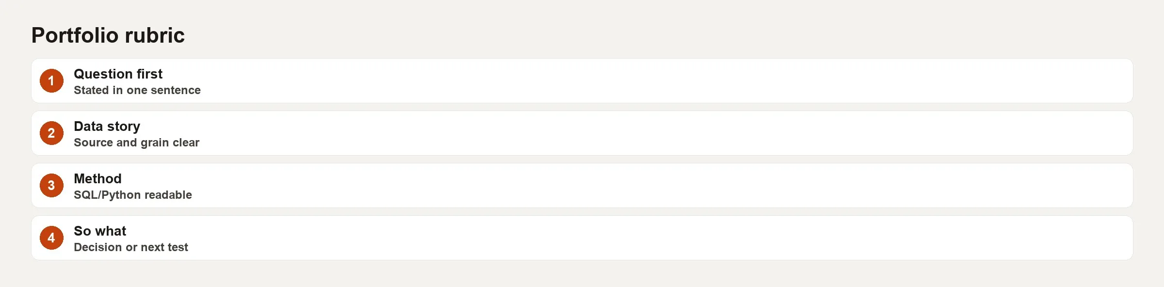
Use this scoring table, giving each row a score from 0 to 2. A strong public project usually lands at 9 or higher out of 12, without needing a PhD-level model.
| Criterion | 0 | 1 | 2 |
|---|---|---|---|
| Question | Topic only | Question without owner/time | Owner, decision, time horizon |
| Definitions | Metric names only | Partial definitions | Written grain + inclusions/exclusions |
| Data reality | Clean demo data story | Some issues mentioned | Issues + handling + residual risk |
| Method clarity | Code dump | Some structure | Readable steps a peer can re-run |
| Checks | None | One ad-hoc check | Multiple checks tied to failure modes |
| Decision | Vague insight | Suggestion without tradeoffs | Action + risk + next measurement |
If you score a 0 or 1 on Question or Decision, fix those before you polish any charts. Pretty charts about something that decides nothing still look fake.
A worked example: renewals at a subscription software company
Imagine a fictional business-to-business software product. Your stakeholder is the head of customer success, and the decision is which accounts the customer success (CS, the team that helps customers succeed) team should call first about renewals in the next 30 days. The team only has time to work 120 accounts.
This is the question you write at the top of the repository.
Which 120 accounts renewing in the next 60 days should CS call first to keep the most annual recurring revenue (ARR), given we can only work 120 accounts this month?
That sentence already beats a vague title like “churn analysis,” because it names the capacity limit and a business measure of value.
Definitions (excerpt)
- What one row means: one row per
account_idon the date you rank the accounts. - Renewal window: the contract ends within the next 60 days.
- At-risk flag (version 1): product usage dropped by 30% or more from one month to the next, or the account had two or more severity-1 support tickets in 45 days.
- Excluded: free-tier accounts, internal accounts and accounts already in a legal dispute.
You can argue with those rules, and that is a good sign. Rules that can be argued with are what grown-up analytics looks like, while hidden rules only give fake polish.
Method sketch in SQL
WITH renewing AS (
  SELECT
    a.account_id,
    a.arr,
    a.contract_end_date,
    a.csm_owner
  FROM accounts a
  WHERE a.plan_tier <> 'free'
    AND a.is_internal = FALSE
    AND a.in_legal_dispute = FALSE
    AND a.contract_end_date BETWEEN CURRENT_DATE
      AND CURRENT_DATE + INTERVAL '60 days'
),
usage AS (
  SELECT
    account_id,
    SUM(CASE WHEN month_offset = 0 THEN active_seats END) AS seats_m0,
    SUM(CASE WHEN month_offset = 1 THEN active_seats END) AS seats_m1
  FROM account_monthly_usage
  GROUP BY 1
),
tickets AS (
  SELECT
    account_id,
    COUNT(*) AS sev1_45d
  FROM support_tickets
  WHERE severity = 1
    AND created_at >= CURRENT_DATE - INTERVAL '45 days'
  GROUP BY 1
)
SELECT
  r.account_id,
  r.arr,
  r.contract_end_date,
  r.csm_owner,
  CASE
    WHEN u.seats_m1 IS NULL OR u.seats_m1 = 0 THEN NULL
    ELSE (u.seats_m0 - u.seats_m1) * 1.0 / u.seats_m1
  END AS seat_drop_pct,
  COALESCE(t.sev1_45d, 0) AS sev1_45d,
  CASE
    WHEN COALESCE(t.sev1_45d, 0) >= 2 THEN TRUE
    WHEN u.seats_m1 IS NOT NULL
      AND u.seats_m1 > 0
      AND (u.seats_m0 - u.seats_m1) * 1.0 / u.seats_m1 >= 0.30
      THEN TRUE
    ELSE FALSE
  END AS at_risk_v1
FROM renewing r
LEFT JOIN usage u USING (account_id)
LEFT JOIN tickets t USING (account_id);
Checks you show in the writeup
- The row count of
renewingequals the number of distinct accounts in the window after the exclusions. - No
account_idappears twice in the final ranked table. - The ARR of the final top 120 accounts is compared with the total renewing ARR, which shows how much of the money you cover.
- A sensitivity note that says how many more accounts become at-risk if the seat drop threshold moves from 30% to 20%.
A tiny check in Python or SQL belongs in the repository, like this one.
assert prioritization["account_id"].is_unique
assert prioritization["arr"].min() >= 0
assert prioritization.query("at_risk_v1")["account_id"].nunique() > 0
# coverage: top 120 by score should not be empty when capacity is 120
assert len(top_120) == min(120, len(prioritization))
The decision paragraph that people skip writing
Here is an example ending for the memo.
“Prioritize the 120 accounts with highest arr among at_risk_v1 = true. If fewer than 120 are at-risk, fill remaining slots by ARR among not-at-risk renewals so capacity is not wasted. Risk: usage data lags by up to three days; re-run every Monday. Do not treat this as a churn model, because it is an operations queue that decides where CS time goes. Next measurement: compare renewal rate of called vs not-called accounts in the same risk band after 60 days.”
That is the signal a reviewer wants. It is far more useful than a line like “we found insights about customers.”
Presentation choices that reduce fake vibes
- Use one main chart and not twelve, and mark the decision threshold on it, so a reviewer sees the decision instead of a gallery.
- Show a dead end, such as “We tried ticket volume alone, and it ranked tiny accounts with noisy support at the top.”.
- Keep AI-written prose under control by using short sentences, your own voice and no hype, because reviewers trust a portfolio that sounds like you.
- Link related learning without padding: SQL practice on the SQL series, metric clarity via the metrics series, and broader paths on Learn.
- Add a line about the license and the source of any public dataset, because ethics is part of professionalism.
How many projects?
Two excellent projects beat six half-built dashboards. A common strong set looks like this.
- One decision analysis that leans heavily on SQL and shows how you think about a warehouse.
- One end-to-end piece with light Python, covering files, a chart and a memo.
- Optionally a third, which is a write-up on data quality or on experiment design if that matches the role you want.
Depth in your definitions and checks matters more than stacking every library (a package of ready-made code) you can find.
Common mistakes
- Tool museum: Spark, dbt, Airflow and three BI (business intelligence, the reporting tools people read) tools, and still no decision.
- Accuracy theater: model scores with no discussion of what a mistake costs the business.
- Invisible grain: weekly and daily numbers mixed together until the charts lie.
- No stakeholder voice: the analysis floats in space with nobody to use it.
- Secret sauce opacity: code so clever that nobody can audit it in an interview.
- Resume-driven metrics: vanity numbers that nobody in a real company would fund.
- Copy-and-paste AI README text: generic paragraphs about “using synergies,” which you should delete.
Practice: a weekend anti-fake sprint
Block out six hours across a weekend and follow these steps.
- Hour 1: write the question with the owner, the capacity limit and the success metric.
- Hour 2: write the definitions and exclusion rules before touching any charts.
- Hours 3 and 4: build one method path and three checks.
- Hour 5: write the one-page memo with a decision and a risk.
- Hour 6: score the rubric, fix only the lowest criterion, and publish a draft folder even if it looks ugly.
A project that is ugly but ready to support a decision beats one that is pretty and hollow, and you can polish it later. Ship it.
Quick recap
- Fake portfolios hide the mess, the definitions and the decisions, while real ones show them clearly.
- Use the stack of question, data reality, method, checks, narrative and decision.
- Pick problems you can finish, with a named stakeholder role and a clear constraint.
- Score yourself with the rubric before you redesign any charts.
- Two deep projects beat a zoo of copies.
- Verification stories, including how you checked AI output, are part of the portfolio and are not a confession to hide.
Your next step
Pick one portfolio project and score it against the rubric in this post before you touch the charts. Add the missing pieces, usually the data reality and the decision, in plain words. One deep project that shows your thinking beats several polished copies of tutorials.
Sources
- Google re:Work, hiring and structured interviewing principles (signal over polish): https://rework.withgoogle.com/
- US Bureau of Labor Statistics, Occupational Outlook for data-related roles (what work often includes): https://www.bls.gov/ooh/
- Hadley Wickham, Tidy Data (Journal of Statistical Software) on structure and clarity of datasets: https://www.jstatsoft.org/article/view/v059i10
- PostgreSQL documentation (practical SQL reference for portfolio queries): https://www.postgresql.org/docs/current/
- The Turing Way, Guide for Reproducible Research (documentation and project hygiene): https://the-turing-way.netlify.app/
- Microsoft, data analytics career learning paths (role skill framing, not a required vendor path): https://learn.microsoft.com/en-us/training/paths/data-analytics-microsoft/
Keep going
Same lessons in your feed
Short diagrams, hooks, and weekly tutorials on Substack, Instagram, X, and Facebook.