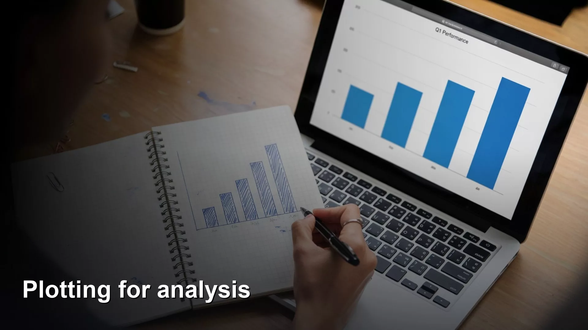
A chart is only useful if it helps someone decide something. Before you draw anything in Python, finish the sentence “this chart helps someone decide whether to ___”, and then build the simplest chart that makes that decision easier. This post shows you how, using one drawing tool and a short list of habits that keep your charts honest.
Say you finish summarizing your sales by region and the table is right. Then your manager asks, “Can you make it visual?” You open a charting library (a package of ready-made code for drawing charts), paste three snippets from the internet, and send a rainbow bar chart with a cut-off axis and the title “Chart 1.” Nobody can make a decision from it, even though it looks like analysis happened.
This is the plotting post in the Python for analytics series. You already load tables, filter, group, join, clean, and hand off results. Plotting is not a new career. It is a communication layer on top of numbers you already trust. We pick matplotlib, with the plotting shortcuts built into pandas, as one stack and stick with it, so you build muscle memory and stop chasing every new tool.
A chart is a job, not a decoration
Before you import anything, finish this sentence: This chart helps someone decide whether to ___. If you cannot finish it, you are making wallpaper. Wallpaper is fine for your own exploration, but it becomes a problem when it lands in a leadership deck with no claim behind it.
Analysis charts usually do one of three jobs:
- Compare categories, such as East versus West revenue
- Show change over time, such as weekly orders
- Show composition carefully, such as share of the total, with a warning about pie charts that have too many slices
If the job is “impress with color,” stop. Go back to the table from the earlier post on grouping data and write one honest sentence first. The chart should make that sentence faster to see, and it should never replace the sentence.
This matches the habit from the analytics foundations series, which asks for the question before the output. A plot without a question is a screenshot of your curiosity and not a handoff.
One stack: matplotlib plus pandas plotting
The internet will try to sell you five charting libraries before breakfast. For this series we choose two pieces that work together:
- matplotlib as the drawing engine
- pandas
.plot()as the shortcut when your data is already in a DataFrame, which is a table inside Python
Why not Plotly or Seaborn for now? Both are excellent, since Plotly shines for interactive dashboards and Seaborn shines for statistical looks. You can learn them later. Right now you need one path that has these traits:
- It installs with a single familiar command (
pip install matplotlib). - It works offline in a notebook (a document that mixes code, results, and notes) or a script (a small program file).
- It exports an image file you can paste into a chat message or a slide.
- It does not require you to think like a web developer.
Stick to that stack for a month of real work. Switching libraries every week is how people never learn honest titles and axes.
Chart anatomy you can defend
Every serious chart needs a few boring parts. Boring is good, because boring is readable on a phone in the early morning.
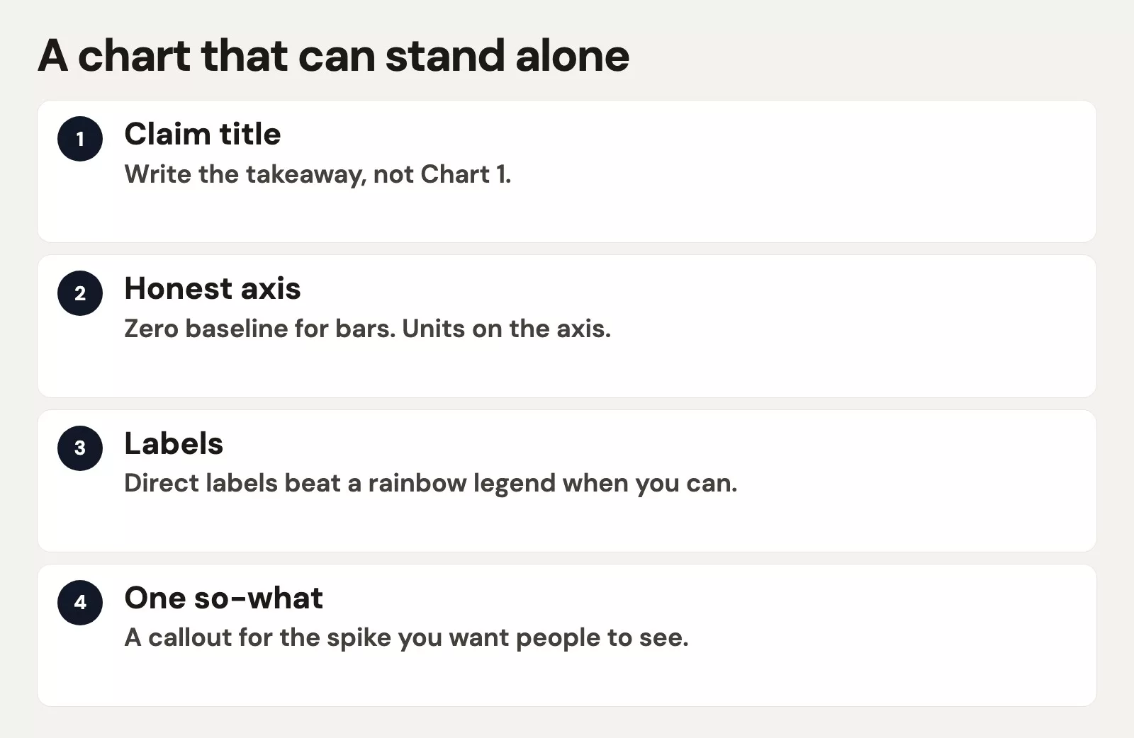
| Part | Job | Bad version |
|---|---|---|
| Title | States the claim or comparison | “Chart 1” or “Sales” |
| Axes | Units and scale people can trust | No labels, mystery zeros |
| Encoding | Bars/lines for the comparison | 3D pie with 12 slices |
| Annotation | Points at the takeaway | No callout, reader guesses |
| Source note | Where the data came from | Silent screenshot |
Rule of thumb: If someone cannot retell your chart’s message without the slide notes, the chart failed its job.
From group-by to bar chart
Start from a summary table you already trust. Do not plot a mess of raw rows when the question is “by region.” Add up the numbers first, as the earlier post on grouping showed, and then plot.
import pandas as pd
import matplotlib.pyplot as plt

sales = pd.DataFrame({
    "region": ["East", "West", "East", "West", "East", "North"],
    "amount": [42.5, 18.0, 91.25, 33.0, 12.0, 55.0],
    "order_date": pd.to_datetime([
        "2026-01-03", "2026-01-03", "2026-01-04",
        "2026-01-04", "2026-01-05", "2026-01-05",
    ]),
})

by_region = (
    sales.groupby("region", as_index=False)["amount"]
    .sum()
    .sort_values("amount", ascending=False)
)

print(by_region)

ax = by_region.plot(
    kind="bar",
    x="region",
    y="amount",
    legend=False,
    color="#c2410c",
    figsize=(8, 4.5),
)
ax.set_title("East leads total sales in this sample week")
ax.set_xlabel("Region")
ax.set_ylabel("Sales amount (USD)")
ax.tick_params(axis="x", rotation=0)
plt.tight_layout()
plt.savefig("sales_by_region.png", dpi=160)
plt.show()
What that code draws:
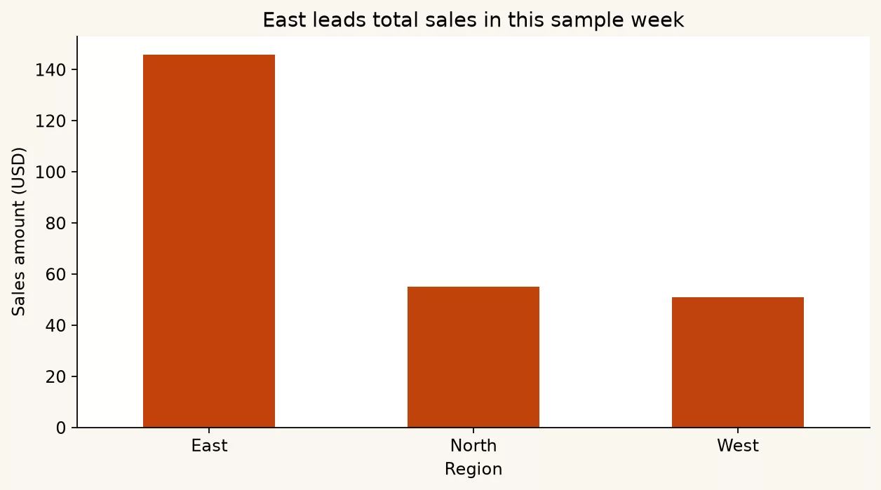
Notice what we did on purpose:
- We added up the numbers before plotting.
- We sorted the bars so the eye lands on the leader.
- We wrote a title that claims something, not “Bar chart of amount.”
- We labeled the axes with units.
- We saved an image file for the handoff, following the habits from the earlier post on handing off work.
Lines for time, not for categories
A line suggests a smooth path from one point to the next. Use one when the horizontal axis is ordered time or another ordered sequence. Do not connect “East, West, North” with a line, because that invents a path that does not exist.
daily = (
    sales.groupby("order_date", as_index=False)["amount"]
    .sum()
    .sort_values("order_date")
)

ax = daily.plot(
    kind="line",
    x="order_date",
    y="amount",
    marker="o",
    legend=False,
    color="#1e40af",
    figsize=(8, 4.5),
)
ax.set_title("Daily sales amount, sample week")
ax.set_xlabel("Order date")
ax.set_ylabel("Sales amount (USD)")
plt.tight_layout()
plt.savefig("sales_daily.png", dpi=160)
plt.show()
What that code draws:
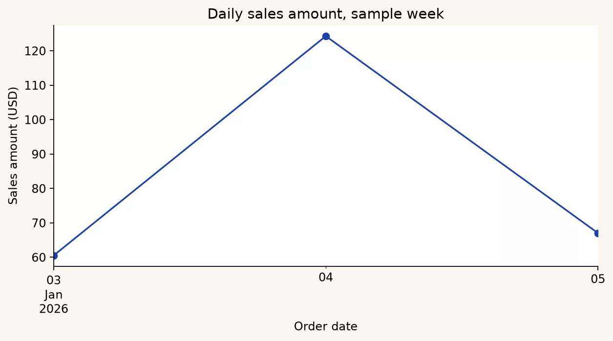
If your time series has missing days, decide whether to show gaps or fill in zeros. Staying silent about it is also a choice. A smooth line across missing dates can lie by implication.
A little more control with matplotlib objects
The pandas .plot() shortcut is great until you need a callout. At that point you step one level down to the axes object, which is the drawing area of the chart, and you already get it back as ax from many plot calls.
fig, ax = plt.subplots(figsize=(8, 4.5))
ax.bar(by_region["region"], by_region["amount"], color="#c2410c")
ax.set_title("East leads total sales in this sample week")
ax.set_xlabel("Region")
ax.set_ylabel("Sales amount (USD)")

# Call out the top bar
top = by_region.iloc[0]
ax.annotate(
    f"Leader: {top['region']}",
    xy=(0, top["amount"]),
    xytext=(0.4, top["amount"] * 0.85),
    arrowprops=dict(arrowstyle="->", color="#292524"),
    fontsize=10,
)

fig.tight_layout()
fig.savefig("sales_by_region_annotated.png", dpi=160)
plt.show()
What that code draws:
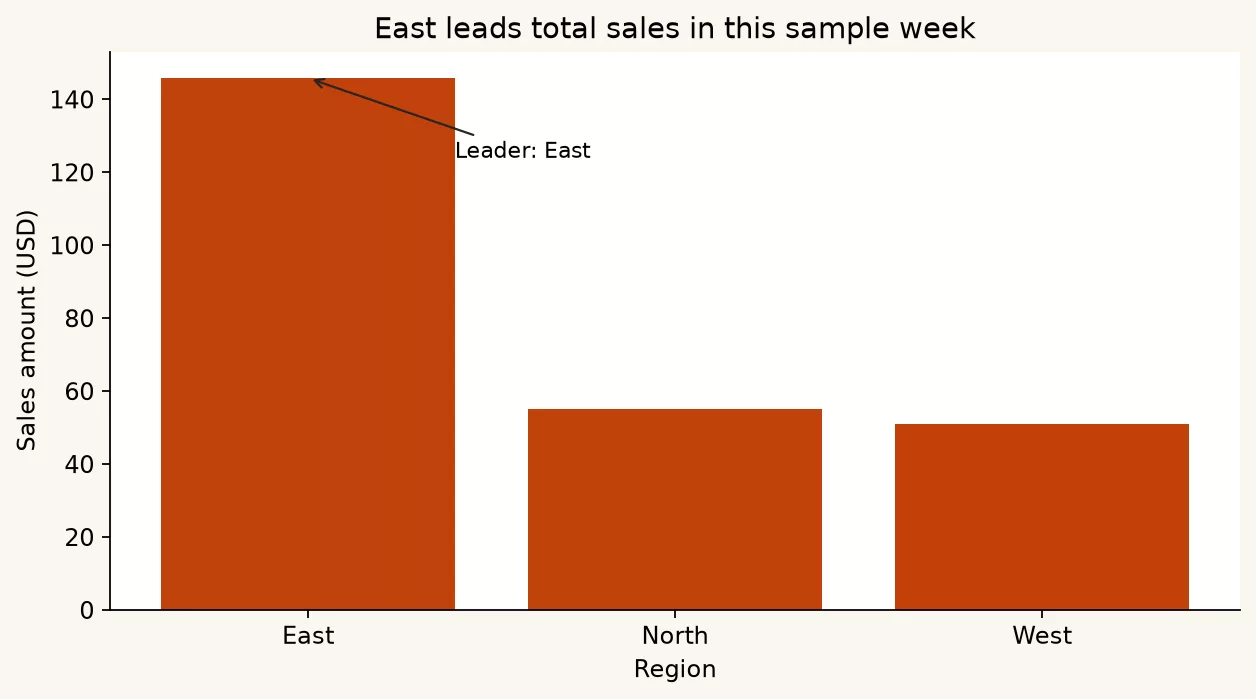
One annotation beats five. If you need five callouts, you probably need two charts or a table.
Honesty checklist (axes and baselines)
Visual example for this checklist: same scores, two scales.
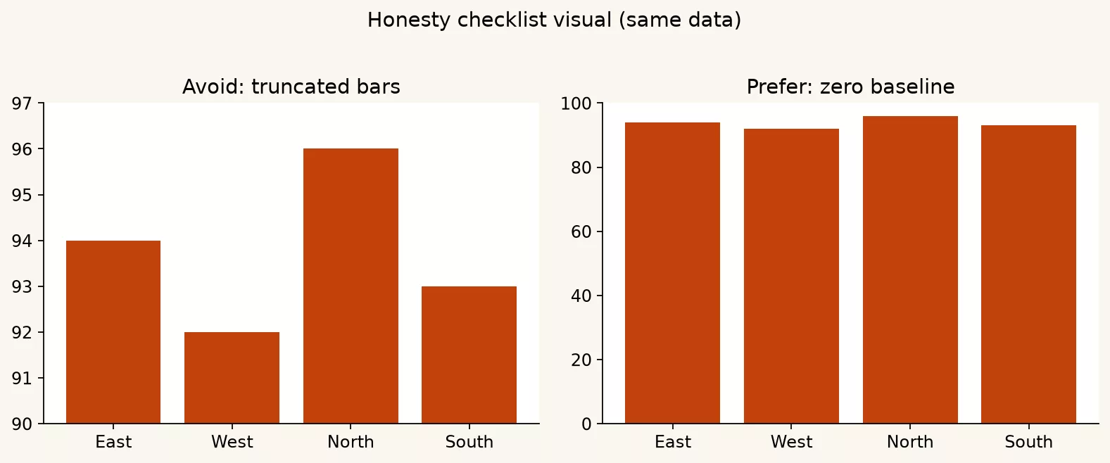
Charts can be technically correct and still misleading. A few defaults keep you out of trouble, as this table shows:
| Temptation | Risk | Prefer |
|---|---|---|
| Start bar axis above zero | Exaggerates small gaps | Zero baseline for bar length comparisons |
| Dual axes for unrelated metrics | Fake correlation vibes | Two charts or indexed series with a note |
| Too many categories | Spaghetti | Top N + “Other,” or a table |
| Rainbow default colors | Hard to read, not colorblind-safe | One strong color + gray for context |
| 3D effects | Perspective lies | Flat 2D always |
This is the same spirit as reading numbers like an adult, where rates need denominators and charts need fair scales. If leadership only sees the picture, the picture must not smuggle in a conclusion that the table does not support.
Explore mode versus explain mode
In a notebook you will make ugly exploratory charts, and that is fine. Mark them as exploration. When you export a chart for other people, follow these habits:
- Remove the grid clutter you do not need.
- Change the title into a claim.
- Set the figure size for slides or documents, because a chart drawn at the wrong size gets stretched and its text turns blurry or tiny.
- Save at enough dots per inch that the text stays sharp, since 160 is a decent start and higher is better for print.
- Keep the underlying CSV (a plain spreadsheet-style text file) or a query (a written request for data) note nearby, as the earlier post on handoffs recommends.
When rough exploratory charts reach executives, people end up saying the dashboard (the screen of charts they check) lied. Prevent that with a two-folder habit, keeping rough work in scratch/ and finished work in share/.
Worked example: a weekly region story
What that code draws:
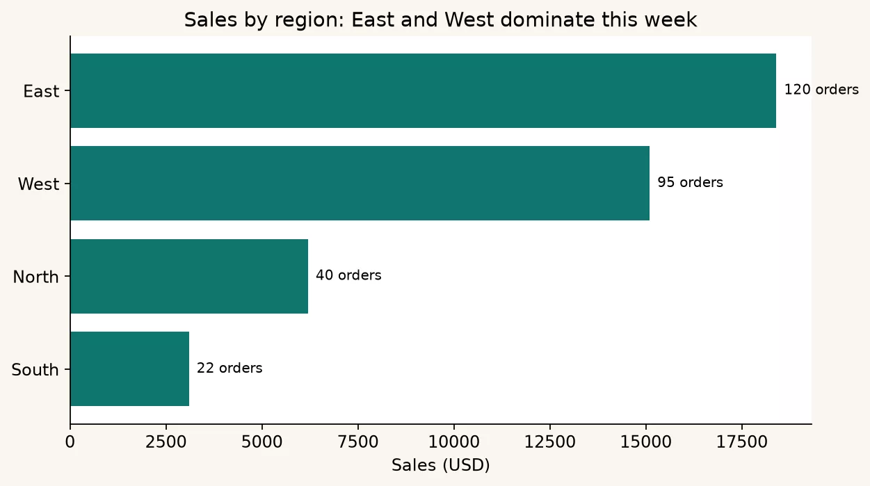
Suppose your question is: Which region should get the next support hire if we staff by recent sales volume? You are not making art. You are ranking volume with context.
import pandas as pd
import matplotlib.pyplot as plt

# Pretend this is the output of a clean pipeline (the earlier cleaning posts)
weekly = pd.DataFrame({
    "region": ["East", "West", "North", "South"],
    "orders": [120, 95, 40, 22],
    "sales": [18400, 15100, 6200, 3100],
})

weekly = weekly.sort_values("sales", ascending=True)  # horizontal bars read well

fig, ax = plt.subplots(figsize=(8, 4.5))
ax.barh(weekly["region"], weekly["sales"], color="#0f766e")
ax.set_title("Sales by region: East and West dominate this week")
ax.set_xlabel("Sales (USD)")
ax.set_ylabel("")
for i, row in weekly.reset_index(drop=True).iterrows():
    ax.text(row["sales"] + 200, i, f"{int(row['orders'])} orders", va="center", fontsize=9)
fig.tight_layout()
fig.savefig("region_support_context.png", dpi=160)
plt.show()

print("Share-ready sentence:")
print(
    "East and West produced most sales this week; "
    "South volume is small even if percent growth looks loud."
)
The labels on the bars add order counts, so the sales figure alone does not hide the workload. That is analysis plotting, which means adding context that answers the decision and leaving out chart junk.
Common mistakes
- Plotting before adding up the numbers: you get a hairball of points nobody asked for.
- Leaving default titles: rename until a stranger understands the point.
- Using pie charts for eight or more slices: use bars or a table instead.
- Comparing rates with unlabeled counts: a 50% region with 2 customers is not a strategy.
- Copying Plotly snippets into a matplotlib mindset: pick one stack this month.
- Forgetting to save the figure and only seeing it in a live notebook session.
- Using color as the only signal without position or labels, which fails for colorblind readers and on black-and-white printouts.
Quick recap
- Charts answer decisions, and decoration is optional and often harmful.
- This series sticks to matplotlib plus pandas plotting, so the habits become automatic.
- Add up the numbers first, use bars for categories, and use lines for ordered time, because checking the totals first catches errors before they become a chart.
- Give every chart a title, axes, one annotation, and an honest baseline.
- Export for the handoff, and keep the table of truth nearby.
How to practice on Monday morning
- Take one trusted summary from last week’s work, where a CSV file is fine.
- Write the decision sentence first, so the chart answers a question instead of decorating a slide.
- Make one bar chart or one line chart in matplotlib through pandas, so you learn the basic chart before trying fancier ones.
- Add a title, axis labels, and at most one annotation, so the chart can be read without you in the room.
- Export an image file, and keep the table beside it.
- Ask a teammate what decision they would make from the chart alone, and fix whatever they miss.
When you are ready to compare exploration with production style, continue to the next post, on notebooks versus scripts. Charts live in both worlds, and the difference is how repeatable the path is.
Sources
Research and further reading used for this article:
- matplotlib: Quick start guide (figures, axes, savefig)
- pandas: Chart visualization (DataFrame.plot helpers)
- matplotlib annotate (callouts on axes)
- Analytics Made Simple: Python for analytics (series home)
- Analytics Made Simple: Learn (related paths on this site)
Keep going
Same lessons in your feed
Short diagrams, hooks, and weekly tutorials on Substack, Instagram, X, and Facebook.