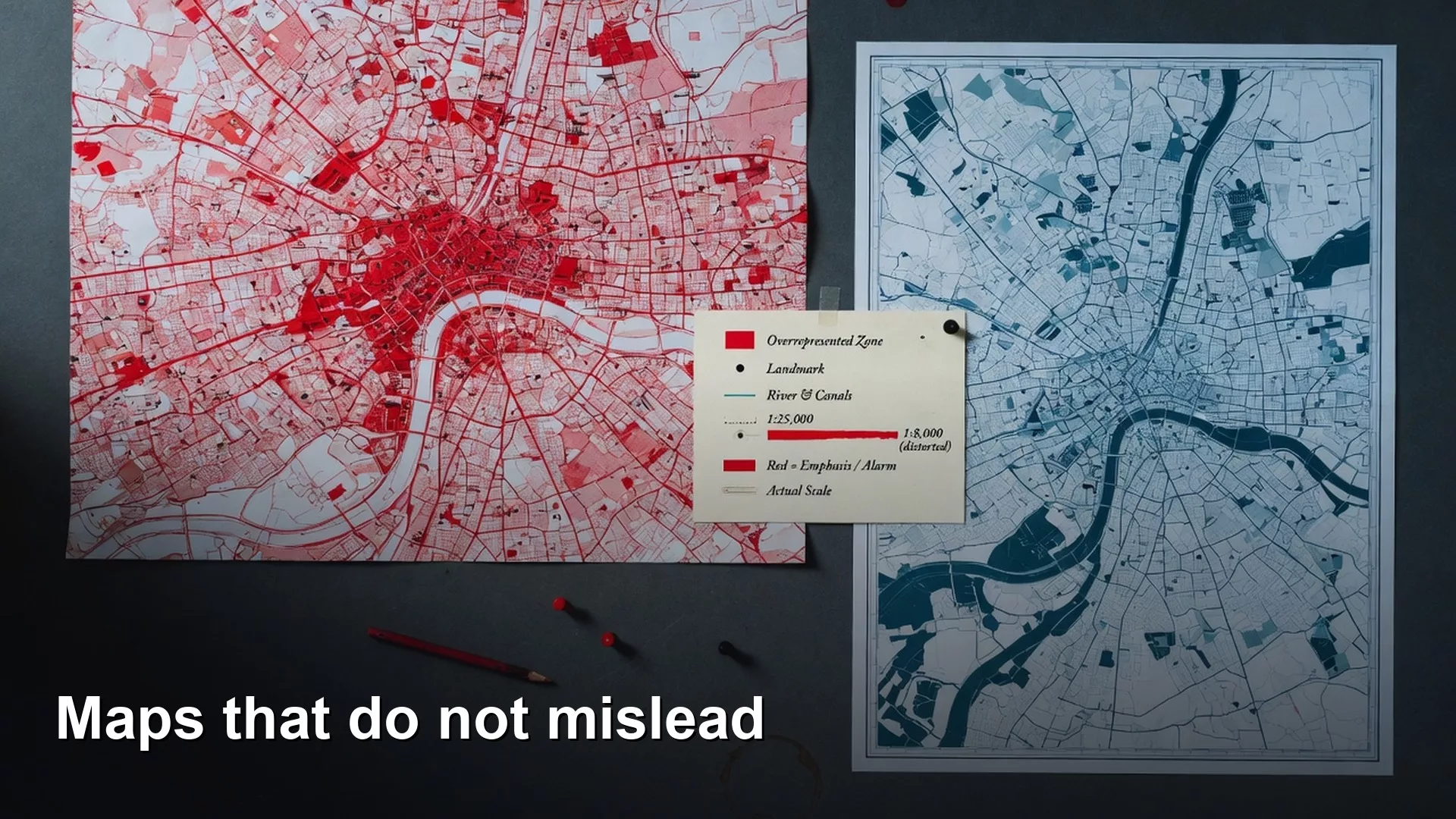
A map can mislead you even when every number on it is correct. Suppose you shade a map of “orders by county” (a choropleth, which colors each area by its value). Three large rural counties look quiet and two small urban counties look like the entire business. Someone concludes that demand lives only in dense ZIP codes and cancels a rural pilot that was actually healthy for the number of customers it served. The map had no bad intent. It counted orders in areas of very different sizes and let color tell the story without dividing by anything, which is why bad class breaks and raw counts fool people so well.
Now imagine your team switches from raw order counts to orders per 1,000 households and publishes the class breaks, meaning the cutoffs between colors. Rural counties stop looking dead, and the plan to cut coverage gets paused. The data is the same, but the story on the map is different.
Maps are arguments with color
Tables make people argue about numbers, while maps make people argue about places and only half remember the numbers. That power is useful in operations reviews and dangerous in executive packs. Your job is not to make the least exciting map, but to make the argument the map implies match the question you actually asked.
If the question is where total volume is highest for staffing, raw counts can be right. If the question is where activity is high compared with the chance to be active, then rates or per-person measures belong in the colors. Mixing those two questions under one legend is how strategy slides go wrong for a whole quarter.
Rule of thumb: Write the question as a sentence on the chart. If the colors do not answer that sentence, you have built a poster and not an analysis.
The honest map path
An honest map goes through four stages. If you skip one, the map still gets published, and that is exactly the problem.
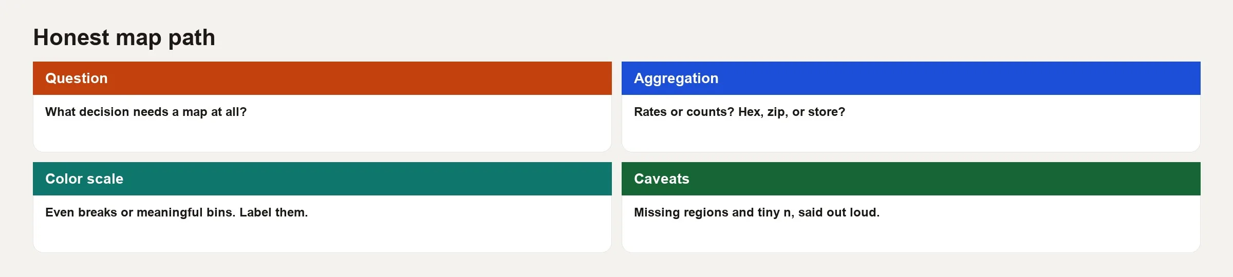
1. Question
Here are examples of clear questions.
- Which districts have the highest order volume, so we can plan staffing?
- Which districts have the highest number of orders per 1,000 residents?
- Where are delivery failures high compared with the number of delivery attempts?
- Which store catchment areas show coverage gaps where demand is meaningful?
Unclear questions such as “show performance on a map” force you to invent a metric under deadline. Invented metrics tend to become permanent, because the PNG (a common picture file format) image of the map gets reused in later decks.
2. Aggregation
Pick a unit of area that matches the decision and how dense the data is, such as a store radius, an H3 hex cell (a small hexagon from a global grid), a ZIP code, a county or a sales territory. Smaller units show more detail and also more noise, while larger units hide pockets of activity and make rates steadier. Hide or gray out any unit that falls below a minimum count. The privacy rule from the earlier post on when maps help still applies, which means you should combine points into areas when the points are sensitive.
Join your data to the map shapes carefully. A mismatched region id drops rows and creates fake empty places. An empty place is not the same as a zero, because it means you either do not know the value or failed to match it.
3. Color scale
Sequential scales (light to dark) fit low-to-high magnitudes. Diverging scales fit values around a meaningful center (above/below target). Rainbow scales rarely help with continuous data, and they often confuse colorblind readers. Class breaks, which can be set by quantile, by equal interval or by hand, change which places look extreme. If a stakeholder can flip from quantile to equal interval and reverse the hero region, put the break method in the footnote.
4. Caveats
State any incomplete geocodes (addresses that could not be placed on the map), hidden cells, the time window and the metric definition on the figure itself. Caveats are not legal filler. They keep the map true when it travels to other people without you.
Pitfall table: counts, bins, missingness
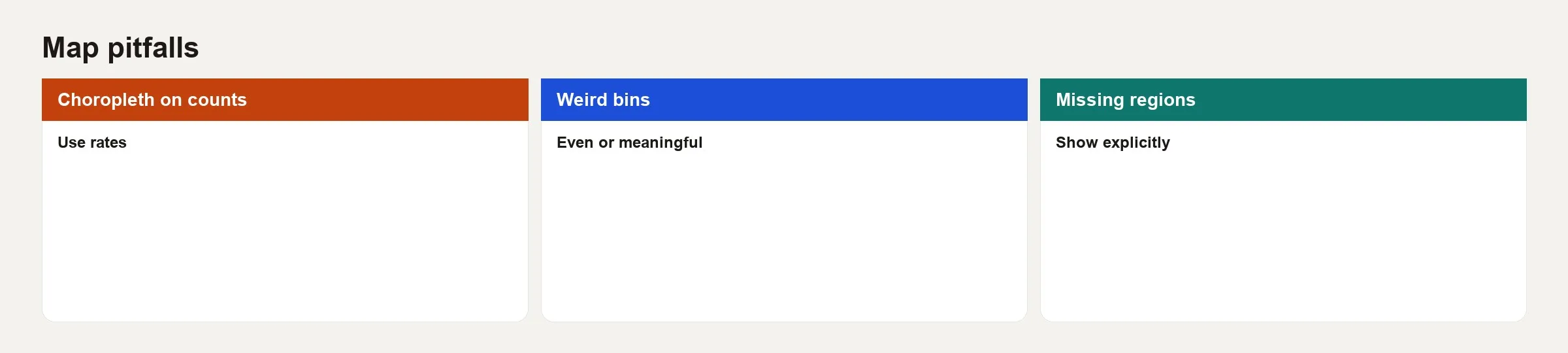
Remember those three pairs, because most misleading business maps fail at least one of them.
Choropleth on counts
Large shapes dominate the eye. A county with many people will often have many orders even if adoption is weak. Prefer rates when you compare intensity across areas or populations of different sizes, and keep a companion bar chart of the top absolute counts if staffing still needs volume.
Weird bins
Automatic breaks can isolate a single outlier in the top class and mush everyone else into similar colors. Sometimes that is correct. Sometimes it hides a real gradient (a gradual change in values from one area to the next). Try one alternative classification and see whether the story is solid. Manual breaks tied to service targets, for example under 2%, 2% to 5% and over 5% failure, are often more honest for operations than purely statistical bins.
Missing regions
If a region has no rows because of a join miss, do not color it like zero demand. Give it a distinct “no data” style, and state the unmatched share in the caption, for example “4.2% of orders could not be placed and are off the map.”
A worked example: counts versus rates
Here are toy regions for a subscription hardware accessory, with numbers invented for teaching.
| Region | Orders | Households (k) | Orders per 1k households |
|---|---|---|---|
| North | 8,000 | 400 | 20.0 |
| East | 3,000 | 80 | 37.5 |
| South | 5,500 | 250 | 22.0 |
| West | 1,200 | 30 | 40.0 |
| Central | 6,000 | 300 | 20.0 |
On a map of counts, North and Central look like the winners. On a map of rates, West and East look strongest. Both maps are true, but the rate map answers where adoption is most intense and the count map answers where you ship the most boxes. Put the matching title on each map.
Here is a SQL (the standard language for asking a database for data) sketch for the rate metric.
SELECT
  r.region_id,
  r.region_name,
  COUNT(o.order_id) AS orders,
  h.households,
  COUNT(o.order_id) * 1000.0 / NULLIF(h.households, 0) AS orders_per_1k_hh
FROM regions r
LEFT JOIN households h ON h.region_id = r.region_id
LEFT JOIN orders o
  ON o.region_id = r.region_id
 AND o.order_date BETWEEN DATE '2026-01-01' AND DATE '2026-03-31'
GROUP BY r.region_id, r.region_name, h.households;
Then apply a minimum volume rule before you celebrate a region with a high rate.
SELECT *
FROM region_rates
WHERE orders >= 100  -- suppress fluky high rates on tiny volume
ORDER BY orders_per_1k_hh DESC;
West, with 1,200 orders, might still qualify. A region with 12 orders and a wild rate should not lead a meeting about where to invest.
Point maps, heatmaps, and when to avoid both
Point maps are honest about locations when privacy allows and when overlapping dots are under control, which you can manage by sampling, by nudging dots slightly or by clustering them. Heatmaps and density surfaces look scientific, but a smoothing setting can invent blobs that are not really there. If you use a density surface, fix the settings, state them, and confirm that the blob survives a second setting.
Hex or grid maps often beat raw points on public dashboards because they combine points into areas by design. They still need rates when the chance of activity differs between cells, for example because of jobs, population or store traffic.
Basemaps and visual noise
Roads, terrain and labels for points of interest compete with your data for attention. For analytical maps, prefer a quiet base map, few labels and a legend that states the units. 3D buildings rarely improve a rate comparison. Animation can help a live audience follow a time series, yet it can wreck comprehension in a static PDF export.
Accessibility is part of honesty. Do not rely on red and green alone, add direct labels for a few regions you want to call out, and make sure the contrast holds when the slide is projected in a dim room.
Common mistakes
- Defaulting every metric to a county map of counts, even when a rate would answer the question.
- Letting the software pick the color groups without ever reading where the breaks fall.
- Coloring unmatched regions as zero, which turns missing data into apparent failure.
- Publishing customer point maps to wide audiences, which can expose private locations.
- Changing the zoom until the region you like fills the frame and implying that it matters nationally.
- Using two visual signals at once, such as size and color mapped to related fields, which people misread as a single field.
- Skipping the table. If the map cannot be summarized in ten ranked rows, the meeting will invent its own ranking from color memory.
How to practice
- Take one existing map at work and write down the question it actually answers, then rewrite the title to match.
- Rebuild the same data as a rate, or as a count if you started with a rate, and note which regions change rank.
- Apply a minimum sample size filter and restyle the regions that have no data.
- Export a companion table of the top 10 and bottom 10 units with the metric and the sample size.
- Run the ten-point checklist and fix anything that fails before the next review.
That completes the Geospatial for beginners pair of posts, which covered when geographic analysis is worth doing and how to draw it without lying by accident. For more learning paths across analytics topics, visit the Learn hub. When spatial metrics join your official list of key numbers, treat them like any other metric, following the metrics series, with quality checks inspired by the data quality series.
Quick recap
- Maps argue with color, so match the argument to a written question.
- Follow this path: question, area unit, color scale, then caveats.
- Prefer rates for intensity across unequal areas, and keep counts when volume is the decision.
- The way you group values and style missing data can reverse which region looks like the winner.
- Hide tiny samples, and never confuse no data with zero.
- Ship a map backed by the checklist, along with a small table, and skip the fancy base map.
A pre-publish map checklist
- The question sentence matches the field that sets the colors.
- The area unit and the time window are labeled on the map.
- The choice between counts and rates is deliberate and stated.
- A minimum sample size rule is applied, and small areas are hidden.
- Regions with no data look different from regions with a value of zero.
- The classification method is named, whether it is quantile, equal interval or manual thresholds.
- The share of addresses placed on the map is noted if it matters.
- A privacy review is done for any view that shows individual points.
- The palette is safe for colorblind readers, and the legend units are readable.
- A companion table is available for the top and bottom regions.
This checklist follows the same spirit as the chart checklist in the finance series, which covers definitions, sample size and alignment. Geography adds two more concerns of its own, which are privacy and how you classify values into color groups.
Series notes
This is Part 2 of Geospatial for beginners. The previous post covered when geographic analysis helps at all.
Sources
- Cynthia Brewer / ColorBrewer. Color advice for cartography (sequential and diverging schemes). https://colorbrewer2.org/
- US Census Bureau. Geography resources and notes on comparing areas of different sizes. https://www.census.gov/programs-surveys/geography.html
- PostGIS. Documentation (spatial aggregates and joins underlying many warehouse maps). https://postgis.net/documentation/
- Kenneth Field. Cartography resources and practical mapping guidance (see Esri cartography blog and related writing on classification). https://www.esri.com/arcgis-blog/products/arcgis-pro/mapping/
- H3 documentation. Hex binning concepts for analytical grids. https://h3geo.org/docs/
- Stephen Few. “Save the Pies for Dessert” and related visual integrity essays (principles transfer from charts to thematic maps). https://www.perceptualedge.com/articles/visual_business_intelligence/save_the_pies_for_dessert.pdf
Keep going
Same lessons in your feed
Short diagrams, hooks, and weekly tutorials on Substack, Instagram, X, and Facebook.