Inclusive metrics start with one question: whose story is missing from this number? A metric is only a picture of the people it can see, so before a number starts steering decisions, you should know who is left out of it.
Say your dashboard (a screen of charts that tracks key numbers) shows that activation is up. Activation means the share of new sign-ups who get far enough to use the product for real. Leadership is pleased, and the product team ships more of whatever moved the line. Three months later, support tickets climb among people who never got a fair chance to activate. Some had no payment method yet, and some shared one account across a household. Others live in regions where text-message (SMS) codes arrive late, or they only use the product at work on locked-down devices. The metric was not wrong in the database. It was simply an incomplete story about who succeeds.
Or say the number rose after a checkout redesign, and the chart left out users who gave up when the mobile form rejected their local phone format. Those users were marked “not in funnel,” which means the chart never counted them. Your support team knew them by name, and the metric did not.
Inclusive metrics start with who can appear
Every metric is a camera angle, and cameras always crop the picture. Inclusive analytics does not pretend the crop is the whole world. It makes the crop visible, checks who falls outside the frame, and then decides whether the decision still holds.
Here are some common crops that analysts inherit without noticing.
- Logged-in users only, even though many real customers browse while logged out.
- Completed accounts, even though the painful drop happens before anyone creates an account.
- English screen events, because other languages ship later.
- App-only behavior, even though a large group uses the website or partner channels.
- Paid customers, even though free users are the pipeline (the pool of people who may become paying customers later) you say you care about.
- US-centric time windows, even though global usage peaks overnight at your headquarters.
None of these crops is automatically wrong. Measuring paid retention for a finance forecast is perfectly fine. The trouble starts when a cropped metric is used to claim “customers are happy” or “the product works for everyone,” or when automated tuning quietly punishes the group you cannot see.
Rule of thumb: If you cannot name who is excluded from a KPI (a key performance indicator, the number a team steers by), you are not measuring a population. You are measuring whatever was convenient to count.
The loop: metric, who is in, who is out, action
Use a simple four-box walk every time a metric graduates from “exploratory” to “steering,” which means people start making decisions based on it.
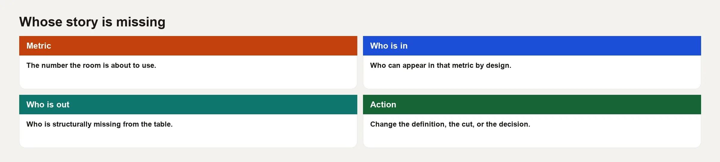
1. Metric: name the decision, not only the formula
Write one sentence in this form: “We will use X to decide Y.” If you cannot fill in Y, you do not need a production metric yet. Inclusive work often fails because teams argue about the group they divide by (the denominator) without knowing what decision the number feeds. A churn definition for board reporting and a churn definition for win-back campaigns can both be valid, and they can still need different rules about who counts.
Tie this to the metric habits from the metrics series: an owner, what one row represents, the top and bottom of the fraction, the filters, and the refresh schedule. Inclusion is one more required line on that card, not a separate manifesto.
2. Who is in: the population that can score
List the eligibility rules in plain language, and answer these questions.
- What event or status puts someone in the group you divide by?
- What time window must they survive before they count?
- Which screens or channels must they use?
- Which countries, plans, or segments are in scope?
Then turn the rules back into people. “Accounts with at least one successful payment method and a completed onboarding checklist by day 7” is a formula. In human terms it may mean “people who already cleared identity, banking, and design hurdles that we do not measure.”
3. Who is out: the missing story
Ask a few deliberately uncomfortable questions, because the people a metric leaves out are rarely visible from inside the data.
- Who tries and never becomes eligible?
- Who is active but untracked, such as shared logins, offline users, or people on a partner portal?
- Who is filtered out as “noise,” such as small regions, low-volume languages, or new platforms?
- Who appears only through a stand-in, such as zip code, device model, or internet service provider (ISP), the company that sells your internet connection, that happens to line up with protected or sensitive traits?
- Who would look like a failure because our tracking is biased, not because they failed?
Write the people who are out as named groups, not as a leftover bucket called “other.” “Users without a verified phone number in markets where SMS is unreliable” is something a team can act on. “Outliers” is just a way to stop thinking.
4. Action: what changes because of the gap
Noticing a gap without changing anything is just journaling. Choose at least one of these responses.
- Widen the metric to include more screens or the steps that happen before an account exists.
- Add a companion metric, such as a funnel step for the excluded group.
- Split the steering metric by segment so an average cannot hide harm.
- Stop using the metric for a decision it cannot support.
- Fix the tracking so the missing group can show up fairly.
- Change the product or operations when the metric revealed a real barrier.
Proxies, fairness, and “neutral” features
Analysts often get pulled into scoring, ranking, or prioritizing work: lead scores, credit-adjacent limits, support priority, fraud flags, and content moderation queues. You do not have to train a neural network for this to matter. A simple tiering rule written as a database query (SQL is the language most analysts use to ask databases questions) is already a decision system.
A proxy is an attribute that stands in for something you cannot or should not measure directly. Zip code stands in for income, device price stands in for “serious user,” nighttime usage stands in for “bot,” and language stands in for “support cost.” Some proxies are useful, but many encode history that we would not defend out loud.
Here is how to handle proxies in an inclusive way.
- Name the proxy and what you intend it to measure, such as “zip as rough income for marketing mix,” not “zip as creditworthiness.”
- Ask who gets ranked wrongly, again and again, if the proxy is wrong.
- Prefer outcome metrics you can defend, such as a paid invoice or a verified delivery, over lifestyle guesses.
- When legal or policy teams care, and they should, escalate early, because silence from analytics is not the same as neutrality.
You do not need to become a fairness researcher overnight. You do need to refuse “the model said so” as a complete answer when the inputs were zip code, phone operating system, and browser language.
Worked example: activation rate and the people who never count
Say a consumer app defines activation as “created an account, added a profile photo, and finished a first project within 7 days.” The weekly activation rate is the north star, meaning the one number the whole growth team is judged on. The rate rises after a campaign aimed at users who already know similar tools.
Walk the loop for this metric.
Metric and decision: The team uses 7-day activation to decide whether onboarding experiments ship. One row is one user account, and the window is the first 7 days after sign-up.
Who is in: Users who create an account and also trigger the browser events for photo upload and project creation. That requires a modern browser, enough bandwidth to upload a photo, and a project template that assumes a desktop-sized screen.
Who is out, for example:
- People stuck before account creation, because email verification failed or their school or work domain was blocked.
- Users on slow connections who skip the photo upload and therefore never “activate” by definition.
- Shared household devices where one account serves three people, so the tracking undercounts humans.
- Languages where project templates are incomplete, so a first project is harder for reasons unrelated to the person.
- Users who do meaningful work through a partner embed that does not fire the same events.
Actions the team can actually ship:
- Add a companion metric: the percentage of sign-ups that fail email verification, split by domain type.
- Make the photo optional in the activation definition for low-bandwidth markets, or track a core project without a photo.
- Split activation by language and device type so the average cannot hide a drop.
- Track the partner embed events so those users can appear in the same story.
Here is a compact inclusion review table you can paste into a one-page metric description.
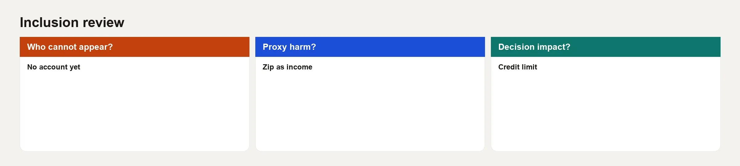
Here is the same table filled in for this activation metric.
| Ask | Answer for activation |
|---|---|
| Who cannot appear? | Pre-account failures; partner-embed users; blocked email domains |
| Proxy harm? | Photo requirement proxies bandwidth and device quality |
| Decision impact? | Onboarding experiments optimize for already-resourced users |
| Companion metric? | Verification success rate; activation by language and device |
| Stop using for? | Claims that “the product works for all new users” |
A small SQL sketch, with toy names, shows how easy it is to hide people inside a WHERE clause (the part of a query that filters rows) that looks professional.
-- Steering metric as currently defined
SELECT
  DATE_TRUNC('week', u.signed_up_at) AS signup_week,
  COUNT(*) FILTER (
    WHERE u.photo_uploaded_at IS NOT NULL
      AND u.first_project_at <= u.signed_up_at + INTERVAL '7 days'
  )::float / NULLIF(COUNT(*), 0) AS activation_rate
FROM users u
WHERE u.account_status = 'active'
  AND u.signup_surface = 'main_app'  -- partner embed excluded
  AND u.locale IN ('en-US', 'en-GB') -- "for now"
GROUP BY 1
ORDER BY 1;
The filters may be temporary, but temporary filters have a habit of becoming “how we measure success.” The inclusive habit is to write those filters on the metric card in everyday language and to schedule a date when you will revisit them.
Segments, small samples, and the ethics of averages
Teams sometimes avoid splitting metrics by language, region, or assistive-technology use because the numbers are small or the data is sensitive. Both worries are real. Neither one justifies reporting only averages forever.
- Small samples: Use longer time windows, grouped summaries, or interviews with real users instead of declaring the group irrelevant.
- Privacy: Combine rows into totals, hide any cell below a size threshold, and avoid publishing cross-tabs that could identify a person. Talk to privacy counsel about sensitive attributes.
- Missing attributes: If you lack a field, do not invent it with a proxy. Measure the barrier itself instead, such as error rates, completion time, or support contacts.
- Quality of the split: A badly self-reported field can create false confidence, so treat the quality of demographic or access fields as seriously as revenue fields (see the data quality series).
Inclusive metrics often look like simply better product analytics: funnels that start earlier, tracking that covers every screen and channel, and safety-check metrics that sit next to the north star. The moral case and the craft case agree more often than people expect.
How this connects to charts and stewardship
The earlier post on accessible charts still applies here. A beautifully labeled line for a biased metric is still a biased story, only easier to read. In the other direction, inclusive metric definitions still need inclusive presentation, because if only one team can decode the caveats buried in a hover tooltip, the missing story stays missing in the meeting.
Stewardship matters too. Who may see which slices, how long you keep sensitive attributes, and what “official” means are all questions of governance. Pair this post with your team’s habits for looking after data, and with the wider path on data stewardship when access and ownership get real. For a map of related skills, use the Learn page.
Common mistakes
- Optimizing a cropped KPI while claiming universal success. Limit the claim to the population you measured.
- Calling excluded users “noise.” Noise means a tracking failure or fraud. People are not noise.
- Using proxy features without naming what they stand for. Zip code is not income, and a device is not intent.
- Letting one average rule the roadmap. Safety-check metrics and segments prevent silent drops.
- Inclusion theater. A paragraph in a document with no companion metric or product change is not a review.
- Freezing all launches until fairness is perfect. Waiting for perfect is a stall tactic, so ship improvements and keep measuring who still cannot appear.
- Leaving inclusion to an ethics committee alone. Analysts write the WHERE clauses, so own them.
- Ignoring what support and sales hear. Tickets often name the missing story before the warehouse does.
Quick recap
- Every metric crops reality, so inclusion means naming the crop and the people outside it.
- Walk metric → who is in → who is out → action before a KPI steers product or policy.
- Proxies can smuggle harm into “neutral” scores, so name what they stand for and how they can fail.
- Companion metrics and segments beat a single flattering average.
- Accessible charts and inclusive definitions need each other.
- Small, scheduled improvements beat perfection stalls and empty ethics paragraphs.
How to practice this week
- Pick one steering metric that you report in a recurring meeting.
- Write the decision it is supposed to drive in one sentence.
- List the eligibility rules, then rewrite them as “who is in” in everyday language.
- Name three groups who cannot appear or who appear unfairly. If you cannot name three, ask support or sales for candidates.
- Fill in the inclusion review table (who cannot appear, proxy harm, decision impact).
- Propose one action: a companion metric, a segment, a tracking fix, or narrower wording for the claim.
- Add the inclusion note to the metric’s definition document so it survives the next owner.
This series stops at two posts on purpose: one on presentation and one on definition. Together they are a minimum bar for inclusive data products. The next series in the queue shifts to career skills, such as how analysts grow as individual contributors, build portfolios, and earn senior trust with clear storytelling.
Series notes
This is Part 2 of Inclusive data products. Previous: charts real users can read.
Sources
- National Institute of Standards and Technology (NIST). AI Risk Management Framework (useful language for measuring and managing system impacts, including socio-technical risk). https://www.nist.gov/itl/ai-risk-management-framework
- UK Government Statistical Service. “Harmonisation” and inclusive data guidance (practical public-sector framing of who is counted). https://analysisfunction.civilservice.gov.uk/policy-store/inclusive-data-taskforce-recommendations-report-and-implementation-plan/
- Office for National Statistics (UK). Inclusive Data Taskforce materials and related updates. https://www.ons.gov.uk/aboutus/whatwedo/programmesandprojects/inclusivedata
- Google People + AI Research (PAIR). People + AI Guidebook (human-centered questions around datasets and evaluation, transferable to KPI design). https://pair.withgoogle.com/guidebook
- Data Feminism (D’Ignazio and Klein). Book site and open chapters on power, counting, and whose knowledge counts. https://data-feminism.mitpress.mit.edu/
- W3C Web Accessibility Initiative (WAI). Accessibility fundamentals (a reminder that exclusion is not only visual). https://www.w3.org/WAI/fundamentals/accessibility-intro/
Keep going
Same lessons in your feed
Short diagrams, hooks, and weekly tutorials on Substack, Instagram, X, and Facebook.