

Hiring managers open a portfolio link and see seven Tableau Public dashboards with stock retail data, no question stated, and a README that says “passionate about insights.” They close the tab. Not because dashboards are useless. Because the portfolio never showed how the candidate thinks under ambiguity, chooses a method, or recommends a decision.
This is Part 2 of Analyst career path. Part 1 mapped the IC ladder. This part is about building a portfolio that gets interviews: for new grads, career switchers, and employed analysts who need external proof or a better internal packet. Part 3 will cover storytelling once you are in the room with seniors.
What you’ll learn
- What hiring loops actually scan for in 10 minutes
- A four-step portfolio path: question → real-ish data → method → decision writeup
- How many projects you need (fewer than you think) and what each must prove
- A scoring rubric that weights clarity and rigor over polish
- How to handle confidential work, AI assistance, and public data without looking fake
What a portfolio is for (and what it is not)
A portfolio is a set of artifacts that let a stranger trust your judgment before they meet you. It is not a museum of every chart you have ever made. It is not a certificate wall. It is not a clone of a YouTube course project with the instructor’s conclusions.
Good portfolios answer four silent questions:
- Can this person frame a business question?
- Can they handle messy data without hiding the mess?
- Can they choose and explain a method at the right altitude?
- Can they recommend a decision (or next test) with risks named?
If your best work is locked inside an employer, you still need public proxies: sanitized case studies, public datasets with realistic constraints, open-source contributions, blog posts with runnable code, or internal writeups you are allowed to share. “I cannot show anything” is a common feeling. It is rarely a complete strategy.
The portfolio path
Build each flagship project along the same path. The path matches how good on-the-job analysis actually works.
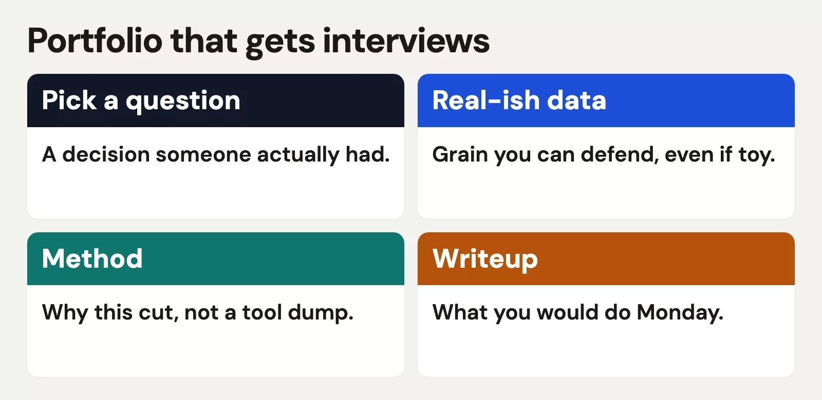
1. Pick a question (decision-shaped)
Weak: “Explore the superstore dataset.” Strong: “Should this fictional retailer expand same-day delivery to mid-size cities, and what risk would that create for margin?” Weak: “Churn analysis.” Strong: “Which two save interventions should customer success pilot first for month-2 churn, given limited CSM time?”
Write the question in one sentence at the top of the README. If you cannot, the project is still a vibe. Tie the question to a role you want: product, marketing, finance, ops. Hiring managers hire for problems they have.
2. Use real-ish data
“Real-ish” means the data has enough mess to force judgment: missing values, changing definitions, delayed events, duplicates, or sampling bias. Perfectly clean CSV toys teach syntax. They do not teach trust.
Sources that work:
- Public government or research datasets with a clear grain
- Company-approved anonymized extracts
- Synthetic data you generate with documented assumptions (label it synthetic)
- Open product analytics dumps or competition data, reframed with a business decision you invent carefully
Document source, grain, refresh, and known holes. That documentation is part of the skill demo. Link it to quality habits you would use at work (see the data quality series for vocabulary).
3. Method (readable, not theatrical)
Show SQL, Python, or a BI workbook that another analyst can follow. Prefer boring clarity over clever one-liners. Comment the non-obvious joins. State why you chose a cohort chart instead of a pie. If you use a model, explain the baseline you beat and what would falsify the result.
Method altitude should match the question. Do not run a neural net to rank three marketing channels with two years of monthly data. Do not use only a pivot table if the role expects window functions and experiment caution. Match the job description’s reality, not Twitter’s flex culture.
4. Decision writeup
End with a short memo a manager could paste into Slack:
- Recommendation (or “do not decide yet; run this test”)
- 1 to 3 numbers that matter
- Risks and what would change your mind
- Ask (pilot, budget, instrumentation, meeting decision)
This is the part most portfolios skip. It is also the part that maps to senior signals from Part 1: decision quality, not chart polish.
How many projects, and what mix
Three strong projects beat twelve thin ones. A practical mix for most analyst roles:
| Project | Proves | Typical artifacts |
|---|---|---|
| Core analytics case | SQL + metric judgment + viz | README, SQL, 2 to 4 charts, decision memo |
| Messy data / quality case | Skepticism and cleaning choices | Before/after checks, issue log, limited claims |
| Role-flavored case | Domain fit (product, growth, finance, ops) | Experiment design, funnel, cohort, or forecast note |
Optional fourth: a small public contribution (docs fix, dbt package example, open dashboard with real users) if it shows collaboration. Optional is optional. Depth first.
Worked example: one project scored like a hiring manager
Candidate project title: “Reducing early churn for a subscription box (public + synthetic hybrid).”
Question: Which two interventions should CS pilot to cut cancel rate between month 1 and month 2 without adding more than 10 minutes of CSM time per at-risk account?
Data: Public-ish order and subscription tables plus a synthetic CSM contact log labeled as synthetic. Grain documented: one row per subscription-month. Known hole: cancellations after failed payment may be under-tagged.
Method: Cohort retention table, simple risk score using tenure + skip rate + contact history, and a prioritization of save offers by estimated impact × effort. SQL for cohorts; Python for a transparent scorecard, not a black box.
Decision writeup (abridged): Pilot (1) proactive contact at first skip for high-tenure customers and (2) one-time box customization for month-1 accounts with two or more skips. Do not pilot discount stacking first: margin risk high, historical save rate unclear. Success metric: month-2 retention lift with CSM minutes tracked. Kill criteria included.
Now score it with a hiring-oriented rubric.
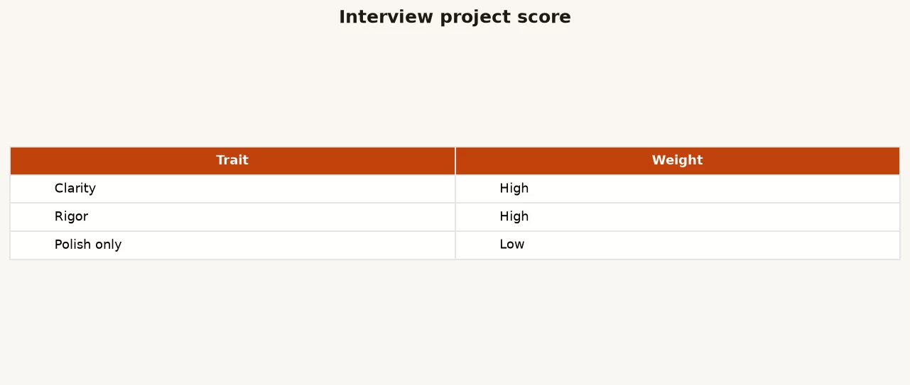
| Trait | Weight | What “high” looks like |
|---|---|---|
| Clarity | High | One-sentence question; memo a manager can skim |
| Rigor | High | Grain, holes, method fit, falsifiers named |
| Polish only | Low | Pretty theme without substance does not save you |
A fuller self-score card you can keep in the repo:
Portfolio project scorecard (1-5)
Question is decision-shaped: _
Source and grain stated: _
Data problems acknowledged: _
Method matches question altitude: _
Code or workbook is navigable: _
Charts have takeaway titles: _
Recommendation + risks + ask: _
Could a stranger rerun the core pull: _

Red flags to fix before sharing:
- No question / only "EDA"
- Only screenshots, no logic
- Overclaims causality from observational data
- Confidential data leakage
- Identical to a public course notebook
If clarity and rigor are high, polish can be “clean enough.” If polish is high and the question is missing, rewrite before you restyle.
Presentation logistics that reduce friction
- One hub link: personal site, GitHub profile README, or Notion index. Do not make recruiters hunt five tools.
- Each project folder: README first, then data dictionary, then code, then outputs.
- Time-to-value: decision memo above the fold; deep SQL below for the technical interviewer.
- Licenses and citations: credit datasets; do not paste proprietary schemas.
- Accessibility: readable charts follow Part 1 of Inclusive data products habits (labels, not color-only). You are also demoing professional standards.
AI tools, courses, and integrity
Using AI to draft SQL or explain errors is normal at work. Portfolios that are only AI-generated prose with unrun code get caught in technical screens. Rules of thumb:
- You must be able to explain every join and filter live
- Run the code; show outputs that match
- If AI helped, your judgment should still be visible in the problem framing and caveats
- Course projects are fine as starting points; change the decision, data constraints, and writeup so the thinking is yours
For SQL quality habits that transfer into interviews, the site’s SQL series and the practical check in how to check AI-written SQL are useful companions. For a wider skill map, use Learn.
Employed analysts: internal portfolios
If you are not job hunting, still keep a private “promotion portfolio”: metric specs you own, incidents prevented, multi-team docs, before/after definition clarity, and decision memos. Same path, different audience. Public polish matters less. Evidence of scope (Part 1) matters more.
When you do go public, rewrite internal work as sanitized cases: change numbers, remove customer names, get approval when required. Never “anonymize” by hope alone.
Common mistakes
- Dashboard galleries without questions. Pretty is not a decision.
- Twelve thin projects. Three deep ones interview better.
- Hiding data mess. Clean screenshots without an issue log look naive.
- Method theater. Complex models for simple decisions signal poor judgment.
- No recommendation. Analysis that ends at a chart forces the reader to work.
- Confidential leaks. Instant disqualifier and a real ethics failure.
- Unrunnable repos. Broken paths and missing packages waste interviewer goodwill.
- Ignoring the role. A pure research notebook for an ops analytics seat is a mismatch.
How to practice this week
- List every public artifact you already have. Kill or archive anything without a question.
- Write three decision-shaped questions for roles you want. Pick one.
- Choose a real-ish dataset and write grain + known holes before you plot anything.
- Build the thinnest path to a decision memo (even if charts are drafty).
- Score the draft with the clarity / rigor / polish rubric. Fix high-weight gaps first.
- Ask one working analyst to skim for 10 minutes and tell you what they still do not understand.
- Publish the hub link only after the README stands alone.
Next in this series: storytelling that gets senior trust, including a simple email skeleton for recommendations under uncertainty.
Quick recap
- Portfolios exist to show judgment under ambiguity, not to display every chart.
- Build projects as question → real-ish data → method → decision writeup.
- Three deep projects with role fit beat a dashboard museum.
- Weight clarity and rigor far above polish.
- Document mess, grain, and risks; end with an ask.
- Protect confidential data; make public work explainable live.
Sources
- GitHub Docs. “About READMEs” (baseline for making projects navigable). https://docs.github.com/en/repositories/managing-your-repositorys-settings-and-features/customizing-your-repository/about-readmes
- US Bureau of Labor Statistics. Occupational outlook materials for data/analytics-adjacent roles (context on skills employers list; not a portfolio recipe). https://www.bls.gov/ooh/
- Google. “re:Work” hiring resources (structured interviewing ideas that reward evidence over vibe). https://rework.withgoogle.com/
- Curious Elephant / common open dataset indexes such as Google Dataset Search for finding real-ish public data. https://datasetsearch.research.google.com/
- dbt Labs Labs blog and docs on analytics engineering workflows (example of project structure that reads professionally). https://docs.getdbt.com/docs/introduction
Merch on Etsy
Open store → Imbalanced Classes Mouse Pad, Data Science Mouse Pad, Analytics Mouse Pad, Imbalanced Mouse Pad
View on Etsy →
Imbalanced Classes Mouse Pad, Data Science Mouse Pad, Analytics Mouse Pad, Imbalanced Mouse Pad
View on Etsy →
 Boxplot Mouse Pad, Data Science Mouse Pad, Analytics Mouse Pad, Box Plot, Whisker Plot
View on Etsy →
Boxplot Mouse Pad, Data Science Mouse Pad, Analytics Mouse Pad, Box Plot, Whisker Plot
View on Etsy →
 You're On Mute White Ceramic Coffee Mug, Data Science Mug, Data Mug, Analytics Mug, Statistics Mug, Programming Mug, Gift Mug, Coffee Mug
View on Etsy →
You're On Mute White Ceramic Coffee Mug, Data Science Mug, Data Mug, Analytics Mug, Statistics Mug, Programming Mug, Gift Mug, Coffee Mug
View on Etsy →
 Y Hat Mouse Pad, Data Science Mouse Pad, Analytics Mouse Pad, Y Pred Mouse Pad
View on Etsy →
Y Hat Mouse Pad, Data Science Mouse Pad, Analytics Mouse Pad, Y Pred Mouse Pad
View on Etsy →