
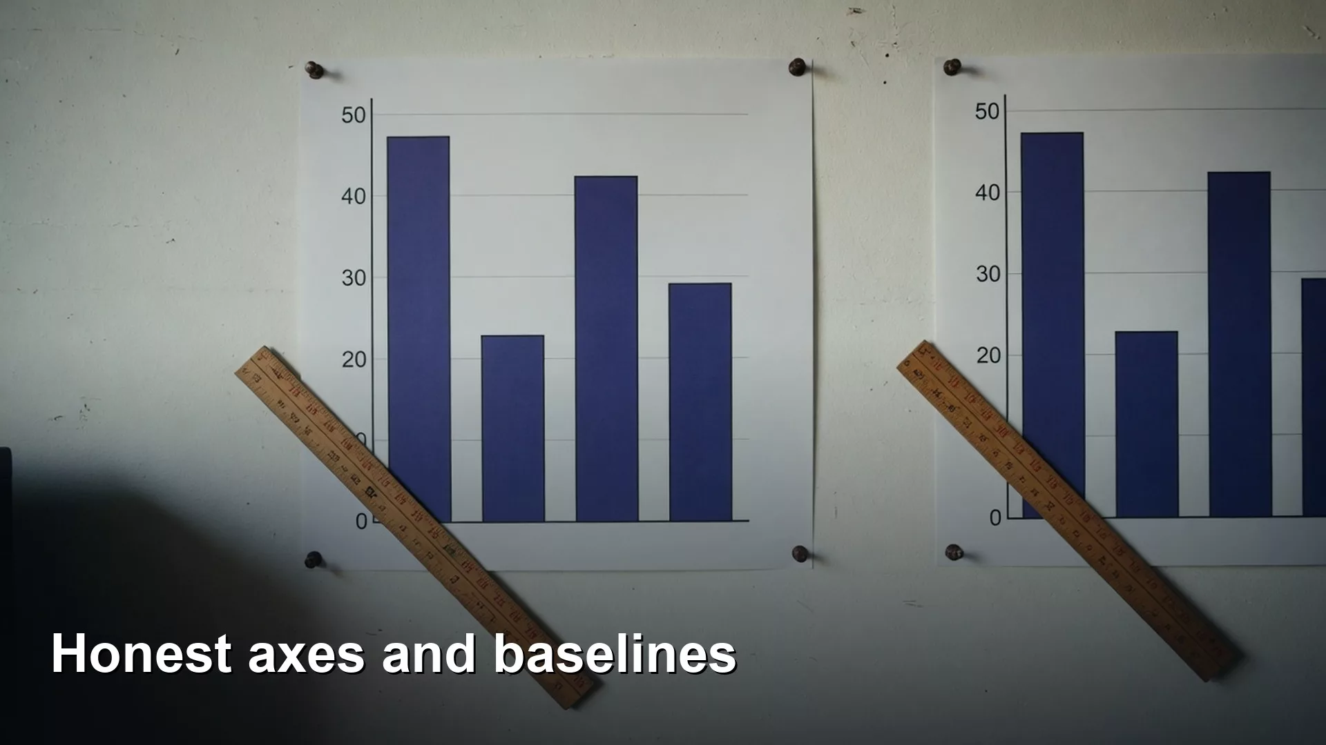
Two charts show the same monthly revenue. On the first, the line climbs gently across a full scale that starts at zero. On the second, the axis starts at $920k and the line looks like a rocket. Same numbers. Different panic level. Someone pastes the rocket into the board pack because “it shows the growth better.” That phrase is doing a lot of work. Better for whom? Better for what decision?
This is Part 3 of Charts that make sense. You already know charts need a job (Part 1) and a type that matches the relationship (Part 2). Now we talk about axes and scales: the quiet machinery that makes a chart honest or theatrical. You do not need a statistics degree. You need a habit of asking what the axis claims.
What you’ll learn
- Why baselines and scales are ethical choices, not cosmetics
- When a zero baseline is required and when a zoomed scale can be honest
- How truncated axes and dual axes go wrong in meetings
- When a log scale helps (briefly) and when it confuses
- A worked example that compares honest and misleading scales on the same table
Axes are claims about magnitude
A chart encodes numbers as position, length, or area. The axis tells the viewer how to translate those marks back into quantities. If the axis lies by implication, the marks lie by implication. Edward Tufte’s graphical integrity ideas and Stephen Few’s practical business graphing both treat scale choice as part of truth-telling, not as a late style toggle.
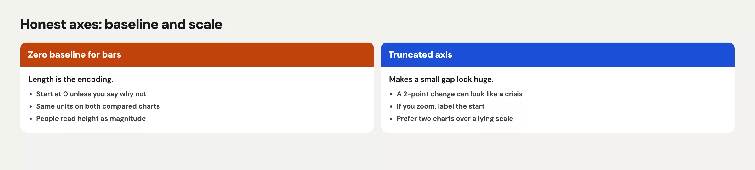
In a meeting, most people will not recompute the values. They will read the slope with their gut. Your scale trains that gut. That is power. Use it carefully.
Rule of thumb: If a scale change would reverse the emotional story without reversing the numbers, flag the scale in the title or subtitle, or do not use it.
Bar charts and the zero baseline
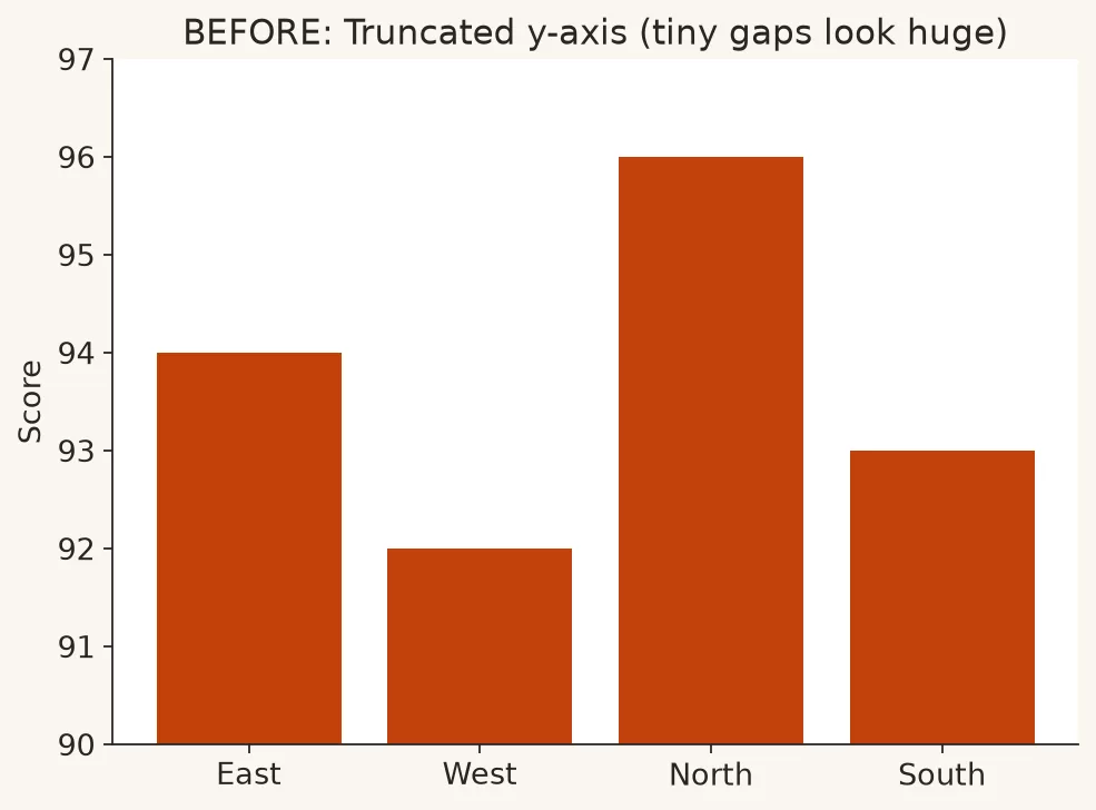
For bar charts that encode magnitude with bar length, start at zero unless you have a rare, well-labeled reason not to. Why? Because people compare lengths. A bar that is twice as tall is read as twice as large. If your axis starts at 90 instead of 0, a value of 100 and a value of 110 look wildly different in length while remaining close in reality.
This is the classic “truncated bar” crime. It still shows up in sales dashboards, survey results, and vendor pitch decks. Tools make it easy: set the minimum to “automatic” and the auto scale hugs the data. Automatic is not the same as honest.
Visual example: the same four scores. Truncated axis on the left, zero baseline on the right.
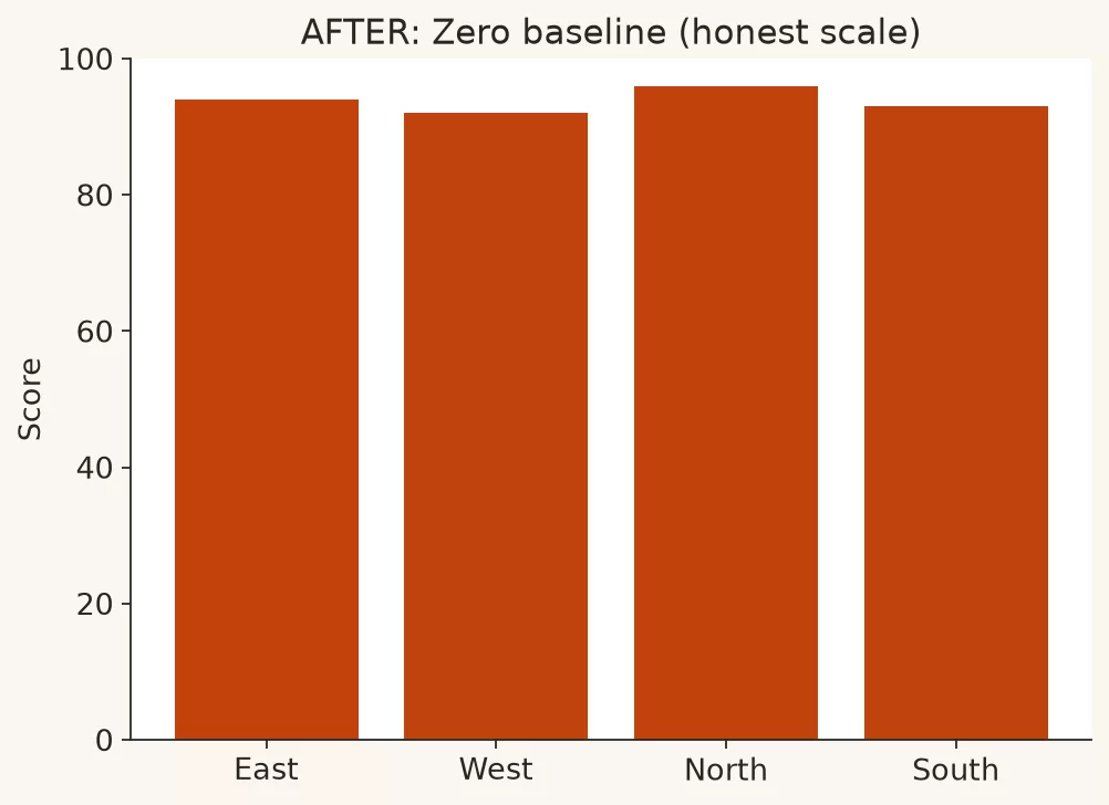
When zero is non-negotiable: comparison of magnitudes with bars or columns, stacked compositions that imply total length, and any ranking chart where length is the main encoding.
When zero is awkward: temperature-like measures that do not have a meaningful zero in the business sense, or indices where zero is outside the domain. Even then, label clearly and consider whether a table is safer.
Line charts: zoom is sometimes honest
Lines encode change and shape more than absolute length. Zooming a line chart to a relevant band can help people see a break in a noisy series. That is different from truncating bars. Still, zoom is not a free pass to invent drama.
Honest zoom practices:
- State the axis range in the subtitle (“Y-axis: $920k to $980k”)
- Show a small full-scale inset if the absolute level matters
- Avoid zoom that turns a 1% move into a cliff without saying so
- Prefer annotations of events over theatrical scale alone
If the decision is “are we up a little or a lot relative to history,” absolute context may matter more than a zoomed slope. If the decision is “did the series break its recent band after the release,” a zoomed band can be the right tool. Match scale to the job from Part 1.
Truncated axes: how to talk about them at work
When someone sends a truncated chart, you do not need a lecture. You need a calm alternative. Try:
- “Can we show the zero-baseline version next to this so the room sees absolute size?”
- “The change is real, but the axis makes it look larger than the percent move. Let’s put the percent in the title.”
- “If we keep the zoom, let’s label the min and max so nobody thinks it starts at zero.”
Most colleagues are not trying to deceive. They are trying to make a weak projector readable. Help them keep readability without borrowing false urgency.
Dual axes: the charming trap
Dual-axis charts put two series on one plot with two different vertical scales. They look efficient. They often invent a relationship. Marketing spend on the left axis, signups on the right axis, and suddenly the lines “move together” because you chose scales that make them hug.
Problems with dual axes:
- Viewers mix units without noticing
- Crossing lines imply intersection that does not exist in reality
- You can make almost any two series look correlated by rescaling
- Color-only distinction fails in print and for many color vision deficiencies (Part 4)
Safer patterns:
- Two separate charts with aligned time axes
- Index both series to 100 at a start date and plot on one axis (with a clear “index” label)
- Plot the ratio or difference if that is the real metric
- Show a scatter of the two measures if correlation is the claim, with the usual caution about causation
Datawrapper and other charting educators have written carefully about dual-axis pitfalls for years. The short workplace version: if you need dual axes to make the story work, the story may not work.
If a stakeholder insists on dual axes for a “single slide,” offer a compromise: two small charts stacked with a shared time axis, same width, same tick marks for time. That layout still fits a slide. It refuses the fake hug of two independent scales. You can still color the series carefully and annotate the event that matters. What you will not do is let a secondary axis manufacture a narrative that the metrics did not earn.
Another dual-axis cousin is the “percent on one side, count on the other” chart for the same measure family. Sometimes people mean well: they want share and volume together. Prefer a bar of volume with share labeled on each bar, or two panels. Mixing percent and count on dual axes is how a small region with loud percent growth steals the meeting from the region that actually drives the workload.
Log scales in one honest paragraph (plus a little more)
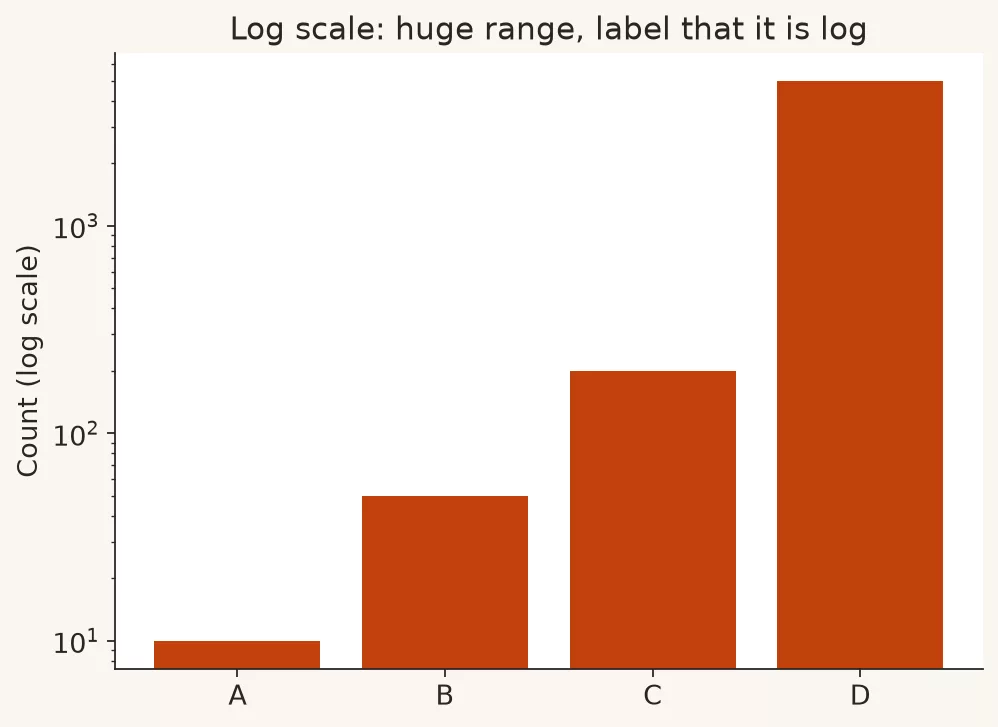
A logarithmic scale compresses large values and expands small ones. It helps when values span orders of magnitude: website traffic from 200 to 2,000,000, or infection counts early in a growth process when multiplicative change matters. On a log scale, equal vertical distances mean equal ratios, not equal differences. That is powerful and easy to misread. If your audience thinks in dollars and headcount, a log axis without a tutorial will be read as linear. Use log scales rarely, label them loudly, and prefer them in analyst-facing explore views more than in first-time executive decks. If you only need to show that one category dominates, a sorted bar on a linear scale is usually clearer.
If you do use log scales in Python later, libraries such as matplotlib support them explicitly. That is an implementation detail. The communication detail is whether your audience understands multiplicative change. When in doubt, show both linear and log, or show a table of growth rates.
Example: a log-scaled bar chart when values span orders of magnitude. The axis must say “log scale” so nobody reads it as linear dollars.
Aspect ratio and time axes
Stretching a chart wide can flatten a trend. Squashing it tall can steepen it. There is no single perfect aspect ratio, but there is a bad habit: reshaping the plot until the line “looks like leadership expects.” Keep time ordered, keep intervals consistent (do not hide a missing week by closing the gap without a break mark), and avoid decorative 3D that further warps perception.
For uneven time intervals, mark the points and consider connecting them only when the continuum is real. Monthly points connected as if they were continuous daily process can over-smooth reality.
Worked example: same revenue, three scales
Suppose monthly recurring revenue (MRR) for a product line looks like this:
| Month | MRR | Change vs prior |
|---|---|---|
| Jan | $940,000 | n/a |
| Feb | $948,000 | +0.9% |
| Mar | $955,000 | +0.7% |
| Apr | $962,000 | +0.7% |
| May | $970,000 | +0.8% |
| Jun | $978,000 | +0.8% |
Three presentations of the same series:
| Version | Y-axis | What the gut feels | Honest use? |
|---|---|---|---|
| A. Full scale bars | $0 to $1.0M | Steady high level, small moves | Yes for magnitude |
| B. Zoomed line | $930k to $990k | Clear upward path | Yes if labeled as zoom |
| C. Truncated bars from $930k | $930k to $990k | Huge growth | No for length encoding |
Version B can support a careful ops discussion about whether growth is stable. Version C is the version that makes a 4% half-year rise look like a moonshot. If the board needs both absolute size and recent slope, show A and B, not C alone.
# Pseudo scale checklist before export
y_min = axis_minimum()
encoding = "bar_length"  # or "line_position"
if encoding == "bar_length" and y_min > 0:
    warn("Bars imply length from zero. Reset baseline or switch to line + label.")
if encoding == "line_position" and y_min > 0:
    require_subtitle(f"Y-axis starts at {y_min}")
if dual_axis:
    prefer("two charts or indexed series")
# Always write the percent change in text when slope looks dramatic.
If you build this in a notebook, the same honesty rules apply as in Python for analytics plotting: save a share figure only after the axis would survive a skeptical question from Finance.
Units, breaks, and multiple charts
Scale honesty also includes units and breaks:
- Label currency and whether figures are thousands or millions
- Do not switch units mid-series without a hard visual break
- Avoid broken axes that hide a gap while still inviting length comparison
- Prefer two charts over one chart with a magic second scale
When totals disagree across systems, fix definitions before you argue about axes. Axis craft cannot rescue a metric conflict. That is quality work from the data quality series.
Write a one-line scale note in your draft checklist the same way you write a filter note. Example: “Bars from zero; line inset zoomed to $930k-$990k for slope; percent change in title.” When reviewers only see the zoomed line, you still have a paper trail for why the second view exists. That habit also helps when someone screenshots one panel into Slack without the companion chart.
Finally, remember that “honest” is audience-relative in one narrow sense: a research team that lives in log space may read log axes fluently. A cross-functional leadership group may not. Honesty includes choosing the scale your audience can decode without a private tutorial. If you must use a specialized scale, spend ten seconds teaching it on the slide. Ten seconds of teaching beats ten minutes of confused debate.
Common mistakes
- Truncated bars for rankings. Length stops meaning magnitude.
- Unlabeled zoomed lines. People assume zero.
- Dual axes as a storytelling shortcut.
- Log scales without audience preparation.
- Aspect ratio games that steepen a story for a screenshot.
- Missing-week compression that makes time look continuous when it is not.
- Auto axis from the tool accepted without a human glance.
How to practice this week
- Find one bar chart in your last deck. Confirm the baseline is zero. If not, rebuild it.
- Find one line chart with a tight axis. Add an explicit range label in the subtitle.
- If you have a dual-axis chart, split it into two charts for the next review and compare the discussion quality.
- Write the percent change next to any chart that “looks dramatic.”
- Ask a colleague what the axis starts at without looking at the numbers. If they guess wrong, the chart needs clearer labeling.
Paths for related skills sit on Learn. Next: color, labels, and accessibility, so honest axes are still readable for more people and in more formats.
Quick recap
- Axes train the gut. Treat them as part of the claim.
- Bars that encode magnitude need a zero baseline.
- Zoomed lines can be honest if labeled; truncated bars rarely are.
- Dual axes often invent relationships. Prefer two charts or an index.
- Log scales are for ratio stories and trained audiences.
Sources
- Stephen Few, Perceptual Edge: https://www.perceptualedge.com/
- Edward Tufte, graphical integrity resources: https://www.edwardtufte.com/tufte/
- Alberto Cairo on visualization and truthfulness: https://www.albertocairo.com/
- Datawrapper Academy, “Which chart to use” and dual axis discussions: https://academy.datawrapper.de/
- matplotlib scales documentation (including log): https://matplotlib.org/stable/users/explain/axes/axes_scales.html
- Calling Bullshit (Bergstrom & West), course materials on misleading visualizations: https://www.callingbullshit.org/
- Analytics Made Simple, Python series: https://analyticsmadesimple.com/series/python/
Merch on Etsy
Open store → Naive Bayes Mouse Pad, Data Science Mouse Pad, Analytics Mouse Pad, Bayesian Mouse Pad
View on Etsy →
Naive Bayes Mouse Pad, Data Science Mouse Pad, Analytics Mouse Pad, Bayesian Mouse Pad
View on Etsy →
 Boxplot Mouse Pad, Data Science Mouse Pad, Analytics Mouse Pad, Box Plot, Whisker Plot
View on Etsy →
Boxplot Mouse Pad, Data Science Mouse Pad, Analytics Mouse Pad, Box Plot, Whisker Plot
View on Etsy →
 Good Cheap Fast White Ceramic Coffee Mug, Data Science Mug, Data Mug, Analytics Mug, Statistics Mug, Programming Mug, Gift Mug, Coffee Mug
View on Etsy →
Good Cheap Fast White Ceramic Coffee Mug, Data Science Mug, Data Mug, Analytics Mug, Statistics Mug, Programming Mug, Gift Mug, Coffee Mug
View on Etsy →
 You're On Mute White Ceramic Coffee Mug, Data Science Mug, Data Mug, Analytics Mug, Statistics Mug, Programming Mug, Gift Mug, Coffee Mug
View on Etsy →
You're On Mute White Ceramic Coffee Mug, Data Science Mug, Data Mug, Analytics Mug, Statistics Mug, Programming Mug, Gift Mug, Coffee Mug
View on Etsy →