A good question about data names the decision it will feed, the time period, the group of customers, and what a good answer would look like. “How are we doing?” is a mood, not a question. A simple ladder of five kinds of question can turn a wandering meeting into an answer you can check.
Say your weekly product meeting slides into a 45-minute wander. You ask, “How are we doing?” A coworker opens a dashboard (a screen of charts that tracks key numbers) with twelve charts, and someone else says revenue is “basically fine.” Nobody writes down a decision, so two weeks later you sit through the same meeting again with newer screenshots.
Companies often sell “data culture” as a set of tools. Tools help, but the scarce skill in most rooms is asking a question that can be answered, checked, and tied to a next action. Analysts feel this when a chat message says “pull numbers on churn” with no time period, no customer group, and no decision attached. Leaders feel it when they sense the room is rewarding activity instead of clarity.
This guide is a practical playbook for asking better data questions in meetings, and it stands on its own. If you want habits for defining metrics, the series on metric definitions is the place to look. For quality checks that should follow any bold claim, see the series on data quality. The language of ownership shows up in the series on data stewardship, and broader learning paths live on the Learn page. When an AI tool drafts the answer too quickly, keep the habits from the post on checking AI-written SQL (the standard language for asking a database for data) and the series on practical AI.
What a good data question does
A useful data question makes four things clear enough that someone can act on them:
- Object: what thing or process you mean, such as customers, orders, tickets, or campaigns.
- Measure: what number or observation you want, with a link to its definition if one exists.
- Scope: the time range, customer group, region, product, or channel.
- Use: whether you want to decide, keep watch, find a cause, or just explore, and what happens with the answer.
You do not need a legal contract in every meeting. You need just enough detail that two people would pull the same table. “How is growth?” fails that test. “Did weekly activated accounts in US self-serve rise or fall week over week for the last six weeks, and are we above the plan line we agreed in Q2?” can be answered, argued over, and improved. (An activated account is one that has finished the first steps that show it is really using the product.)
The question ladder
Think of questions as climbing in decision power. The lower rungs are fine for exploring, but a meeting that lives only on the bottom rung feels busy and settles nothing.
- Rung 1: Curiosity. “What is going on with retention?” This works as a seed, not as a goal for the meeting.
- Rung 2: Description. “What happened to 4-week retention for customers who started in March versus April?”
- Rung 3: Comparison. “How does that compare to plan, to last year, or to the group that did not get the change?”
- Rung 4: Diagnosis. “Which customer groups and steps explain most of the change, and what did we rule out?”
- Rung 5: Decision. “Given this evidence, do we ship, iterate, or stop, and what will we measure next week?”
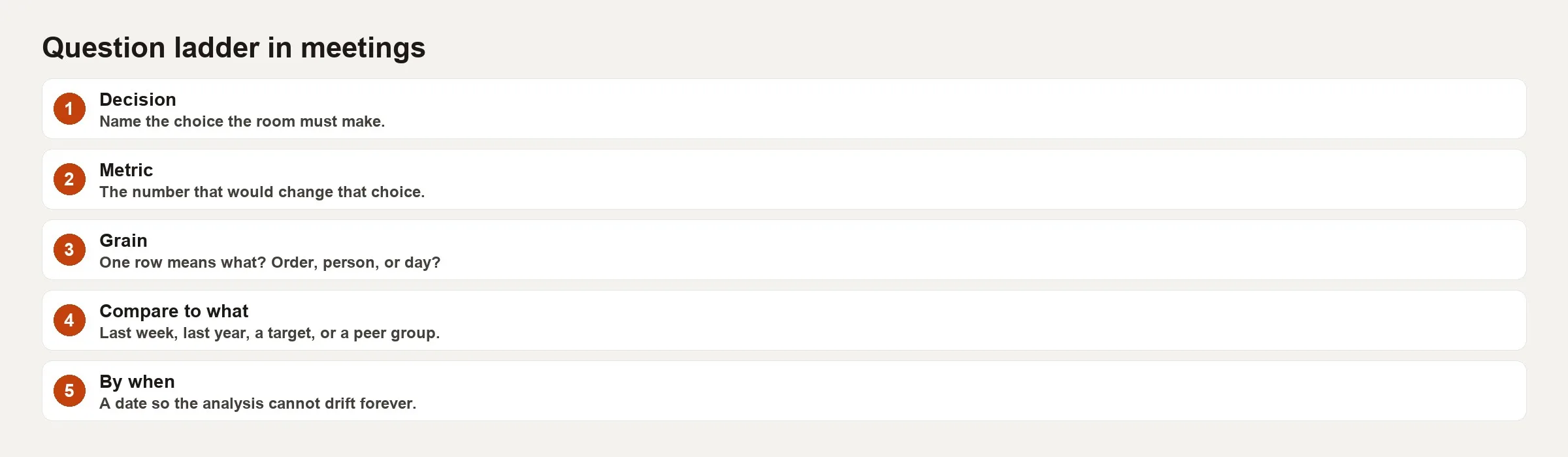
Climbing does not mean every chat must end in a big decision. It means you say out loud which rung you are on. Exploration meetings that pretend to be decision meetings burn trust, while decision meetings that never leave curiosity burn calendars.
Question templates by meeting type
Status or business review
- What is the main metric, where is its definition, and who owns it?
- What is the time window, and what are we comparing against (plan, the prior period, or a forecast)?
- What changed, by how much, and is the change bigger than normal ups and downs?
- What will we do differently before the next review if we are off track?
Incident, or “the number looks wrong”
- When did it break (the first bad point) compared with when we noticed?
- Is this a tracking problem, a data-movement problem, a definition problem, or a real change in the world?
- What independent check supports that guess?
- Who is blocked, and what temporary rule do we use until it is fixed?
Experiment or launch review
- What main metric and success threshold did we write down before the test started?
- What was randomized (people, accounts, or sessions), and what period did we analyze?
- Which side metrics that we were protecting moved, and did any customer group go the opposite way from the average?
- Do we ship, iterate, or stop, and what is the next bet we can measure?
Forecast or planning
- Which drivers are in the model, and which are measured versus assumed?
- What is the range of likely outcomes, not just the single best guess?
- What early signs would tell us by week two that the plan is wrong?
- What decision waits if the low scenario happens?
Rewriting a real agenda
Here is an original product review agenda, full of energy but short on questions:
- Growth update
- Engagement deep dive
- AI insights
- Open discussion
What actually happens in that meeting is twelve charts, three anecdotes, and one AI summary that invents a story about a customer group from a screenshot. Nobody owns the follow-up for next week.
Now the same meeting with each item written as a question on the ladder:
- Description: Did weekly activated accounts (with a link to the definition) for US self-serve move week over week across the last eight weeks?
- Comparison: Are we above or below the Q3 plan line, and by how many accounts?
- Diagnosis: Which acquisition channel explains the largest share of the miss, after we check that tracking is healthy?
- Decision: Do we move 20% of paid budget from Channel A to Channel B for two weeks, and which early metric must improve by Friday?
Here is a supporting table the meeting host can put in the invite:
| Agenda item | Question rung | Owner | Artifact |
|---|---|---|---|
| Activated accounts trend | Description | Growth analyst | One chart + definition link |
| Plan variance | Comparison | Finance partner | Plan vs actual table |
| Channel contribution | Diagnosis | Growth + data eng | Breakdown + tracking note |
| Budget reallocation | Decision | Product lead | Yes/no + success metric |
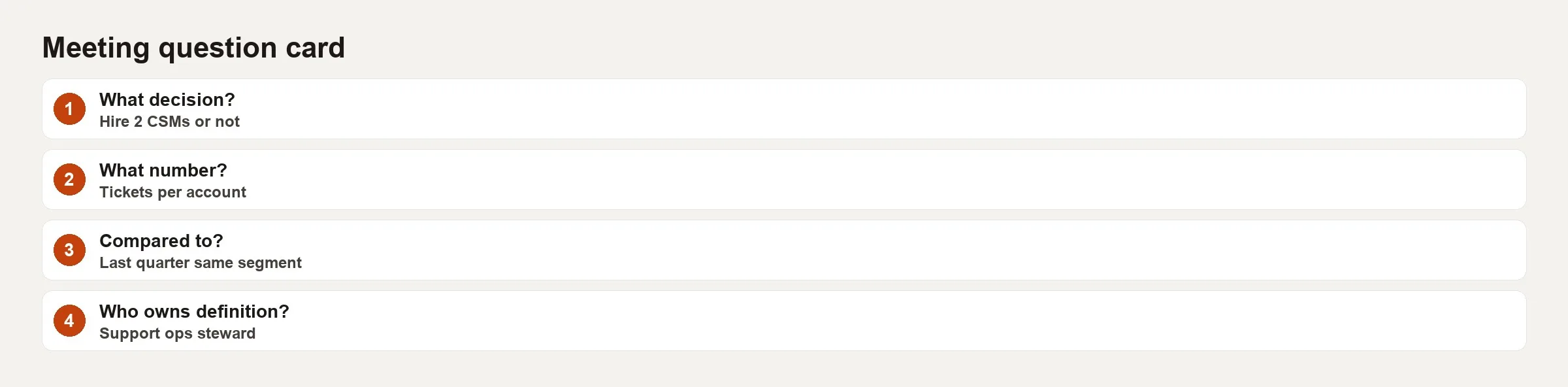
The meeting card is the portable version of all this. It holds the question, its rung, the metric, the scope, the owner, the choices on the table, and one more line: “what would change our mind.” Print it, or paste it into your document template.
Facilitation moves that lead to better questions
- Put a time limit on curiosity. Give the room five minutes to list hunches, then force a rewrite at rung 2.
- Ban orphan metrics. If nobody owns the definition, treat the number as a topic for discussion, not an input to a decision.
- Separate “is the data wrong?” from “is the business wrong?” They have different owners and different next steps.
- Write the decision options before the charts. Charts that go looking for a question turn a meeting into theater.
- End with one sentence: “We decided X, measured by Y, and we will check again on this date.”
- Park AI summaries until the question is clear, because models are good at polishing vague nonsense into confident paragraphs.
Roles: asker, answerer, decider
Meetings go sideways when one person is forced to play all three roles at once.
- The asker clarifies the decision and the success criteria. This is often the product or business owner.
- The answerer provides the evidence, the uncertainty, and the alternatives. This is usually an analyst, an analytics engineer, or sometimes someone in finance.
- The decider chooses among the options and accepts the leftover risk. This is a manager or the accountable owner.
Analysts can coach askers up the ladder without taking over the decision. Deciders can refuse to decide on gut feeling at rung 1 without being “anti-data.” Answerers can say “that question cannot be answered with our current tracking” and treat it as a professional result, not a failure.
Phrases that upgrade a weak ask on the spot
Keep these in your pocket for the moment a vague question lands:
- “What decision will this change this week?”
- “What is the time window and comparison?”
- “Which definition of that metric are we using?”
- “Are we checking data health or business health first?”
- “What would prove this story wrong?”
- “Is this explore, monitor, diagnose, or decide?”
- “Who owns the follow-up number by Friday?”
Said with curiosity instead of as gotchas, these lines save hours of flipping through charts with no point.
Common mistakes
- Starting with the dashboard instead of the decision.
- Mixing definition debates into every status meeting. Schedule definition work on its own, and do not hijack every review.
- Accepting averages that hide reversals when the decision is about one customer group.
- Treating an AI-written story as evidence.
- Asking for “all the data” with no detail level or scope.
- Leaving no owner for the next measurement.
- Confusing a confident tone with good evidence.
- Never writing the decision down, so the next meeting reopens it.
Practice
Before your next recurring review, take the last agenda and rewrite each bullet as a question with a rung label. Cut any item that cannot name a metric or a decision. Add one “what would change our mind” line, and after the meeting score yourself on one point: did you leave with a written decision, or only with “good discussion”?
For a second drill, collect five chat requests from the past month and upgrade each one to include the object, measure, scope, and use. Share the before and after with your team as a living style guide. If SQL is involved, require the upgraded question before anyone spends an afternoon on a query (a written request for data), whether a person or an AI tool writes it.
A short script for the first five minutes
If you run the meeting, open with the same four questions every time. First, what decision is on the table today, even if the answer is “no decision, explore only”? Second, which metric and definition link will we trust for this conversation? Third, what time window and comparison are we using? Fourth, what would make us stop and fix data quality instead of debating the business? People resist scripts until they feel a meeting end on time with a written outcome, and after two or three rounds the script becomes culture instead of pedantry.
When remote attendees join late, paste the four answers in the chat so the room does not restart from rung 1. When someone brings a surprise chart, park it on a “side quest” list unless it changes the named decision. Side quests can be real work, but they do not get to steal the one hour you had for a ship-or-stop call. Whoever reads the notes later will thank you for the boring clarity.
Quick recap
- Good data questions specify the object, the measure, the scope, and the use.
- The ladder runs from curiosity to description, comparison, diagnosis, and decision.
- Name the rung so the meeting matches the work.
- Templates differ for status reviews, incidents, experiments, and forecasts.
- Facilitation and roles matter as much as charts.
- Write down decisions and next measurements, because polish without evidence is still theater.
Your next step
Before your next data meeting, write the question you plan to ask with its four parts: the object, the measure, the scope, and the use, and name the rung (description, comparison, diagnosis, or decision). Sharing that line in the invite helps everyone arrive ready for the same kind of answer.
Series notes
This is a standalone playbook on Learn. It pairs with the Metrics series when definitions need owners.
Sources
- Wong, Dona M. The Wall Street Journal Guide to Information Graphics (practical clarity on matching questions to visuals; book reference).
- Few, Stephen. Now You See It / perceptual and analytical design principles for answering questions with data (book reference; see also https://www.perceptualedge.com/).
- Hubbard, Douglas W. How to Measure Anything (decision-focused measurement framing; book reference).
- Google, HEART framework overview (example of goal-driven metric questions for product work): search for “Google HEART framework Measuring UX” and the original CHI paper by Rodden, Hutchinson, and Fu.
- Analytics Made Simple, Metrics series: https://analyticsmadesimple.com/series/metrics/
- Analytics Made Simple, Learn hub: https://analyticsmadesimple.com/learn/
Keep going
Same lessons in your feed
Short diagrams, hooks, and weekly tutorials on Substack, Instagram, X, and Facebook.