
Data job titles are inconsistent, so judge a role by the questions it answers, the systems it works in, and what it produces, not by its title. The same title can mean very different work at two companies.
Imagine you read three postings titled “data scientist.” One is mostly building dashboards, one is mostly prediction models, and one is mostly managing a product. The title told you almost nothing; the duties told you everything.
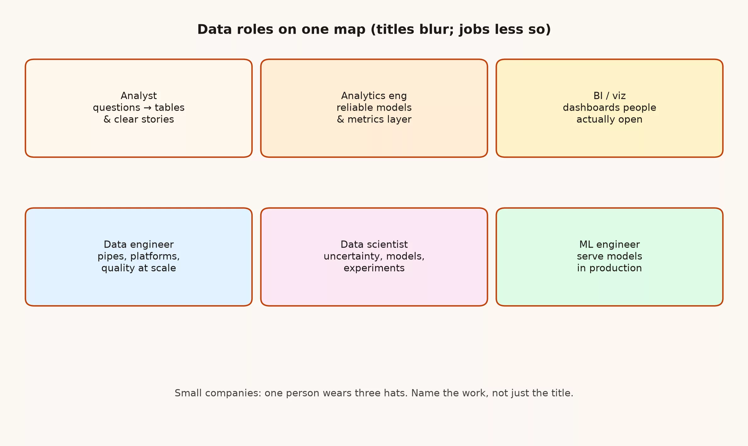
Here is a plain map of common data roles, how they overlap, and how to read a posting clearly. Pair it with how analytics, reporting, and data science differ.
What you’ll learn
- What each major role optimizes for.
- Where titles overlap in small companies.
- Skills that transfer across roles.
- How to choose a path based on taste, not prestige.
- Red flags in job descriptions.
Analyst
Owns questions and clear answers. Pulls data, checks quality, builds tables or lightweight models, and communicates tradeoffs. Success looks like decisions that cite a number people trust. Typical tools are SQL (the standard language for asking a database questions), spreadsheets, business intelligence (BI) tools that build dashboards, pages of charts that update from your data, and sometimes Python. The best analysts are annoying in a helpful way: they ask what decision the chart is for before they build the tenth version.
BI analyst and developer
Owns scalable reporting and semantic layers. Builds dashboards that do not fall over when ten teams filter them wrong. Success looks like self-serve that stays consistent. Tools: BI platforms, modeling layers, strong SQL. If every team invents revenue in their own workbook, BI has more work to do than a new color palette.
Analytics engineer
Sits between analysts and the data platform, turning analysis that people keep repeating into tested, reusable tables and metric definitions in the warehouse, so everyone works from the same numbers. Success looks like fewer one-off pipelines and clearer grains. Tools: SQL, dbt-like workflows, git, basic software hygiene. Think “software habits for analytics SQL.”
Data engineer
Owns how data moves and where it lives: loading it from source systems, scheduling the jobs that move it (often called orchestration), storage, access, cost, and often the checks that catch bad data. Success looks like data arriving correctly without heroics. Tools: warehouses, pipes, infra as code, strong software skills. When the pipe is broken, nobody cares which charting tool you prefer.
Data scientist
Owns uncertainty: experiments, forecasting, models, causal questions when the business invests in them. Success looks like decisions improved under ambiguity, not just fancy notebooks. Tools: stats, Python/R, SQL, experimental design. If there is no decision owner for the model, you are decorating a slide.
ML engineer
Owns models in production: serving, monitoring, retraining, latency (how long a prediction takes to come back), and failure modes. Success looks like systems that stay correct after the demo. Tools: ML stacks, software engineering, observability. Demos are easy. Tuesday at 3 a.m. after a silent schema (the layout of the data) change is the job.
Comparison
| Role | Primary question | Typical output |
|---|---|---|
| Analyst | What should we do? | Brief, chart, recommendation |
| BI | How do we see the same truth? | Dashboard, semantic model |
| Analytics eng | How do we reuse trusted tables? | dbt models, tests |
| Data eng | How does data get here reliably? | Pipelines, platform |
| Data scientist | What can we predict or test? | Model, experiment design |
| ML eng | How does the model run in prod? | Service, monitors |
Small company reality
In a small company one person may cover three of these roles at once, and that works fine as long as everyone is honest about which work comes first. It is not fine when leadership expects production ML, executive BI, and 24/7 pipelines from a single hire without prioritization. Write the priority order down. Otherwise the loudest Slack channel wins every week.
Choosing a path
- Like storytelling and business context → analyst / BI.
- Like software craft and systems → data eng / ML eng.
- Like math under uncertainty → data science.
- Like modeling business logic in SQL → analytics eng.
Job description red flags
- Laundry list of ten languages and five cloud certs for one junior seat.
- “Rockstar” with no mention of stakeholders or quality.
- Unclear whether success is research or production.
- No data stack named at all.
- Unlimited scope with no decision rights.
Transferable skills
Across all of these roles, the durable skills are: clear writing, careful definitions, basic statistics intuition, SQL fluency, and the ability to say “I do not know yet” without panicking a room. Tools change. Those habits compound.
Quick recap
- Map work by outputs, not prestige titles.
- Overlaps are normal; ownership should still be clear.
- Pick paths by taste and problems you enjoy.
- Small teams blend roles; big teams specialize.
- Read postings for real success metrics.
A good first step this week: read two job postings for the role you want and underline what success looks like in each. Compare that with the work you already do.
Sources
- https://analyticsmadesimple.com/analytics-bi-data-science-and-more-whats-the-difference/
- https://analyticsmadesimple.com/key-terms/
Keep going
Same lessons in your feed
Short diagrams, hooks, and weekly tutorials on Substack, Instagram, X, and Facebook.