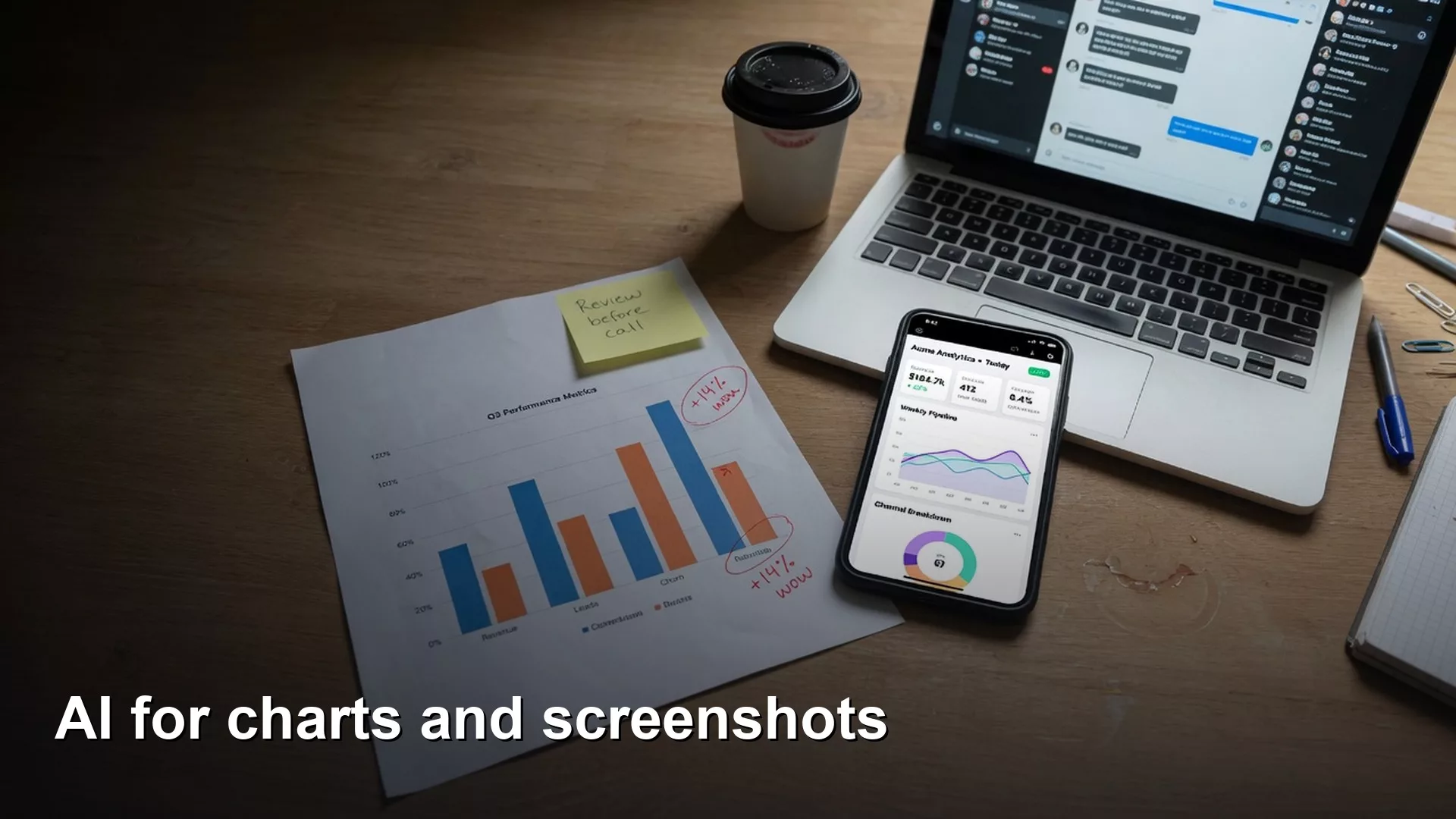
Some AI tools can now look at a picture of a chart or a screenshot and describe it. That helps you draft a first read, but the tool can also invent a whole story from a cropped axis, a forecast line, or a theme color. So ask it only for what is visible, make it say when it is unsure, and check any surprising claim against the real data.
Say you drop a dashboard (a screen of charts that updates on its own) screenshot into a chat and ask, “What drove the dip in week 12?” The model answers in full sentences, names three customer segments, and even offers a tidy story about seasonality. You paste that answer into the team status channel. An hour later your coworker in finance replies with the actual query result, and the news is bad: week 12 was a tracking bug. The chart’s vertical axis did not start at zero, and the red line was a forecast rather than real numbers. The model never had a chance to know any of that. It still sounded sure.
Models that accept images are genuinely useful for people who work with data. They can describe a chart, flag possible problems, and turn a messy slide into a first outline. They are also an easy way to turn a guess into confident-sounding prose. This post shows how to use them on charts and screenshots without treating a picture as proof.
If you are still getting comfortable with how these models work, start with the plain-English guide to LLMs, ChatGPT, and generative AI. (An LLM, or large language model, is the kind of AI that reads and writes text.) When a visual read turns into a database question, keep the checklist for reviewing AI-written SQL (the standard language for asking a database for data) close by. For wider reading, browse the Learn page and the Practical AI series.
Multimodal in plain English
A multimodal model accepts more than plain text. Here the extra input is an image: a picture file of a dashboard, a photo of a whiteboard, a slide export, or a phone screenshot of a mobile chart. The model writes its answer based on both the pixels and your question.
This is different from optical character recognition (OCR), which simply tries to read the letters and numbers in an image. Vision-language models go further and try to work out meaning, such as the title, the lines being compared, the rough size of the values, and how the pieces relate. Meaning is where the risk lives. A misread character is a small error. A misread story can send a whole meeting the wrong way.
It is also different from handing the model the table behind the chart. Numbers in a data file can be checked with code. Numbers guessed from the blurry edges of a compressed screenshot are estimates at best and invented at worst.
A workflow that keeps humans honest
Use a three-step loop every time an image might influence a decision, so the model helps you look but never decides for you:
- Describe. Ask for what is visible: the title, the axes, the legend, the lines being compared, the time range, any notes, and any menu controls that might be a filter.
- Verify. Check the description against the data source, the export, or a second person. Treat everything the model said as a list of guesses to confirm.
- Act. Only after that, write the ticket, the SQL, or the update to your stakeholders.
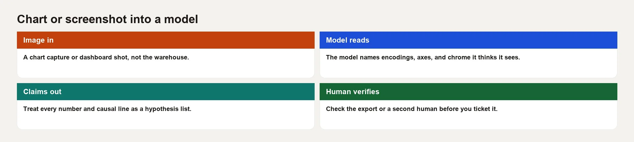
Skip the verify step and you are only playing at analytics. The model is not your data warehouse (the central database that holds company data for reporting), and the screenshot is not your warehouse either. A screenshot is a picture of the data with someone’s design choices baked in.
Why charts are hard for machines (and people)
How a chart draws the data is not the data
A bar chart turns values into lengths, and a line chart shows change along a shared axis. Color separates one series or category from another. A truncated axis, a second axis on the right, a log scale, 100% stacked bars, and filled area charts each change what “looks big” means, so models and people both misread them, especially when rushed.
Design can hide things by leaving them out
Cropping can cut off the baseline. A legend can sit just outside the capture. A tooltip (the small box that appears when you hover) may hold the real number while the label on the chart is rounded. Dark mode and brand colors can swap “good” and “bad” compared with what the model learned in training. Watermarks and confidential banners sometimes get mistaken for chart labels.
Buttons and menus around the chart look like data
Dashboard screenshots also show filters, last-refreshed times, row counts, and comparison toggles. Models often treat a filter label as a finding. An example is “users filtered to Enterprise,” which only shows how the analyst set up the view. A good habit is to ask, “List everything on this screen that is not the chart itself.”
Compression and resolution
Slack recompresses images, and phone photos of a monitor add glare. Thin gridlines vanish and small axis numbers turn to mush. If you cannot read a number at a glance, do not expect the model to recover it precisely. Use a full-resolution export, or better still the table of query results.
What to ask for (and what to forbid)
A few prompt habits reduce the harm, and each one works because it stops the model from filling gaps with confident guesses:
- Ask for a structured inventory first (title, axes, series, visible annotations) instead of a narrative.
- Require honest uncertainty language such as “approximate,” “illegible,” or “not visible.”
- Forbid explanations of cause unless the chart itself states one.
- Forbid exact values when the tick marks are unclear, and allow ranges or “cannot read.”
- Ask for a separate list of risks, such as a second axis, a truncated baseline, a missing legend, or a line that might be a forecast.
Here is a prompt you can copy and adapt:
You are helping an analyst inventory a chart image.
1) List only what is visible: title, axis labels, legend, series, time range, notes.
2) For any number, say if it is exact label text or a visual estimate.
3) List design risks (truncated axis, dual axis, stacked, log, missing legend).
4) Do not invent causes. Do not invent series not in the legend.
5) If something is unreadable, say unreadable.
Output markdown sections: Visible, Numbers, Risks, Open questions.
Run a second prompt only after you paste the real table or confirm the numbers through a BI export (BI means business intelligence, the dashboard tools your company uses). Then ask, “Given this verified table, draft three questions an analyst should check next.” That is where the model’s language skill helps, because it is working from facts you already confirmed.
Worked example: the week-12 dip that was not a dip
The setup uses toy data made up for teaching. A product dashboard shows weekly active accounts, and the screenshot is a line chart titled “Weekly active accounts (Global)” with a visible drop from week 11 to week 12. The legend shows “Actual” and “Plan,” and the vertical axis starts near 80,000 instead of zero. A small caption says “Plan is finance target,” and the capture cuts off the filter bar on the left.
Here is the weekly table behind the chart, which is what verification would show you:
| Week | Actual | Plan | Note |
|---|---|---|---|
| 10 | 102400 | 100000 | |
| 11 | 103100 | 101000 | |
| 12 | 98000 | 102000 | Tracking bug undercounted mobile web |
| 13 | 104200 | 103000 | Bugfix backfilled later |
A careless read might say, “Active accounts fell about 5% in week 12, missing plan, likely because of seasonality or churn in a major segment.” That sentence is exactly what stakeholders love to hear, and it is mostly wrong. The drop is real in the broken metric but not necessarily in the business. Seasonality was invented. Segment detail was never on the chart.
A careful inventory would say that there are two lines, that the truncated axis exaggerates the visual drop, that a plan line is present, and that the filters are not fully visible. It would add that some values are estimated from labels and that no cause is shown. Then the analyst checks the pipeline notes, finds the tracking bug, and writes a different update: “Metric dip under investigation; do not brief churn.”
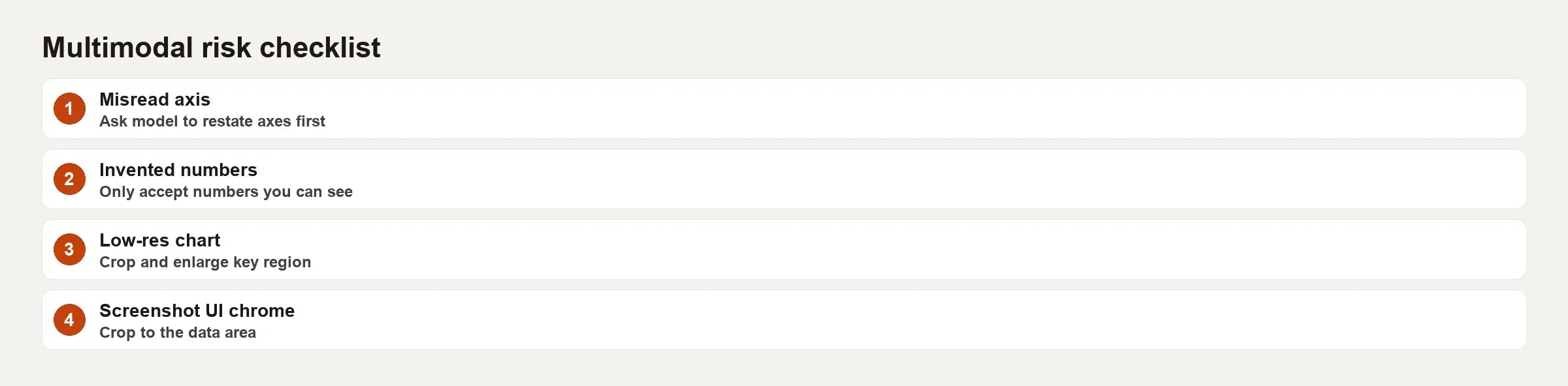
The image above is the risk card you want on the wall. It lists truncation, a second axis, cropped filters, unreadable ticks, forecast versus actual confusion, and invented cause. Pin it next to any workflow where people paste a screenshot into an AI tool.
Screenshots of tools, not only charts
People who work with data also paste other kinds of screenshots, and these all count:
- Query editor errors and partial result grids
- Run pages from data pipeline (a chain of automatic steps that moves data) tools such as dbt or Airflow
- Spreadsheet pivots with frozen panes
- Slide decks that mix a chart with bullet points
The same rules apply. Copy and paste the error text instead of a screenshot whenever the tool allows it, and export a CSV (a plain spreadsheet-style text file) file instead of photographing a grid. Read the schema (the list of tables and columns in a database) documentation instead of guessing column names from a blurry header row. Image input is a bridge for the times when a picture is the only thing you have, and it should not be your default way to debug.
When the model suggests SQL from a screenshot of results, treat it like any other AI-written SQL and check the grain (what one row stands for), the joins, and the filters with the habits in the tutorial linked above. The image did not prove that the query is safe to run on your live production database.
Governance and privacy angles
Screenshots are a quiet way for data to leave your company. A harmless-looking dashboard capture can include customer names, revenue, health data, or unreleased product numbers. Before you paste one into a consumer chat tool, ask four things. Is this vendor approved? Is training on your chats turned off? Does the vendor keep the image? Can you crop out personal details first?
These team habits help, and the US National Institute of Standards and Technology (NIST) offers a general way to think about them in its AI Risk Management Framework (RMF), which is linked in the sources below:
- Default to redacted exports or made-up demo accounts for training material.
- Ban pasting production screenshots into tools your company has not approved.
- Prefer business-grade accounts with retention controls for anything sensitive.
- Keep a log of when image features are used on regulated data.
Common mistakes
- Reading values as exact when they are visual estimates.
- Accepting explanations of cause that the chart never showed.
- Ignoring truncated axes or a second axis.
- Missing cropped filters and time-range controls.
- Confusing plan, forecast, and actual lines.
- Using consumer tools for confidential dashboards.
- Skipping verification because the answer sounded professional.
- Building an automatic pipeline on screenshot inputs when a proper data feed exists.
Quick recap
- A model’s read of a chart is a set of guesses, not warehouse facts.
- The workflow is describe, verify, then act.
- Mistakes cluster around how charts draw data, cropping, surrounding menus, compression, and invented causes.
- Prompt for inventories and risks, and forbid confident stories without evidence.
- Prefer tables, exports, and pasted text over pictures when you can.
- Screenshots carry privacy risk, so treat them like any other data access.
Practice this week
Take three real charts from your work, or public demos if production data is restricted. For each one, run the inventory prompt, then export the underlying data or open the BI query behind it. Next, mark every claim the model made as true, false, or unknown, and note one design risk that misled the first read. Save a before-and-after note for your team wiki so the lesson outlives the exercise.
For a bonus experiment, crop the legend off one chart on purpose and see whether the model invents series names. That one test convinces more skeptics than a policy document.
Series notes
This is a standalone guide to visual AI on the Learn page. It pairs with chart craft in the Charts series.
Sources
- OpenAI, vision and image input guide: https://platform.openai.com/docs/guides/images-vision
- Anthropic, vision documentation for Claude: https://platform.claude.com/docs/en/build-with-claude/vision
- Google, Gemini image understanding docs: https://ai.google.dev/gemini-api/docs/vision
- Cairo, Alberto. Related public writing on chart design and how encoding misleads readers (see The Functional Art / teaching materials overview): https://www.thefunctionalart.com/
- NIST AI RMF (risk framing when models process workplace screenshots): https://www.nist.gov/itl/ai-risk-management-framework
- Analytics Made Simple, Practical AI series: https://analyticsmadesimple.com/series/practical-ai/
Keep going
Same lessons in your feed
Short diagrams, hooks, and weekly tutorials on Substack, Instagram, X, and Facebook.