Grok Imagine is a studio for turning a written brief into a picture, so it works best when you treat it as a studio and not as a chat that invents a cover for you. Write down the subject, the setting, the style, and any exact words that must appear on the image. Use Quality Mode, zoom in to 100% to check every letter, and throw away any file with a misspelling before it reaches a slide deck.
Say your all-hands deck is due in twenty minutes and slide 1 still has a gray box labeled INSERT HERO. You open Imagine, type “make a professional cover,” and forty seconds later you have a cream slide, a stock-looking laptop, and the word “Analytcs” in huge serif letters. You used a picture studio like a magic button, and a studio needs a brief.
This post is the Imagine stretch of the Grok series on Analytics Made Simple. Chat, Grok Build, and the developer interface are other ways into Grok, while Imagine is the one you open when the thing you need is a still picture (and later a short clip). We are an educational site and not an xAI partner. The company’s product names move around, so re-check the official documentation the week you roll this out.
Studio versus chat
Grok chat, on grok.com, in the iOS and Android apps, or inside X, is for writing, questions, and talking about images. You can attach a screenshot and ask “what is this chart saying.” That is still chat. Imagine is the picture and short-video studio at grok.com/imagine, and it is also in the apps. Its job is to give you a file you can put on a slide, a product listing, or a social post. If you stay in the chat box and hope a pretty card appears, you will get the “Analytcs” problem again, which is a vibe and not a usable file.
Three other ways into Grok sit nearby. Grok Build is an assistant that works on a folder of code. The xAI Console and the API (the way a program asks the service for images) are for apps and scripts, and they bill by usage or per image and not through a chat subscription. Chat money and API credits are separate systems, so do not assume a chat plan such as SuperGrok (or whatever the live plan is called this week) pays for unlimited Imagine API calls. If you are wiring image generation into a tool, the image model name in xAI’s documentation, checked in August 2026, is grok-imagine-image-2.0. If you just need one poster before lunch, stay on grok.com/imagine and skip the Console.
Open the studio on purpose, full screen, with no Slack thread pasted above the prompt as “context.” The model will try to draw whatever you typed, including your typos and your hedges. “Make it pop” is not a subject, and “maybe a city vibe” is not a setting. If you tend to type while anxious, write the brief in a note first.
Rule of thumb: If you cannot name the subject in six words, you are not ready to generate.
A brief that works
A usable Imagine brief has four fields, and if you skip one the model will invent it. That invention is how you end up with extra laptops, fake brand marks, and a serif title nobody asked for.
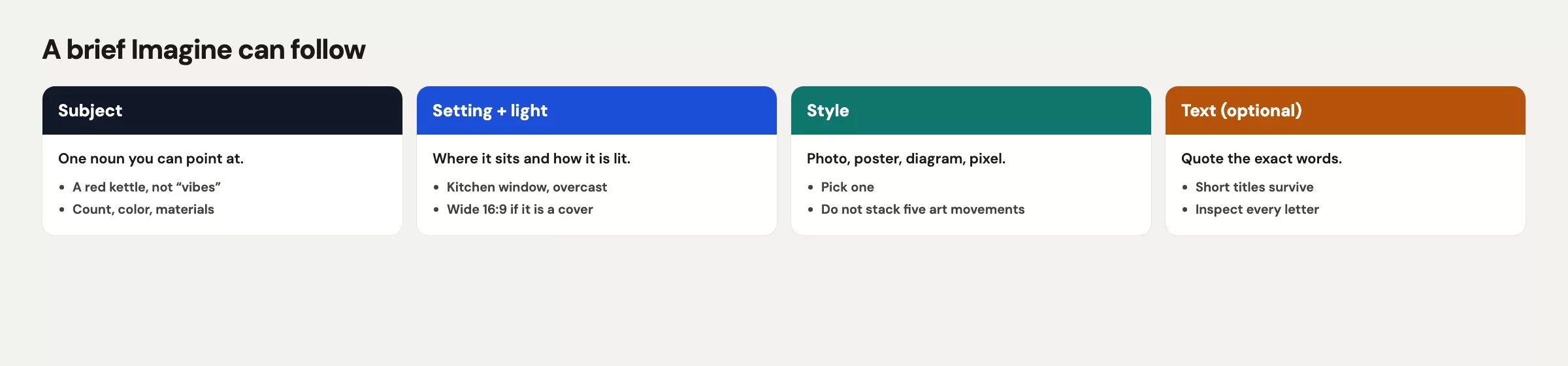
Subject is the noun you would point at with a finger, such as a round table, a laptop, a printed page of database code, or a plain mug. It is not “professional energy.” If a product is in the shot, name its color either as a hex code or in plain paint words you can check later: teal #0F766E, cream wall, black laptop, no logo on the lid.
Setting is the place, the light, and the time of day: a small conference room, a late afternoon window, one plant, a cream wall. The word “office” is too wide, and the model will fill a wide word with a stock glass tower and a skyline that belongs to no city you work in.
Style is the medium, so pick one: documentary photo, flat vector poster, or marker on paper. Mixing “cinematic, editorial, 3D render, watercolor, infographic” in one line gives you a collage of five other people’s mood boards. Also say what to refuse, such as fake logos, celebrity faces, realistic staff, and extra hands.
Text-if-any is the field people skip and then regret. If the image must carry words, write the exact string, the spelling, the capitalization, and where it sits (top band, bottom band, or nowhere). If the words belong in the slide template instead, write no on-image text in the brief. A blank instruction is not the same as a no-text instruction, because blank means the model may add a title, since posters often have titles.
Add the aspect ratio (the width-to-height shape) in the same note. A 16:9 still for a deck cover is a different crop than a 1:1 listing tile. You can resize later with the tools in the next post in this series, but you still save a pass if the first generation already matches the hole in the slide.
| Brief field | Toy example (Dock 4 lunch and learn) |
|---|---|
| Subject | Round wood table, open laptop, printed SQL page, plain cream mug, no brand marks |
| Setting | Small conference room, late afternoon window light, cream wall, one plant, empty chairs |
| Style | Documentary photo, natural color, not illustration, not 3D, not a slide template |
| On-image text | None. Title lives in the deck. |
| If text is required | Exact lines: DOCK 4 LUNCH AND LEARN / Thu 4:00 p.m. / Room 2B |
| Ratio | 16:9 for slide 1, or 4:5 if this is a feed still |
| Refuse | Fake logos, photoreal staff, extra fingers, misspelled type, city skyline |
Write those rows in a note, then paste them as one prompt. Do not paste a Slack argument, a brand manifesto, and a joke, because extra prose dilutes the nouns. If you need a reference look, you can attach images, which the next post in this series covers. When you start from nothing, words are enough as long as they are specific.
Quality mode and Image 2.0
In xAI’s announcement on August 7, 2026, Quality Mode on grok.com/imagine (and in the iOS and Android Grok apps) is Imagine Image 2.0, and the same model family is available through the API as grok-imagine-image-2.0. The company says version 2.0 follows instructions more tightly, plans lettering and layout with more care, and holds on to what you put in across generations and edits. Treat that as the vendor’s claim, then inspect the file yourself. Faster or cheaper modes may still exist in the apps, and the names move around. If you are making a deck cover or a listing photo, pick Quality Mode and accept the wait. If you are doodling a metaphor for a private brainstorm, a faster mode is fine. Check the live control the week you ship, because the label on a toggle is not a contract.
Image 2.0 also adds edit tools that the next post covers: a region or magic-wand selector, segmentation, background removal, multiple reference images, and smart resize. You do not need those on the first generation. You need a brief and a careful look at the result. Generating in a hurry in a cheap mode and then blaming the model for “Analytcs” is a workflow (the usual steps you follow) miss, so slow down for anything that will be seen by more than you.
On-image text is the hard part
Image models have gotten better at letters, but they still get things wrong with total confidence. Tiny misspelled lettering is the most common public failure, and it is the one your audience can screenshot. Extra fingers come second, and “close enough” logos come third. Realistic people you did not hire are a rights problem, which the last Imagine post in this series covers. For this post, your inspection job is spelling, the count of hands and props, and invented marks.
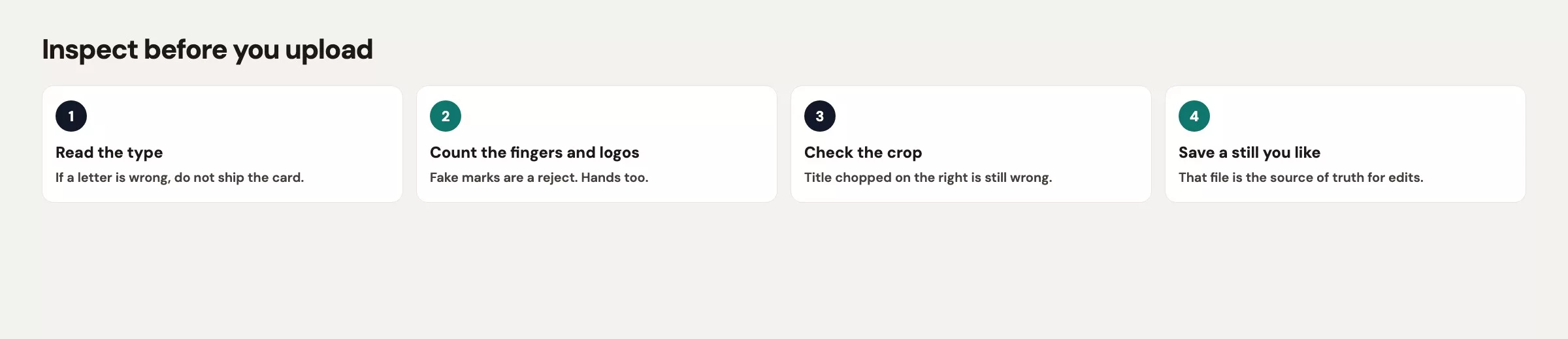
Open the image at 100%, not as a slide thumbnail or a phone lock screen, and read every letter out loud. If the brief said DOCK 4 and the file says DOK 4, the file is wrong, and you cannot fix it in the caption because people screenshot the picture. If you see a logo-shaped blob on the laptop lid, throw the file away or edit the lid. You do not get to invent a partner’s mark just because the plastic looked empty.
Count hands, mugs, and chairs, because models duplicate props when a scene is busy. One extra hand on the table is enough to make the room look like a magic trick. If your subject was “one mug, no logo” and you now have two mugs and a faint mermaid, start over or edit that region. Do not argue that viewers will not notice, because they do.
For deck covers, prefer no on-image text at all. Put the real title in the slide, so the picture carries the metaphor (table, light, tools) and the lettering stays crisp because you typed it in Google Slides or Keynote. If the job is a poster that must live as one PNG (a common picture file format) in a hallway, you accept the inspection work and write the strings into the brief with brutal exactness. Three short lines in capitals beat a paragraph of fine print.
These are the lettering failures to hunt for, even in Quality Mode:
- Missing or extra letters (
Analytcs,Thurssday,Rm 2B8) - Lookalike shapes that pass a glance (rn vs m, cl vs d)
- A second, smaller title in the scene that you did not ask for
- A fake badge in the corner that looks like a conference sponsor
- Warped baselines, as if the lettering were printed on a waving flag
Worked brief: a toy event poster
Suppose you need a 16:9 still for a lunch-and-learn session next week in Room 2B. The slide already has a title in the template. You only need a photo that says “we sit at a table and look at database code” (the session teaches SQL, the standard language for asking a database for data), without photographing coworkers and without inventing a vendor logo. This is a made-up example, so do not present it as a real event.
Paste a brief like the one below, and keep it in a note so you can reuse the same nouns on the next generation instead of wandering.
Documentary photo, 16:9.
Subject: a round light-wood table in a small conference room with one open laptop (black, lid logo-free), one printed page of SQL, and one plain cream ceramic mug. No people. No extra hands. No brand marks.
Setting: late afternoon window light from the left, cream wall, one green plant in the corner, two empty chairs, quiet office, no skyline through the glass.
Style: real camera, natural color, slight grain OK, not illustration, not 3D render, not a PowerPoint template, not a neon infographic.
On-image text: none. Do not add a title, date, URL, or badge.
Refuse: photoreal staff, celebrity faces, fake logos, misspelled letters, extra fingers, city skyline, stock “teamwork” poses.
This table shows what a clean result looks like. It is a made-up example, and there is no promise the model always hits it.
| Check | Pass | Fail (do not ship) |
|---|---|---|
| Subject count | One table, one laptop, one mug, one printout | Two laptops, a second mug, a mystery notebook |
| Type | None on the photo | Analytcs, LUNCH & LERN, a URL blob |
| Marks | Blank laptop lid, blank mug | Invented apple-ish mark, mermaid, “SONY” |
| People | Empty chairs | A photoreal coworker you did not consent |
| Hands | None, or none extra | A hand with six fingers on the table edge |
| Ratio | 16:9 fills the slide hole | Square image stretched on slide 1 |
If you must put lettering on the PNG (a hallway print with no slide around it), change only the text field and keep every other noun. Use short lines with exact spelling, then zoom to 100% and read them aloud.
On-image text, large sans-serif, high contrast, top band only, exact three lines:
DOCK 4 LUNCH AND LEARN
Thu 4:00 p.m.
Room 2B
No other words. No hashtags. No fake sponsor row.
Generate once and inspect. If the lettering is wrong, do not type “make it more professional” and roll the dice on a new room, because that is how the mug color drifts and the plant becomes a fern from a different building. Set the file aside. The next post covers edits that stick, changing one thing per pass. If the whole scene is junk (wrong room, a wall of fake logos, six chairs), throw it away and generate again from the same brief. Same brief, new roll, and do not “improve” the brief with five new adjectives while you are annoyed.
Save the PNG with a boring name such as dock4-lunch-16x9-v1.png, and put v1 in the filename even if you feel lucky. Slide 1 should not be a file called hero_ship.png five minutes after the first generation.
Common mistakes
| Mistake | What happens | Do this instead |
|---|---|---|
| Prompt is “professional cover” | Cream slide, misspelled title, mystery laptop | Four-field brief plus refuse list |
| Inspect at thumbnail size | Analytcs ships to 14 people | 100% zoom, read letters aloud |
| Type on the photo “for polish” | Warped fine print, fake badges | Title in the slide; or three short exact lines |
| Chat window instead of Imagine | A description of a cover, or a weak embed | Open grok.com/imagine |
| Assume chat plan = API wallet | Surprise bills or throttles | Studio for humans; Console only if you build |
| Photoreal staff “for realism” | Likeness and consent mess | Empty chairs, or people who agreed in writing |
| Close-enough logos | You implied a partner you do not have | Blank lid, or a real official mark you may use |
Quick recap
- Open the Imagine studio, not a chat thread, when you need a still picture.
- Write the subject, setting, style, and text-if-any before you generate.
- Quality Mode is Imagine Image 2.0 (announced August 7, 2026), and the API name is
grok-imagine-image-2.0. Re-check the labels. - Prefer no on-image text. If you must have lettering, write exact short lines and inspect at 100%.
- Hunt for extra fingers and fake logos. Empty chairs beat realistic coworkers you did not ask.
- Use the same brief and a new roll if the scene is junk. One-thing edits wait for the next post.
How to practice this week
Pick one real hole in your week, such as a deck cover, a lunch-and-learn tile, or a listing photo. Write the four fields in a note and open grok.com/imagine. Use Quality Mode (Image 2.0, as announced on August 7, 2026) if the file will be seen by others. Generate once, inspect at 100%, and then keep the file, throw it away, or park it for edits. Do not send a misspelled PNG into a meeting because the thumbnail looked fine.
The earlier post in this series covered Grok Build review, rollback, and safety (git is the undo button over there). The next one covers Grok Imagine edits and iterations, including region edits, references, background removal, resizing, and a three-pass budget. Both live on the Grok series hub. For broader AI paths, see Learn and Practical AI. The privacy habits from earlier in this series still apply, and they are covered in Grok, privacy, and work caution.
Series notes
This is Part 21 of the Grok series. Previous: Build review and safety. Next: Imagine edits.
Sources
Vendor pages checked in August 2026. Research and further reading used for this article:
- Grok Imagine (consumer studio for images and short video)
- xAI: Imagine Image 2.0 (Aug 7, 2026 Quality Mode launch, consumer and API)
- xAI docs: Imagine overview (image generation, edits, video family, model ids)
- Grok (chat apps: writing and questions, not the studio)
- xAI API (Console and API are a separate wallet from chat plans)
- Analytics Made Simple: Grok series (hub for chat, Build, Imagine, and the API map)
- Analytics Made Simple: Learn (other tutorial paths on this site)
Keep going
Same lessons in your feed
Short diagrams, hooks, and weekly tutorials on Substack, Instagram, X, and Facebook.